Mixed models
Longitudinal data, Panel data
Bayesian Networks, Graphical Models, etc.
Mixed models, hierarchical models
From hierarchical models to bayesian networks
The dangers of Anova
TODO: TO SORT -- Anova examples
There is a big confusion in the litterature between "anova" (Analysis of variance: for us, it will just be variance-based tests to compare models) and "mixed models" (because anova is not limited to the classical regression models we have presented but can also be used to study mixed models). As a rule of thumb, when people stop to be intelligible and start to use a lot of incomprehensible words, they are laboriously, unknowingly trying to fit mixed models. I hope, in this chapter to clarify things and explain that it is, actually, very simple -- provided the computer does the computations for us, that is.
TODO: This chapter is not written yet.

TODO: state the structure of this chapter
Correlated observations (GLS), Mixed models
Longitudinal data, panel data
Graphical models, Bayesian networks, Probabilistic
  Relational Models (PRM)
One of the assumptions of linear regression is that the noises are independant identically distributed gaussian variables. But sometimes, one should expect some dependance between those noises: for instance, when you perform several experiments on the same subject, the fact that it is the same subject will have some influence on the results; other example, when you study a time-dependant phenomenon, there might be a noise term for each observation, but the noises of two nearby observations are likely to be close -- the same applies for spatial observations.
One way to take into account these dependances consists in estimating the variance-covariance matrix and use the Generalized Least Squares (GLS) method.
The simplest use of the GLS method is when the noises are independant but have different variances -- they are heteroskedastic. In this case, the variance-covariance matrix is diagonal.
TODO: give an example
When the observations are performed over time, successive noises might be correlated. For example, we may posit that the noises form an AR(1) (order-1 Auto-Regrerssive) process. The variance-covariance matrix is then of the form
1          rho  rho^2  ...   ... rho^(n-1)
rho         1   rho    rho^2 ... rho^(n-1)
rho^2      rho   1     rho   ... ...
...
rho^(n-1)  ...                   1

TODO: Give an example
You could generalize this example to spatial observations,
Cov(i,j) = exp( - alpha * distance between the points i and j ).
TODO: numeric examples
library(nlme)
?gls
Sometimes, you want to solve an over-determined linear system, for instance, you work for an asset manager, you are provided with return forecasts (we call these "alpha") for a series of assets, but for some assets, you have two forecasts, and some forecasts are not for individual assets but groups of assets (we call these "portfolios"). For instance,
alpha1 = .03
alpha2 = .1
alpha3 = -.05

alpha1 = -.05
alpha2 = .08

(alpha1 + alpha2 + alpha3)/3 = .02
How do we combine all these? The most direct way, if you have no further information, is to see the problem as a regression problem.
x <- matrix(c( 1,     0,   0,
               0,     1,   0,
               0,     0,   1,
               1,     0,   0,
               0,     1,   0,
               1/3, 1/3, 1/3  ),
             nc = 3, byrow = TRUE)
y <- c(.03, .1, -.05, -.05, .08, .02)
lm( y ~ x )
We get
alpha1 = -0.008636
alpha2 = 0.091364
alpha3 = -0.047273
Bit this is not the end of the story: you might actually have more information that that. First, the various forecasts usually come from different sources, that you trust more or less.
# The first source is not that reliable, but has a wide
# coverage: there is a forecast for all the assets.
alpha1 = .03                         With variance 1
alpha2 = .1                          With variance 1
alpha3 = -.05                        With variance 1

# The second source is more reliable
alpha1 = -.05                        With variance .5
alpha2 = .08                         With variance .5

# The last source is the forecast on a portfolio:
# this is usually much easier to do, and the forecast
# errors on the various assets tend to cancel out:
# this is our most precise forecast.
(alpha1 + alpha2 + alpha3)/3 = .02   With variance .2
TODO: computatitons in this case
The GLS system can be written in matrix form
P1 * alpha = forecast1        With variance 1
P2 * alpha = forecast2        With variance .5
P3 * alpha = forecast3        With variance .2
Where the matrices P1, P2, P3 are
      1 0 0
P1 =  0 1 0
      0 0 1

P2 =  1 0 0
      0 1 0

P3 = ( 1/3 1/3 1/3 )
Actually, the variances themselves can be matrices: this means that the errors on the various foreacsts you make are not independant, they are (gaussian and) correlated. This can be written
P1 * alpha = forecast1        With V1
P2 * alpha = forecast2        With V2
P3 * alpha = forecast3        With V3
or even
A x = b with variance V
It the errors were independant and identically distributed, we would have V=1 and we would try to find x that minimizes the mean square error
(A x - b)' (A x - b)
This is the length of the Ax-b vector for the Euclidian distance. Here, we simply replace this distance by one that takes the matrix V into account: the Mahalanobis distance (we have already seen it somewhere in this book).
Minimize (A x - b)' V^-1 (A x - b)
The computations yield
2 A' V^-1 (A x - b) = 0
and then
x = (A' V^-1 A)^-1 A' V^-1 b
To check that it is correct and indeed better than the least squares estimate (when we know the matrix V), let us perform a small simulation.
%%G
P <- matrix(c(
  1, 0, 0,
  0, 1, 0,
  0, 0, 1,
  1, 0, 0,
  0, 1, 0,
  1/3, 1/3, 1/3),
  nc = 3,
  byrow = TRUE)
V <- diag(c(1,1,1, .5, .5, .2))
alpha_true <- rnorm(3)

N <- 100   # Number of samples
n <- 100   # Sample size
res <- res_ls <- matrix(NA, nr=N, nc=3)
library(MASS)           # For mvrnorm
x0 <- rnorm(3)  # Real values
for (i in 1:N) {
  b <- mvrnorm(1, mu = P %*% x0, Sigma = V)
  # The GLS solution
  res[i,] <-
    solve( t(P) %*% solve(V, P), t(P) %*% solve(V, b) )
  # The usual least-squares solution
  res_ls[i,] <- solve( t(P) %*% P, t(P) %*% b)
}

x <- cbind(
  GLS = apply(t(t(res) - x0), 2,
              function (x) sum(x^2)) / N,
  LS = apply(t(t(res_ls) - x0), 2,
             function (x) sum(x^2)) / N
)
y <- paste("x", as.vector(row(x)), sep="")
z <- colnames(x)[ as.vector(col(x)) ]
x <- as.vector(x)
y <- as.factor(y)
z <- as.factor(z)
library(lattice)
dotplot(~ x | y, group=z,
        layout = c(1,3),
        pch = 16,
        cex = 2,
        xlim = range(-.1*x,1.1*x),
        auto.key = TRUE,
        main = "Mean Sqaure error of LS and GLS estimates",
        xlab = "")
%--
The mean square error is indeed smaller...
> apply(t(t(res) - x0), 2, function (x) sum(x^2))
[1] 307.7805 310.0312 682.9758

> apply(t(t(res_ls) - x0), 2, function (x) sum(x^2))
[1] 340.6182 346.2469 830.7217
Here is our last example: we have made an experiment on several subjects, in different conditions, and we would like to know if the conditions have an influence on the result. If each subject is used only once (for instance, if you study how children learn to read), you cannot take into account the differences between subjects; but if the experiment is non-destructive, you can reuse the subjects and compare their results in different conditions. If your analysis takes into account the differences between the subjects, you can spot the effects of the different conditions even if their amplitude is dwarfed by the differences between subjects.
If you want a variance-covariance matrix to apply the GLS method in this context, you can try with
Cov(i,j) = 1       if i = j
         = alpha   if experiments i and j were performed
                   on the same subject
         = 0       otherwise
But there is another way of modeling those experiments:
Result of experiment i on subject j =
    effect of experiment i + effect of subject j.
With letters and indices:
Yij = a_i + b_j + noise_ij.
The difference between such a model and a classical regression
Y ~ experiment + subject
is that the effects of the subjects, b_j, are NOT parameters of the model -- they form a random variable, assumed to be gaussian, whose mean and variance are to be estimated. Indeed, considering them as parameters to be estimated would not make sense, since usually the subjects only form a sample of the population (e.g., if they are human beings, we just have a handful of them, not the whole Earth population). Furthermore, this allows us to reduce the number of parameters to be estimated.
Before we start giving examples, a word about the vocabulary: "effects" just means "parameters in the model"; "fixed effects" are the effects to be estimated (in the example above, "a_i" or "effects of experiment i"), "random effects" are the effects not to be estimated, for which we only want an estimation of the mean and the variance (in the example above, "b_j" of "effects of subject j").
TODO: Example 1, a model of the form
  y ~ experiment + (1 | subject)

TODO: Present the nlme library
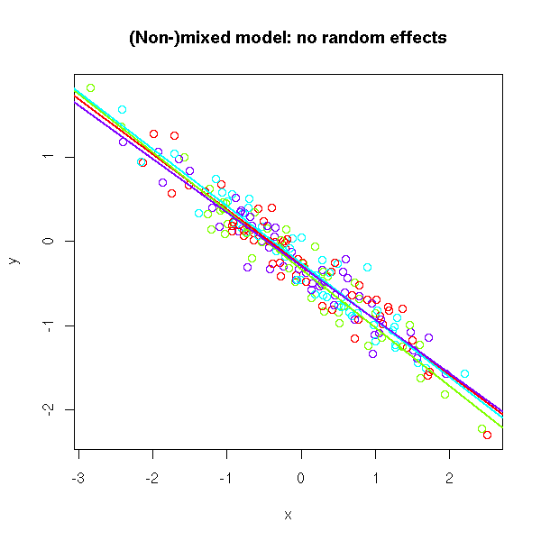
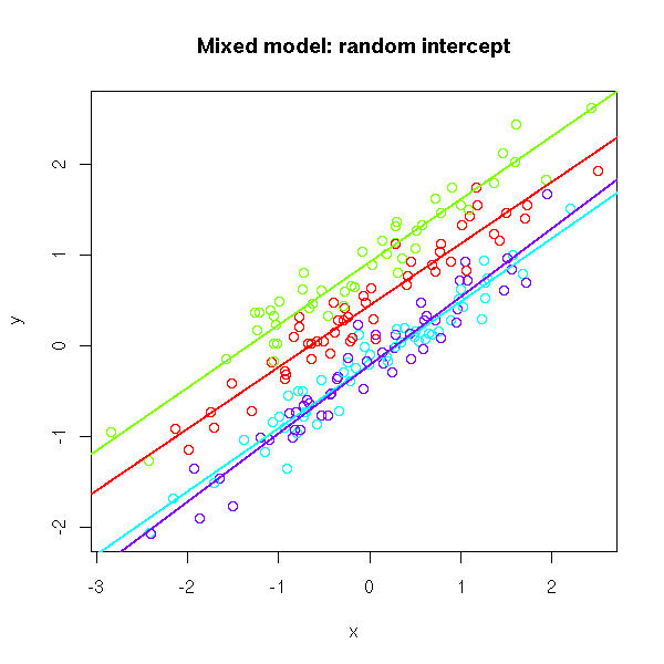
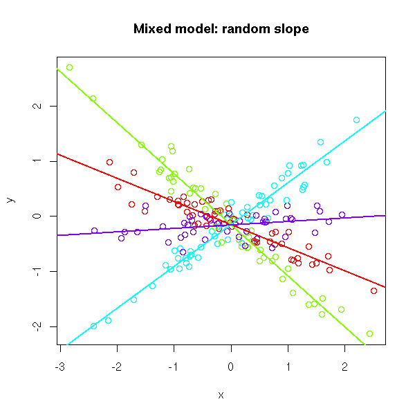
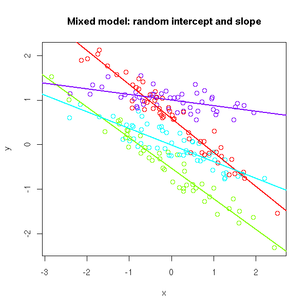
If you have a single predictive variable, you can simply plot the cloud of points, with a different colour for each group, a regression line for each, and assess, visually, if the slope is the same in all the groups and if the intercept is the same.
# No random effects
N <- 200
k <- 4
x <- rnorm(N)
g <- sample(1:k, N, replace=TRUE)
a <- rep(runif(1,-1,1), k)
b <- rep(runif(1,-1,1), k)
y <- a[g] + b[g] * x + .2 * rnorm(N)
plot(x, y, col=rainbow(k)[g],
     main="(Non-)mixed model: no random effects")
for (i in 1:k) {
  abline(lm(y[g==i] ~ x[g==i]),
         col=rainbow(k)[i], lwd=2)
}
# Random intercept
a <- runif(k,-1,1)
b <- rep(runif(1,-1,1), k)
y <- a[g] + b[g] * x + .2 * rnorm(N)
plot(x, y, col=rainbow(k)[g],
     main="Mixed model: random intercept")
for (i in 1:k) {
  abline(lm(y[g==i] ~ x[g==i]),
         col=rainbow(k)[i], lwd=2)
}
# Random slope
a <- rep(runif(1,-1,1), k)
b <- runif(k,-1,1)
y <- a[g] + b[g] * x + .2 * rnorm(N)
plot(x, y, col=rainbow(k)[g],
     main="Mixed model: random slope")
for (i in 1:k) {
  abline(lm(y[g==i] ~ x[g==i]),
         col=rainbow(k)[i], lwd=2)
}
# Random intercept and slope
a <- runif(k,-1,1)
b <- runif(k,-1,1)
y <- a[g] + b[g] * x + .2 * rnorm(N)
plot(x, y, col=rainbow(k)[g],
     main="Mixed model: random intercept and slope")
for (i in 1:k) {
  abline(lm(y[g==i] ~ x[g==i]),
         col=rainbow(k)[i], lwd=2)
}
There are two R packages to deal with mixed models: the old nlme, and its more recent but incompatible replacement, lme4. Since the syntax used to describe the models changed from something I never really understood in nlme to something perfectly in sync with the description of non-mixed models, we shall strive to stick to lme4.
The models look like this (the only potentially troublesome point is the fact that, as always, the intercept is implicit: when we write "x", it encompasses the intercept and the effect of x):
y ~ x                 No random effects
y ~ (1 | g) + x       The intercept is a random effect
y ~ (x | g)           Intercept and slope are random effects

y ~ ( 1 | g1 * g2 )   Several groupings (they can be nested)
The lme4 function to fit a mixed model is called "lmer".
If you have more variables than that, fewer observations, more groups, if you want actual tests, you can proceed as follows.
First, look at the data.
library(lme4)
xyplot(Reaction ~ Days, groups = Subject,
       data = sleepstudy,
       type = "l")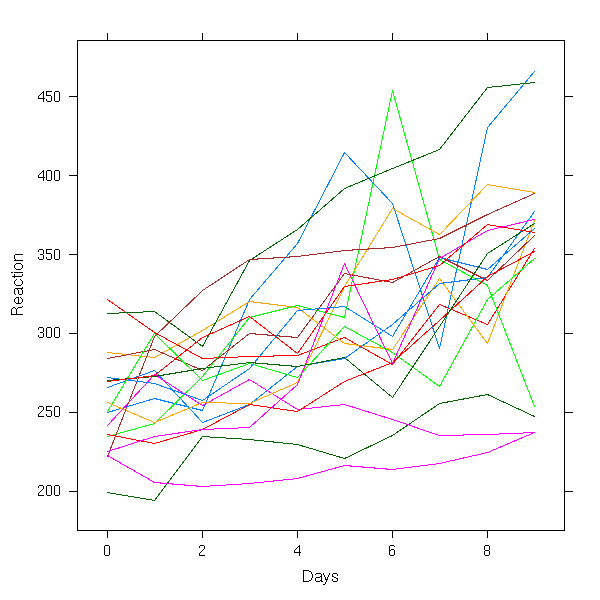
xyplot(Reaction ~ Days | Subject,
       data = sleepstudy,
       type = "l")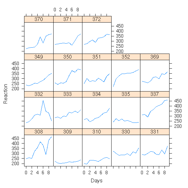
Then, perform a regression in each group and look whether the regression coefficients are the same in each
# A regression in each group
r <- lmList(Reaction ~ Days | Subject, data = sleepstudy)
# The regression coefficients
do.call("rbind", lapply(r, function (x) { x$coef }))
# To check if they are different, let us compute
# their 95% confidence interval.
lmListIntervals <- function (r, level=.95) {
  s <- array(numeric(0),
             dim=c(length(r),
             dim(confint(r[[1]]))))
  dimnames(s)[2:3] <- dimnames(confint(r[[1]]))
  dimnames(s)[[1]] <- names(r)
  names(dimnames(s)) <- c("Group", "Variable", "Interval")
  for (i in 1:length(r)) {
    s[i,,] <- confint(r[[i]], level=level)
  }
  s
}
s <- lmListIntervals(r)
aperm(s, c(1,3,2))

lmListIntervalsPlot <- function (s, i=1) {
  plot.new()
  plot.window( xlim = range(s[,i,]), ylim=c(1,length(r)) )
  segments( s[,i,1], 1:length(r),
            s[,i,2], 1:length(r) )
  axis(1)
  axis(2)
  box()
  level <- diff(as.numeric(gsub(" .*", "", dimnames(s)[[3]])))
  title(xlab = dimnames(s)[[2]][i],
        ylab = "Subject",
        main = paste(level, "% confidence intervals", sep=""))
}
lmListIntervalsPlot(s,1)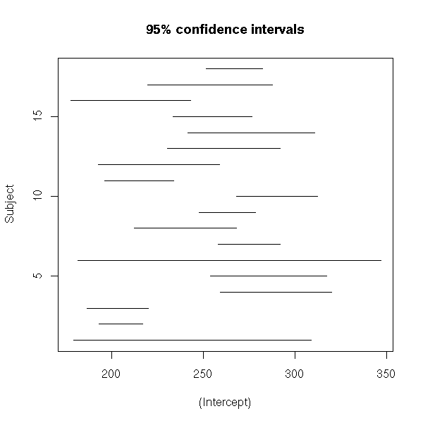
lmListIntervalsPlots <- function (s) {
  k <- dim(s)[2]
  op <- par(mfrow=c(1,k))
  for (i in 1:k) {
    lmListIntervalsPlot(s,i)
  }
  par(op)
}
lmListIntervalsPlots(s)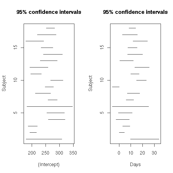
In this example, things are not that compelling...
# No random effects
N <- 200
k <- 4
x <- rnorm(N)
g <- sample(1:k, N, replace=TRUE)
a <- rep(runif(1,-1,1), k)
b <- rep(runif(1,-1,1), k)
y <- a[g] + b[g] * x + .2 * rnorm(N)
d <- data.frame(x=x, y=y, g=as.factor(g))
lmListIntervalsPlots(lmListIntervals(
  lmList( y ~ x | g, data = d )
))
mtext("No random effects",
      side=3, line=3, font=2, cex=1.2)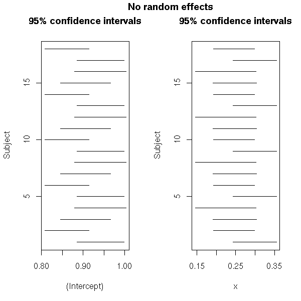
# Random intercept
a <- runif(k, -1, 1)
b <- rep(runif(1,-1,1), k)
y <- a[g] + b[g] * x + .2 * rnorm(N)
d <- data.frame(x=x, y=y, g=as.factor(g))
lmListIntervalsPlots(lmListIntervals(
  lmList( y ~ x | g, data = d )
))
mtext("Random intercept",
      side=3, line=3, font=2, cex=1.2)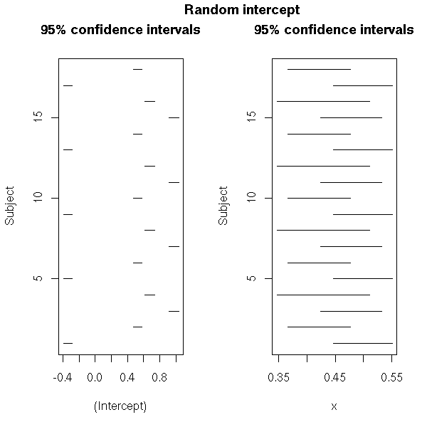
# Random slope
a <- rep(runif(1,-1,1), k)
b <- runif(k, -1, 1)
y <- a[g] + b[g] * x + .2 * rnorm(N)
d <- data.frame(x=x, y=y, g=as.factor(g))
lmListIntervalsPlots(lmListIntervals(
  lmList( y ~ x | g, data = d )
))
mtext("Random slope",
      side=3, line=3, font=2, cex=1.2)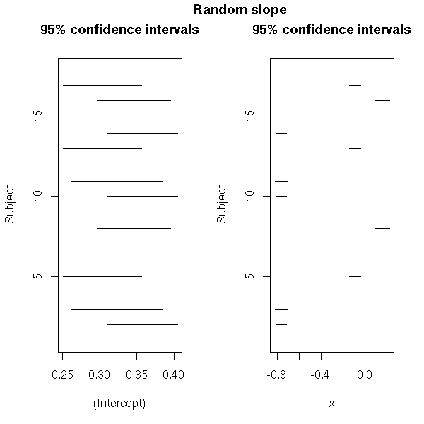
# Random intercept and slope
a <- runif(k, -1, 1)
b <- runif(k, -1, 1)
y <- a[g] + b[g] * x + .2 * rnorm(N)
d <- data.frame(x=x, y=y, g=as.factor(g))
lmListIntervalsPlots(lmListIntervals(
  lmList( y ~ x | g, data = d )
))
mtext("Random intercept and slope",
      side=3, line=3, font=2, cex=1.2)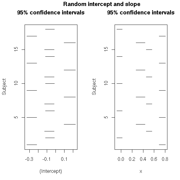
Then, from those plots, you can choose a model. For the sleep data, there is noting really compelling: let us try a linear model with random slope and intercept.
# No random effects
lm(   Reaction ~ Days,
      data = sleepstudy)
# Random intercept
lmer( Reaction ~ Days + (1 | Subject),
      data = sleepstudy)
# Random slope
lmer( Reaction ~ Days + (Days - 1 | Subject),
      data = sleepstudy)
# Random intercept and slope
r <- lmer(
  Reaction ~ Days + (Days | Subject),
  data = sleepstudy
)
Perform a few diagnostic plots
TODO...
Those diagnostic plots may prompt you to change the model.
TODO
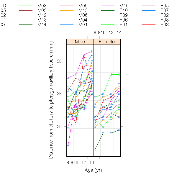
data(Orthodont, package="nlme")
xyplot( distance ~ age | Sex, group = Subject,
        data = Orthodont, type="l" )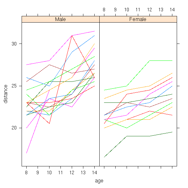
data(BodyWeight, package="nlme")
xyplot(weight ~ Time | Rat,
       data = BodyWeight,
       type = "l",  aspect = 8)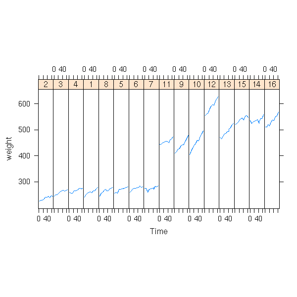
xyplot(weight ~ Time | Diet, group = Rat,
       data = BodyWeight,
       type = "l",  aspect = 3)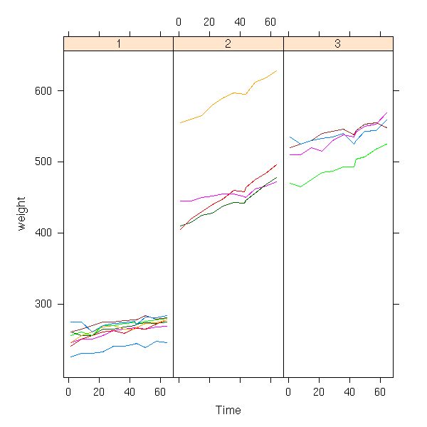
TODO: nested groupings (Hierarchical Models)
TODO: crossed groupings
TODO (motivation but no details)

data(Cefamandole, package="nlme")
xyplot( conc ~ Time | Subject,
        data = Cefamandole,
        type = "l" )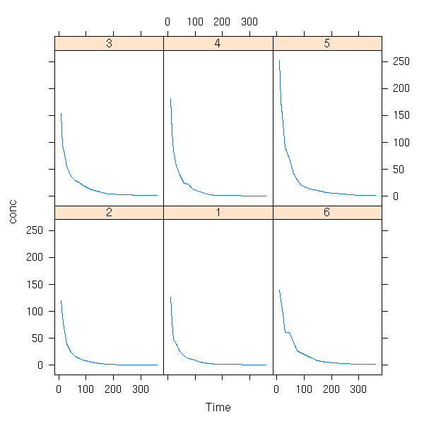
data(Dialyzer, package="nlme")
xyplot( rate ~ pressure | QB, group = Subject,
        data = Dialyzer, type = "l")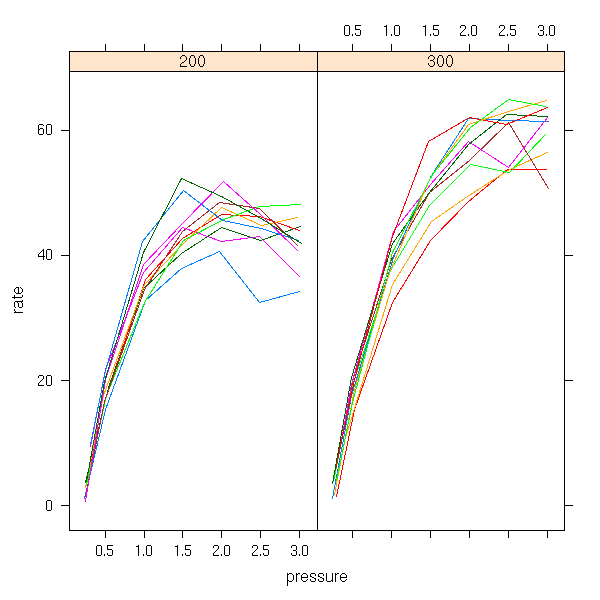
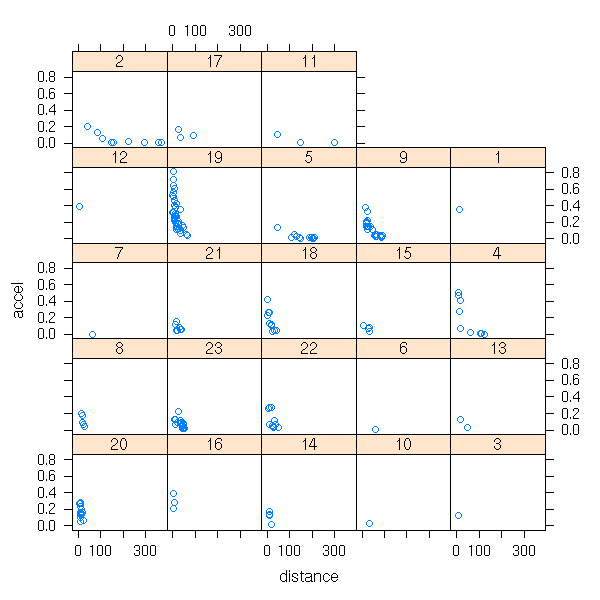
data(Earthquake, package="nlme")
xyplot(accel ~ distance | Quake, data=Earthquake )
A mixed model of the form
y_ij = a + b_i + x_ij + epsilon_ij
b ~ N(0,1)
can be seen as a bayesian model with a gaussian prior on b. (There is a small difference, though: in a truly bayesian setup, we have a prior on b, such as b ~ N(0,1), while in a mixed model, we just have the shape of the distribution, b ~ N(m,s), and the mean m and the standard deviation s are parameters to be estimated).
As a result, one can use bayesian software to fit mixed models.
TODO: An example, in Jags...
One can try to smooth a cloud of points with a model of the form
y = b1 (x - a1)_+ + b2 (x - a2)_+ + ... + bn (x - an)_+
where
x_+ = x   if x >= 0
      0   if x < 0
and the knots a_i are heurstically chosen (say, the quantiles of x).
In other words, we try to describe y as a broken line.
plus <- function (x) {
  ifelse( x >= 0, x, 0 )
}
op <- par(mfrow=c(2,2), mar=c(3,3,2,2), oma=c(0,0,2,0))
plot.basis.function <- function (a) {
  curve( plus(x - a),
         xlim = c(-1, 1),
         ylim = c(-1, 1),
         lwd = 3,
         col = "blue" )
  abline(h=0, v=0, lty=3)
}
plot.basis.function(-1)
plot.basis.function(-.5)
plot.basis.function(0)
plot.basis.function(.5)
par(op)
mtext("Linear splines: basis functions",
      font = 2, line = 2, cex = 1.5)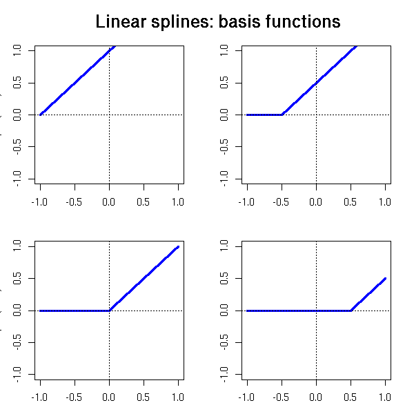
TODO: a cloud on points and the corresponding linear
spline.

N <- 100
x <- runif(N, -1, 1)
y <- sin(2*pi*x) + .5*rnorm(N)
plot(x,y)
z <- apply(as.matrix(seq(-1,1,by=.2)), 1, function (a)  { plus(x-a) })
z <- z[,-1] # This is already captured by the intercept
y.pred <- predict(lm(y ~ z))
o <- order(x)
lines( x[o], y.pred[o], col="red", lwd=3 )
title(main="Broken line regression")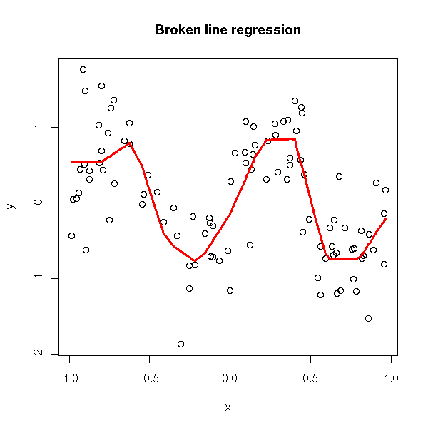
TODO: turn this into a function
argument: number of knots
choose them either equispaced in range(x), or along the
quantiles of x.
broken.line.regression <- function (
x, y,
knots = max(2,ceiling(length(x)/10)),
method = c("equispaced", "quantiles")
) {
method <- match.arg(method)
if (length(knots) == 1) {
if (method == "quantiles") {
knots <- quantile(x, knots+2)[ - c(1, knots+2) ]
} else {
knots <- seq(min(x), max(x), length=knots+2) [ - c(1, knots+2) ]
}
}
z <- apply(as.matrix(knots), 1, function (a) { plus(x-a) })
lm( y ~ z )
}
plot.broken.line.regression <- function (x, y, ...) {
o <- order(x)
plot(x, y)
r <- broken.line.regression(x, y, ...)
lines( x[o], predict(r)[o], col="red", lwd=3 )
invisible(r)
}
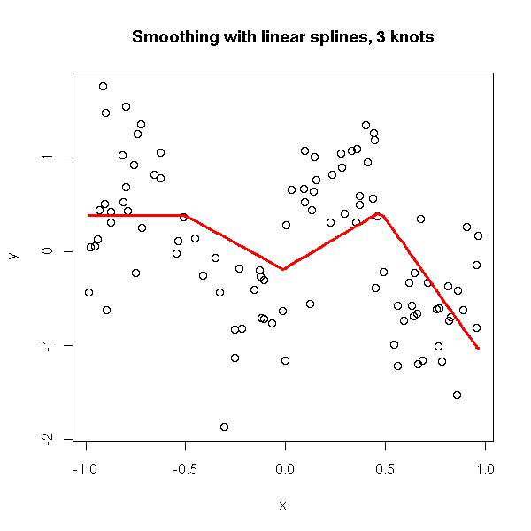
plot.broken.line.regression(x,y, knots = 3)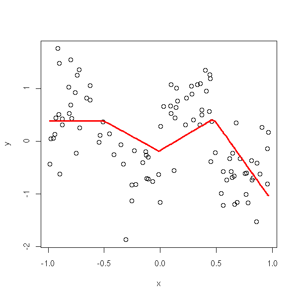
plot.broken.line.regression(x,y, knots = 3)
title(main="Smoothing with linear splines, 3 knots")
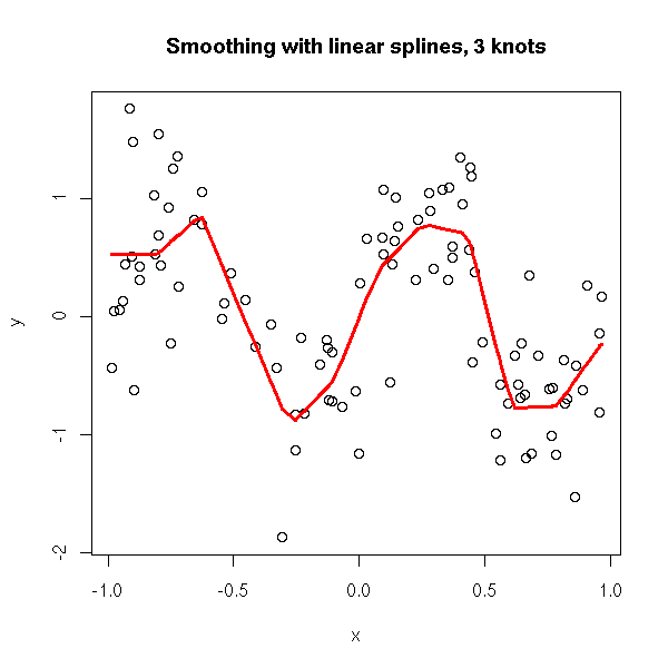
plot.broken.line.regression(x,y, knots = 10)
title(main="Smoothing with linear splines, 3 knots")
plot.broken.line.regression(x,y, knots = 30)
title(main="Smoothing with linear splines, 3 knots")
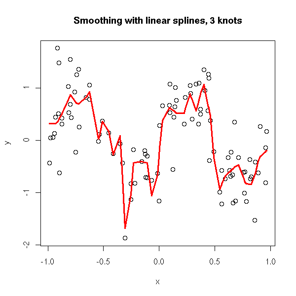
If we want a smooth approximation, we tend to increase the number of points, but then, the approximation becomes too noisy. This is because this method allows for wild changes in the slope of two neighbouring segments.
In other words, we did not assume anything on those slopes. Instead, we can assume that they form a random walk.
y = b1 (x - a1)_+ + b2 (x - a2)_+ + ... + bn (x - an)_+
b ~ N(0,1)
TODO: program this...
Usually, your data are stored in (1-dimensional) vectors. But sometimes, it has a slightly more complicated structure. For instance, when you measure several variables on several subjects every day, it is natural to represent each variable as an array, one row per subject, one column per date. Such data are called "panel data".
Imagine we want to predict one variable y form several others x1, x2, x3. Usual regression is not a good idea: we would expect the observations on the same subject to be correlated, and the observations from one day to the next to be correlated. How can we tackle this?
It will be easier if the data is not presented as a list of arrays, but as a single data frame, the first column giving the subject number, the second the date, the others the various variables.
First, as always, we should look at the data. For each variable and each subject, look at the path.
xyplot(y  ~ time, groups=subject, data=d, type="l")
xyplot(x1 ~ time, groups=subject, data=d, type="l")
xyplot(x2 ~ time, groups=subject, data=d, type="l")
xyplot(x3 ~ time, groups=subject, data=d, type="l")
Same for two variables at a time (here, we assume that the observations are chronologically ordered).
xyplot(y ~ x1, groups=subject, data=d, type="l")
xyplot(y ~ x2, groups=subject, data=d, type="l")
xyplot(y ~ x3, groups=subject, data=d, type="l")

xyplot(x1 ~ x2, groups=subject, data=d, type="l")
xyplot(x1 ~ x3, groups=subject, data=d, type="l")
xyplot(x2 ~ x3, groups=subject, data=d, type="l")
If you see something it will help you choose the model: which terms to include? Do they have a linear effect?
Second, we can perform the regression y ~ x1 + x2 + x3 + time (or the one suggested by the previous plots) for each subject and look at the distribution of the coefficients: we want to know if those coefficients depend on the subject (this is often the case for the intercept) or not (this is often the case for the other coefficients).
library(nlme)
r <- groupedData( y ~ x1 + x2 + x3 + time | subject, data=d )
plot(intervals(lmList(y ~ x1 + x2 + x3 + time, r)))
Third, we can perform the mixed model regression. For instance, if the previous plot suggested that the intercept and the x1 coefficient depend on the subject, but not the others:
res <- lme( y + x1 + x2 + x3 + x4,
            random = ~ x1 | subject,
            data = r )
Finally, we can look at the result:
res
summary(res)
plot(res)
plot(res, resid(.) ~ x1)
plot(res, resid(.) ~ x2)
plot(res, resid(.) ~ x3)
plot(res, resid(.) ~ time)

TODO: the residuals ACF
If there are problems with the residuals, such as heteroskedasticity (e.g., the higher x1, the more dispersed the residuals), correlated residuals, we must go back to the previous step and specify the structure of the variance-covariance matrix.
Another possible problem is the presence of non-linear effects: there again, we go back to the previous step, changing the model.
You can also check if the model is unduly complex: you can compare it with models with fewer variables, with fewer random effects, with the "anova" function -- but remember that it is only valid if the models are nested and have been estimated by Maximum Likelihood (the default, for "mle", is Restricted Maximum Likelihood (REML), which maximizes a likelihood in which the fioxed effects have been integrated out, which gives less biased results, but is unsuitable for tests).
anova(
  lme( y + x1 + x2 + x3 + x4,
       random = ~ x1 | subject,
       data = r,
       method="ML" ),
  lm(  y + x1 + x2 + x3 + x4,
       data = r)  )

anova(
  lme( y + x1 + x2 + x3 + x4,
       random = ~ x1 | subject,
       data = r, method="ML" ),
  lme( y + x1 + x2,
       random = ~ 1 | subject,
       data = r,
       method="ML")
)
An example with splines.

A non-linear example.

An example with a heteroskedasticity problem.

An example with autocorrelations.

An example with "time-series behaviour".
TODO
Structure of this section (when it is finally written...)
Introduction
  General idea
    The observations in a group are often correlated
    Example 1: Y_ijk = a_i + b_ij + c_ijk    i=group, j=subject
    Example 2: Y_ij = a_i + b_i X_ij + c_ij
    Concrete examples: amova
  First simulation, first plots
Vocabulary
  Longitudinal data, repeated measures data, longitudinal
    data, split-splot design,
  aov, Error
  rpsych, break the sum of squares into the pieces defined
    by the Error term
Treillis, nlme, groupedData, Comparing the syntax with
  that of aov/Error
Mixed models and the variance-covariance matrix
nlme: Non-linear mixed models
Other functions
    glmmPQL (MASS)
    GLMM    (lme4)
    lme     (nlme)
    nlme
    aov
    glm ???
Generalizations: graphical models, bayesian networks
A few examples:
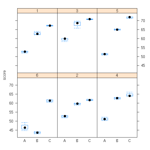
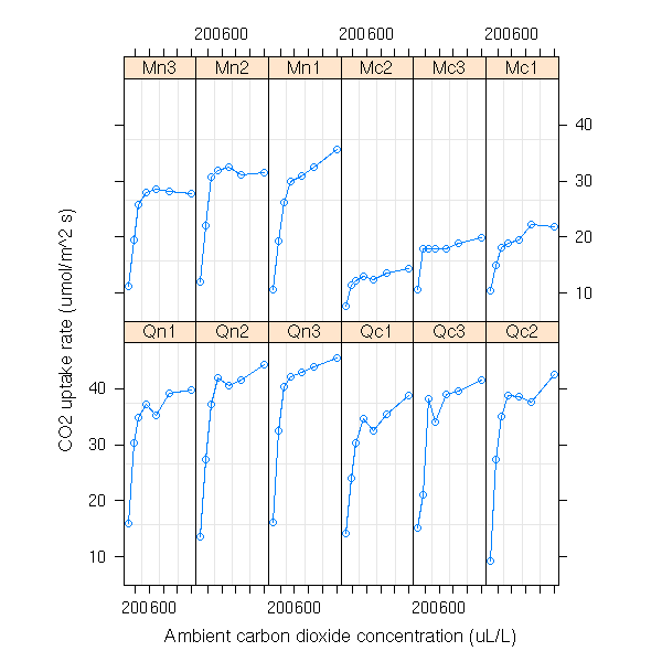
data(Orthodont)
formula(Orthodont)
attr(Orthodont,"outer")
plot(Orthodont)

plot(Orthodont, outer=T)

data(Machines)
formula(Machines)
plot(Machines)

data(CO2)
formula(CO2)
attr(CO2,"outer")
plot(CO2)
plot(CO2, outer=T)

data(Pixel)
formula(Pixel)
attr(Pixel,"outer")
plot(Pixel)
plot(Pixel, inner=~Side)
But this is not really the setup mentionned above: I had qualitative predictive variables...
y ~ x
y ~ x | sujet
y ~ x | sujet, outer = ~ groupe
y ~ x | sujet, outer = ~ groupe1 * groupe2

m <- groupedData(...)
lmList(m) # Computes a regression for each subject

Using moxed models:
Write the model, on paper
Indicate what are the fixed effects, the random effects
Write the model in R:

lme(fixed = y ~ x, random= ~ x | subject)

Model                          fixed              random
----------------------------------------------------------------------
Y = (a+a_i) + (b+b_i) x        y ~ x              ~ x | subject
Y = (a+a_i) + b x              y ~ x              ~ 1 | subject
Y = a + (b+b_i) x              y ~ x              ~ -1 + x | subject

You can also give the shape of the variance-covariance matrix,
but I have not looked into this (yet).

Explain how to read the results
summary(...)

anova(lme(...,methodd="ML"))

fixed.effects(r)
random.effects(r)

Plots:
plot(r, x ~ fitted(.) | g)
... resid(.)

Forecasts:
predict
Mixed models:
glmmPQL (MASS)
GLMM    (lme4)
lme     (nlme)
aov
glm ???
Non-linear mixed effects:
nlme
The documentation gives the following example:
Y = A_i ( 1 - exp( - B_i ( X - C_i ) + noise_ij
  i: plant number
  j: observation number
Arguments of the "nlme" function:
  Y ~ f(X, A, B, C)
  fixed = A + B + C ~ 1 | plant
  random = A + B + C ~ 1 | plant
If there are other predictive variables:
  fixed = A + B + C ~ x1 * x2 | plante
  random = A + B + C ~ 1 | plante
You can also use lists:
  fixed = list( A + B ~ x1 * x2, C ~ 1 )

Scatter plot matrix of the random effects:
  pairs(r, ranef(.))

Plot the fitted curves:
  r <- nlme(...)
  plot(augPred(r))
Vocabulary:
Longitudinal data
repeated measures data
longitudinal data
split-splot design
mixed model, hierarchical analysis, multilevel analysis
Other examples:
Theoph
Wafer   3 nested levels of grouping: Wafer, Site within Wafer, Device within Site


outer factor = it is constant for each level of the grouping factor
             = it is entirely determined by the group (or subject)
inner factor = it varies

Often, you cannot put everything into a single formula such as
  y ~ x1 + x2 | g1/g2/g3
You can add "inner" or "outer" arguments to the groupedData function.
  y ~ x | subjet, outer = ~ x1 * x2
  (here, x is quantitative, subject determines the value of x1 and x2)
In a plot: group=lines, outer=panels
grouping factor: the population from which we sample.
inner factor: can change within groups
In a plot: inner=lines, group=panels

Inner: changes within a group
Outer: does not change within a group

If there are several levels of grouping:
  current ~ voltage | Wafer/Site/Device
  inner=list( Wafer = ~ Length, Site = ~ Length)
or
  current ~ voltage | Wafer/Site/Device
  outer=list( Device = ~ Length )

Longitudinal data:
  y ~ x | subject
  where x is continuous (often, x is the time).
Panel data: idem, but the values of "x" (the time) are the same for
  all the subjects.

Displaying and printing groupedData objects.
  data(Pixel)
  plot(Pixel)
Here, there are two levels of grouping, we can include a single one:
  plot(Pixel, display=1)
Compare with:
  plot(Pixel, inner=~Side)

Often, you end up with unreadable plots, with many curves on top of
each other. You can ask the computer to "fuse" those curves with a
function of your choice.
Example (this is the default function):
  plot(Pixel, display=1, collapse=1, FUN=mean)
If you want to investigate heteroscedasticity:
  plot(Pixel, display=1, collapse=1, FUN=sd)
If there are only two (very different) curves in each panel, you
might want to look at their difference:
  plot(Pixel, display=1, collapse=1, FUN=diff)

You can display only a few selected panels:
  plot(Pixel, subset=list(Dog=c(3,4)))

Mixed Models: The observations on a single subject are correlated.

Example: education.
We measure the performance of pupils according to the
pupil, the class, the year, the teacher, the school, the
methods, the textbooks, the city, the sex, the SES,
etc. Furthermore, the results evolve with time.
Thus, some spot an increase in the marks: what is the
cause?  do we give higher marks for the same achievement?
Is the variance higher?

Other example: amova.

Other example: breeding (group = the sire)

HLM: Hiearchical Linear Modeling

Linear models: the observations are assumed to be independant
Mixed models: they are not

First presentation of hierarchical models:
  y ~ x | Subjet, outer = ~ groupe
We first perform a regression y ~ x for each subject.
Then, we take the resulting coefficients (say, the
intercept a and the slope b) and we check if they depend
on the group:
  a ~ group
  b ~ group

We can do the same thing for a logistic regression.

Mixed and hierarchical models: There are several notions
of residuals. But the more complex the model, the higher
the errors on thes residuals (in linear regression, the
residuals are an estimation of the noise, but here, we
have several noises and our estimations mixes them up a
bit).

Hierarchical models: the observations are "grouped" and we
know those groups. (You could also imagine situations in
which we do not know the groups.)

Other possible introduction to mixed models.  We have
performed a couple of observations on a thousand subjects.
Our model would suggest performing a single linear
regression on each subject: this is not possible, because
we have too few observations wrt the number of
parameters. We can get out of this situation by making a
further on assumption the parameters we are looking for:
that they are following a given distribution. (This is a
bayesian point of view.)
We are no longer interested in the parameters of each
subject, but simply in the parameters of this distribution
(e.g., if the intercept of our regressions is assumed to
be gaussian, we would just want the mean intercept and the
variance of the intercepts -- not their individual
values).

HLM = Multilevel Analysis
Multilevel Analysis Lexicon:
  http://www.paho.org/English/DD/AIS/be_v24n3-multilevel.htm

http://cran.r-project.org/doc/contrib/rpsych.html
We consider three events, A, B and C. If they are independant, we have
P(A, B, C) = P(A) * P(B) * P(C).
But these events may be linked. For instance:
If A is true then B has a higher probability.
If B is true then C has a higher probability.
This can be modelled as:
P(A,B,C) = P(A) * P(B|A) * P(C|A).
In more complex situations it would become unreadable -- instead, we can display those dependencies by a diagram:
A ---> B ---> C
Here is another possible configuration:
If A is true then B has a higher probability.
If C is true then B has a higher probability.

P(A,B,C) = P(A) * P(C) * P(B|A,C)

A ---> B <--- C
You can represent in a graphical way the dependance relations between those variables A, B, C, D, E as follows.
1. Choose an (arbitrary) order on the variables.
2. Simplify the formula as much as possible.
P(A,B,C,D,E) = P(A) * P(B|A) * P(C|A,B) * P(D|A,B,C) * P(E|A,B,C,D),
For instance, it could be:
P(A,B,C,D,E) = P(A) * P(B|A) * P(C) * P(D|B,C) * P(E|A,C)
3. Draw the graph whose vertices are the variables an with one edge x ---> y if P(y|...x...) appears in the above formula.
In our example, it would be:
E <--- A <--- B
^             |
|             |
|             V
C ----------> D
The problem, is that the results depends on the order chose at the begining. If you are lucky, the result will be simple and easy to interpret, otherwise...
In particular, if we know beforehand some causal relations between our variables, we shall choose an order that respects it -- and if we did not forget anything, the resulting graph will contain nothing else.
This graph is not yet very usable: we still need to add some probabilities -- in our example, the distributions of A, B|A, C, D|BC et E|AC.
Such a graph then allows us to compute all the conditional probabilities involving those variables.
For instance:
           P(A)             P(A)                    P(A)
P(A|EB) = -------- = --------------------- = --------------------
           P(ABE)     P(B) P(A|B) P(E|AB)     P(B) P(A|B) P(E|A)
You can formalize the manipulations we just performed so that they can be done by a computer; you can also devise algorithms that change the graph so as to simplify the computations -- for instance, applying the Bayes formula is equivalent to changing the orientation of one of the vertices.
TODO...
As explained briefly in the section about "anova within", you must be extra careful when you choose the model and when you write the error terms.
In a model such as
Y(i,j,k) = mu + A(i) + B(j) + C(k) + Error(i,j,k)
the order in which you write the terms is important. Thus, in the following example,
n <- 100
a <- rnorm(n)
b <- rnorm(n)
y <- 1 -.2*a + .3*b + rnorm(n)
anova(lm(y~a+b))
anova(lm(y~b+a))
The anova tables are
         Df  Sum Sq Mean Sq F value    Pr(>F)
a          1   3.356   3.356  3.0749   0.08267 .
b          1  21.165  21.165 19.3924 2.741e-05 ***
Residuals 97 105.866   1.091
and
          Df  Sum Sq Mean Sq F value    Pr(>F)
b          1  19.753  19.753 18.0991 4.837e-05 ***
a          1   4.767   4.767  4.3682   0.03923 *
In the first case, the influence of a is not significant (at a 5% level), but it is in the second.
I do not know exactly what it implies for the interpretation of the results. It the results are really significant, you should be safe, they should remain so whatever the order. On the contrary, if the are slightly significant, you might hope to change this and tweak the anova results into saying what you want it to say just by changing the order -- yet another deceptive use of statistics.
Anova assumes that the variables are gaussian, equivariant and independant (in the examples above, they wer not always gaussiam...).
If they are just independant, you can replace the analysis of variance by the Kruskal and Wallis test.
?kruskal.test
The the analysis of variance tells us that the means are not equal, you will want to know which ones. You could perform Student T tests for each pair of groups in order to find those that are significantly different -- but this would defeat the very purpose of anova: the rate of type I error would dramatically rise...
There are innumerable methods to perform those tests while controling this risk (Bonferroni, Tukey's HSD, Fisher's LSD, Scheffe), that are just variants Student's T test. The main differences are: first, change the confidence level (if you want an overall 95% confidence level, the confidence level for each of those T tests should be much higher), second, instead of estimatin the variance of the two groups to compare from just those two groups, use all the groups.
Actually, I do not really understand the differences between those methods.
TODO:

1.  If you decide to perform some of the tests before
looking at the data (unrealistic, except, of course, if
you decide to performa all the tests).

1a. A single comparison: use Student's T test.

1b. Few comparisons: use Bonferroni's adjustment to
Student'st T test.
Just perfrom a Student T test with a critical p-value
equal to alpha/m instead of alpha, where m is the number
of tests.

TODO: analyze and criticize.
On a simulation, look at
  min(Student's T tests p-values) ~ anova p-value
You do not have
  Anova p-value = m * Student T test p-value
However, this is the Bonferroni adjustment.
Yet, you will always have:
  Anova p-value < m * Student T test p-value
and, for small p-values, it is a good approximation.
If the tests were independant, you would just have to replace
    p  --->  1 - (1-p)^m
But the tests are not independant.
However, this is the ******** adjustment.
Yet, you will have
  Anova p-value < 1 - (1-p)^m

You can check all this with simulations.

N <- 1000
n <- 20   # Sample size
k <- 4    # number of samples
res <- matrix(NA, nr=N, nc=2)
for (a in 1:N) {
  x <- factor(rep(1:k,1,each=n))
  y <- rnorm(k*n)
  res[a,1] <- summary(aov(y~x))[[1]][1,5]
  p <- 1
  for (i in 1:(k-1)) {
    for (j in (i+1):k) {
    p <- min(c( p, t.test(y[x==i],y[x==j])$p.value ))
    }
  }
  res[a,2] <- p
}
plot(res, xlab="p-value (anova)", ylab="p-value (multiple Student's T tests)")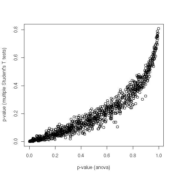
plot(sort(res[,1]),
     main = "p-values (anova)")
abline(0, 1/N, col = 'red')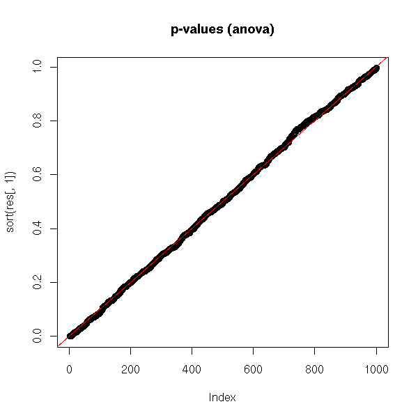
plot(sort(res[,2]),
     main = "p-values (multiple Student's T tests)")
abline(0, 1/N, col = 'red')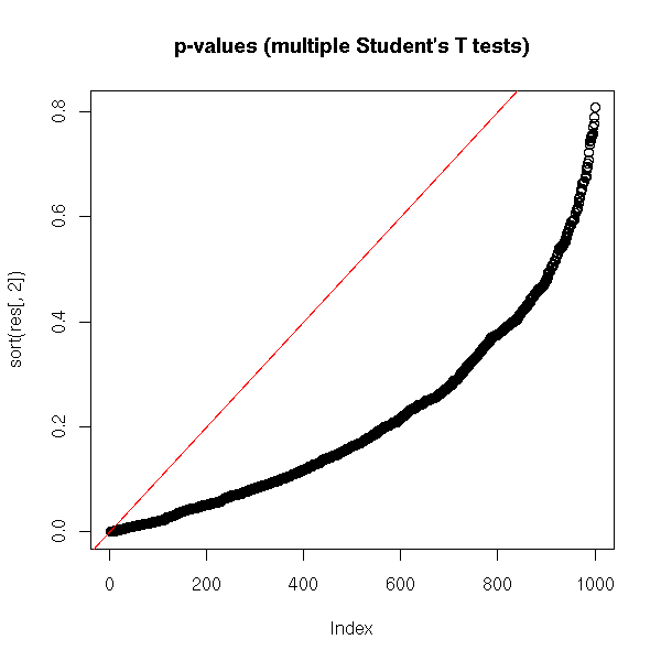
plot(sort(k*(k-1)/2*res[,2]),
     ylim = c(0,1),
     main = "p-values (Bonferronni)")
abline(0, 1/N, col = 'red')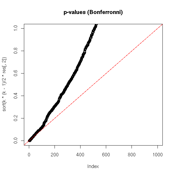
plot(sort(1-(1-res[,2])^(k*(k-1)/2)),
     main = "p-values (*********)")
abline(0, 1/N, col = 'red')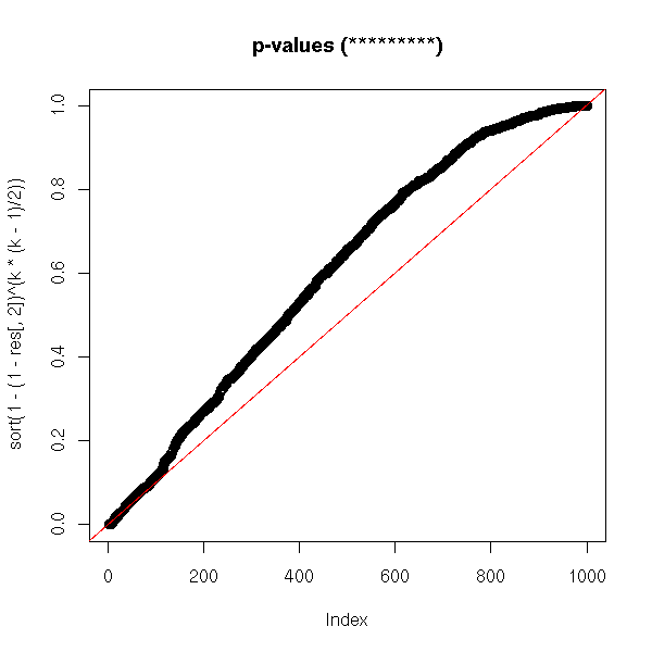
Let us have a look at what happend when there are much
more tests:

# Very, very long...
N <- 1000
n <- 20   # Sample size
k <- 20   # Number of samples
res <- matrix(NA, nr=N, nc=2)
for (a in 1:N) {
  x <- factor(rep(1:k,1,each=n))
  y <- rnorm(k*n)
  res[a,1] <- summary(aov(y~x))[[1]][1,5]
  p <- 1
  for (i in 1:(k-1)) {
    for (j in (i+1):k) {
    p <- min(c( p, t.test(y[x==i],y[x==j])$p.value ))
    }
  }
  res[a,2] <- p
}

op <- par(mfrow=c(2,2))
plot(res,
     xlab = "p-value (anova)",
     ylab = "p-value (multiple Student tests)")

# plot(sort(res[,1]), main="p-values (anova)")
# abline(0,1/N, col='red')

plot(sort(res[,2]),
     ylim = c(0,1),
     main = "p-values (multiple Student tests)")
abline(0, 1/N, col = 'red')
abline(h = .05, lty = 3)

plot(sort(k*(k-1)/2*res[,2]),
     ylim = c(0,1),
     main = "p-values (Bonferronni)")
abline(0, 1/N, col = 'red')
abline(h = .05, lty = 3)

plot(sort(1-(1-res[,2])^(k*(k-1)/2)),
     main = "p-values (********)")
abline(0, 1/N, col = 'red')
abline(h = .05, lty = 3)
par(op)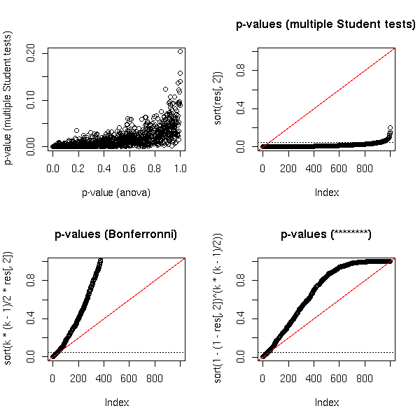
You could try to find a better transformation, but you
will not be assured that the resulting p-value is actually
greater that the real p-value.
op <- par(mfrow=c(4,4))
for (i in seq(50,200,length=16)) {
  plot(sort(1-(1-res[,2])^i),
       main = paste(
         "p-value (correction exponent = ",
         round(i),
         ")",
         sep = ''
       )
      )
  abline(0, 1/N, col = 'red')
  abline(h = .05, lty = 3)
}
par(op)

2. Most of the time, you decide to perform the tests after
looking at the data and performing the analysis of
variance.
If the anova tells you that there are differences between
the groups you will want to check if parameters ai and aj
are significantly different -- you do not do this for all
the pairs (i,j), but just for those with the largest
difference.

2a. Tukey's LSD: compute confidence intervals for ai-aj:
ai-aj \pm t _{n-I} ^{alpha/2} \hat sigma (1/Ji-1/Jj)
where I is the number of levels of the predictive variable
      Ji is the number of observations with X=i
The problem is that it is very wrong.

2b. Fisher's LSD
Idem but before, you perform an F test to see if all the
coefficients are equal.
The problem is that it is still wrong: the distribution of
the differemce between the largest and the smallest
coefficient is not a T distribution.

2c. Tukey's HSD (Honest Significant Difference)
This time, we use the right distribution.
TukeyHSD(aov(...))

TODO
?qtukey

TODO: re-read the last chapter in Faraday's book.

The functions "p.adjust", "pairwise.t.test" (and
"pairwise.*") perform that kind of thing.

TODO:
library(help=multcomp)

Correcting p-values:
library(multcomp)
rawp <- 2 * (1 - pnorm(abs(teststat)))
procs <- c("Bonferroni", "Holm", "Hochberg", "SidakSS", "SidakSD",
           "BH", "BY")
res <- mt.rawp2adjp(rawp, procs)
adjp <- res$adjp[order(res$index), ]
adjp
TODO: plots that compare those corrections.

TODO: give an example of a situation when you _really_ want to do a
lot of tests.
1. Genoma mapping
2. DNA microarrays

TODO: understand

3. Contrasts
A contrast is a linear combination of the effects
("effects" means "coefficients of the regression") the sum
of whose coefficients is zero. For instance
  a1 - a2
or
  (a1 + a2)/2 - (a3 + a4)/2

You might have to consider questions more complex than "is
ai=aj?"  (to which you can easily answer with Tukey's
HSD), questions of the form "is this contrast zero?". In
other words, you are comparing more that two effects at
the same time.

Scheffe's theorem gives confidence intervals for those
contrasts.
TODO: explain
TODO: give a geometric interpretation
(a contrast defines a hyperplane, the confidence interval
is obtaines by cutting the confidence ellipsoid by a line
orhtogonal to this hyperplane)
TODO:
  FWER: Family-Wise type-I Error Rate
  FDR: False Discovery Rate
?reshape
?aggregate
?stack
TODO
longitudinal data
repeated measures data,
multilevel data
split-plot designs
TODO
  Data: one quantitative variable, one qualitative
    variable (with more than two values)
  Preliminary test: do the data look gaussian?
    boxplot, histograms (lattice), qqnorm
  Preliminary test: equivariance (test.bartlett)
  Analysis of Variance
  If needed: post-hoc tests
TODO
REML: Restricted Maximum Likelihood
Examples:
  EM algorithm (first derivatives)
  Fischer Scoring (2nd derivatives)
  Derivative Free
  Average Information algorithm
Design matrix: the matrix X in "Y = X b + e"
Mixed model: Y = X b + Z u + e
  Fixed effects: the term "X b"
  Random effects: the term "Z u"
  Y, X et Z are known
  We want b.

  We consider u and e as noise (we could of course
    estimate them, but in the tests, we shall consider them
    as noise).
  If you just want b without any information about u, if
    you do not want to perform any test, you can simply
    perform a regression: Y ~ cbind(X,Z)
  When you look at a mixed model, you are also interested
    in the variance (actually, the variance-covariance
    matrix) of u.
Mixed model: Y_ijk = a_i + (b_j + e_ijk)
             where the term between brackets is considered
             as noise
estimation: find b (the fixed effects)
prediction: find u (the random effects)
BLUE: Best Linear Unbiased Estimator
BLUP: Best Linear Unbiased Prediction

Mixed model:
library(nlme)
nlme(y~x1+x2, fixed=x1~1, random=x2~1)
TODO: some simulations to show that it is actually
different from usual anova.
There are fewer parameters to estimate

Examples of grouped data (y~x|group, where x may be time,
a factor, or a continuous variable) include
longitudinal data,
repeated measures data,
multilevel data,
split-plot designs.

Grouped data: something that looks like
library(nlme)
library(lattice)
data(Orthodont)
formula(Orthodont)
plot(Orthodont)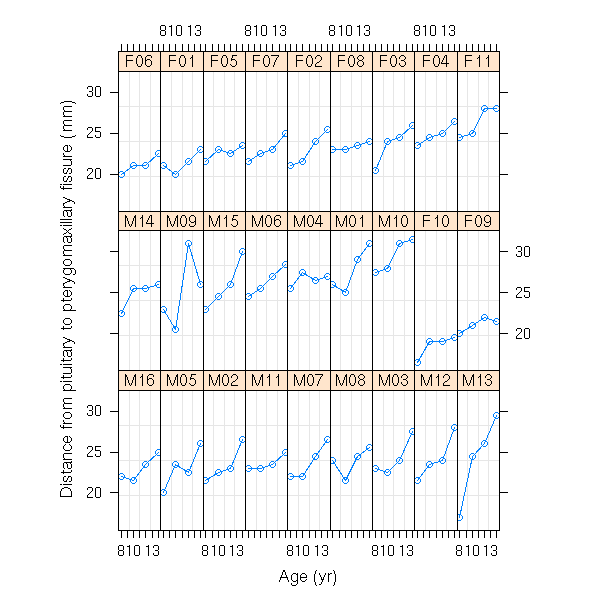
plot(Orthodont, outer=T)
data(Machines)
bwplot(score~Machine|Worker, data=Machines)
data(CO2)
plot(CO2)
plot(CO2, outer=T)

The "groupedData" data type attaches a formula to the data.
groupedData(y~x|z1, data=d, outer=~z2)
Here, we have a hierarchical model: the value of z2 is
determined by that of z1.
  outer = ~z2*z3
  outer = list(~z2, ~z3)    (not tested)

Examples of mixed models

1. You perform several observations (x,y) (two variables)
on each subject and you realize, graphically, that y~x is
linear for each subject but with a different slope and a
different intercept.
We want the "average slope" and the "average intercept".

  y_ij = (a + a_i) + (b + b_i) * x_ij + c_ij
  i = subject number
  j = number of the observation in that subject
  a_i, b_i, c_ij: noises
  a and b are the quantities to estimate

2. Variant: the subjects fall into two groups. We can
compute the average slope and intercept in the two
groups. Are they significantly different?
  y_ijk = (a_k + a_ik) + (b_k + b_ik) * x_ijk + c_ijk
  i = subject number
  j = number of the observation in this subject
  k = group of the subject (each subject belongs to a
      single group, so once we know i, we know k)
  a_ik, b_ik, c_ijk: noises
  a_k, b_k: quantites to estimate
H0: a_1=a_2 and b_1=b_2
H1: a_1 \neq a_2 or b_1 \neq b_2

Likelihood ratio test
r1 <- lme(...)
r1 <- update(r1, method="ML")    # Otherwise, it is REML and the
                                 # test would be meaningless
...
anova(r1,r2)

Plots:
plot(r, resid(.,type="p") ~ fitted(.) | z)

predict
(slightly different becaus of the random effects)
First look at the data (to spot potential errors in the data, etc.)
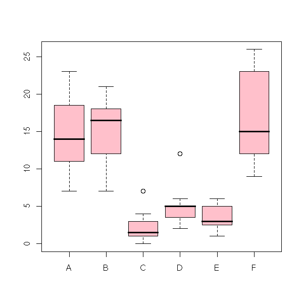
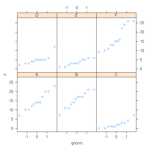
data(InsectSprays)
y <- InsectSprays$count
x <- InsectSprays$spray
boxplot(y~x, col='pink')
Let is check if they look gaussian.
library(lattice)
histogram(~ y | x)
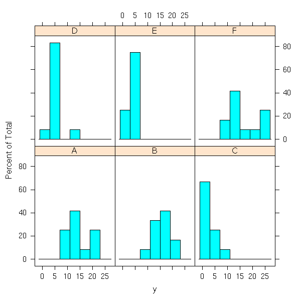
qqmath(~ y | x)
# TODO: qqmathline
You can also perform more formal tests.
n <- length(levels(x))
res <- matrix(NA, nr=n, nc=2)
colnames(res) <- c('raw p-value',
                   'Bonferroni-corrected p-value')
rownames(res) <- levels(x)
for (i in 1:n) {
  p <- shapiro.test(y[ x ==  levels(x)[i] ])$p.value
  res[i,] <- c(p, min(c(1,n*p)))
}
res
This yields
  raw p-value Bonferroni-corrected p-value
A       0.749                        1.000
B       0.641                        1.000
C       0.048                        0.286
D       0.003                        0.016
E       0.297                        1.000
F       0.101                        0.605
Sample D is a bit problematic:
> y[ x=='D' ]
[1]  3  5 12  6  4  3  5  5  5  5  2  4
"12" is much higher than the other values.
> shapiro.test(y[ x=='D' ][-3])
      Shapiro-Wilk normality test
data:  y[x == "D"][-3]
W = 0.8978, p-value = 0.1735
Thus, we shall perform the analysis with and without this value.
TODO

i <- which( (x != 'D') | (y != 12) )
xx <- x[i]
yy <- y[i]
We should also check that the samples have the same variance.
> bartlett.test(y~x)
      Bartlett test for homogeneity of variances
data:  y by x
Bartlett's K-squared = 25.9598, df = 5, p-value = 9.085e-05

> bartlett.test(yy~xx)
      Bartlett test for homogeneity of variances
data:  yy by xx
Bartlett's K-squared = 36.8992, df = 5, p-value = 6.275e-07
So we have a BIG problem...
TODO:
Idea 1: correct the data
Idea 2: use a non-parametric analysis of variance
Idea 3: forget about the problem.
The analysis of variance, either with the "lm" function or with "aov".
r1 <- anova(lm(y~x))
r2 <- summary(aov(y~x))
The results are the same.
> r1
Analysis of Variance Table
Response: y
          Df  Sum Sq Mean Sq F value    Pr(>F)
x          5 2668.83  533.77  34.702 < 2.2e-16 ***
Residuals 66 1015.17   15.38

> r2
            Df  Sum Sq Mean Sq F value    Pr(>F)
x            5 2668.83  533.77  34.702 < 2.2e-16 ***
Residuals   66 1015.17   15.38
This tells us that the means in the various groups are indeed significantly different.
To know where the differences are, we can perform Student T tests. But beware: as there are a lot of them (15), we must correct their p-values.
n <- length(levels(x))
res <- matrix(NA, nr=n, nc=n)
rownames(res) <- levels(x)
colnames(res) <- levels(x)
for (i in 2:n) {
  for (j in 1:(i-1)) {
    res[i,j] <- t.test( y[ x == levels(x)[i] ], y[ x == levels(x)[j] ] )$p.value
  }
}
#res <- res * n*(n-1)/2; res <- ifelse(res>1,1,res)
res <- 1 - (1-res)^n
image(res, col=topo.colors(255))  # TODO: unreadable

                                  # Write a function that plots
                                  # distance matrices, correlation
                                  # matrices (with the corresponding
                                  # p-values).
                                  # With the name of the
                                  # rows/columns, with a legend for
                                  # the colors.
round(res,3)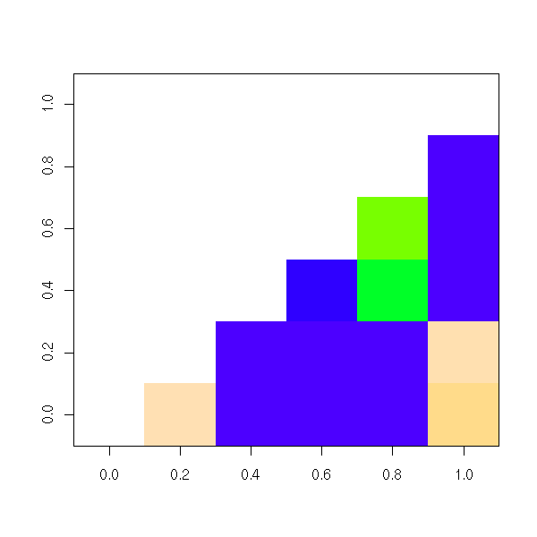
This yields:
      A     B     C     D  E  F
A
B 0.998
C 0.000 0.000
D 0.000 0.000 0.034
E 0.000 0.000 0.375 0.545
F 0.923 0.991 0.000 0.000  0
This suggests a partition into two groups: ABF and DCE.
We remark that C and E are not significantly different, nor are E and D, but C and D are (at 5%).
We can plot this by turning the p-values into distances.
d <- 1-res
d <- ifelse(is.na(d), t(d), d)
diag(d) <- 0
p <- isoMDS(d)$points
plot(p, pch=16)
text(p, levels(x), pos=c(1,2,1,1,1,3))
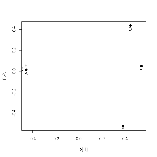
There is already a function to perform those computations:
TukeyHSD(aov(y~x))
This yields again the groups ABF and CDE.
> TukeyHSD(aov(y~x))
  Tukey multiple comparisons of means
    95% family-wise confidence level
Fit: aov(formula = y ~ x)
$x
           diff        lwr       upr
B-A   0.8333333  -3.866075  5.532742
C-A -12.4166667 -17.116075 -7.717258
D-A  -9.5833333 -14.282742 -4.883925
E-A -11.0000000 -15.699409 -6.300591
F-A   2.1666667  -2.532742  6.866075
C-B -13.2500000 -17.949409 -8.550591
D-B -10.4166667 -15.116075 -5.717258
E-B -11.8333333 -16.532742 -7.133925
F-B   1.3333333  -3.366075  6.032742
D-C   2.8333333  -1.866075  7.532742
E-C   1.4166667  -3.282742  6.116075
F-C  14.5833333   9.883925 19.282742
E-D  -1.4166667  -6.116075  3.282742
F-D  11.7500000   7.050591 16.449409
F-E  13.1666667   8.467258 17.866075
TODO: can't we plot this?
TODO: finish this
Notes talen while reading:
http://cran.r-project.org/doc/contrib/Fox-Companion/appendix-mixed-models.pdf
The linear model assumes that the observations are independant; but sometimes, the observations can be grouped: two observations from different groups are independant, but two observations from the same group are not. For instance, the groups con contain the successive observations on a given subject, with one group per subject.
TODO: a simulation example

TODO: a real example

The influence of the predictive variables is not the same
on the different groups.

TODO: some plots to explain when to think about mixed
models.
In R:
lme:  linear mixed models
nlme: non linear mixed models
      For the moment, there is no generalized linear mixed model:
      use "glmmPQL" in MASS.
The "panel" argument:
 xyplot(mathach ~ ses | school, data=Pub.20, main="Public",
     panel=function(x, y){
         panel.xyplot(x, y)
         panel.loess(x, y, span=1)
         panel.lmline(x, y, lty=2)
         }
     )
First step in the analysis of a mixed model: perform a regression in each group.
TODO: plot
xyplot(y~x|g,...)
r <- lmList(y~x|g)
plot(intervals(r))
You see which "effects" ("effect" means "regression coefficient") depend on the group and which do not.
Then, you can use the "lme" function
r <- lme(y ~ constant effects,
    random = ~ random effects | group,
   )
r
summary(r)
intervals(r)
plot(r)???
TODO: give more details. How is the result printed? (residuals, standard deviation, correlations, etc.)
After performing the regression, you can start interrogating it.
1. (As for a normal regression)
Is this coefficient significantly different from zero?
Give me a 5% confidence interval for it.

2. Is this random effect really random or is it constant
  (in other words, does it vary from one group to the next
  or is it constant from one group to the next)?
  This is actually a test on the variance of the
  coefficient: we test if this variance is significantly
  different from zero.
  You can see this as a model comparison test and use the
  "anova" function.

TODO: They used REML and they nonetheless compare the
likelihood?
Comparing two mixed models: Estimate them with Maximum Likelihood (by default, it is REML, that gives a better result, which is inappropriate for model comparisons) and give them to the "anova" function.
TODO: various complications of the simplistic model I have just presented.
1. Several random effects.
   They may be correlated.
   Covariance matrix.
2. Nested groups.
TODO
TODO: in R?
?manova
?summary.manova
There are several quantitative to explain with one (or several) qualitative variable(s). You can use the Pillai-Bartlett test, or Wilks lamdba (multivariabe F, bad idea, but commonly used) test, or Hotelling-Lawley's test or Roy's test.
It is a bad idea to perform (directly) several analyses of variance, first, because we would be performing several tests, whose p-values would have to be corrected, second, because we would not take into account correlation between the variables to explain -- but they should not be too correlated: then, you had better discard the redundant variables.
A multiple analysis of variance would proceed as:
1. Chech the assumptions
2. Perform an amova to check if there is any difference.
3. If so, look at the variables to explain, one at a time,
   with a classical anova.
4. Perform the post hoc tests, to quantify the effects.

TODO: find/build an example
TODO: several predictiva variables
TODO: several predictiva variables, some of which are
      quantitative
Hypotheses of amova: gaussian variables, homogeneous variances, homogeneous covariances.
library(car)
?Anova

options(contrasts=c("contr.sum", "contr.sum"))   ????
r <- lme(y ~ x2, random = ~ 1 | x1 )
summary(r)
fixed.effects(r)
random.effects(r)

This work is licensed under a Creative Commons Attribution-NonCommercial-ShareAlike 2.5 License.
Vincent Zoonekynd
<zoonek@math.jussieu.fr>
latest modification on Sat Jan 6 10:28:23 GMT 2007