Model behind the regression
A few DIY regression lines
Correlation
Least Squares
Regression with R
Regression: general definition
Regression asymetry and PCA (Principal Component Analysis)
TO SORT
Other regressions
TO SORT
TODO: TO SORT
Preparing the data: transformations, missing values, outliers
Transformations
Missing values
Outliers
TODO: TO SORT
Example
Example
We have two random variables X and Y, and we try to predict the values of Y from those of X (you should remark that the situation is asymetric: X and Y do not play the same role). To this end, we assume that Y is obtained from X in the following way:
Y = a + b * X + noise
where a and b are real numbers (to be determined) and the noise follows a gaussian distribution of zero mean.
More precisely, if we note X_i and Y_i the values corresponding to the ith observation, we have Y_i = a + b X_i + e_i where the e_i are independant, identically distributed gaussian random variables of zero mean.
There are two interpretations to this model: either the pairs (X,Y) are drawn at random, or the values of X are fixed, we choose them (it corresponds to the experiments we design and carry out) and get the values of Y as experimental results.
But this does not change the computations and the interpretation of the results (to be precise, if X is also a random variable, it has to be independant from the noise).
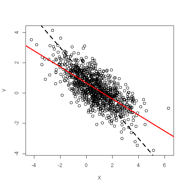
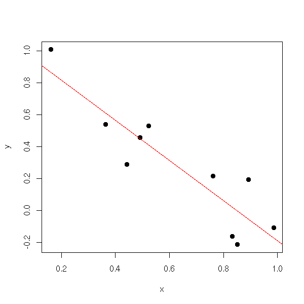
Let us consider the regression set-up
Y = a + b X + epsilon
where X and Y are observed random variables, epsilon is an unobserved random variable (noise), and we want to estimate a and b. One usually assumes that either X is fixed, chosen by the experimenter (a constant random variable) or that it is a random variable independant from the noise. Here, we assume, on the contrary, that it is a random variable correlated with the noise. In this situation, Ordinary Least Squares (OLS) will not work.
TODO: Add a legend...

N <- 1000
a <- 1
b <- -1
Z <- rnorm(N)
epsilon <- rnorm(N)
eta <- rnorm(N)
aa <- runif(1)
bb <- runif(1)
X <- (aa + bb * Z + epsilon) + eta
Y <- a + b * X + epsilon
plot(X,Y)
abline(a,b, lty=2, lwd=3)
abline(lm(Y~X), col="red", lwd=3)
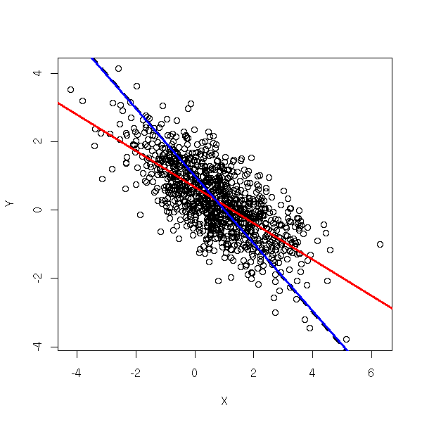
To solve the problem, we can try to find, among all the variables we can measure, a variable Z that contains the same information as X, but is uncorrelated with the noise. This is called an Instrumental Variable (IV) -- actually, there can be several. More precisely,
X = c + d Z + eta
where Z is uncorrelated with epsilon -- the correlation between X and epsilon is accounted for by eta). The idea of 2-stage least squares is to first regress X against Z and then Y against \hat X = c + d Z (\hat X is called an "instrument"). This gives more reliable estimates of a and b. In R, this can be done with the "tsls" function from the "sem" package.
library(sem)
r <- tsls(Y ~ X, instruments = ~ Z)
plot(X,Y)
abline(a,b, lty=2, lwd=3)
abline(lm(Y~X), col="red", lwd=3)
abline(r$coef[1], r$coef[2], col="blue", lwd=3)
In you want to do the computations by hand:
X = Z d + eta
d = (Z' Z)^-1 Z' X
\hat X = Z d
       = Z (Z' Z)^-1 Z' X
b = (hatX' hatX)^-1 hatX' Y
  = [ ( X' Z' (Z' Z)^-1 Z' ) ( Z (Z' Z)^-1 Z' X ) ]^-1 ( X' Z' (Z' Z)^-1 Z' ) Y
  = [   X' Z' ( (Z' Z)^-1 Z' Z ) (Z' Z)^-1 Z' X   ]^-1 ( X' Z' (Z' Z)^-1 Z' ) Y
  = [   X' Z'                    (Z' Z)^-1 Z' X   ]^-1 ( X' Z' (Z' Z)^-1 Z' ) Y
  = (X'Z'(Z'Z)^-1Z'X)^-1 (X'Z'(Z'Z)^-1Z') Y
TODO: Check those computations. Can we simplify the result further?
In case you want confidence intervals, or if you want to perform tests, it is wiser to use those formulas -- indeed, you cannot plug your data into the equations for the OLS confidence intervals or tests: its inputs (\hat X) already result from a first estimation.
You might wonder: how can we see that there is such a problem? Well, we cannot. Only the interpretation of the various variables, i.e., only domain-knowledge can tell you that there is something wrong with Ordinary Least Squares.
TODO: Some more vocabulary...
TODO: write an introduction
You posit a relation between several variables that cannot be observed directly ("latent variables"), e.g.,
Y = a1 + b1 X + epsilon1
Z = a2 + b2 X + c2 Y + epsilon2
which can be repreented by the following diagram,
X ----------> Y
  \_
    \_        |
      \_      V
        \_
          `-> Z
and you measure proxies for the latent variables
x1 = a3 + b3 X + epsilon3
x2 = a4 + b4 X + epsilon4
x3 = a5 + b5 X + epsilon5

y1 = a6 + b6 Y + epsilon6
y2 = a7 + b7 Y + epsilon7

z1 = a8 + b8 Z + epsilon8
z2 = a9 + b9 Z + epsilon9
The game is now to estimate the coefficients.
As the latent variables are unknown, we can "rescale" (apply a linear transformation to) them. To avoid this, we assume that X, Y and Z are measured on the same scale as x1, x2, x3. Some of the equations above become
x1 = X + epsilon3
y1 = Y + epsilon6
z1 = Z + epsilon8
TODO: Explain how to do this in R
library(help=sem)
library(help=systemfit)
TODO: Explain the algorithms behind this (RAM, Reticular Action Model).
TODO: give comcrete examples where one would want to use such methods.
TODO: Mention specialized software to fit those models
Amos
EQS
Lisrel
MPlus
TODO: URL Structural Equation Modeling with the sem package in R (John Fox)
Here is an example.
op <- par(mfrow=c(2,2))
for (n in c(10,1e2,1e3,1e4)) {
  x <- runif(n)
  y <- 1 - x + .2*rnorm(n)
  plot(y~x, main=paste("sample with", n, "observations"))
}
par(op)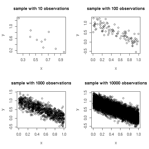
The very idea of regression is geometric: whenever you use a regression, you should first look at the data to see if regression is a good idea.
Here are, from the manual, four very different data sets that give the same regression line. It stresses that you should always look at your data set, with plots.
data(anscombe)
ff <- y ~ x
op <- par(mfrow = c(2,2),
          mar = .1 + c(4,4,1,1),
          oma = c(0,0,2,0))
for(i in 1:4) {
  ff[2:3] <- lapply(paste(c("y","x"), i, sep=""), as.name)
  ## or   ff[[2]] <- as.name(paste("y", i, sep=""))
  ##      ff[[3]] <- as.name(paste("x", i, sep=""))
  assign(paste("lm.",i,sep=""),
         lmi <- lm(ff, data= anscombe))
  #print(anova(lmi))
}
for(i in 1:4) {
  ff[2:3] <- lapply(paste(c("y","x"), i, sep=""), as.name)
  plot(ff, data = anscombe,
       col = "red", pch = 21, bg = "orange", cex = 1.2,
       xlim = c(3,19), ylim = c(3,13))
  abline(get(paste("lm.",i,sep="")), col="blue")
}
mtext("Anscombe's 4 Regression data sets",
      outer = TRUE, cex = 1.5)
par(op)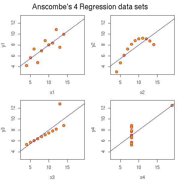
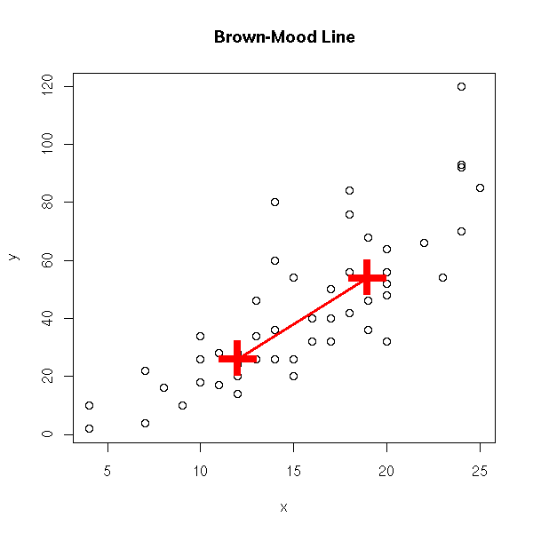
Put the data into two classes (the first and the second); take the center (median point) of each, join them.
data(cars)
x <- cars$speed
y <- cars$dist
plot(y~x)
o <- order(x)
n <- length(x)
m <- floor(n/2)
p1 <- c( median(x[o[1:m]]), median(y[o[1:m]]) )
m <- ceiling(n/2)
p2 <- c( median(x[o[m:n]]), median(y[o[m:n]]) )
p <- rbind(p1,p2)
points(p, pch='+', lwd=3, cex=5, col='red' )
lines(p, col='red', lwd=3)
title(main="Brown-Mood Line")
Put the data into three classes, take their centers, draw the triangle, draw the line through its center of gravity and parallel to its base.
three.group.resistant.line <- function (y, x) {
  o <- order(x)
  n <- length(x)
  o1 <- o[1:floor(n/3)]
  o2 <- o[ceiling(n/3):floor(2*n/3)]
  o3 <- o[ceiling(2*n/3):n]
  p1 <- c( median(x[o1]), median(y[o1]) )
  p2 <- c( median(x[o2]), median(y[o2]) )
  p3 <- c( median(x[o3]), median(y[o3]) )
  p <- rbind(p1,p2,p3)
  g <- apply(p,2,mean)
  plot(y~x)
  points(p, pch='+', lwd=3, cex=3, col='red')
  polygon(p, border='red')
  a <- (p3[2] - p1[2])/(p3[1] - p1[1])
  b <- g[2]-a*g[1]
  abline(b,a,col='red')
}
three.group.resistant.line(cars$dist, cars$speed)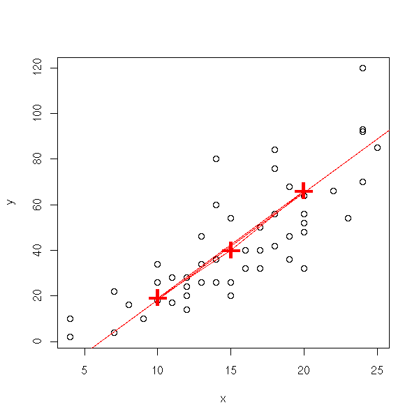
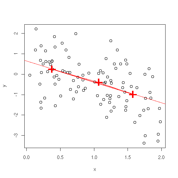
If the triangle is not flat, it is a sign that the relation is not linear...
n <- 100
x <- runif(n,min=0,max=2)
y <- x*(1-x) + rnorm(n)
three.group.resistant.line(y,x)
Let b_ij be the slope of the line through points i and j. Set
b = median b_ij

a = median (yi - b xi)
      i

median.line <- function (y,x) {
  n <- length(x)
  b <- matrix(NA, nr=n, nc=n)
  # Exercise: Write this without a loop
  for (i in 1:n) {
    for (j in 1:n) {
      if(i!=j)
        b[i,j] <- ( y[i] - y[j] )/( x[i] - x[j] )
    }
  }
  b <- median(b, na.rm=T)
  a <- median(y-b*x)
  plot(y~x)
  abline(a,b, col='red')
  title(main="The median line")
}
median.line(cars$dist, cars$speed)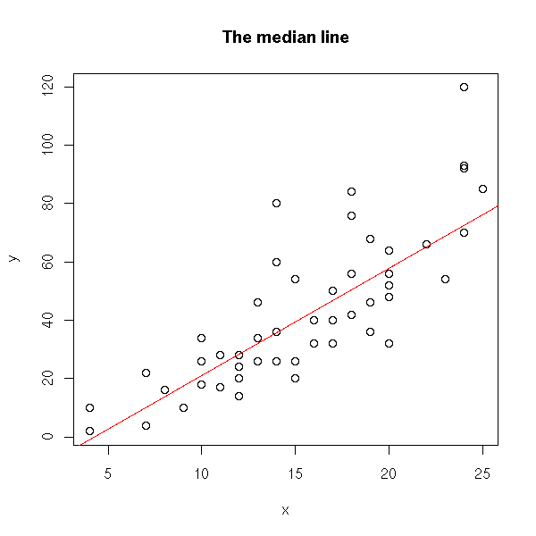
b = median median b_ij
      i     j!=i

a = median (yi - b xi)
      i
This yields:
other.median.line <- function (y,x) {
 n <- length(x)
  b <- matrix(NA, nr=n, nc=n)
  for (i in 1:n) {
    for (j in 1:n) {
      if(i!=j)
        b[i,j] <- ( y[i] - y[j] )/( x[i] - x[j] )
    }
  }
  b <- median( apply(b, 1, median, na.rm=T), na.rm=T ) # Only change
  a <- median(y-b*x)
  plot(y~x)
  abline(a,b, col='red')
  title(main="The median line")
}
other.median.line(cars$dist, cars$speed)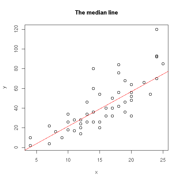
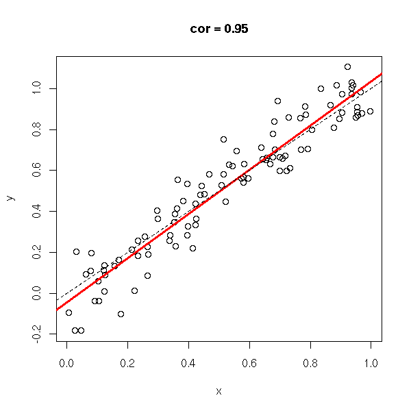
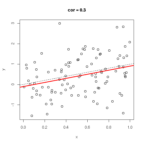
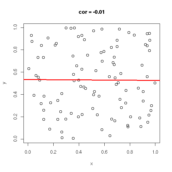
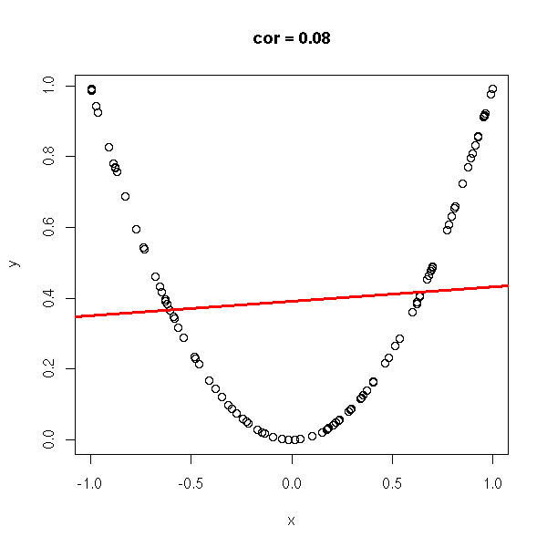
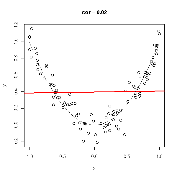
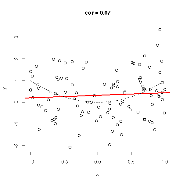
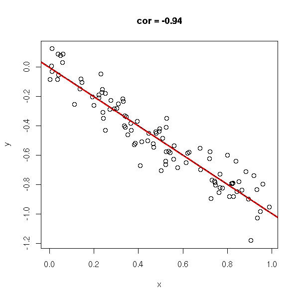
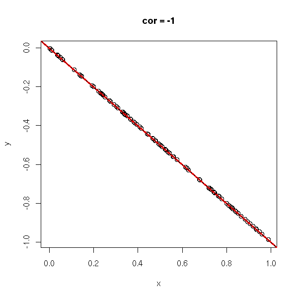
The correlation coefficient (unitless, between -1 and 1), tells you if you can approximate a data set with a line. In the following examples, the correlation coefficient goes from -1 to 1.
do.it <- function (x, y) {
  plot(x,y, main=paste("cor =", round(cor(x,y), digits=2)))
  abline(lm(y~x), col='red', lwd=3)
}

n <- 100
x <- runif(n)
x <- x[order(x)]
y <- x
do.it(x,y)
abline(0,1,lty=2)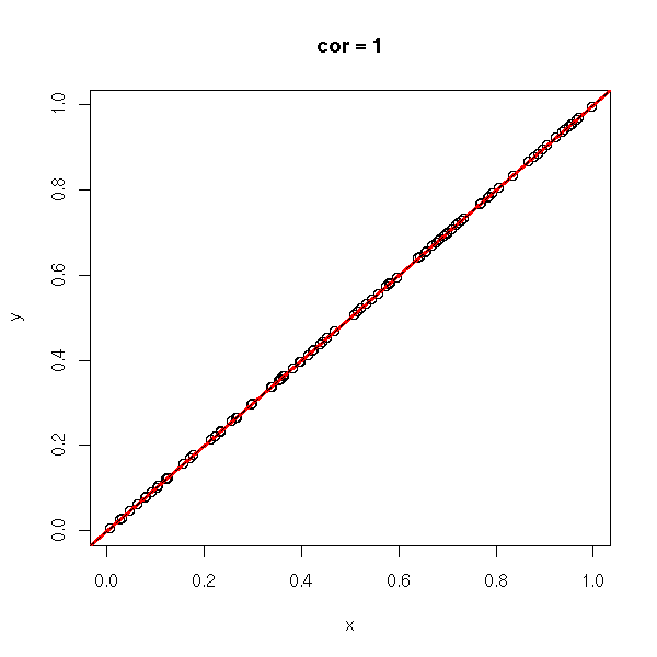
y <- rnorm(n,x,.1)
do.it(x,y)
abline(0,1,lty=2)
y <- rnorm(n,x,1)
do.it(x,y)
abline(0,1,lty=2)
y <- runif(n)
do.it(x,y)
x <- runif(n,-1,1)
y <- x*x
do.it(x,y)
y <- rnorm(n, x*x, .1)
do.it(x,y)
x <- sort(x)
lines(x,x*x,lty=2)
y <- rnorm(n, x*x, 1)
do.it(x,y)
x <- sort(x)
lines(x,x*x,lty=2)
x <- runif(n)
y <- rnorm(n,-x,1)
do.it(x,y)
abline(0,-1,lty=2)
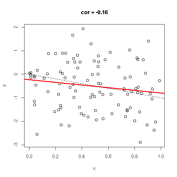
y <- rnorm(n,-x,.1)
do.it(x,y)
abline(0,-1,lty=2)
y <- -x
do.it(x,y)
abline(0,-1,lty=2)
TODO: the CAPM and the correlation...
The correlation we compute from a sample is just an estimation of the correlation between the random variables. The accuracy of this estimation depends on the sample size, of course, but also on the correlation itself: the closer from zero, the more imprecise.
library(mvtnorm)
k <- 100                # Number of samples for each correlation
N <- 20                 # Size of the samples
r <- seq(-1, 1, by=.2)  # The true correlations
n <- length(r)
rr <- matrix(NA, nr=n, nc=k)
for (i in 1:n) {
  for (j in 1:k) {
    x <- rmvnorm(N, sigma=matrix(c(1, r[i], r[i], 1), nr=2, nc=2))
    rr[i,j] <- cor( x[,1], x[,2] )
  }
}
estimated.correlation <- as.vector(rr)
true.correlation <- r[row(rr)]
boxplot(estimated.correlation ~ true.correlation,
        col = "pink",
        xlab = "True correlation",
        ylab = "Estimated correlation" )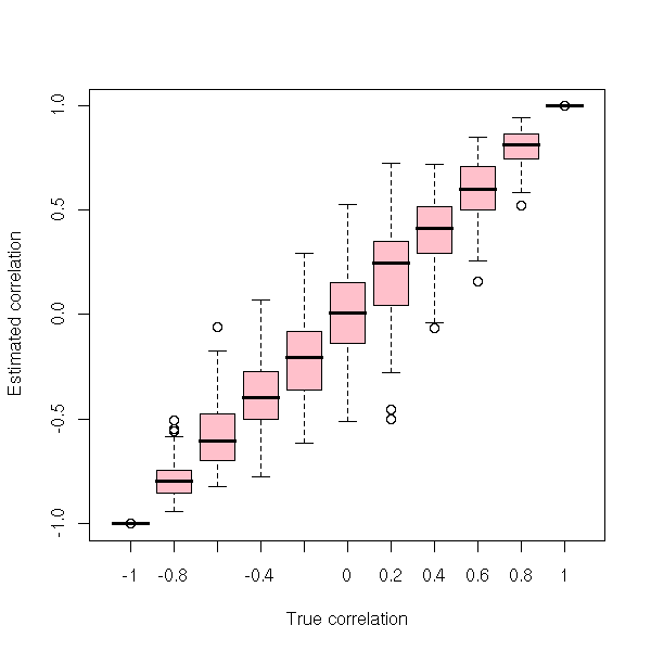
boxplot(estimated.correlation - true.correlation ~ true.correlation,
        col = "pink",
        xlab = "True correlation", ylab = "Error" )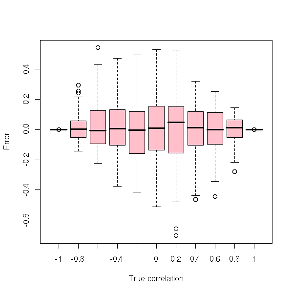
N <- 20    # Sample size
n <- 1000  # Number of samples
true.correlation <- runif(n, -1, 1)
estimated.correlation <- rep(NA, n)
for (i in 1:n) {
  x <- rmvnorm(N, sigma=matrix(c(1, true.correlation[i],
                                 true.correlation[i], 1), nr=2, nc=2))
  estimated.correlation[i] <- cor( x[,1], x[,2] )
}
plot(estimated.correlation ~ true.correlation)
abline(0,1, col="blue", lwd=3)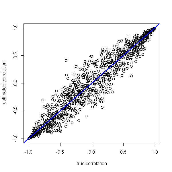
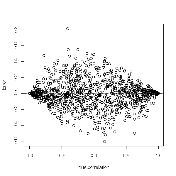
plot(estimated.correlation - true.correlation ~ true.correlation, ylab="Error")
abline(h=0, lty=3)
plot(abs(estimated.correlation - true.correlation) ~ true.correlation,
     ylab="abs(Error)")
lines(lowess(abs(estimated.correlation - true.correlation) ~ true.correlation),
      col="red", lwd=3)
abline(h=0, lty=3)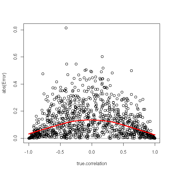
TODO:
plotCorrPrecision(Hmisc)
                      Plot Precision of Estimate of Pearson
                      Correlation Coefficient
We can test wether the correlation is non-zero. In this example, it is not significantly different from zero.
> n <- 10
> x <- rnorm(n)
> y <- rnorm(n)

> cor(x,y)
[1] -0.4132864

> cor.test(x,y)
      Pearson's product-moment correlation
data:  x and y
t = -1.2837, df = 8, p-value = 0.2352
alternative hypothesis: true correlation is not equal to 0
95 percent confidence interval:
 -0.8275666  0.2924366
sample estimates:
       cor
-0.4132864
We even get a confidence interval for the correlation.
In some situations, there is clearly a relation between the two variables, but it is not linear. Instead of the correlation between the variables, you can look at the correlation between their ranks. This allows you to spot monotonic relations between variables.
> b <- (0:100)/100
> c <- b^2
> cor(b,c)
[1] 0.9676503
> cor(rank(b),rank(c))
[1] 1
TODO: cor(..., method=...)
It is another rank-based measure of correlation but, contrary to the rank (Spearman) correlation, it has a direct interpretation in terms of prababilities: it is the proportion of pairs of observations that are in the same order for the two variables.
N <- 1000
n <- 100
x <- matrix(nr=N, nc=3)
colnames(x) <- c("Pearson", "Spearman (rank)",
                 "Kendall's tau")
y1 <- 1:n
for (i in 1:N) {
  y2 <- sample(y1)
  x[i,] <- c( cor(y1, y2),
              cor(y1, y2, method="spearman"),
              cor(y1, y2, method="kendall") )
}
plot(x[,2:3],
     xlab="Spearman rank correlation",
     ylab = "Kendall's tau",
     main="Rank correlation and Kendall's tau contain the same information")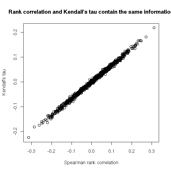
N <- 1000
n <- 100
x <- matrix(nr=N, nc=3)
colnames(x) <- c("Pearson", "Spearman (rank)",
                 "Kendall's tau")
y1 <- 1:n
for (i in 1:N) {
  # We only shuffle k elements of the vector
  k <- sample(2:n, 1)  # At least two elements to shuffle
  k <- sample(1:n, k)
  y2 <- y1
  y2[k] <- sample(y2[k])
  # In order to have negative correlations, we also
  # reverse the vector, from time to time
  if (sample(c(T,F),1)) {
    y2 <- n + 1 - y2
  }
  x[i,] <- c( cor(y1, y2),
              cor(y1, y2, method="spearman"),
              cor(y1, y2, method="kendall") )
}
plot(x[,2:3],
     # Colour: usual (Pearson) correlation
     col = rainbow(nrow(x))[rank(x[,1])],
     xlab="Spearman rank correlation",
     ylab = "Kendall's tau",
     main="Rank correlation and Kendall's tau contain the same information")
abline(h=0, v=0, lty=3)
abline(0, 1, lwd=3)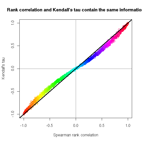
Exercise: define a generalized Kendall tau as the proportion of pairs (x,y) in the same order for both variables when x and y are in the first and third terciles of the first variable -- this should tell you if the two variables spot the same large values. Write a function to compute it.
gkt <- function (x, y, n=3, ...) {
  q <- quantile(x, c(1/n, 1-1/n), na.rm=T)
  i1 <- which( x <= q[1] & ! is.na(y) )
  i2 <- which( x >= q[2] & ! is.na(y) )
  n <- 0
  for (i in i1) {
    n <- n + sum( y[i] <= y[i2] )
  }
  n <- n / length(i1) / length(i2)
  2 * n - 1
}
gkt(1:100, sample(1:100))

N <- 1000
n <- 100
x <- matrix(nr=N, nc=4)
colnames(x) <- c("Pearson",
                 "Spearman (rank)",
                 "Kendall's tau",
                 "Generalized Kendall's tau")
y1 <- 1:n
for (i in 1:N) {
  # We only shuffle k elements of the vector
  k <- sample(2:n, 1)  # At least two elements to shuffle
  k <- sample(1:n, k)
  y2 <- y1
  y2[k] <- sample(y2[k])
  # In order to have negative correlations, we also
  # reverse the vector, from time to time
  if (sample(c(T,F),1)) {
    y2 <- n + 1 - y2
  }
  x[i,] <- c( cor(y1, y2),
              cor(y1, y2, method="spearman"),
              cor(y1, y2, method="kendall"),
              gkt(y1, y2) )
}
pairs(x)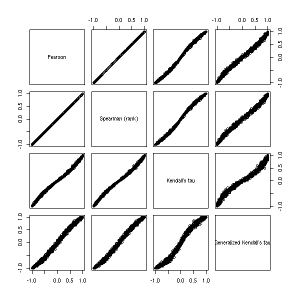
Visualizing a correlation matrix is not always very easy: people often present the numerical values themselves, each with a p-value -- apparently unawares that so many uncorrected p-values are misleading.
Let us consider the following example. Variables 1 and 4 are correlated, variables 2 and 3 are correlated.
library(mvtnorm)
set.seed(1)
V <- matrix(c(
  1, 0, 0, .5,
  0, 1, .3, 0,
  0, .3, 1, 0,
  .5, 0, 0,  1), nr=4, nc=4)
stopifnot( eigen(V)$values > 0 )
n <- 20
x <- rmvnorm(n, sigma=V)
The correlation is
> cor(x)
           [,1]        [,2]       [,3]      [,4]
[1,]  1.0000000 -0.11412602 0.34961170 0.3808395
[2,] -0.1141260  1.00000000 0.01837415 0.1749909
[3,]  0.3496117  0.01837415 1.00000000 0.3219497
[4,]  0.3808395  0.17499092 0.32194969 1.0000000

> round(  cor(x), digits=2  )
      [,1]  [,2] [,3] [,4]
[1,]  1.00 -0.11 0.35 0.38
[2,] -0.11  1.00 0.02 0.17
[3,]  0.35  0.02 1.00 0.32
[4,]  0.38  0.17 0.32 1.00
We can also compute the p-values of each of those correlations.
cor.pvalues <- function (x) {
  k <- dim(x)[2]   # Number of variables
  res <- matrix(NA, nr=k, nc=k)
  for (i in 1:k) {
    for (j in 1:k) {
      if (i != j) {
        res[i,j] <- cor.test(x[,i], x[,j])$p.value
      }
    }
  }
  res
}
We get
> cor.pvalues(x)
           [,1]      [,2]      [,3]       [,4]
[1,]         NA 0.6318717 0.1307911 0.09759736
[2,] 0.63187172        NA 0.9387136 0.46056543
[3,] 0.13079106 0.9387136        NA 0.16627230
[4,] 0.09759736 0.4605654 0.1662723         NA
Actually, there is already a function to compute both the correlation matrix and its p-values in the Hmisc package.
> library(Hmisc)
> rcorr(x)
      [,1]  [,2] [,3] [,4]
[1,]  1.00 -0.11 0.35 0.38
[2,] -0.11  1.00 0.02 0.17
[3,]  0.35  0.02 1.00 0.32
[4,]  0.38  0.17 0.32 1.00

n= 20

P
     [,1]   [,2]   [,3]   [,4]
[1,]        0.6319 0.1308 0.0976
[2,] 0.6319        0.9387 0.4606
[3,] 0.1308 0.9387        0.1663
[4,] 0.0976 0.4606 0.1663
Nothing is significant -- and these were non-corrected p-values... Our sample is too small, let us consider a more reasonable one.
> set.seed(1)
> n <- 200
> x <- rmvnorm(n, sigma=V)
> round(cor(x), digits=2)
      [,1]  [,2]  [,3]  [,4]
[1,]  1.00 -0.01  0.05  0.55
[2,] -0.01  1.00  0.28 -0.01
[3,]  0.05  0.28  1.00 -0.02
[4,]  0.55 -0.01 -0.02  1.00

> round(cor.pvalues(x), digits=4)
       [,1]   [,2]   [,3]   [,4]
[1,]     NA 0.8566 0.4825 0.0000
[2,] 0.8566     NA 0.0001 0.8497
[3,] 0.4825 0.0001     NA 0.7753
[4,] 0.0000 0.8497 0.7753     NA
It remains significant even if we correct the p-values.
> round(1 - (1-cor.pvalues(x))^6, digits=5)
        [,1]    [,2]    [,3]    [,4]
[1,]      NA 0.99999 0.98080 0.00000
[2,] 0.99999      NA 0.00045 0.99999
[3,] 0.98080 0.00045      NA 0.99987
[4,] 0.00000 0.99999 0.99987      NA
After examining the numeric values of a correlation matrix, we can start to plot it. The simplest way is to draw a checker board and colour it according to the correlations -- red for positive correlations, green for negative ones.
library(mvtnorm)
set.seed(1)
V <- matrix(c(
  1, 0, 0, .5,
  0, 1, .3, 0,
  0, .3, 1, 0,
  .5, 0, 0,  1), nr=4, nc=4)
stopifnot( eigen(V)$values > 0 )
n <- 200
x <- rmvnorm(n, sigma=V)
colnames(x) <- LETTERS[1:4]

library(sma)
plot.cor( cor(x), labels=T )
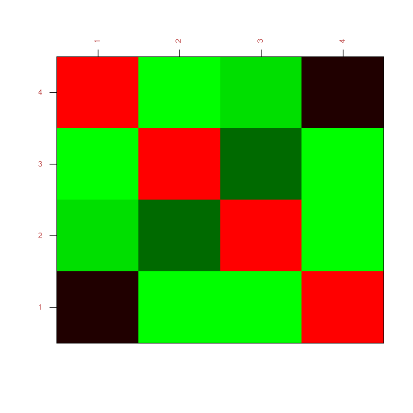
TODO: Understand why these is so much green...
Even though the correlation matrix has become a plot, it is still hard to interpret, especially if there are many variables. One reason is that the variables (the rows and the columns) are not in the "best" order: if, for instance, each variable is strongly correlated to an (unknown) variable Y1 or Y2, we would expect to see two clusters of variables. How can we reorder the variables to help spot such a structure?
We have already seen it when we presented correspondance analysis.
TODO:
give an example...
Another way of plotting a correlation matrix is to turn it into a distance. There are two ways of doing so (as the correlation is defined with squares, we get something that behaves like the square of a distance: if you really want a distance, just take the square root.
distance^2 = 1 - correlation
distance^2 = 1 - abs(correlation)
In the first case, the (squared) distance varies between 0 and 2, two variables with a correlation of -1 are considered far apart. In the second case, the distance varies between 0 and 1 and two random variables with correlation close to -1 are consider very close -- indeed, they contain the same information.
With that distance, we can use Distance Analysis or MDS to plot the variables.
TODO
In some cases, this will not be enlightening: we then resort to Minimum Spanning Trees.
TODO
Sometimes, you want to compute the correlation of two (or more) random variables, but some of the values are missing.
One method is to discard all the observations (rows) in which at least one value is missing: the problem is that you discard a lot of valuable information -- in some extreme cases, especially if you have many variables, you would end up discarding all the observations: it suffices that there be at least one missing value in each row...
Another method is to compute the correlation coefficients one by one, i.e., just two variables at a time. You discard much less information (but actually, you still discard some: if one ariables contains fewer values that the other, you can use the fact that the two are correlated to increase the precision of the estimation of the mean of the short one -- and this mean, in turn, will be used in the computation of the correlation coefficient), but there is a drawback: the coefficients of the correlation matrix will not be estimated using the same number of observations. As a result, the correlation matrix need not be positive...
TODO: example
k <- 3
n <- 10
finished <- FALSE
while (!finished) {
  x <- matrix(rnorm(n*k), nr=n, nc=k)
  x[ sample( 1:(k*n), n ) ] <- NA
  finished <- ! all(
    eigen(
      cor(x, use="pairwise.complete.obs")
    )$values >= 0
  )
}
This yields
> x
             [,1]       [,2]       [,3]
 [1,] -2.24222998  1.3181985 -2.4130672
 [2,]          NA  0.6912282 -0.2678092
 [3,]          NA -0.7577793         NA
 [4,]          NA -0.9019797         NA
 [5,]  1.05577316 -0.1728323         NA
 [6,]          NA  0.2576251  1.0278166
 [7,]          NA -0.1183476  1.8332917
 [8,] -0.51008918  1.5367152         NA
 [9,] -1.75605793         NA  1.9852189
[10,] -0.05718876  0.2286824 -0.1190583

> cor(x, use="pairwise.complete.obs")
           [,1]       [,2]       [,3]
[1,]  1.0000000 -0.7796932  0.2361549
[2,] -0.7796932  1.0000000 -0.9516614
[3,]  0.2361549 -0.9516614  1.0000000

> eigen(cor(x, use="pairwise.complete.obs")) $ value
[1]  2.3522275  0.7688139 -0.1210414
What you can do is find out how to compute a full-fledged maximum-likelyhood estimator of correlation including missing values.
You encounter this situation in finance, when you want to computre the correlation between the returns of two assets with a different history length. It goes by the name "Stambaugh method".
# Not tested...
stambaugh.covariance <- function (long, short) {
  stopifnot( is.vector(long), is.vector(short),
             length(long) == length(short),
             ( is.na(long) & is.na(short) ) | !is.na(long))
  i.long <- ! is.na(long)
  i.short <- ! is.na(short)
  mu_long_ML <- mean(long[i.long])
  Omega_long_long_ML <- var(long[i.long])
  mu_long_truncated <- mean(long[i.short])
  mu_short <- mean(short[i.short])
  r <- lm( short[i.short] ~ long[i.short] )
  a <- coef(r)[1]
  b <- coef(r)[2]
  Omega_epsilon <- var(resid(r))
  mu_short_ML <- mu_short +
    b * (mu_long_ML - mu_long_truncated)
  Omega_short_short_ML <- Omega_epsilon +
    b * Omega_long_long_ML * b
  Omega_short_long_ML <- b * Omega_long_long_ML
  Omega <- matrix(c(
      Omega_long_long_ML,
      Omega_short_long_ML,
      Omega_short_long_ML,
      Omega_short_short_ML),
    nr = 2, nc = 2
  )
  colnames(Omega) <- rownames(Omega) <- c("long", "short")
  mu <- c(long = mu_long_ML, short = mu_short_ML)
  list( mu = mu, Omega = Omega )
}

V <- matrix(c(1, .5, .5, 2), 2, 2)
n <- 20 # Sample size
N <- 1000
res <- matrix(NA, nc=2, nr=N)
colnames(res) <- c("complete.obs", "stambaugh")
library(MASS) # For mvrnorm
for (i in 1:N) {
  x <- mvrnorm(n, mu=c(0,0), Sigma=V)
  x[ 1:ceiling(n/2) ,2 ] <- NA
  res[i,2] <- stambaugh.covariance(x[,1], x[,2])$Omega[1,2]
  res[i,1] <- cov(x[,1], x[,2], use="complete.obs")
}
histogram( ~ as.vector(res) |
           colnames(res)[as.vector(col(res))],
           xlab = "Estimated covariance",
           layout = c(1,2),
           panel = function (...) {
             panel.histogram(...)
             panel.abline(v=0.5, lty=3, lwd=3, col="blue")
           } )
%--
There is a slight difference, in the right direction, but it is hardly noticeable.
> apply(res, 2, mean)
complete.obs    stambaugh
   0.4944555    0.4988373
> apply(res, 2, sd)
complete.obs    stambaugh
   0.5074997    0.5048349
But the situation can be even worse: sometimes you want to estimate a correlation matrix, you need to, but you do not have enough data. For instance, if you have 1000 variables and 100 observations of each, you cannot reliably estimate the 1000*1000 correlation coefficients -- you have 10 times more coefficients to estimate than actual data...
Luckily, the information in your data is not that large: it is probably reasonnable to assume that the correlation between your variables can be explained by a few unobserved variables, also called factors. In our previous example, if we have 10 (orthogonal) factors, we "just" have to estimate the variance of each variable and its correlation with each factor: 10*1000+1000 coefficients to estimate, approximately 10 times less the number of actual observations -- I would be happier with 20, but it is much better...
You might wonder how we can retain 10 factors. Well, actually, it is very simple: compute the correlation matrix, diagonalize it, zero out all the eigen values except the largest 10, compute the corresponding "correlation" matrix, scale it so that its diagonal entries are back to 1.
But how do we know the number of factors to retain?
A simple idea is to compare the eigen values with those coming from random data. As we do not know the distribution of the variables, we can simply shuffle each of them.
RMT <- function (x ,  # One variable per column
                 main="") {
  k <- dim(x)[2]      # Number of variables
  N <- 100            # Number of permutations
  r <- cov(x)
  res0 <- eigen(r)$values
  res <- matrix(NA, nr=N, nc=k)
  for (i in 1:N) {
    y <- apply(x, 2, sample)
    res[i,] <- eigen(cov(y))$values
  }
  if (k>10) {
    res <- res[,1:10]
    res0 <- res0[1:10]
  }
  boxplot(as.vector(res) ~ as.vector(col(res)),
          ylim=range(res0, res, 0),
          col="pink", ylab="eigen values",
          main=main)
  lines(res0, col="blue", lwd=3)
}

k <- 10  # Number of variables
n <- 20  # Number of observations
x <- matrix(rnorm(n*k), nr=n, nc=k)
RMT(x, "Independant variables")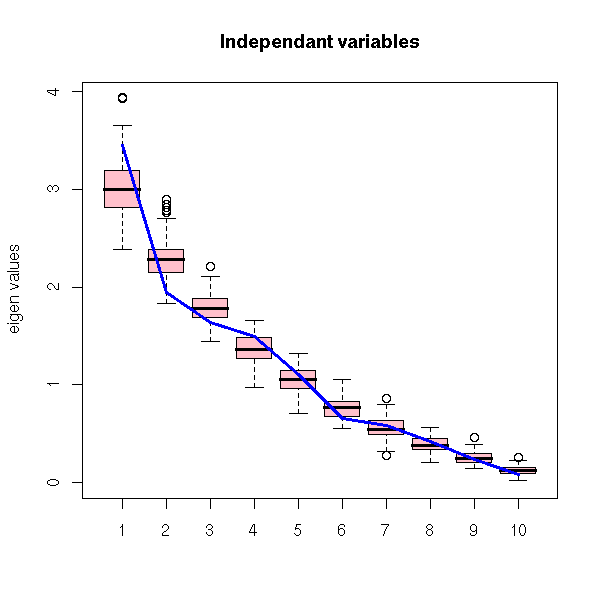
With simulated, correlated variables.
k <- 10  # Number of variables
n <- 20  # Number of observations for each variable
m <- 3   # Number of factors
# Building the variance-covariance matrix
correlation.matrix <- function (x) {
  # x contains the correlations, one column per factor
  k <- dim(x)[2]  # Number of factors
  n <- dim(x)[1]  # Number of variables
  x %*% t(x)
}
covariance.matrix <- function (correlations.with.the.factors, variances) {
  r <- correlations.with.the.factors %*% t(correlations.with.the.factors)
  sqrt(variances %*% t(variances)) * r
}
V <- covariance.matrix(matrix(runif(k*m, -1,1), nr=k, nc=m),
                       runif(k, 1,2))
library(mvtnorm)
x <- rmvnorm(n, sigma=V)
RMT(x)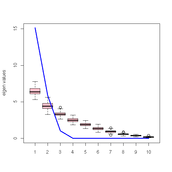
TODO: Understand/Explain why the eigen values are exactly zero...
With some noise on top of this.
op <- par(mfrow=c(2,2), mar=c(2,2,3,1))
for (v in c(.1, .25, .5, 1)) {
  RMT(x + v*rnorm(n*k), main=paste("noise sd =", v))
}
par(op)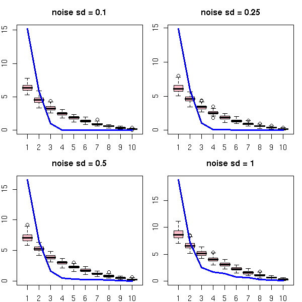
TODO: An example with simulated non-gaussian variables
TODO: An example with real (financial) data
TODO: The misuses of Random Matrix Theory.

1. One can compute the distribution of the eigen values
when the variables are iid gaussian variables. Some people
use that even if the variables are known to be
non-gaussian.

2. The idea of permuting the values of each variable
implicitely assumes that those values are
independant. However, some people try to use this for time
series -- a situation where those values are likely to be
dependant...
Computing the correlation of two random variables is a good idea if they are jointly gaussian: the correlation then tells you the whole story. Unfortunately, variables are rarely jointly gaussian: either they are gaussian but related in a non-linear way, or they are not gaussian at all.
How can we describe, in general terms, the relation of two variables?
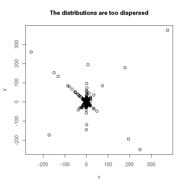
The first attempt should be to look at the data, for example with a scatterplot. If the variables are not too dispersed, this will give you a glimpse of the relation between them. But if they are very dispersed, if they have fat tails (it means: if they have more extreme values than a gaussian distribution -- this is the case of the Cauchy or T distributions), we will not see much. In order to see something, you can transform each variable so that it be uniformly distributed in [0,1] and then look at the scatterplot.
TODO: an example...

N <- 1000
x <- rt(N, df=1)
y <- ifelse(sample( c(T,F), N, replace=T ), x, -x) + rt(N,df=1)

plot(x,y, main="The distributions are too dispersed")
uniformize <- function (x) {
  x <- rank(x, na.last="keep", ties.method="random")
  x / max(x, na.rm=T)
}
x <- uniformize(x)
y <- uniformize(y)
plot(x, y, main="After uniformization")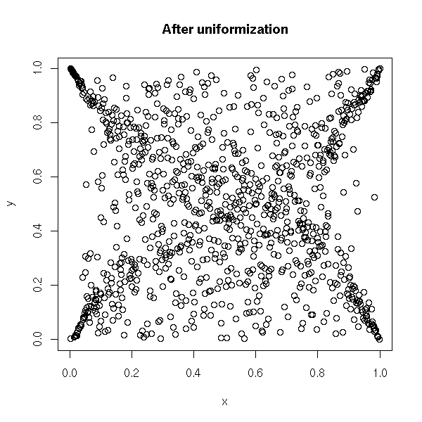
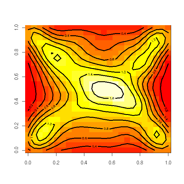
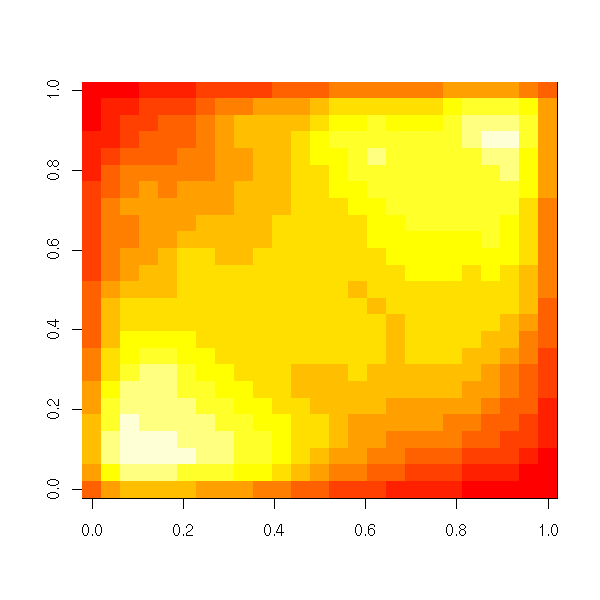
Another way of looking at this scatterplot (useful when there are too many observations) is to estimate the corresponding density.
r <- kde2d(x, y)
image(r)
contour(kde2d(x,y), add=T, lwd=3)
TODO: a hexbin plot, as well.
This density is called the "copula" of the two variables. It replaces the correlation in non-gaussian and/or non-linear situations.
As the density can be anything, it is a bit difficult to study. To this end, we often try to find a "simple" copula sufficiently close to that of our data. Here are a few examples of families of copulas to choose from.
The gaussian copulas are copulas of jointly gaussian variables with a given correlation matrix.
op <- par(mfrow=c(2,2), mar=c(2,3,4,2))
for (r in c(-.9, -.5, 0, .5)) {
  N <- 1000
  x <- rnorm(N)
  y <- rnorm(N)
  y <- cbind(x,y) %*% chol( matrix(c(1,r,r,1), nr=2) )[,2]
  cor(x,y)
  x <- uniformize(x)
  y <- uniformize(y)
  s <- kde2d(x, y)
  image(s, main=paste("Correlation =", r))
  contour(s, add=T, lwd=3)
}
par(op)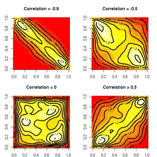
The mixture-of-gaussian copulas are copulas of mixtures of gaussians.
do.it <- function (seed, k=3, N=10000) {
  set.seed( seed )
  centers <- matrix(rnorm(2*k), nc=2)
  cluster <- sample(1:k, N, replace=T)
  x <- centers[cluster,1] + rnorm(N)
  y <- centers[cluster,2] + rnorm(N)
  x <- uniformize(x)
  y <- uniformize(y)
  s <- kde2d(x,y)
  image(s)
}
do.it(1)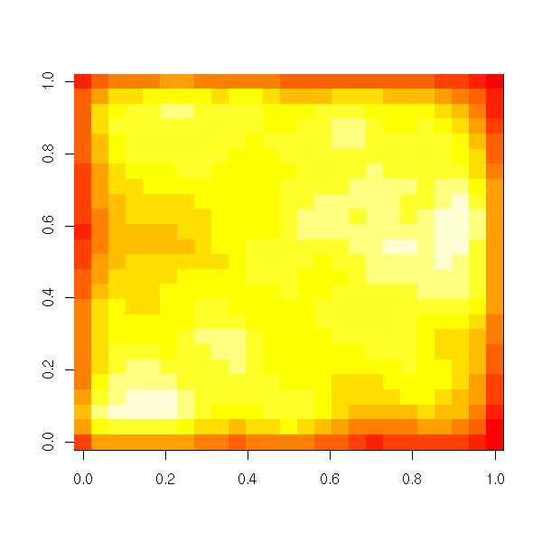
do.it(2)
TODO: non-spherical gaussian variables... More plots?

library(bayesm)
do.it <- function (seed=2, k=3, N=10000) {
  set.seed( seed )
  r <- list()
  for (i in 1:k) {
    m <- matrix(rnorm(4), nr=2)
    r <- append(r, list(list( rnorm(2), solve(chol( t(m) %*% m)))))
  }
  p <- runif(k)
  p <- p / sum(p)
  s <- rmixture(N, p, r)   # Very long...
  op <- par(mfrow=c(2,2), mar=c(2,3,4,2))
  plot(s$x, col=s$z, main="Mixture of gaussians", xlab="", ylab="")
  image(kde2d(s$x[,1], s$x[,2]), main="Density of a mixture of gaussians",
        col=rev(heat.colors(100)))
  box()
  x <- uniformize(s$x[,1])
  y <- uniformize(s$x[,2])
  plot(x, y, col=s$z, main="Uniformized variables", xlab="", ylab="")
  r <- kde2d(x,y)
  image(r, main="Mixture-of-gaussians copula")
  box()
  contour(r, add=T, lwd=3)
  par(op)
}
do.it()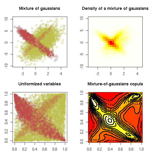
The Gumbel copula is defined by
C(u,v) = exp - ( (-log u)^a + (-log v)^a )^(1/a)

f <- function (u, v, a) {
  exp( -( (-log(u))^a + (-log(v))^a )^(1/a) )
}
N <- 50
v <- u <- ppoints(N)
uu <- rep(u, N)
vv <- rep(v, each=N)
op <- par(mfrow=c(2,2), mar=c(2,2,4,1))
for (a in c(-10, -2, 0, 5)) {
  w <- matrix( f(uu, vv, a), nr=N )
  image(w, main=paste("Gumbel copula, a =", a))
}
par(op)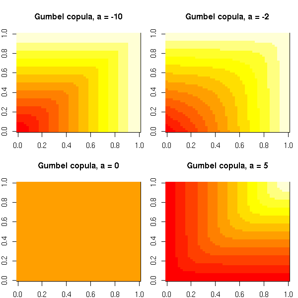
TODO: How to sample from it???
More generally, archimedian copulas are defined by
C(u,v) = f^{-1} ( f(u) + f(v) )

TODO: plots
For more about copulas in R, check:
library(help=copula)
library(help=fgac)   # generalized archimedian copula
http://www.crest.fr/pageperso/charpent/ENSAI.htm
The idea is to find the values of a and b that minimize the sum of the squared distances between the predicted values of Y and the actual values (on the preceding plot, it means we measure the vertical distance between each point and the line, and we try to move the line so that the sum of the squares of these distances be as small as possible).
If you do the computations by hand (write the sum of squares, write that the partial derivatives with respect to a and b are zero, solve), you get:
my.lss <- function (x, y, ...) {
  n <- length(x)
  sx <- sum(x)
  sy <- sum(y)
  sxx <- sum(x*x)
  sxy <- sum(x*y)
  d <- n*sxx-sx*sx
  a <- (sxx*sy - sx*sxy)/d
  b <- (-sx*sy + n*sxy)/d
  plot(x,y, ...)
  abline(a, b, col='red', ...)
  c(a,b)
}

n <- 10
x <- runif(n)
y <- 1 - 2*x + .3*rnorm(n)
my.lss(x,y)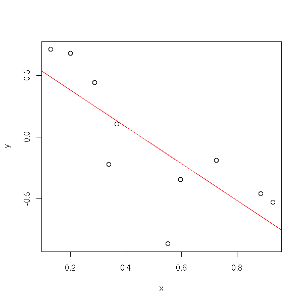
To do the same in higher dimensions, it suffices to write the computations with matrices.
my.lss <- function (x,y, ...) {
  x <- as.matrix(x)
  x <- cbind(rep(1,dim(x)[1]), x)
  t(solve( t(x) %*% x, t(x) %*% y ))
}

n <- 50
x1 <- runif(n)
x2 <- runif(n)
x <- cbind(x1,x2)
y <- 1+x1-x2 + .3*rnorm(n)
my.lss(x, y)
You can get this formula pretty easily. The model states:
Y = X B + Bruit
so
X' Y = X' X B + X' Bruit
thus
(X' X)^-1 X' Y = B + (X' X)^-1 X' Bruit
hence
E[ (X' X)^-1 X' Y ] = E [ B + (X' X)^-1 X' Bruit ]
ie,
E[ (X' X)^-1 X' Y ] = E [ B ] + E [ (X' X)^-1 X' Bruit ]
ie,
E[ (X' X)^-1 X' Y ] = B + 0
ie, (X' X)^-1 X' Y is an unbiased estimator of B (we do not know if it is a good one, but at least it is unbiased).
You can see linear regression as an orthogonal projection of Y onto the subspace generated by 1, X1, X2, etc. (here, 1 is the vector all of whose coordinates are 1).
The estimators from the least squares method are the Best (their variance is the lowest) Linear Unbiased Estimators (BLUE).
However, some biased estimators have a lower variance, a lower Meas Square Error (MSE) and are thus more interesting.
Furthermore, some non-linear estimators are more robust and thus better suited to non-normal noise distributions.
In the real world, I suggest looking at the data (did I already stress the importance of plotting your data?) and comparing least squares regression and other regression.
TODO: Rewrite this section:
1. Plot the data. The figure suggests that regression is a good
   idea.
2. Perform the computations, plot the result.
3. Read the numeric results.
4. Look at the diagnostic plots.
   Check that the assumptions were not flagrantly breached.
Of course, there is already a function to perform this kind of computation. The following line asks R to try to write Y as an affine function of X (we never explicitely add the intercept, but it is always there: if you really want to remove it -- you shoudn't -- you can, by writing y~-1+X).
res <- lm( y ~ x )
(If you want to write your own functions that accept such formulas as argument, you can use the "model.matrix" function to turn the formula into a matrix.)
The "res" object contains the regression result. You can plot it as follows (the "plot(res)" command would give you plots to assess the relevance of this regression -- more about this later).
n <- 10
x <- runif(n)
y <- 1 - x + .2*rnorm(n)
res <- lm( y ~ x )
plot(y~x, pch=16)
abline(res, col='red')
Let us look at the contents of this object, with the "str" function.
> str(res)
List of 12
 $ coefficients : Named num [1:2]  0.946 -0.925
  ..- attr(*, "names")= chr [1:2] "(Intercept)" "x"
 $ residuals    : Named num [1:10] -0.218  0.201  0.109  0.148  0.127 ...
  ..- attr(*, "names")= chr [1:10] "1" "2" "3" "4" ...
 $ effects      : Named num [1:10] -1.053 -0.725  0.196  0.208  0.219 ...
  ..- attr(*, "names")= chr [1:10] "(Intercept)" "x" "" "" ...
 $ rank         : int 2
 $ fitted.values: Named num [1:10] 0.212 0.637 0.160 0.270 0.140 ...
  ..- attr(*, "names")= chr [1:10] "1" "2" "3" "4" ...
 $ assign       : int [1:2] 0 1
 $ qr           :List of 5
  ..$ qr   : num [1:10, 1:2] -3.162  0.316  0.316  0.316  0.316 ...
  .. ..- attr(*, "dimnames")=List of 2
  .. .. ..$ : chr [1:10] "1" "2" "3" "4" ...
  .. .. ..$ : chr [1:2] "(Intercept)" "x"
  .. ..- attr(*, "assign")= int [1:2] 0 1
  ..$ qraux: num [1:2] 1.32 1.46
  ..$ pivot: int [1:2] 1 2
  ..$ tol  : num 1e-07
  ..$ rank : int 2
 $ df.residual  : int 8
 $ xlevels      : list()
 $ call         : language lm(formula = y ~ x)
 $ terms        :Classes 'terms', 'formula' length 3 y ~ x
  .. ..- attr(*, "variables")= language list(y, x)
  .. ..- attr(*, "factors")= int [1:2, 1] 0 1
  .. .. ..- attr(*, "dimnames")=List of 2
  .. .. .. ..$ : chr [1:2] "y" "x"
  .. .. .. ..$ : chr "x"
  .. ..- attr(*, "term.labels")= chr "x"
  .. ..- attr(*, "order")= int 1
  .. ..- attr(*, "intercept")= int 1
  .. ..- attr(*, "response")= int 1
  .. ..- attr(*, ".Environment")=length 6 <environment>
  .. ..- attr(*, "predvars")= language list(y, x)
 $ model        :`data.frame':  10 obs. of  2 variables:
  ..$ y: num [1:10] -0.00579  0.83807  0.26913  0.41728  0.26766 ...
  ..$ x: num [1:10] 0.792 0.334 0.849 0.731 0.870 ...
  ..- attr(*, "terms")=Classes 'terms', 'formula' length 3 y ~ x
  .. .. ..- attr(*, "variables")= language list(y, x)
  .. .. ..- attr(*, "factors")= int [1:2, 1] 0 1
  .. .. .. ..- attr(*, "dimnames")=List of 2
  .. .. .. .. ..$ : chr [1:2] "y" "x"
  .. .. .. .. ..$ : chr "x"
  .. .. ..- attr(*, "term.labels")= chr "x"
  .. .. ..- attr(*, "order")= int 1
  .. .. ..- attr(*, "intercept")= int 1
  .. .. ..- attr(*, "response")= int 1
  .. .. ..- attr(*, ".Environment")=length 6 <environment>
  .. .. ..- attr(*, "predvars")= language list(y, x)
 - attr(*, "class")= chr "lm"
The "print" function prints those contents in a terser way: just the coefficients.
> res

Call:
lm(formula = y ~ x)

Coefficients:
(Intercept)            x
     0.9457      -0.9254
But usually, you want more details. And ideed, the result object contains much more information. First, the residuals (i.e., the difference between the predicted value and the actual value -- this is NOT the noise that appears in the model: to compute this noise, you would have to know the exact values of the coefficients a and b; here, we just have an estimation of those coefficients: the residuals are just an estimation of the noise). Then, the coefficients with, for each of them, an estimation of the standard error and a test to know if the coefficient is zero or not. Here, the two stars tell us that the slope is non zero with a confidence of 0.1% (.001926). Same for the intercept.
The R-squared, between 0 and 1, tells us if the model is close to the data: we shall come back on it when we speak of ANalysis Of VAriance (Anova). The adjusted R-squared corrects this value by taking into account a potential overfit of the data -- for instance, if there are as many parameters as data, you will have R^2=1, but your regression will be meaningless.
The F-test and the corresponding p-value are the results of a comparison of this model and the null model (the null model is the model Y = contant + noise, i.e., the model with no slope, i.e., y~1).
> summary(res)

Call:
lm(formula = y ~ x)

Residuals:
     Min       1Q   Median       3Q      Max
-0.21828 -0.12899  0.01060  0.12269  0.20110

Coefficients:
            Estimate Std. Error t value Pr(>|t|)
(Intercept)   0.9457     0.1444   6.548 0.000179 ***
x            -0.9254     0.2043  -4.529 0.001926 **
---
Signif. codes:  0 `***' 0.001 `**' 0.01 `*' 0.05 `.' 0.1 ` ' 1

Residual standard error: 0.16 on 8 degrees of freedom
Multiple R-Squared: 0.7194,     Adjusted R-squared: 0.6844
F-statistic: 20.51 on 1 and 8 DF,  p-value: 0.001926
There is yet another way of printing the result, that gives the same information as the last three lines of the "summary" function. We shall come back on this later: the "anova" function allows you to compare regression models.
> anova(res)
Analysis of Variance Table

Response: y
          Df  Sum Sq Mean Sq F value   Pr(>F)
x          1 0.52503 0.52503  20.514 0.001926 **
Residuals  8 0.20475 0.02559
---
Signif. codes:  0 `***' 0.001 `**' 0.01 `*' 0.05 `.' 0.1 ` ' 1
In the sequel, we shall mainly use the "summary" function.
We try to predict a random variable Y from another variable X. Both are quantitative,
The regression curve of Y on X is the function f that minimizes
E( Y - f(X) )^2.
We can get it as follows:
f(x) = E[ Y | X=x ].
The problem is that to compute this regression, we need to know the distribution of Y|X -- but all we have is a sample. If you really have a lot of data, you can try to compute the regression with, e.g., weighted moving averages.
But usually, you have to downgrade your expectations: you will restrict your attention to a class of simple functions, for instance, a linear (or rather, affine) function or a polynomial -- the simpler the model, the more reliable the results. In the linear case, we want to minimize
E( Y - (aX+b) )^2.
This is linear regression.
TODO: Stress the problems
1. This is asymetric, X and Y play different roles.
2. This only works for functional relations.
   For instance, if the relation is x^2 + y^2 = 1 (more generally,
   if the distribution of Y|X=x is bimodal for some values of x),
   we will not get anything reliable.
   TODO: Plot.
3. This also assumes that taking the mean of Y|X=x is a good idea.
   You might want to take the median (this is called quantile
   regression) or the mode.
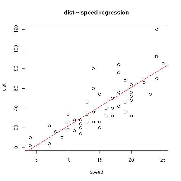
Linear regression tries to minimize the sum of the squared distances between the line and the cloud of points -- the distance is measured vertically.
data(cars)
plot(cars)
abline(lm(cars$dist ~ cars$speed), col='red')
title(main="dist ~ speed regression")
This is not symetric: if you interchange the variables, you get something different. However, you will notice that both lines will run through the center of gravity of the cloud of points.
plot(cars)
r <- lm(cars$dist ~ cars$speed)
abline(r, col='red')
r <- lm(cars$speed ~ cars$dist)
a <- r$coefficients[1] # Intercept
b <- r$coefficients[2] # slope
abline(-a/b , 1/b, col="blue")
title(main="dist ~ speed and speed ~ dist regressions")
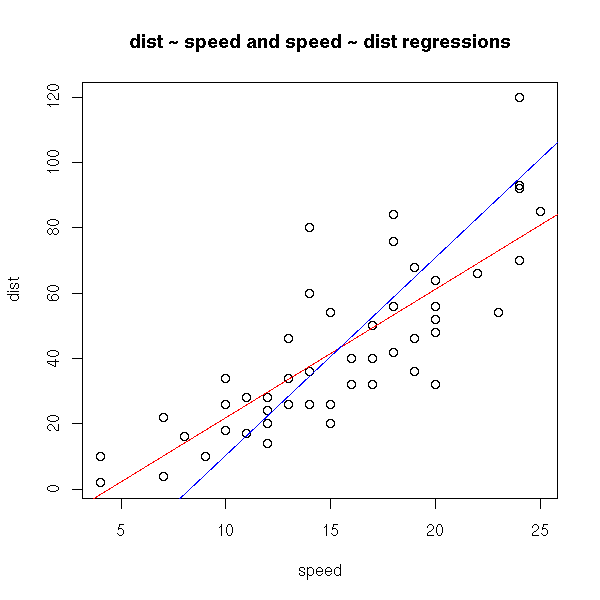
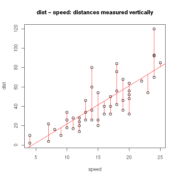
In both cases we minimize the (sum of squared) distances between the cloud of points and the line, but in one case, those distances are measured vertically, in the other they are measured horizontally. These are two reasonable but different means of measuring the distance between a cloud of points and a line. That is why we get different results.
plot(cars)
r <- lm(cars$dist ~ cars$speed)
abline(r, col='red')
segments(cars$speed, cars$dist, cars$speed, r$fitted.values,col="red")
title(main="dist ~ speed: distances measured vertically")
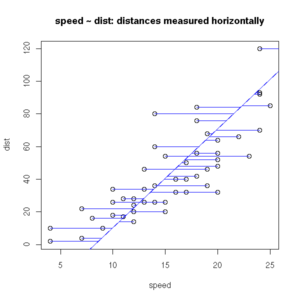
plot(cars)
r <- lm(cars$speed ~ cars$dist)
a <- r$coefficients[1] # Intercept
b <- r$coefficients[2] # slope
abline(-a/b , 1/b, col="blue")
segments(cars$speed, cars$dist, r$fitted.values, cars$dist, col="blue")
title(main="speed ~ dist: distances measured horizontally")
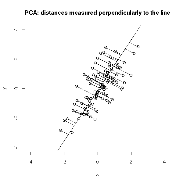
There is another sensible way of measuring the distance between a cloud of points and a line: the sum of the squared distances between the points and the line, measured orthogonally to the line. This is called PCA (Principal Component Analysis, aka "orthogonal regression" or "perpendicular sums of squares" or "total least squares") -- and this time, it is symetric.
plot(cars)
r <- lm(cars$dist ~ cars$speed)
abline(r, col='red')
r <- lm(cars$speed ~ cars$dist)
a <- r$coefficients[1] # Intercept
b <- r$coefficients[2] # slope
abline(-a/b , 1/b, col="blue")
r <- princomp(cars)
b <- r$loadings[2,1] / r$loadings[1,1]
a <- r$center[2] - b * r$center[1]
abline(a,b)
title(main='Comparing three "regressions"')
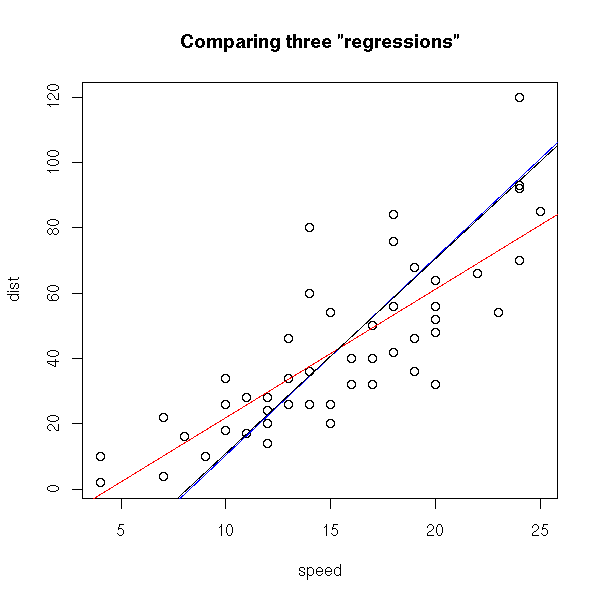
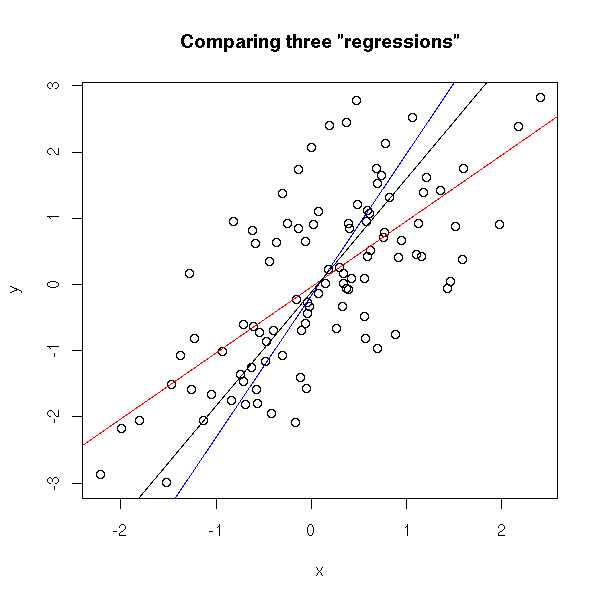
In this example, the blue and black lines are almost the same. In the following example, they are distinct.
set.seed(1)
x <- rnorm(100)
y <- x + rnorm(100)
plot(y~x)
r <- lm(y~x)
abline(r, col='red')
r <- lm(x ~ y)
a <- r$coefficients[1] # Intercept
b <- r$coefficients[2] # slope
abline(-a/b , 1/b, col="blue")
r <- princomp(cbind(x,y))
b <- r$loadings[2,1] / r$loadings[1,1]
a <- r$center[2] - b * r$center[1]
abline(a,b)
title(main='Comparing three "regressions"')
plot(y~x, xlim=c(-4,4), ylim=c(-4,4) )
abline(a,b)
# Change-of-base matrix
u <- r$loadings
# Projection onto the first axis
p <- matrix( c(1,0,0,0), nrow=2 )
X <- rbind(x,y)
X <- r$center + solve(u, p %*% u %*% (X - r$center))
segments( x, y, X[1,], X[2,] )
title(main="PCA: distances measured perpendicularly to the line")
TODO: this part is not written yet...
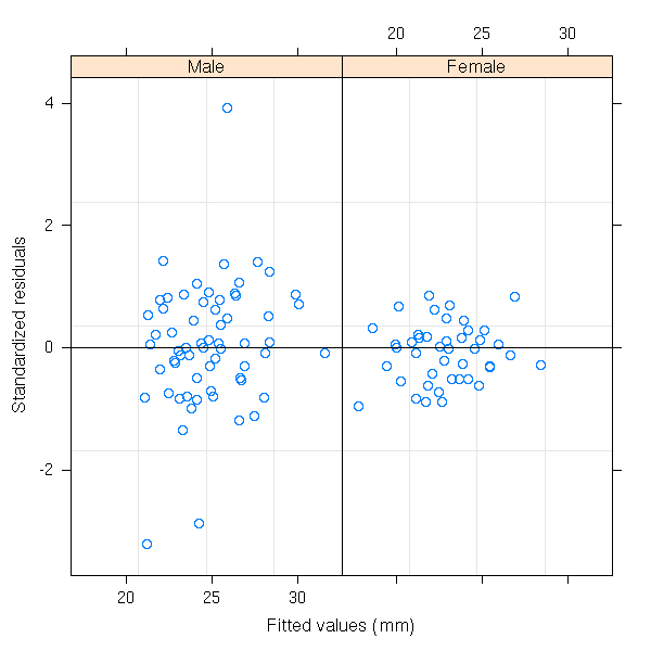
library(help=nlme)

(It is here, for instance, that you will find a "gls" function, for
generalized least squares.)

Just a few examples from the manual.

library(help=nlme)
library(nlme)

library(nlme)
data(Orthodont)
fm1 <- lme(distance ~ age, Orthodont, random = ~ age | Subject)
# standardized residuals versus fitted values by gender
plot(fm1, resid(., type = "p") ~ fitted(.) | Sex, abline = 0)
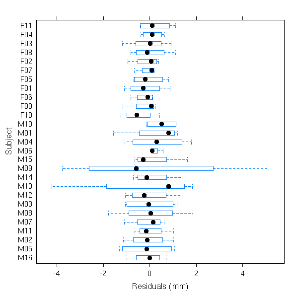
# box-plots of residuals by Subject
plot(fm1, Subject ~ resid(.))
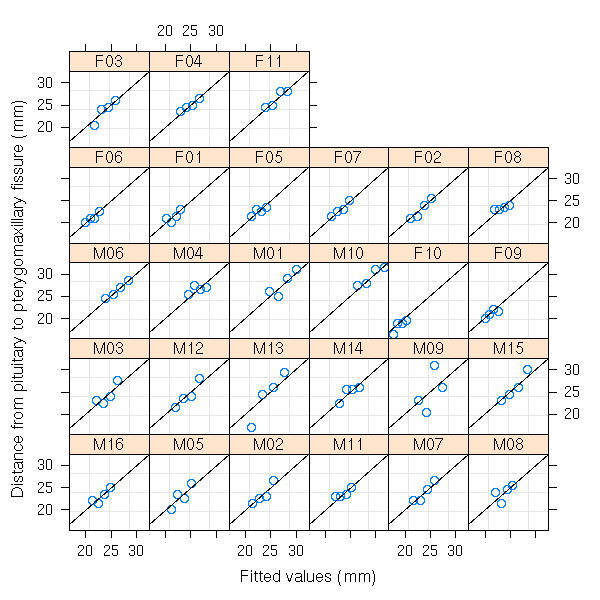
# observed versus fitted values by Subject
plot(fm1, distance ~ fitted(.) | Subject, abline = c(0,1))
The "nlme" package contains a "plot" function for non linear model.

TODO
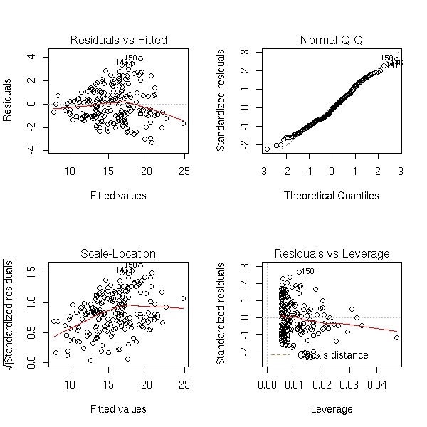
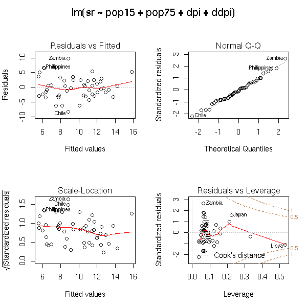
The "plot" function produces four plots that help assess the quality and relevance of a regression.
data(crabs)
n <- length(crabs$RW)
r <- lm(FL~RW, data=crabs)
op <- par(mfrow=c(2,2))
plot(r)
par(op)
Those plots remain useful in higher dimensions. Here is the example from the manual (you try to predict a variable from four others).
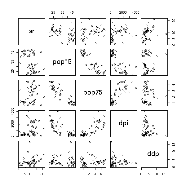
data(LifeCycleSavings)
plot(LifeCycleSavings)
op <- par(mfrow = c(2, 2), oma = c(0, 0, 2, 0))
plot(lm.SR <- lm(sr ~ pop15 + pop75 + dpi + ddpi, data = LifeCycleSavings))
par(op)

## 4 plots on 1 page; allow room for printing model formula in outer margin:
op <- par(mfrow = c(2, 2), oma = c(0, 0, 2, 0))
#plot(lm.SR)
#plot(lm.SR, id.n = NULL)               # no id's
#plot(lm.SR, id.n = 5, labels.id = NULL)# 5 id numbers
plot(lm.SR, panel = panel.smooth)
## Gives a smoother curve
#plot(lm.SR, panel = function(x,y) panel.smooth(x, y, span = 1))
par(op)
Before performing a regression, it is a good idea to transform the data so that they look more or less gaussian. The important points are the symetry of the distributions and the lack of outliers, that can bear too much impact on the regression results. In most cases (lucky us!) the transformation also removes residual problems, such as heteroskedasticity.
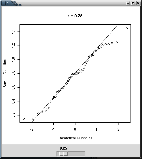
You can perform the transformations by hand, with qqplots to estimate the quality of the transformation -- for instance with a Tk Widget.
n <- 100
x <- abs(rnorm(n)) ^ runif(1,min=0,max=2)

library(tkrplot)
bb <- 1
my.qqnorm <- function () {
  qqnorm(x^bb, main=paste('k =',bb, ", p-valeur (Shapiro) =", shapiro.test(x^bb)$p.value))
  qqline(x^bb)
}
tt <- tktoplevel()
img <-tkrplot(tt, my.qqnorm)
f<-function(...) {
    b <- as.numeric(tclvalue("bb"))
    if (b != bb) {
        bb <<- b
        tkrreplot(img)
    }
}
s <- tkscale(tt, command=f, from=0.05, to=2.00, variable="bb",
             showvalue=TRUE, resolution=0.05, orient="horiz")
tkpack(img,s)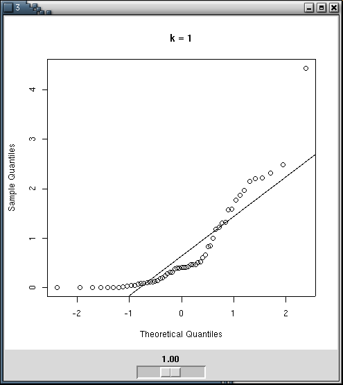
You can also directly use Shapiro's test.
n <- 100
x <- abs(rnorm(n)) ^ runif(1,min=0,max=2)
kk <- seq(.01,5,by=.01)
N <- length(kk)
pv <- rep(NA, N)
for (i in 1:N) {
  pv[i] <- shapiro.test( x^kk[i] )$p.value
}
plot( pv ~ kk, type='l', xlab='exponent', ylab='p-value' )
seuil <- .05
abline( v = kk[ range( (1:N)[pv>seuil] ) ], lty=3 )
abline( v = kk[pv==max(pv)], lty=3 )
abline( h = seuil, lty=3 )
title(main="Shapiro's test")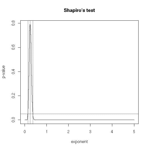
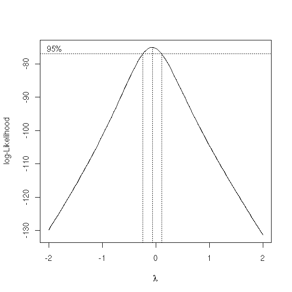
The "boxcox" function already does this.
x <- exp( rnorm(100) )
y <- 1 + 2*x + .3*rnorm(100)
y <- y^1.3
library(MASS)
boxcox(y~x, plotit=T)
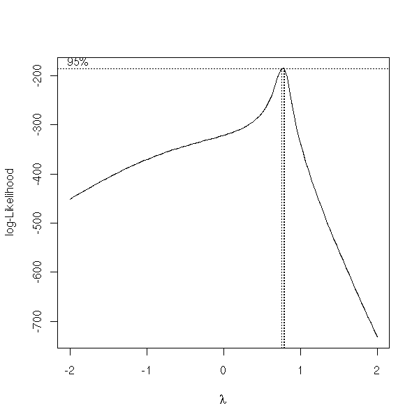
There is another one in the "car" library.
> summary( box.cox.powers(cbind(x,y)) )
Box-Cox Transformations to Multinormality

  Est.Power Std.Err. Wald(Power=0) Wald(Power=1)
x    0.3994   0.0682        5.8519       -8.8011
y    0.2039   0.0683        2.9868      -11.6596

L.R. test, all powers = 0:  50.8764   df = 2   p = 0
L.R. test, all powers = 1:  263.585   df = 2   p = 0
To ease the interpretation of the transformation, you will strive to choose a simple exponent (say, a simple fraction): it will be easier to explain to your boss why you chose a cubic root than to explain that you needed to raise an easy-to-understand quantity to the power 0.3994.
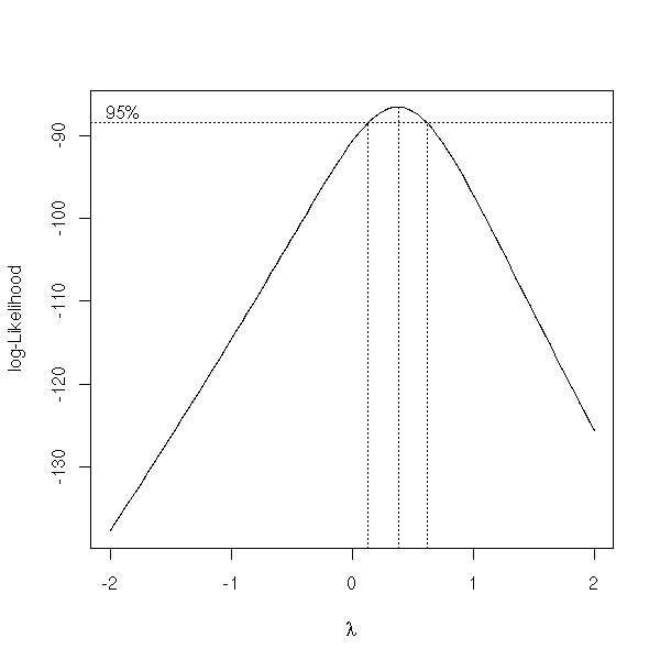
my.box.cox <- function (x, lambda=seq(-2,2,.01)) {
b <- boxcox(x, lambda=lambda)
# Confidence interval (from "boxcox")
lim <- max(b$y) - qchisq(19/20,1)/2
l1 <- min(b$x[ b$y>lim ])
l2 <- max(b$x[ b$y>lim ])
# A simple fraction between l1 and l2
done <- F
den <- 0
while (!done) {
den <- den+1
num <- floor(den*min(lambda))-1
nummax <- ceiling(den*max(lambda))
#cat(paste("DEN", den, "NUMMAX", nummax, "\n"))
while ((!done) & (num<=nummax)) {
num <- num+1
#cat(paste("den",den,"num",num,"\n"))
if( l1<=num/den & num/den<=l2 ){
done <- T
}
}
}
list(value=num/den, numerator=num, denominator=den,
exact=b$x[ b$y==max(b$y) ],
int=c(l1,l2) )
}
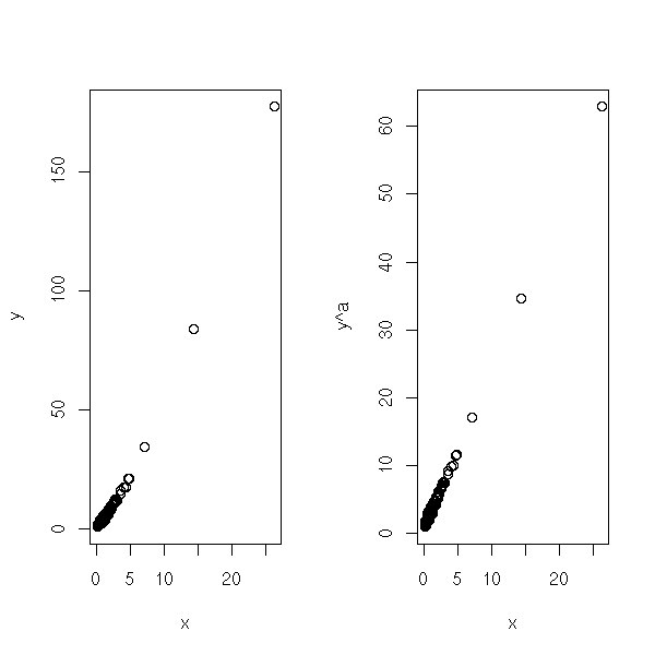
my.box.cox(y~x) # 3/4Here is a comparison the the initial data and the transformed ones.
bc <- boxcox(y ~ x, plotit=F)
a <- bc$x[ order(bc$y, decreasing=T)[1] ]
op <- par( mfcol=c(1,2) )
plot( y~x )
plot( y^a ~ x )
par(op)
More concrete examples.
data(trees)
plot(trees)
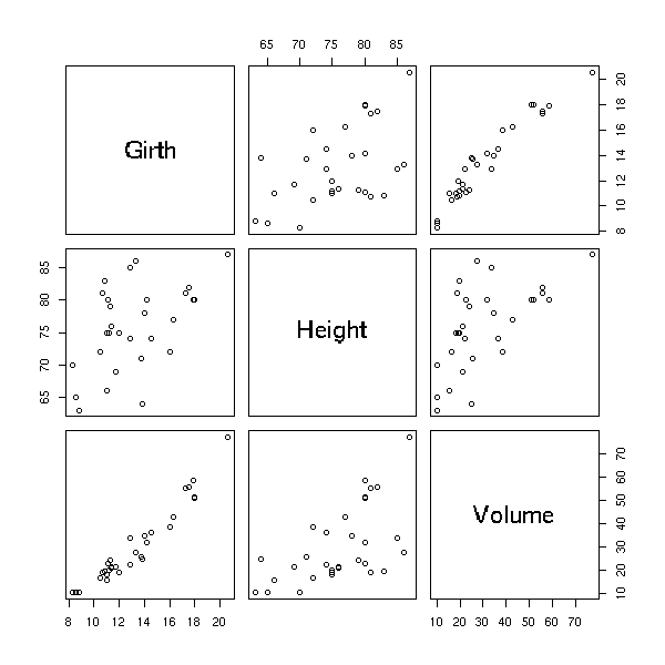
boxcox(Volume ~ Girth, data = trees)
boxcox(Volume ~ log(Height) + log(Girth), data = trees )
TODO: I have not finished writing this part.
TODO
help.search("impute")
library(help=norm)
?aregImpute
na.omit
plot(approx(...))
Data sets sometimes contain missing values, because they could not be observed, because they were lost, or because we realized that they were erroneous and could not redo the experiments. Simply discarding the corresponding subjects may not be that good an idea: if a single variable is missing for a given subject, you would also discard all the other variables for that subject. If the data are displayed in a table, one row per subject, one column per variable, you would discard a row whenever it contains a missing value.
If the missing data are few, you can discard the corresponding observations.
If the missing values are missing at random, you can get by by replacing the missing values with their mean or median.
But quite often, the fact that a value is missing depends on the value itself: for instance, of we ask people their income, in an opinion poll, high-earning people will be more reluctant to answer. This must be taken into account.
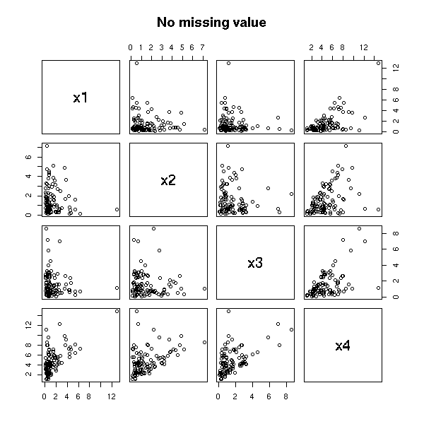
n <- 100
v <- .1
x1 <- rlnorm(n)
x2 <- rlnorm(n)
x3 <- rlnorm(n)
x4 <- x1 + x2 + x3 + v*rlnorm(n)
m1 <- cbind(x1,x2,x3,x4)
pairs(m1, main="No missing value")
remove.higher.values <- function (x) {
  n <- length(x)
  ifelse( rbinom(n,1,(x-min(x))/(max(x)+1))==1 , NA, x)
}
x1 <- remove.higher.values(x1)
x2 <- remove.higher.values(x2)
x3 <- remove.higher.values(x3)
x4 <- remove.higher.values(x4)
m2 <- cbind(x1,x2,x3,x4)
pairs(m2, main="A few missing values")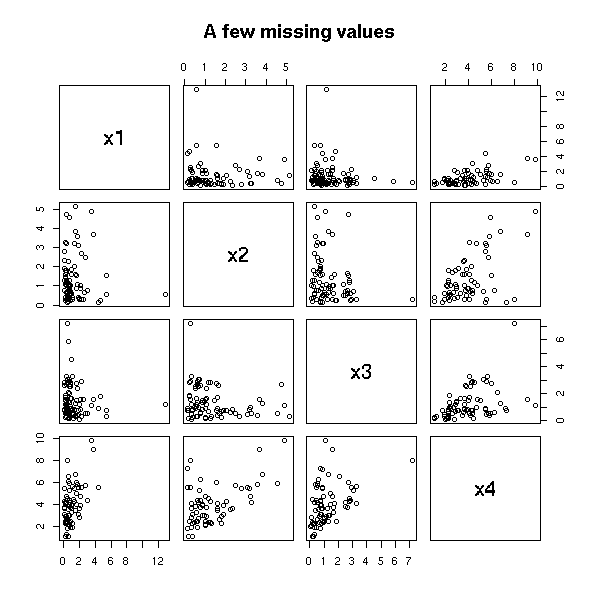
The mean is lower that what it should be.
> apply(m2, 2, mean, na.rm=T)
      x1       x2       x3       x4
1.158186 1.160651 1.298134 3.966040
> apply(m1, 2, mean, na.rm=T)
      x1       x2       x3       x4
1.438024 1.652619 1.472807 4.710466
TODO: is this a good example? Do missing values have a real effect on the result of the regression or the forecasts?
> lm(m2[,4]~m2[,-4]-1)
Coefficients:
m2[, -4]x1  m2[, -4]x2  m2[, -4]x3
     1.026       1.030       1.021

> lm(m1[,4]~m1[,-4]-1)
Coefficients:
m1[, -4]x1  m1[, -4]x2  m1[, -4]x3
     1.014       1.029       1.013
To see of the values are missing at random or of the missing-ness follows a certain pattern, one can use a decision tree.
library(rpart)
for (i in 1:4) {
  r <- rpart(factor(is.na(m2[,i]))~m2[,-i])
  cat(paste("Coordinate number", i, "\n"))
  print(r)
}
It yields:
Coordinate number 1
n= 100
node), split, n, loss, yval, (yprob)
      * denotes terminal node
1) root 100 9 FALSE (9.1e-01 9.0e-02) *

Coordinate number 2
n= 100
node), split, n, loss, yval, (yprob)
      * denotes terminal node
1) root 100 9 FALSE (9.1e-01 9.0e-02) *

Coordinate number 3
n=99 (1 observations deleted due to missing)
node), split, n, loss, yval, (yprob)
      * denotes terminal node
1) root 99 13 FALSE (0.8686869 0.1313131) *

Coordinate number 4
n= 100
node), split, n, loss, yval, (yprob)
      * denotes terminal node
 1) root 100 12 FALSE (0.88000000 0.12000000)
   2) m2[, -i].x2< 3.397467 93  9 FALSE (0.90322581 0.09677419)
     4) m2[, -i].x1< 1.066317 55  3 FALSE (0.94545455 0.05454545) *
     5) m2[, -i].x1>=1.066317 38  6 FALSE (0.84210526 0.15789474)
      10) m2[, -i].x1>=1.469563 31  2 FALSE (0.93548387 0.06451613) *
      11) m2[, -i].x1< 1.469563 7  3 TRUE (0.42857143 0.57142857) *
   3) m2[, -i].x2>=3.397467 7  3 FALSE (0.57142857 0.42857143) *
Here, we see that the fact that one of the first three variables is missing does not depend on the value of the other variables; on the contrary, the fact that the last variable is missing depends on the value of the other values. For the first variables, if we want to fill in the missing values, we can use the mean or the median; for the last one, we can try to predict it from the first variables.
There is another R funtion to fit regression trees: "tree". But it is only there for compatibility reasons with S-Plus: you should prefer "rpart".
The first algorithm to build decision trees was the ID3 algorithm, by Quinlan. It was then extended to account for missing values, under the name C4.5. The program itself is a commercial product, so you will not find it in R. However, if you want a free implementation of the same ideas, you can look into their reimplementation by Weka (a Java machine learning environment), christened J4.8.
http://www.cs.waikato.ac.nz/ml/weka/
TODO: URL about C4.5 and J4.8
The idea used by R is CART (in its commercial incarnation, so we cannot use that name) or "recursive partitionning".
The main differences between C4.5 and rpart are as follows.
Rpart trees are binary while C4.5 can be more general.
C4.5 used the "information gain" or the "informormation ratio" as a splitting criterion; Rpart replaces the information by the Gini index.
Rpart pruning is based on cross-validation, which can be time-consuming but produces smaller trees; C4.5 uses a simpler pruning algorithm.
C4.5 penalizes for missing values, Rpart does not; Rpart
The following document details those differences:
Decision tree discovery, Kohavi and Quinlan
http://ai.stanford.edu/~ronnyk/treesHB.pdf
Usually, the regression tree gives the best results to assess missing values, bu you can try other methods.
TODO: delete this section?

We should get the same result with a logistic regression, but this
is not the case. WHY?

for (i in 1:4) {
  cat(paste("Coordinate number", i, "\n"))
  print(summary(glm( is.na(m2[,i]) ~ m2[,-i], family=binomial )))
}
We can also look if the fact that a variable is missing depends on the fact that other variables are missing., for instance with a logistic regression.
TODO: We could also use a Chi2 test.

m3 <- data.frame(m2)
summary(glm(is.na(x4) ~ is.na(x1) + is.na(x2) + is.na(x3), data=m3, family=binomial))
This yields:
Coefficients:
              Estimate Std. Error z value Pr(>|z|)
(Intercept)    -1.8926     0.3613  -5.239 1.62e-07 ***
is.na(x1)TRUE   0.8266     0.7473   1.106    0.269
is.na(x2)TRUE  -0.2042     0.7146  -0.286    0.775
is.na(x3)TRUE   0.7278     0.8865   0.821    0.412
Here, the fact that x4 is missing does mot depend on the fact that the other variables are missing. We could also check for more complicated relations, with interactions (yes, this starts to look like a decision tree):
summary(glm(is.na(x4) ~ is.na(x1) * is.na(x2) * is.na(x3), data=m3, family=binomial))
Same conclusion.
Lest us now try to predict the fact that a variable is missing from the value of the other variables.
If we try directly,
r1 <- glm(is.na(x4) ~ x1+x2+x3, data=m3, family=binomial)
r2 <- glm(is.na(x4) ~ 1, data=m3, family=binomial)
anova(r1,r2)
it crashes, because to compute the first regression, ot starts to discard the subjects with at least one missing value (so that is.na(x4) is always false: the "TRUE" cases have been discarded...).
m4 <- m3[!is.na(apply(m3,1,sum)),]
r1 <- glm(is.na(x4) ~ x1+x2+x3, data=m4, family=binomial)
r2 <- glm(is.na(x4) ~ 1, data=m4, family=binomial)
anova(r1,r2)

TODO: interpret those results.
TODO: understand
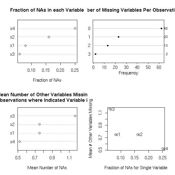
The "naclus" and "naplot" allow you to see where the data are missing.
op <- par(mfrow=c(2,2))
library(Design)
r <- naclus(data.frame(m2))
naplot(r)
par(op)
op <- par(mfrow=c(2,2))
for(m in c("ward","complete","median")) {
  plot(naclus(data.frame(m2), method=m))
  title(m)
}
plot(naclus(data.frame(m2)))
title("Default")
par(op)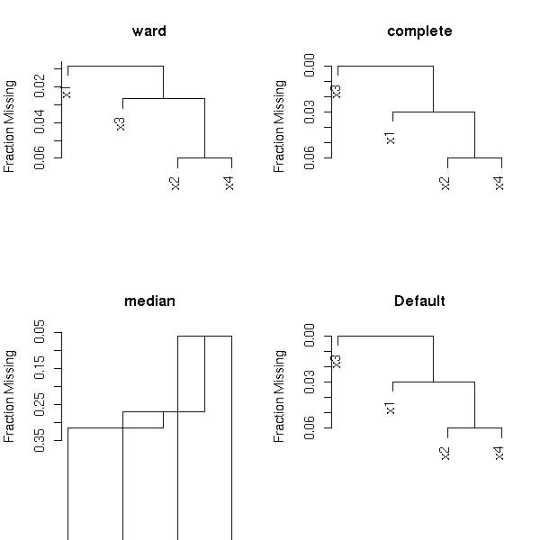
Let us now show, on this example, that it is useful to take missing values into account.
Let us first perform a regression, without investigating the missing values.
> lm(x4~x1+x2+x3)

Call:
lm(formula = x4 ~ x1 + x2 + x3)

Coefficients:
(Intercept)           x1           x2           x3
     0.1332       0.9874       1.0112       1.0133
Now, we replace the missing values with the mean (or the median) (the values are biased towards zero).
median.impute <- function (x) {
  x[ is.na(x) ] <- median(x)
  x
}
y1 <- median.impute(x1)
y2 <- median.impute(x2)
y3 <- median.impute(x3)
y4 <- median.impute(x4)

> lm(y4 ~ x1+x2+x3)
Call:
lm(formula = y4 ~ x1 + x2 + x3)

Coefficients:
(Intercept)           x1           x2           x3
     0.2205       0.9890       0.9876       0.9732
And now, with the "transcan" function.
library(Hmisc)
op <- par(mfrow=c(2,2))
w <- transcan(~x1+x2+x3+x4, imputed=T, transformed=T, trantab=T, impcat='tree',
              data=data.frame(x1,x2,x3,x4), pl=TRUE)
par(op)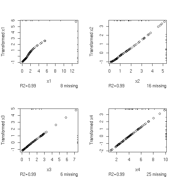
y1 <- impute(w,x1)
y2 <- impute(w,x2)
y3 <- impute(w,x3)
y4 <- impute(w,x4)
This yields:
> lm(y4~y1+y2+y3)

Call:
lm(formula = y4 ~ y1 + y2 + y3)

Coefficients:
(Intercept)           y1           y2           y3
    -0.4539       1.1403       1.2540       1.1498
On this example, the values are too high, but this is not always the case.
TODO: compare those three methods (discard, median, transcan)

# The transcan function changed since I wrote this code...
remove.higher.values <- function (x) {
  n <- length(x)
  ifelse( rbinom(n,1, ((x-min(x))/(max(x)+1))^.3 )==1 , NA, x)
}

N <- 100
# Discrad
c1 <- matrix(NA, nr=N, nc=4)
# Transcan
c2 <- matrix(NA, nr=N, nc=4)
# Median
c3 <- matrix(NA, nr=N, nc=4)
n <- 100
v <- .1
for (i in 1:N) {
  x1 <- rlnorm(n)
  x2 <- rlnorm(n)
  x3 <- rlnorm(n)
  x4 <- x1 + x2 + x3 + v*rlnorm(n)
  m1 <- cbind(x1,x2,x3,x4)
  x1 <- remove.higher.values(x1)
  x2 <- ifelse(sample(c(T,F),n,replace=T), NA, x2)
  x3 <- remove.higher.values(x3)
  x4 <- remove.higher.values(x4)
  m2 <- cbind(x1,x2,x3,x4)
  d <- data.frame(x1,x2,x3,x4)
  try( c1[i,] <- lm(x4~x1+x2+x3)$coefficients )
  w <- NULL
  try( w <- transcan(~x1+x2+x3+x4, imputed=T, transformed=T, impcat='tree', data=d) )
  if(!is.null(w)){
    y1 <- impute(w,x1,data=d)
    y2 <- impute(w,x2,data=d)
    y3 <- impute(w,x3,data=d)
    y4 <- impute(w,x4,data=d)
    try( c2[i,] <- lm(y4~y1+y2+y3)$coefficients )
  }
  median.impute <- function (x) {
    x[ is.na(x) ] <- median(x)
    x
  }
  y1 <- median.impute(x1)
  y2 <- median.impute(x2)
  y3 <- median.impute(x3)
  y4 <- median.impute(x4)
  try( c3[i,] <- lm(y4~x1+x2+x3)$coefficients )
}
boxplot(c2 ~ col(c2), col='pink')
abline(h=c(0,1),lty=3)
%--
If you compare those values with those you would get by simply discarding the subjects with at least one missing value, we wonder if imputation is that good an idea...
#%G
boxplot( cbind(c1,c3,c2) ~
         cbind( 3*col(c1)-2, 3*col(c3)-1, 3*col(c2)),
         border=c(par('fg'), 'red', 'blue')[rep(c(1,2,3),4)],
         ylim=c(-2,3)
       )
abline(h=c(0,1),lty=3)
legend( par("usr")[1], par("usr")[3], yjust=0,
        c("discard", "median", "transcan"),
        lwd=1, lty=1,
        col=c(par('fg'),'red', 'blue') )
title(main="Handling missing values")
%--
TODO: provide a more convincing example
TODO: Try to explain why the results are that bad. Transcan does not assume that the data are gaussian and first transforms them -- here, they were already gaussian. But it should not have a drastic effect.
There are other functions to impute missing values:
TODO
?transace
TODO:
# The "most related" variables
plot(varclus(~x1+x2+x3))
TODO: validate the imputations of the missing values (for instance, with bootstrap: one you have chosen a model, evaluate it on a 90% of the data and validate it on the remaining 10%).
TODO
You can handle them as the missing values.

TODO:
Explain how to spot them (graphically, looking at the variables one
at a time (boxplot, histogram, density, qqnorm), two at a timr
(pairs, PCA), looking at the residuals, etc.)
TODO: more details
TODO: other methods (clustering)
People can be tempted to test for the presence of outliers and remove them, automatically: we shall see that there are better ways ("robust methods") that this crude procedure.
TODO
See also "GAM" (Generalized Additive Models), later.
TODO: what is it?
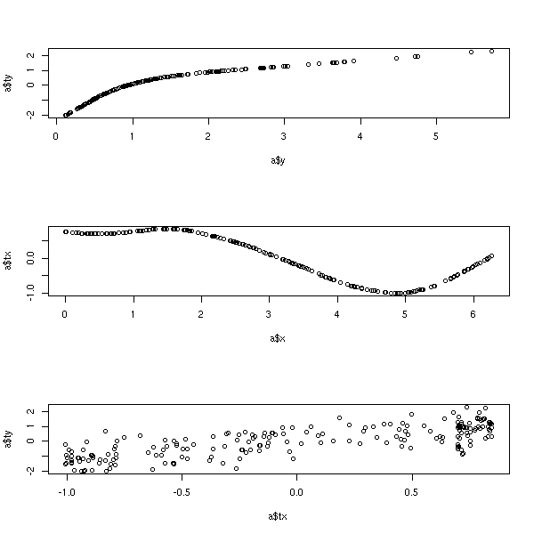
Find g, f1, ..., fn to maximize R^2 of the model
g(Y) = f1(X1) + ... + fn(Xn)

What is the difference with GAM?
We also transfrom the variable to predict

library(acepack)
?ace

Example from the manual

library(acepack)
TWOPI <- 8*atan(1)
x <- runif(200,0,TWOPI)
y <- exp(sin(x)+rnorm(200)/2)
a <- ace(x,y)
op <- par(mfrow=c(3,1))
plot(a$y,a$ty)  # view the response transformation
plot(a$x,a$tx)  # view the carrier transformation
plot(a$tx,a$ty) # examine the linearity of the fitted model
par(op)
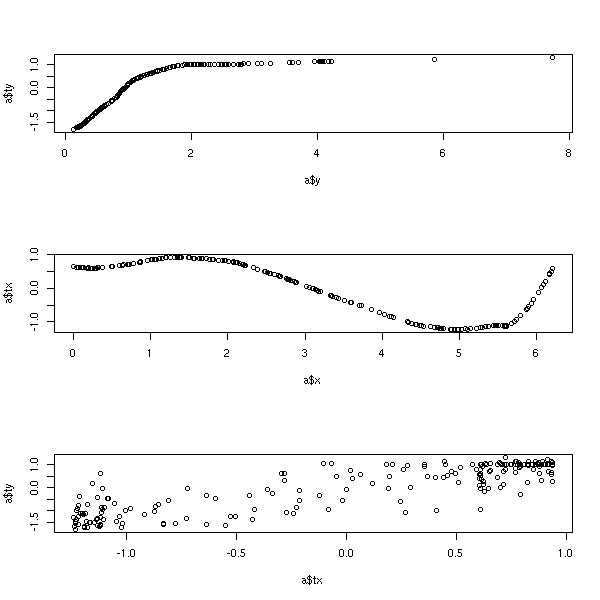
TODO
Similar to ACE.

library(acepack)
?avas

library(acepack)
TWOPI <- 8*atan(1)
x <- runif(200,0,TWOPI)
y <- exp(sin(x)+rnorm(200)/2)
a <- avas(x,y)
op <- par(mfrow=c(3,1))
plot(a$y,a$ty)  # view the response transformation
plot(a$x,a$tx)  # view the carrier transformation
plot(a$tx,a$ty) # examine the linearity of the fitted model
par(op)
TODO:
Complete this example.
Provide the data as a file.
Add missing data and outliers.
Add a test sample.
In the model, suggest and compare several methods (with bootstrap).

In particular:
  regression with and without transformation of the data
  handling of missing data: discard the observations
                            mean
                            median
  Linear regression, splines, svm, etc.
Consider the following data
              y          x1          x2        x3          x4       x5
1    0.17737252 0.255593371 -0.01877868 55.041698  1.06486649 1.601552
2    0.12867410 0.960419271 -0.19436940  1.198466  1.29289552 1.746549
3    0.13069250 0.863139268 -1.75373604  1.235540  1.62006050 1.474043
4    0.24660910 0.545280691  0.77253952  1.729689 -0.96193294 1.819215
5    0.06068440 0.678051326 -0.52889122  6.262365  2.02333474 2.784879
6    0.01562173 0.751754458 -1.15476842  1.525834  3.45646388 1.621467
7    0.12855980 0.440126896  0.48876004  3.591808  0.93048007 2.760134
8    0.01311403 0.387135598 -1.14240969  2.416364  3.60703700 1.664418
9    0.12805800 0.084511305 -1.35014687  5.811351  1.44654008 2.129711
10   0.07289424 0.216225055  1.94773238  1.629576  1.66476647 1.243259
11   0.20015592 0.375460150 -0.10764990 33.271750  0.60030701 2.554126
12   0.00967752 0.420041527 -0.69493709 15.786367  3.91269188 2.943540
13   0.18532207 0.252310834 -0.16696766  1.652677  1.09072717 1.570431
14   0.14099584 0.666372093  0.76253962  1.060118  0.34173217 1.363799
15   0.07331360 0.048310076  0.04428767  1.743556  1.92284974 1.517609
16   0.39708878 0.323382935  0.95223442  2.270229 -0.41723736 1.550922
17   0.12408025 0.044613951  0.41033758  3.831911  1.31146354 1.636827
18   0.12769826 0.053085268  0.59687579  1.908977  1.10201039 1.550858
19   0.20857330 0.972532847 -0.90311733  1.290658  1.26966839 1.447662
20   0.15594300 0.081915355 -1.15742730  1.405443  1.05322479 2.940306
21   0.37840463 0.649070143 -0.35228245  1.917989  0.36974761 1.356612
22   0.66522777 0.260343743 -2.47825418  4.795896  0.54582777 1.162321
23   0.63918773 0.513310948 -0.14159619  1.332781 -0.26621952 2.991911
24   0.11260928 0.543954646  1.06146044  6.681447  1.07751157 2.989188
25   0.09960026 0.403813454  0.55095958  7.279781  1.50800580 1.611078
26  -0.61535539 0.706742991 -1.20051134  7.564472 -0.56472250 2.157740
27   0.24971773 0.748126270 -0.26498237  1.117801  0.73077297 2.904779
28   0.06268585 0.764109087 -2.05296785  1.218234  2.24522236 2.527298
29   0.22153778 0.402428063  1.43230181  2.624402 -0.52847371 2.189166
30   0.21088420 0.497645303  1.47542866  1.518825 -0.19523074 1.472104
31   0.13608028 0.291170579 -1.46970914  1.516058  1.34040053 1.863857
32   0.75431108 0.478386517  0.31657036  1.225444 -0.58215047 2.218527
33   0.05093748 0.331470089 -0.07112817  1.007887  2.24270617 2.430400
34   0.04495159 0.261359577  1.14768074 13.174180  2.27230911 1.753251
35   0.19566843 0.129011235  0.32604949  2.475796  0.66536288 2.146549
36   0.46863291 0.067206315  0.86525243  1.208705 -0.62951123 2.062168
37  -1.74756315 0.378743229 -1.25873494  1.179726 -0.85146758 2.799012
38   0.04493936 0.617941440  0.10186404  1.103134  2.36010564 1.245357
39   0.08532079 0.659343313  1.47558024  1.515066  1.19388336 1.649593
40   0.10020669 0.203460848 -0.44762778  3.175103  1.38946612 2.967908
41 -16.03253190 0.110310319  0.01567256  2.266611 -0.26535524 2.495451
42   0.14614080 0.009384898 -0.22534736 15.678337  1.06682652 2.379440
43   0.16193855 0.985065327  0.28556123  5.103220  0.16327102 1.808208
44   0.04025704 0.749261997  0.65743242  4.235644  2.39118753 2.013844
45  -0.49303230 0.664672238 -1.42673466  1.111907 -0.73723968 1.532473
46   0.15835584 0.149211494 -0.23719301  3.172205  0.86034783 2.481339
47   0.27790539 0.165996711  0.64921865  3.399877 -0.06153391 2.339315
48   0.12971347 0.387604755  0.38543904  4.045104  1.05940996 2.211520
49   0.04955036 0.417031078  0.43766860  5.399120  2.17897848 2.339830
50   0.41876667 0.131038313  0.48986874  4.725115  0.33483485 1.238809
and try to predict y from x1, x2, x3, x4, x5
m <- read.table("faraway")
op <- par(mfrow=(c(6,1)))
for (i in 1:6) {
  boxplot(m[,i], horizontal=T, main=names(m)[i])
}
par(op)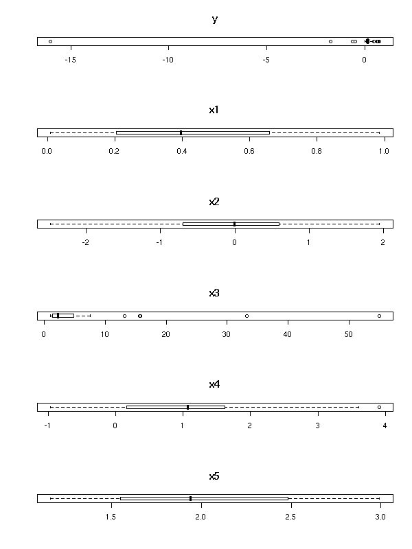
m <- read.table("faraway")
op <- par(mfrow=(c(3,2)))
for (i in 1:6) {
  hist(m[,i], col='light blue', probability=T, xlab=names(m)[i])
  lines(density(m[,i]), col='red', lwd=2)
}
par(op)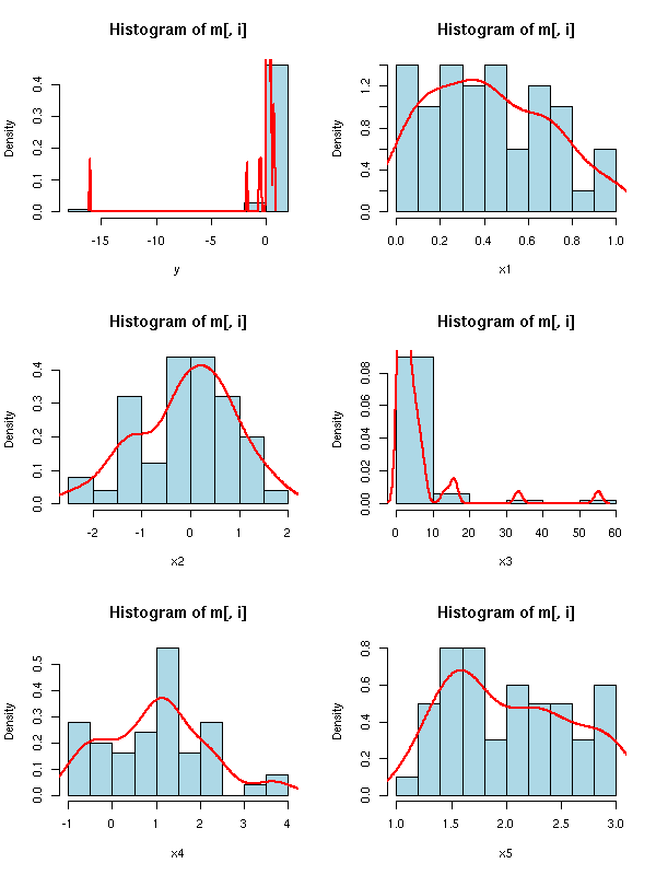
m <- read.table("faraway")
op <- par(mfrow=(c(3,2)))
for (i in 1:6) {
  qqnorm(m[,i], main=names(m)[i])
  qqline(m[,i], col='red')
}
par(op)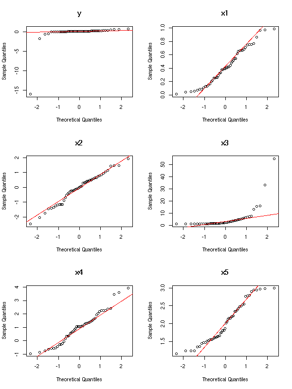
The variables y and x3 have to be transformed
TODO: find the transformation
TODO: redraw the plots for Y and X3
TODO: Are there still outliers? Remove them
This example comes from Faraway's book, who says he gave it it to his students who provides wildly differing results. The model is the following:
faraway.sample <- function (n=50) {
  n <- 50
  x1 <- runif(n)
  x2 <- rnorm(n)
  x3 <- 1/runif(n)
  x4 <- rnorm(n,1,1)
  x5 <- runif(n,1,3)
  e <- rnorm(n)
  y <- 1/(x1+.57*x1^2+4*x1*x2+2.1*exp(x4)+e)
  data.frame(y,x1,x2,x3,x4,x5)
}
TODO: check the quality of my forecasts

This work is licensed under a Creative Commons Attribution-NonCommercial-ShareAlike 2.5 License.
Vincent Zoonekynd
<zoonek@math.jussieu.fr>
latest modification on Sat Jan 6 10:28:21 GMT 2007