Graphics
LaTeX
Lattice (Treillis) plots
In this chapter (it tends to be overly comprehensive: consider it as a reference and feel free to skip it), we consider all the configurable details in graphics: symbols, colours, annotations (with text and mathematical symbols), grid graphics, but also LaTeX and GUI building with Tk. This chapter's object of interest is the graphic -- the previous chapter, still about graphics, was data-centric.
Things can be quite complicated because there are two sets of graphical functions: the classical ones and those, more complex but much more powerful, from the lattice and grid packages. We shall detail them in turn and finally explain how graphics can leave R: isolated PDF or PNG files, for inclusion of PDF (e.g., LaTeX) or HTML documents, use of interactive programs to look at the data, etc.
Here are the main functions that turn data into graphs. We do not detail them here, we shall come back on them when we have some data to provide them with.
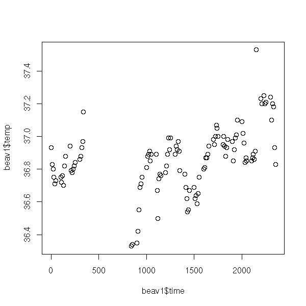
The "plot" function draw a set of points; it may link the points by a broken line.
The syntax "y ~ x" might look strange: it should be read "y as a function of x". We shall also use this syntax to describe the regression models. The can be more complex, for instance, "y ~ x1 + x2" means "y as a function of x1 and x2" and "y ~ x | z" means "y as a function of x for each value of z" (more about this later, when we tackle lattice plots and mixed models).
library(MASS)
data(beav1)
plot(beav1$temp ~ beav1$time)
x <- beav1$time
y <- beav1$temp
o <- order(x)
x <- x[o]
y <- y[o]
plot(y ~ x,
     type = "l",
     xlab = "Time",
     ylab = "Temperature",
     main = "The \"plot\" function, with type=\"l\"")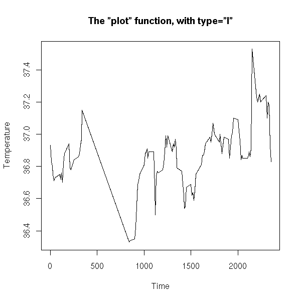
plot(y ~ x,
     type = "b",
     lwd = 3,
     xlim = c(0, 400),
     xlab = "Time",
     ylab = "Temperature",
     main = "The \"plot\" function, with type=\"b\"")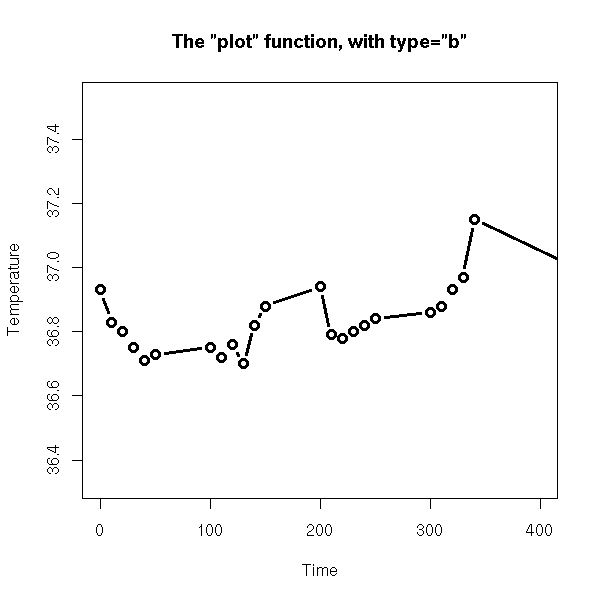
Actually, it is a generic function: it will behave in a different way depending on its argument type. If the argument belongs to the "toto" class, it will look for a "plot.toto" function; if it does not exist, it will fall back to the "plot.default" function. Among others, the "plot", "print", "summary", "predict" behave that way.
# What we would expect
> plot
function (x, y, ...)
UseMethod("plot")

# What we used to have
> plot
function (x, y, ...)
{
  if (is.null(attr(x, "class")) && is.function(x)) {
    if ("ylab" %in% names(list(...)))
      plot.function(x, ...)
    else plot.function(x, ylab = paste(deparse(substitute(x)),
      "(x)"), ...)
  }
  else UseMethod("plot")
}

# What we currently have (R-2.1.0)
> plot
function (x, y, ...)
{
    if (is.null(attr(x, "class")) && is.function(x)) {
        nms <- names(list(...))
        if (missing(y))
            y <- {
                if (!"from" %in% nms)
                  0
                else if (!"to" %in% nms)
                  1
                else if (!"xlim" %in% nms)
                  NULL
            }
        if ("ylab" %in% nms)
            plot.function(x, y, ...)
        else plot.function(x, y, ylab = paste(deparse(substitute(x)),
            "(x)"), ...)
    }
    else UseMethod("plot")
}
<environment: namespace:graphics>

> apropos("^plot\.")
 [1] "plot.data.frame" "plot.default"    "plot.density"    "plot.factor"
 [5] "plot.formula"    "plot.function"   "plot.histogram"  "plot.lm"
 [9] "plot.mlm"        "plot.mts"        "plot.new"        "plot.POSIXct"
[13] "plot.POSIXlt"    "plot.table"      "plot.ts"         "plot.TukeyHSD"
[17] "plot.window"     "plot.xy"

> methods(plot)
 [1] plot.acf*            plot.boot*           plot.correspondence*
 [4] plot.data.frame*     plot.Date*           plot.decomposed.ts*
 [7] plot.default         plot.dendrogram*     plot.density
[10] plot.ecdf            plot.EDAM*           plot.factor*
[13] plot.formula*        plot.hclust*         plot.histogram*
[16] plot.HoltWinters*    plot.isoreg*         plot.lda*
[19] plot.lm              plot.mca*            plot.medpolish*
[22] plot.mlm             plot.NaiveBayes*     plot.POSIXct*
[25] plot.POSIXlt*        plot.ppr*            plot.prcomp*
[28] plot.princomp*       plot.profile*        plot.profile.nls*
[31] plot.rda*            plot.ridgelm*        plot.shingle*
[34] plot.spec            plot.spec.coherency  plot.spec.phase
[37] plot.stepclass*      plot.stepfun         plot.stl*
[40] plot.table*          plot.ts              plot.tskernel*
[43] plot.TukeyHSD

 Non-visible functions are asterisked
To get the non-visible functions, you can use the "getAnywhere" function.
> plot.Date
Error: Object "plot.Date" not found

> getAnywhere("plot.Date")
A single object matching 'plot.Date' was found
It was found in the following places
  registered S3 method for plot from namespace graphics
  namespace:graphics
with value

function (x, y, xlab = "", axes = TRUE, frame.plot = axes, xaxt = par("xaxt"),
    ...)
{
    axisInt <- function(x, main, sub, xlab, ylab, col, lty, lwd,
        xlim, ylim, bg, pch, log, asp, ...) axis.Date(1, x, ...)
    plot.default(x, y, xaxt = "n", xlab = xlab, axes = axes,
        frame.plot = frame.plot, ...)
    if (axes && xaxt != "n")
        axisInt(x, ...)
}
<environment: namespace:graphics>

> str( getAnywhere("plot.Date") )
List of 5
 $ name   : chr "plot.Date"
 $ objs   :List of 2
  ..$ :function (x, y, xlab = "", axes = TRUE,
                 frame.plot = axes, xaxt = par("xaxt"),
                 ...)
  ..$ :function (x, y, xlab = "", axes = TRUE,
                 frame.plot = axes, xaxt = par("xaxt"),
                 ...)
 $ where  : chr [1:2] "registered S3 method for plot from namespace graphics"
                      "namespace:graphics"
 $ visible: logi [1:2] FALSE FALSE
 $ dups   : logi [1:2] FALSE  TRUE
 - attr(*, "class")= chr "getAnywhere"

> str( getAnywhere("plot.Date")$objs[[1]] )
function (x, y, xlab = "", axes = TRUE,
          frame.plot = axes, xaxt = par("xaxt"),
          ...)

> getAnywhere("plot.Date")$objs[[1]]
function (x, y, xlab = "", axes = TRUE,
          frame.plot = axes, xaxt = par("xaxt"),
          ...)
{
    axisInt <- function(x, main, sub, xlab, ylab, col, lty, lwd,
        xlim, ylim, bg, pch, log, asp, ...) axis.Date(1, x, ...)
    plot.default(x, y, xaxt = "n", xlab = xlab, axes = axes,
        frame.plot = frame.plot, ...)
    if (axes && xaxt != "n")
        axisInt(x, ...)
}
<environment: namespace:graphics>
TODO: the following examples should be as simple as possible, just the function, with NO optional arguments. A second example can be graphically more appealling, but the first should be provides by readable code.
The "matplot" can plot several curves at the same time.
x <- as.matrix( EuStockMarkets[1:50,] )
matplot(x,                 # By default: not lines,
        main = "matplot",  # but unconnected coloured numbers
        xlab = "",
        ylab = "")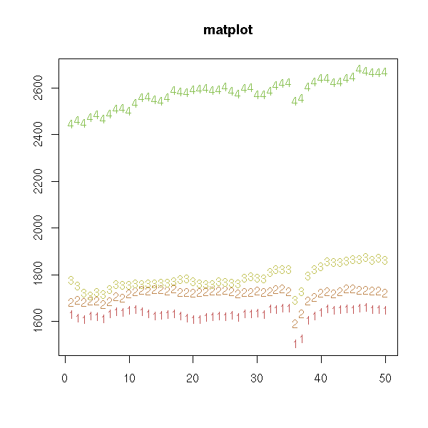
matplot(x,
        type = "l",    # Lines -- but I am not happy
        lty = 1,       # with the axes
        xlab = "",
        ylab = "",
        main = "matplot")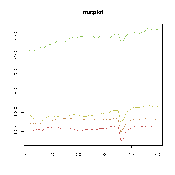
x <- as.matrix( EuStockMarkets )
matplot(time(EuStockMarkets),
        x,
        log = "y",
        type = 'l',
        lty = 1,
        ylab = "Closing price",
        xlab = "Date",
        main = "matplot",
        axes = FALSE)
axis(1)
axis(2)
box()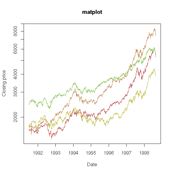
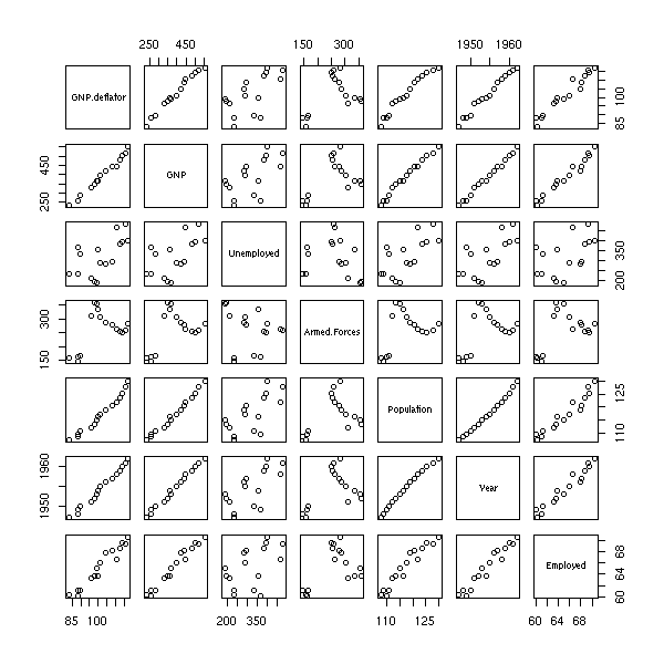
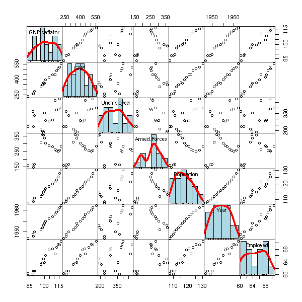
The "pairs" command plots a "matrix of scatterplots" (aka "splom", for ScatterPLOt Matrix).
pairs(longley)
pairs(longley,
      gap=0,
      diag.panel = function (x, ...) {
        par(new = TRUE)
        hist(x,
             col = "light blue",
             probability = TRUE,
             axes = FALSE,
             main = "")
        lines(density(x),
              col = "red",
              lwd = 3)
        rug(x)
      })
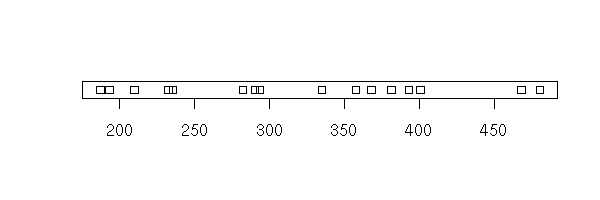
The "stripchart" plots a 1-dimensional cloud of points.
stripchart(longley$Unemployed)
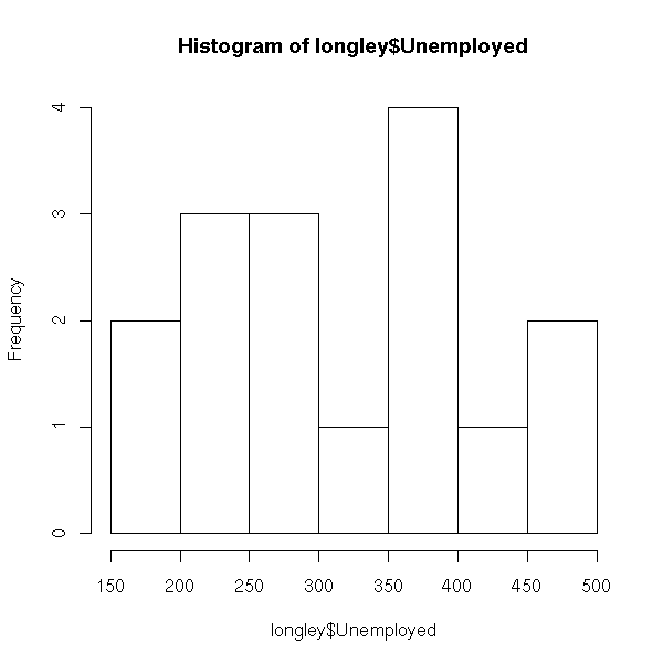
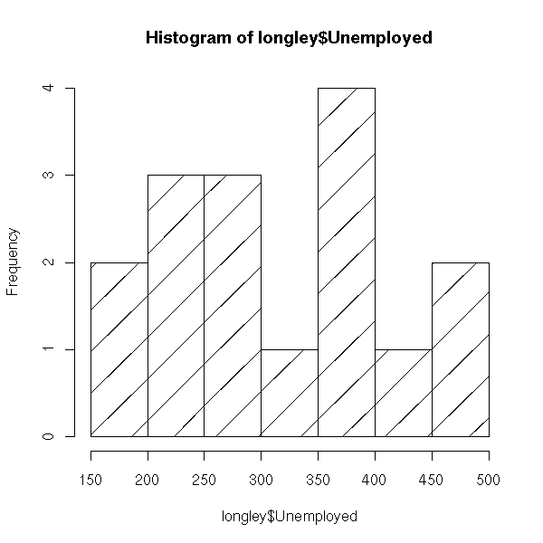
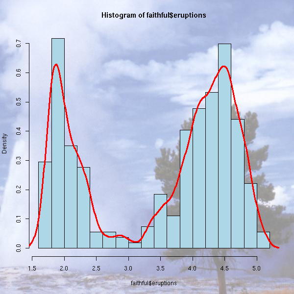
The "hist" command plots a histogram.
hist(longley$Unemployed)
hist(longley$Unemployed,
     probability = TRUE,    # Change the vertical units,
                            # to overlay a density estimation
     col = "light blue")
lines(density(longley$Unemployed),
      col = "red",
      lwd = 3)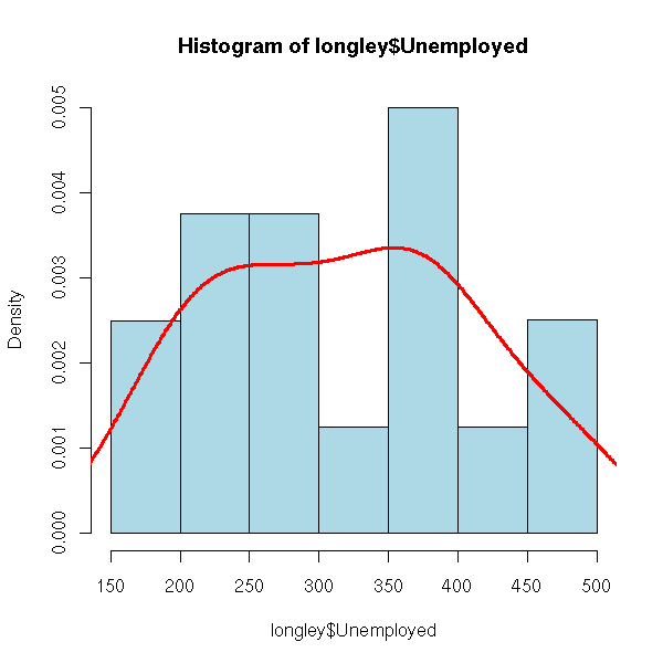
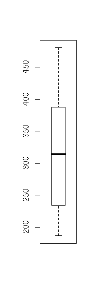
The "boxplot" command displays one or several box-and-whiskers diagram(s).
boxplot(longley$Unemployed)
boxplot(longley$Unemployed,
        horizontal = TRUE,
        col = "pink",
        main = "Box-and-whiskers plot (boxplot)")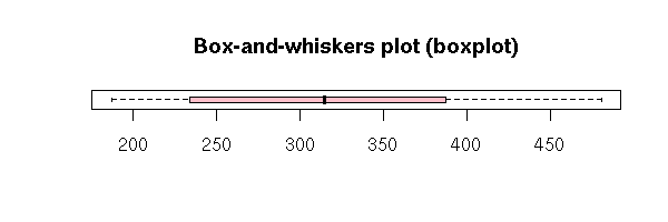
data(InsectSprays)
boxplot(count ~ spray,
        data = InsectSprays,
        col = "pink",
        xlab = "Spray",
        ylab = "Count",
        main = "Insect sprays")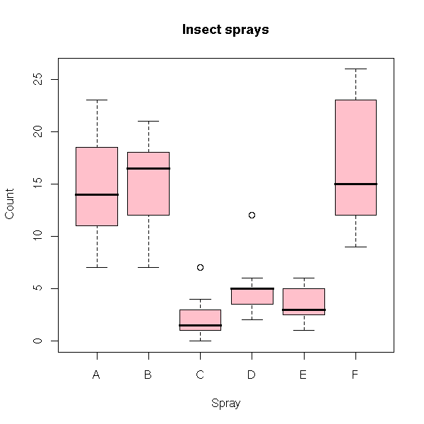
boxplot(count ~ spray,
        data = InsectSprays,
        col = "pink",
        horizontal = TRUE,
        las = 1,            # Horizontal labels
        xlab = "Count",
        ylab = "Spray",
        main = "Insect sprays")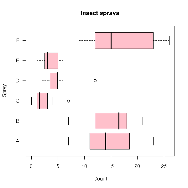
The "contour" function displays a contour plot (I sometimes use it to look at a likelihood function or a bidimensioinal density, estimated with the "kde2d" function).
N <- 50
x <- seq(-1, 1, length=N)
y <- seq(-1, 1, length=N)
xx <- matrix(x, nr=N, nc=N)
yy <- matrix(y, nr=N, nc=N, byrow=TRUE)
z <- 1 / (1 + xx^2 + (yy + .2 * sin(10*yy))^2)
contour(x, y, z,
        main = "Contour plot")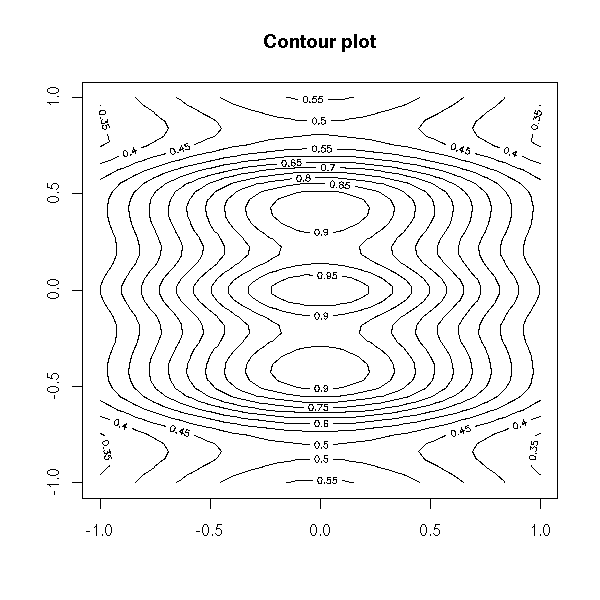
The image function plots the same information, with colours.
image(z)
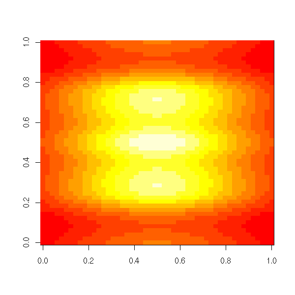
image(x, y, z,
      xlab = "",
      ylab = "")
contour(x, y, z, lwd=3, add=TRUE)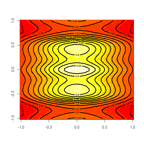
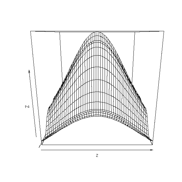
The "persp" function draw a 3D surface.
persp(z)
op <- par(mar=c(0,0,3,0)+.1)
persp(x, y, z,
      theta = 45, phi = 30,
      shade = .5,
      col = rainbow(N),
      border = "green",
      main = "perspective plot, theta=45, phi=30")
par(op)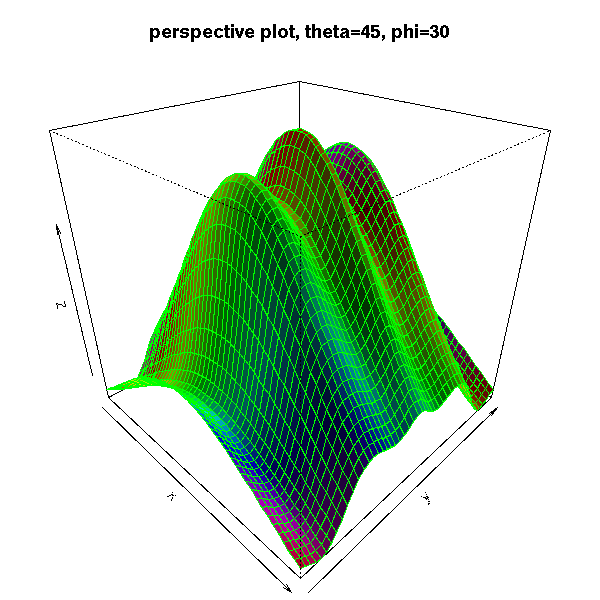
# From the manual: the sinc function
x <- seq(-10, 10, length= 30)
y <- x
f <- function(x,y) { r <- sqrt(x^2+y^2); 10 * sin(r)/r }
z <- outer(x, y, f)
z[is.na(z)] <- 1
op <- par(bg = "white", mar=c(0,2,3,0)+.1)
persp(x, y, z,
      theta = 30, phi = 30,
      expand = 0.5,
      col = "lightblue",
      ltheta = 120,
      shade = 0.75,
      ticktype = "detailed",
      xlab = "X", ylab = "Y", zlab = "Sinc(r)",
      main = "The sinc function"
)
par(op)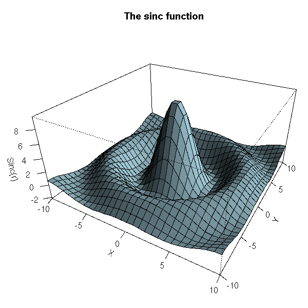
Here are a few ways of configuring those graphics.
You can add a title, change the name of the axes.
n <- 100
x <- rnorm(n)
y <- 1 - x^2 + .3*rnorm(n)
plot(y ~ x,
     xlab = 'X axis',
     ylab = "Y axis",
     main = "Title")
You can also add the title and the axes names afterwards, with the "title" function.
plot(y ~ x,
     xlab = "",
     ylab = "",
     main = "")
title(main = "Title",
      xlab = "X axis",
      ylab = "Y axis")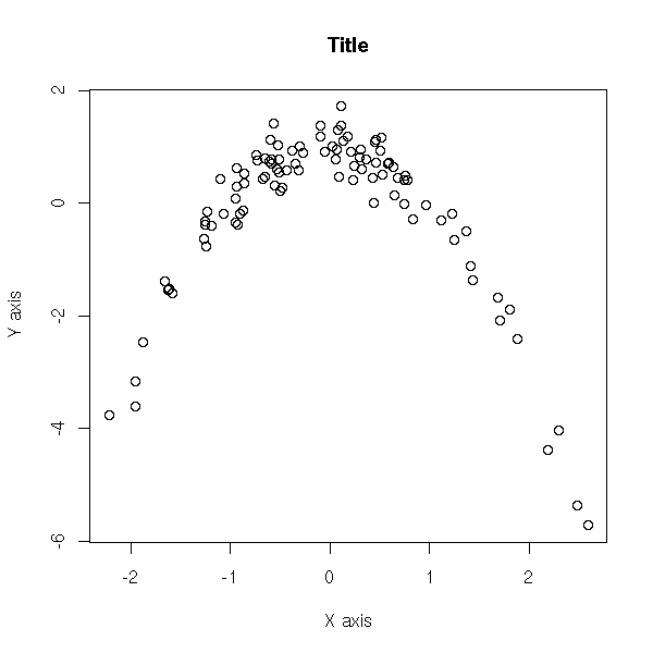
The "text" function allows you to add text in the plot.
set.seed(1)
plot.new()
plot.window(xlim=c(0,1), ylim=c(0,1))
box()
N <- 50
text(
  runif(N), runif(N),
  sample(    # Random words...
    scan("/usr/share/dict/cracklib-small", character(0)),
    N
  )
)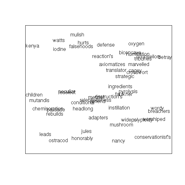
TODO: the "adj" and "pos" arguments...
The "mtext" function allows you to add text in the margin of the plot -- for instance, if your plot has a title and a subtitle, or if you need two different y axes, one on each side of the plot.
N <- 200
x <- runif(N, -4, 4)
y <- sin(x) + .5 * rnorm(N)
plot(x, y,
     xlab = "", ylab = "",
     main = paste("The \"mtext\" function",
                  paste(rep(" ", 60), collapse="")))
mtext("Line 0", 3, line=0)
mtext("Line 1", 3, line=1)
mtext("Line 2", 3, line=2)
mtext("Line 3", 3, line=3)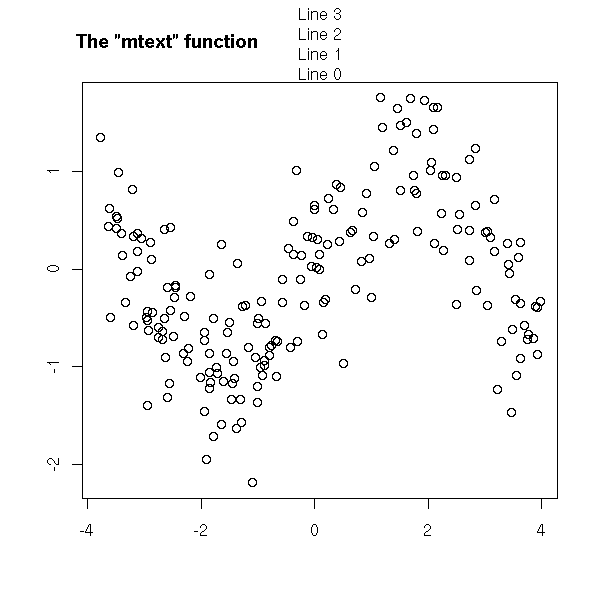
N <- 200
x <- runif(N, -4, 4)
y <- sin(x) + .5 * rnorm(N)
plot(x, y, xlab="", ylab="", main="")
mtext("Subtitle", 3, line=.8)
mtext("Title",    3, line=2, cex=1.5)
mtext("X axis", 1,          line=2.5, cex=1.5)
mtext("X axis subtitle", 1, line=3.7)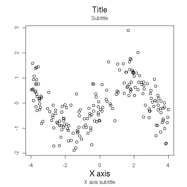
N  <- 200
x  <- seq(-4,4, length=N)
y1 <- sin(x)
y2 <- cos(x)
op <- par(mar=c(5,4,4,4)) # Add some space in the right margin
                          # The default is c(5,4,4,2) + .1
xlim <- range(x)
ylim <- c(-1.1, 1.1)
plot(x, y1, col="blue", type="l",
     xlim=xlim, ylim=ylim,
     axes=F, xlab="", ylab="", main="Title")
axis(1)
axis(2, col="blue")
par(new=TRUE)
plot(x, y2, col="red", type="l",
     xlim=xlim, ylim=ylim,
     axes=F, xlab="", ylab="", main="")
axis(4, col="red")
mtext("First Y axis",  2, line=2, col="blue", cex=1.2)
mtext("Second Y axis", 4, line=2, col="red",  cex=1.2)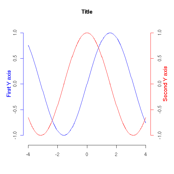
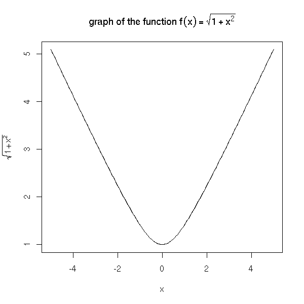
The text may contain mathematical symbols.
x <- seq(-5,5,length=200)
y <- sqrt(1+x^2)
plot(y~x, type='l',
     ylab=expression( sqrt(1+x^2) ))
title(main=expression(
  "graph of the function f"(x) == sqrt(1+x^2)
))
You can also start with such a formula and dynamically change a part of it -- typically, to insert the numeric value of a variable.
x <- seq(-5,5,length=200)
op <- par(mfrow=c(2,2))
for (i in 1:4) {
  y <- sqrt(i+x^2)
  plot(y ~ x,
       type = 'l',
       ylim = c(0,6),
       ylab = substitute(
         expression( sqrt(i+x^2) ),
         list(i=i)
       ))
  title(main = substitute(
    "graph of the function f"(x) == sqrt(i+x^2),
    list(i=i)))
}
par(op)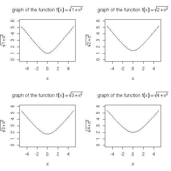
Here are a few examples from the manual.
# From the manual
plot(1:10, 1:10, main = "text(...) examples\n~~~~~~~~~~~~~~",
     sub = "R is GNU ©, but not ® ...")
mtext("«ISO-accents»: ± éè øØ å<Å æ<Æ", side=3)
points(c(6,2), c(2,1), pch = 3, cex = 4, col = "red")
text(6, 2, "the text is CENTERED around (x,y) = (6,2) by default",
     cex = .8)
text(2, 1, "or Left/Bottom - JUSTIFIED at (2,1) by `adj = c(0,0)'",
     adj = c(0,0))
text(4, 9, expression(hat(beta) == (X^t * X)^{-1} * X^t * y))
text(4, 8.4, "expression(hat(beta) == (X^t * X)^{-1} * X^t * y)", cex = .75)
text(4, 7, expression(bar(x) == sum(frac(x[i], n), i==1, n)))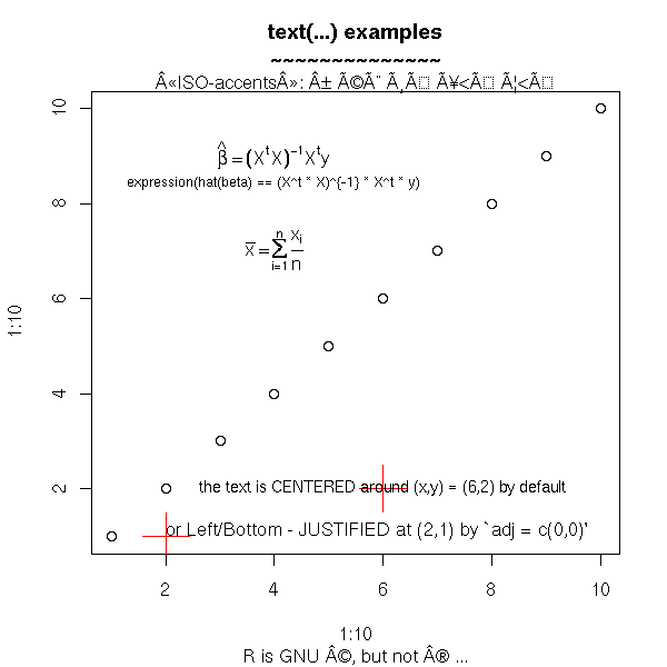
You can even write in Japanese.
?Japanese

# From the manual
plot(1:9, type="n", axes=FALSE, frame=TRUE, ylab="",
     main= "example(Japanese)", xlab= "using Hershey fonts")
par(cex=3)
Vf <- c("serif", "plain")
text(4, 2, "\\#J2438\\#J2421\\#J2451\\#J2473", vfont = Vf)
text(4, 4, "\\#J2538\\#J2521\\#J2551\\#J2573", vfont = Vf)
text(4, 6, "\\#J467c\\#J4b5c", vfont = Vf)
text(4, 8, "Japan", vfont = Vf)
par(cex=1)
text(8, 2, "Hiragana")
text(8, 4, "Katakana")
text(8, 6, "Kanji")
text(8, 8, "English")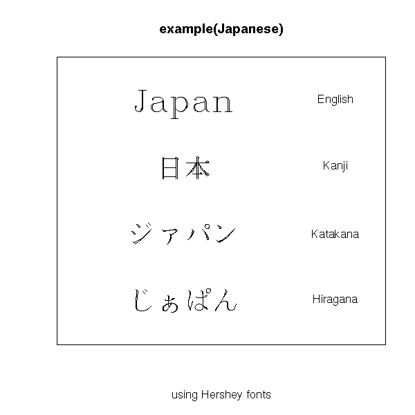
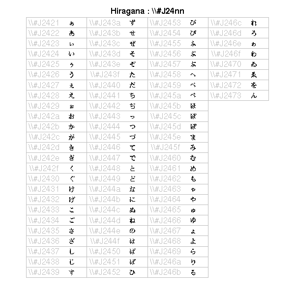
# Other example from the manual
# (it also contains katakana and kanji tables)
make.table <- function(nr, nc) {
  opar <- par(mar=rep(0, 4), pty="s")
  plot(c(0, nc*(10%/%nc) + 1), c(0, -(nr + 1)),
       type="n", xlab="", ylab="", axes=FALSE)
  invisible(opar)
}

get.r <- function(i, nr)   i %% nr + 1
get.c <- function(i, nr)   i %/% nr + 1
Esc2 <- function(str)      paste("\\", str, sep="")

draw.title <- function(title, nc)
  text((nc*(10%/%nc) + 1)/2, 0, title, font=2)

draw.vf.cell <- function(typeface, fontindex, string, i, nr, raw.string=NULL) {
  r <- get.r(i, nr)
  c <- get.c(i, nr)
  x0 <- 2*(c - 1)
  if (is.null(raw.string)) raw.string <- Esc2(string)
  text(x0 + 1.1, -r, raw.string, col="grey")
  text(x0 + 2,   -r, string, vfont=c(typeface, fontindex))
  rect(x0 +  .5, -(r - .5), x0 + 2.5, -(r + .5), border="grey")
}

draw.vf.cell2 <- function(string, alt, i, nr) {
  r <- get.r(i, nr)
  c <- get.c(i, nr)
  x0 <- 3*(c - 1)
  text(x0 + 1.1, -r, Esc2(string <- Esc2(string)), col="grey")
  text(x0 + 2.2, -r, Esc2(Esc2(alt)), col="grey", cex=.6)
  text(x0 + 3,   -r, string, vfont=c("serif", "plain"))
  rect(x0 +  .5, -(r - .5), x0 + 3.5, -(r + .5), border="grey")
}

tf <- "serif"
fi <- "plain"
nr <- 25
nc <- 4
oldpar <- make.table(nr, nc)
index <- 0
digits <- c(0:9,"a","b","c","d","e","f")
draw.title("Hiragana : \\\\#J24nn", nc)
for (i in 2:7) {
  for (j in 1:16) {
    if (!((i == 2 && j == 1) || (i == 7 && j > 4))) {
      draw.vf.cell(tf, fi, paste("\\#J24", i, digits[j], sep=""),
                   index, nr)
      index <- index + 1
    }
  }
}
You can choose the line colour,
plot(runif(5), ylim=c(0,1), type='l')
for (i in c('red', 'blue', 'green')) {
  lines( runif(5), col=i )
}
title(main="Lines in various colours")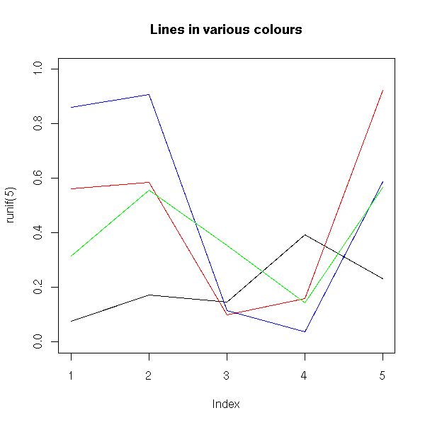
their width,
plot(runif(5), ylim=c(0,1), type='n')
for (i in 5:1) {
  lines( runif(5), col=i, lwd=i )
}
title(main = "Varying the line thickness")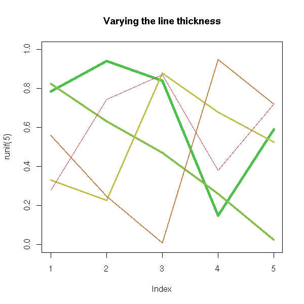
their type,
op <- par(mfrow=c(3,2))
plot(runif(5), type = 'p',
     main = "plot type 'p' (points)")
plot(runif(5), type = 'l',
     main = "plot type 'l' (lines)")
plot(runif(5), type = 'b',
     main = "plot type 'b' (both points and lines)")
plot(runif(5), type = 's',
     main = "plot type 's' (stair steps)")
plot(runif(5), type = 'h',
     main = "plot type 'h' (histogram)")
plot(runif(5), type = 'n',
     main = "plot type 'n' (no plot)")
par(op)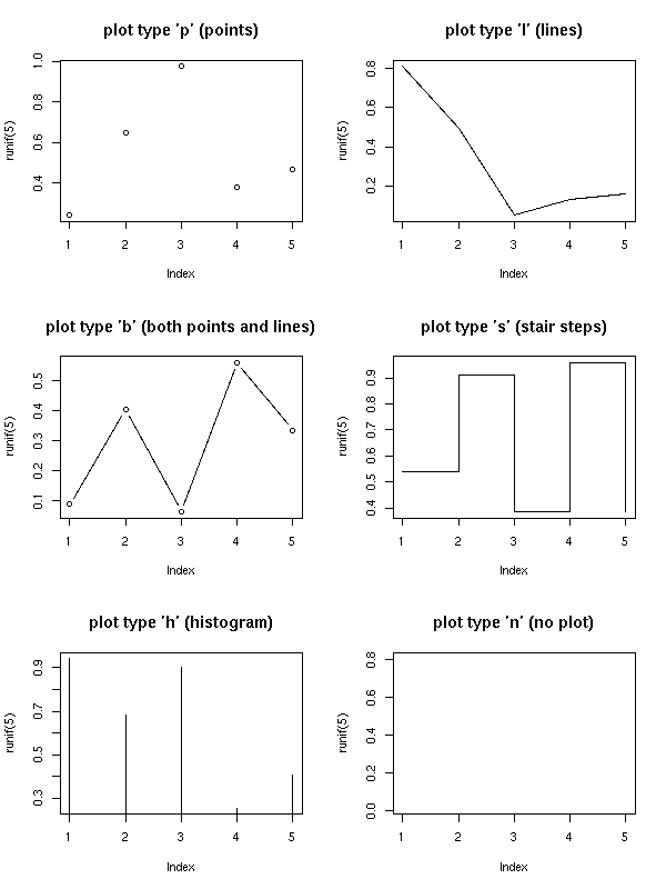
the line type (lty),
op <- par(mfrow=c(3,2), mar=c(3,1,5,1))
plot(runif(5), lty = 1,
     axes = FALSE, type = "l", lwd = 3,
     main = "lty = 1 (default, solid)")
plot(runif(5), lty = 2,
     axes = FALSE, type = "l", lwd = 3,
     main = "lty = 2 (dashed)")
plot(runif(5), lty = 3,
     axes = FALSE, type = "l", lwd = 3,
     main = "lty = 3 (dotted)")
plot(runif(5), lty = "dotdash",
     axes = FALSE, type = "l", lwd = 3,
     main = "lty = 4 (dot, dash)")
plot(runif(5), lty = "longdash",
     axes = FALSE, type = "l", lwd = 3,
     main = "lty = 5 (longdash)")
plot(runif(5), lty = "twodash",
     axes = FALSE, type = "l", lwd = 3,
     main = "lty = 6 (twodash)")
par(op)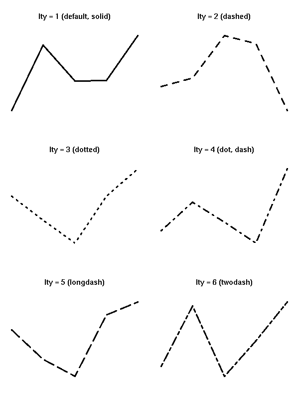
# You can also cook up your own line type
# by providing the length of each segment and
# each space
op <- par(mfrow=c(2,2), mar=c(3,1,5,1))
for (lty in c("42", "14", "8222", "82624222")) {
  plot(runif(5), lty = lty,
     axes = FALSE, type = "l", lwd = 3,
     main = paste("lty =", lty))
}
par(op)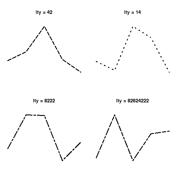
the symbols used (pch) or their size (cex),
op <- par(mar=c(1,1,4,1)+.1)
plot(0,0,
     xlim = c(1,5), ylim = c(-.5,4),
     axes = F,
     xlab = '', ylab = '',
     main = "Available symbols")
for (i in 0:4) {
  for (j in 1:5) {
    n <- 5*i+j
    points(j, i,
           pch = n,
           cex = 3)
    text(j,i-.25, as.character(n))
  }
}
par(op)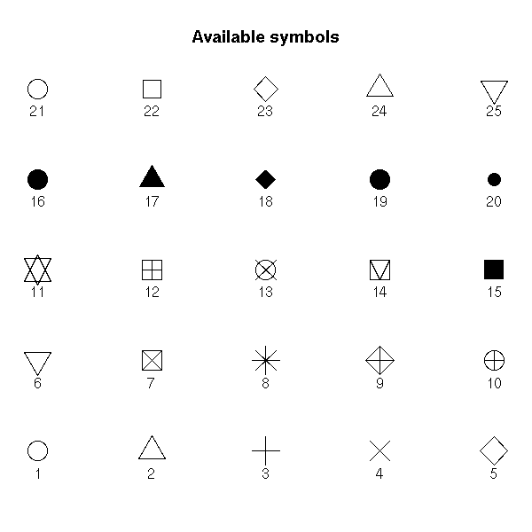
The "density" and "angle" options add shading lines.
hist(longley$Unemployed, density=3, angle=45)
You can also put several graphics in a simgle picture. It might then be necessary to modify the margins to leave some room for the title. The easiest way is through the "mfrow" or "mfcol" argument of the "par" function. (With "mfrow", the plots are first placed in the first row, then the second, etc.; with "mfcol", the plots are first placed in the first column, the the second, etc.)
op <- par(mfrow = c(2, 2))
for (i in 1:4)
  plot(runif(20), runif(20),
       main=paste("random plot (",i,")",sep=''))
par(op)
mtext("Four plots, without enough room for this title",
       side=3, font=2, cex=2, col='red')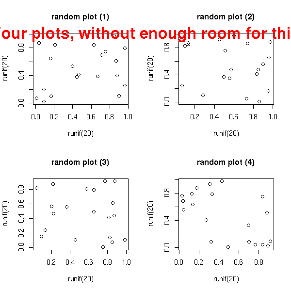
op <- par(mfrow = c(2, 2),
          oma = c(0,0,3,0)   # Outer margins
         )
for (i in 1:4)
  plot(runif(20), runif(20),
       main=paste("random plot (",i,")",sep=''))
par(op)
mtext("Four plots, with some room for this title",
      side=3, line=1.5, font=2, cex=2, col='red')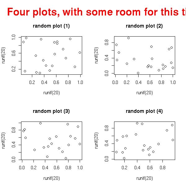
op <- par(mfrow = c(2, 2),
          oma = c(0,0,3,0),
          mar = c(3,3,4,1) + .1     # Margins
         )
for (i in 1:4)
  plot(runif(20), runif(20),
       xlab = "", ylab = "",
       main=paste("random plot (",i,")",sep=''))
par(op)
mtext("Title",
      side=3, line=1.5, font=2, cex=2, col='red')
par(op)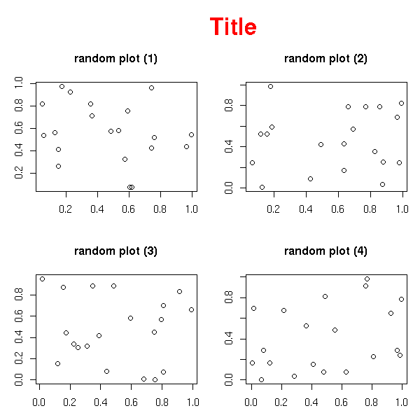
You can also superimpose several graphics, by playing with the "fig" graphical parameter.
n <- 20
x <- rnorm(n)
y <- x^2 - 1 + .3*rnorm(n)
plot(y ~ x,
     main = "The \"fig\" graphic parameter")
op <- par()
for (i in 2:10) {
  done <- FALSE
  while(!done) {
    a <- c( sort(runif(2,0,1)),
            sort(runif(2,0,1)) )
    par(fig=a, new=T)
    r <- try(plot(runif(5), type='l', col=i))
    done <- !inherits(r, "try-error")
  }
}
par(op)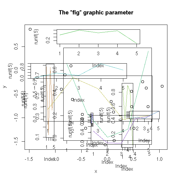
n <- 1000
x <- rt(n, df=10)
hist( x,
      col = "light blue",
      probability = "TRUE",
      ylim = c(0, 1.2*max(density(x)$y)))
lines(density(x),
      col = "red",
      lwd = 3)
op <- par(fig = c(.02,.4,.5,.98),
          new = TRUE)
qqnorm(x,
       xlab = "", ylab = "", main = "",
       axes = FALSE)
qqline(x, col = "red", lwd = 2)
box(lwd=2)
par(op)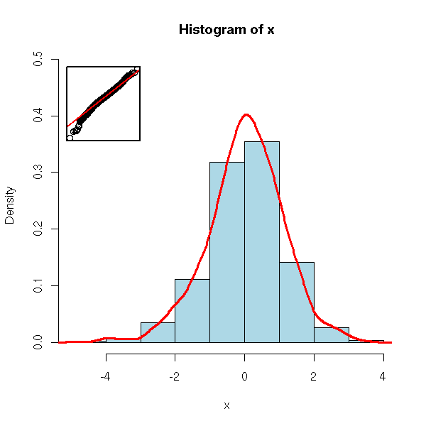
For slightly more complicated layouts, you can use the "layout" function.
op <- par(oma = c(0,0,3,0))
layout(matrix(c(1, 1, 1,
                2, 3, 4,
                2, 3, 4), nr = 3, byrow = TRUE))
hist( rnorm(n), col = "light blue" )
hist( rnorm(n), col = "light blue" )
hist( rnorm(n), col = "light blue" )
hist( rnorm(n), col = "light blue" )
mtext("The \"layout\" function",
      side = 3, outer = TRUE,
      font = 2, size = 1.2)
par(op)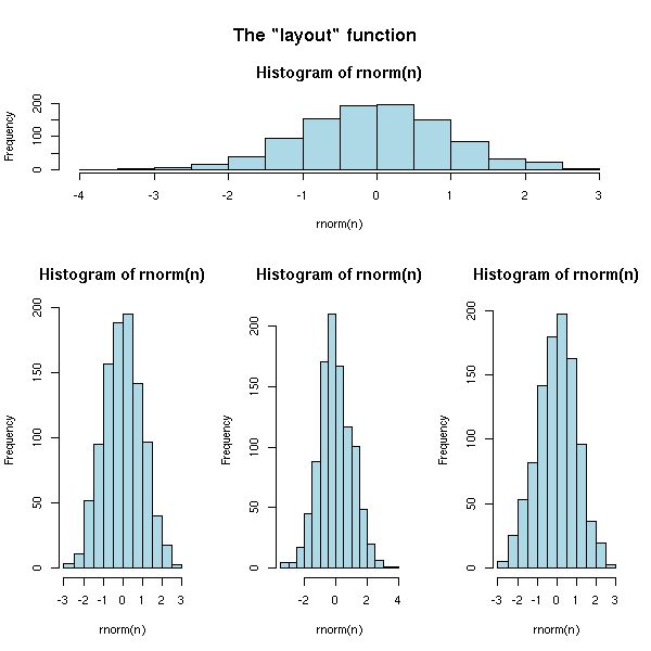
There is also a "split.screen" function -- completely incompatible with the above.
random.plot <- function () {
  N <- 200
  f <- sample(list(rnorm,
                   function (x) { rt(x, df=2) },
                   rlnorm,
                   runif),
              1) [[1]]
  x <- f(N)
  hist(x, col="light blue", main="", xlab="", ylab="", axes=F)
  axis(1)
}
op <- par(bg="white", mar=c(2.5,2,1,2))
split.screen(c(2,1))
split.screen(c(1,3), screen = 2)
screen(1); random.plot()
#screen(2); random.plot() # Screen 2 was split into three screens: 3, 4, 5
screen(3); random.plot()
screen(4); random.plot()
screen(5); random.plot()
close.screen(all=TRUE)
par(op)
You can add several graphical elements: either with certain commands, that do not start a new graphic ("points", "lines", "segments", "text"); or by adding "add=T" to commands that normally start a new picture; or with "par(new=TRUE)" which asks NOT to start a new picture.
plot(runif(5), runif(5),
     xlim = c(0,1), ylim = c(0,1))
points(runif(5), runif(5),
       col = 'orange', pch = 16, cex = 3)
lines(runif(5), runif(5),
      col = 'red')
segments(runif(5), runif(5), runif(5), runif(5),
         col = 'blue')
title(main = "Overlaying points, segments, lines...")
You can paint parts of the drawing area with the "polygon" command.
my.col <- function (f, g, xmin, xmax, col, N=200,
                    xlab="", ylab="", main="") {
  x <- seq(xmin, xmax, length = N)
  fx <- f(x)
  gx <- g(x)
  plot(0, 0, type = 'n',
       xlim = c(xmin,xmax),
       ylim = c( min(fx,gx), max(fx,gx) ),
       xlab = xlab, ylab = ylab, main = main)
  polygon( c(x,rev(x)), c(fx,rev(gx)),
           col = 'red', border = 0 )
  lines(x, fx, lwd = 3)
  lines(x, gx, lwd = 3)
}
op <- par(mar=c(3,3,4,1)+.1)
my.col( function(x) x^2, function(x) x^2+10*sin(x),
        -6, 6,
        main = "The \"polygon\" function")
par(op)
TODO: Example with two colours.
You can define colors with a number, a character string giving its English name (such as "light blue" -- the complete list in in the "rgb.txt" file) or with a character string containing its RGB (or RGBA) code (such as "#CC00FF").
The "rainbow", "heat.color", etc. commands provide colour lists.
# From the manual
ch.col <- c("rainbow(n, start=.7, end=.1)",
            "heat.colors(n)",
            "terrain.colors(n)",
            "topo.colors(n)",
            "cm.colors(n)")
n <- 16
nt <- length(ch.col)
i <- 1:n
j <- n/nt
d <- j/6
dy <- 2*d
plot(i, i+d,
     type="n",
     yaxt="n",
     ylab="",
     main=paste("color palettes;  n=",n))
for (k in 1:nt) {
  rect(i-.5, (k-1)*j+ dy, i+.4,  k*j,
       col = eval(parse(text=ch.col[k])))
  text(2*j,  k * j +dy/4, ch.col[k])
}
The "legend" command adds a legend to the graphic.
TODO:
Explain the "xjust" and "yjust" arguments.
In ALL the graphics of this document, use both arguments.
After that, proofread the HTML/PNG result to check the legend did
not disappear.
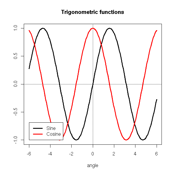
x <- seq(-6,6,length=200)
y <- sin(x)
z <- cos(x)
plot(y~x, type='l', lwd=3,
ylab='', xlab='angle', main="Trigonometric functions")
abline(h=0,lty=3)
abline(v=0,lty=3)
lines(z~x, type='l', lwd=3, col='red')
legend(-6,-1, yjust=0,
c("Sine", "Cosine"),
lwd=3, lty=1, col=c(par('fg'), 'red'),
)
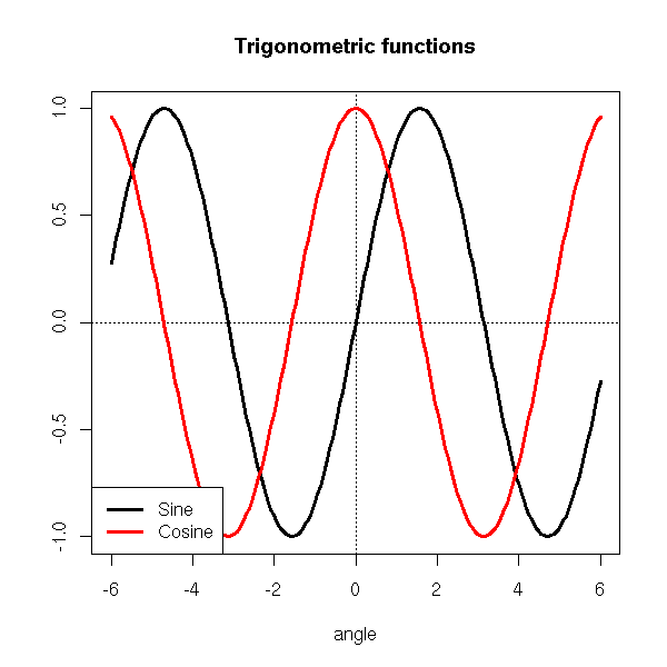
To precisely set its position, you may use the picture limits.
xmin <- par('usr')[1]
xmax <- par('usr')[2]
ymin <- par('usr')[3]
ymax <- par('usr')[4]

TODO: Example using those
One can also use keywords to identify a corner.
plot(y~x, type='l', lwd=3,
     ylab='', xlab='angle', main="Trigonometric functions")
abline(h=0,lty=3)
abline(v=0,lty=3)
lines(z~x, type='l', lwd=3, col='red')
legend("bottomleft",
       c("Sine", "Cosine"),
       lwd=3, lty=1, col=c(par('fg'), 'red'),
      )
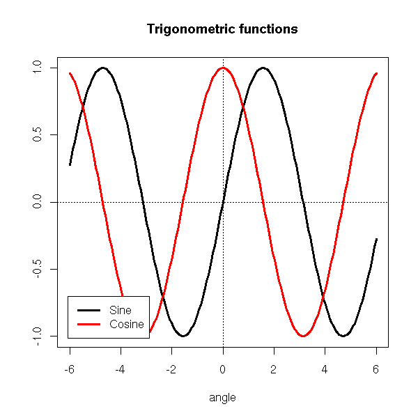
The "inset" argument allows you to move the legend away from the plot.
plot(y~x, type='l', lwd=3,
     ylab='', xlab='angle', main="Trigonometric functions")
abline(h=0,lty=3)
abline(v=0,lty=3)
lines(z~x, type='l', lwd=3, col='red')
legend("bottomleft",
       c("Sine", "Cosine"),
       inset = c(.03, .03),
       lwd=3, lty=1, col=c(par('fg'), 'red'),
      )
You can also put the legend outside the plot.
op <- par(no.readonly=TRUE)
plot(y~x, type='l', lwd=3,
     ylab='', xlab='angle', main="Trigonometric functions")
abline(h=0,lty=3)
abline(v=0,lty=3)
lines(z~x, type='l', lwd=3, col='red')
par(xpd=TRUE)  # Do not clip to the drawing area
lambda <- .025
legend(par("usr")[1],
       (1 + lambda) * par("usr")[4] - lambda * par("usr")[3],
       c("Sine", "Cosine"),
       xjust = 0, yjust = 0,
       lwd=3, lty=1, col=c(par('fg'), 'red'),
      )
par(op)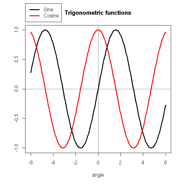
labcurve in Hmisc : to put the name of the curve on the
curve (and not in a remote legend)
You can also add a grid behind a picture to ease its interpretation.
?grid
You can also draw the graphic on a background (a gradient a a pastel image): just save the graphic as a PNG file (using the "png" function), with a transparent background, and composite it with the picture you have chosen with the "composite" command (from ImageMagick) -- you are supposed to type this in a shell (if you are under Windoze, you are on your own: it is too complicated for me).
composite faithful_hist_orig.png faithful600_light.jpg faithful_hist.png
TODO
The "locator" command gives the coordinates of the position of the mouse when the user clicked.
The "identify" gives the name of the plotted point nearest to the position of the mouse when the user clicked.
For more interactivity, you can use Tk (a simple library to build GUI) or an external program (we shall soon speak about ggobi).
The graphical functions we have just seen present a few problems. First, if you choose to devide the screen to display several plots, you cannot go back to an already produced plot to add to it -- nor even to alter it. Second, you cannot nest those screen divisions.
Grid is a low-level graphics library that completely replaces the "standard" commands we have just seen and address those problems. It is used, for instance, by the "lattice" library.
TODO: rewrite this section...
library(help=grid)
library(grid)
?Grid
The idea is to divide the drawing area into rectangular areas (which may overlap): the Viewports.
The commands to draw segments, points, etc. are no longer the same: they are called grid.lines, grid.points, etc.
> apropos("^grid\.")
 [1] "grid.Call"            "grid.Call.graphics"   "grid.circle"
 [4] "grid.collection"      "grid.copy"            "grid.display.list"
 [7] "grid.draw"            "grid.edit"            "grid.frame"
[10] "grid.get"             "grid.grill"           "grid.grob"
[13] "grid.layout"          "grid.legend"          "grid.lines"
[16] "grid.line.to"         "grid.move.to"         "grid.multipanel"
[19] "grid.newpage"         "grid.pack"            "grid.panel"
[22] "grid.place"           "grid.plot.and.legend" "grid.points"
[25] "grid.polygon"         "grid.pretty"          "grid.prop.list"
[28] "grid.rect"            "grid.segments"        "grid.set"
[31] "grid.show.layout"     "grid.show.viewport"   "grid.strip"
[34] "grid.text"            "grid.top.level.vp"    "grid.xaxis"
[37] "grid.yaxis"
You no longer set/get graphical parameters with the "par" command but with "gpar". To modify one of these parameters, you just add the "gpar" command as an argument of the graphic function you want to customize.
grid.rect(gp=gpar(fill="grey"))
The following lines start a new picture, paint it in grey, create a new viewport and enter it.
grid.newpage()
grid.rect(gp=gpar(fill="grey"))
push.viewport(...)
...
pop.viewport()
You can define a viewport with its width and height (with respect to the containing viewport). You can also endow it with units (when drawing inside this new viewport, you will either use the default units (width=height=1) or those user-defined units).
viewport(w = 0.9, h = 0.9, # width and height
         xscale=c(xmin,xmax),
         yscale=c(ymin,ymax),
        )
Often, one adds some space inside the frame:
viewport(w = 0.9, h = 0.9,
         xscale=c(xmin,xmax)+.05*c(-1,1),
         yscale=c(ymin,ymax)+.05*c(-1,1),
        )
Here is an example from the manual.
library(grid)
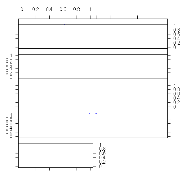
grid.show.viewport(viewport(x=0.6, y=0.6,
w=unit(1, "inches"), h=unit(1, "inches")))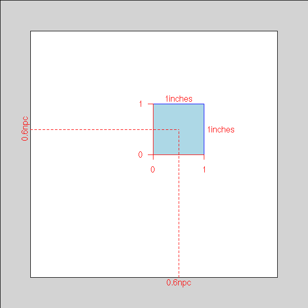
You can also define a viewport containing a table (or a matrix) or viewports.
viewport(layout=grid.layout(2, 2)))
Here is an example from the manual. The following command defines 8 viewports, represented by the blue rectangles (the white part will remain white).
grid.show.layout(grid.layout(4,2,
                 heights=unit(rep(1, 4),
                              c("lines", "lines", "lines", "null")),
                 widths=unit(c(1, 1), "inches")))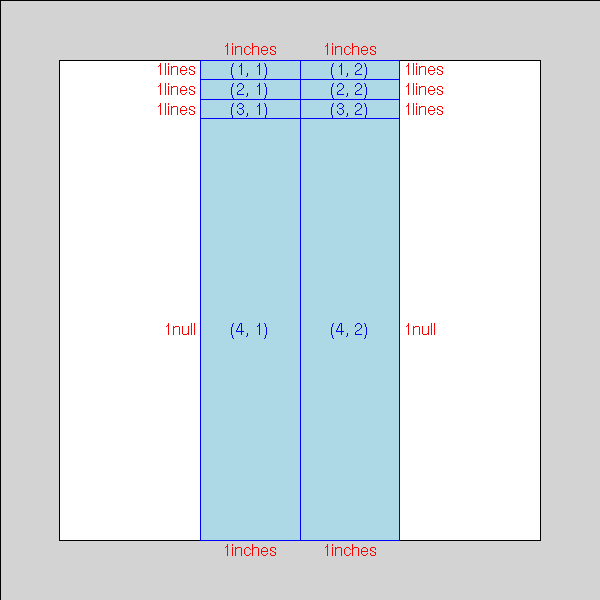
The following lines start a new picture, define a new viewport, divide it into four and put something inside those four parts.
dessine <- function () {
  push.viewport(viewport(w = 0.9, h = 0.9,
                         xscale=c(-.1,1.1), yscale=c(-.1,1.1)))
  grid.rect(gp=gpar(fill=rgb(.5,.5,0)))
  grid.points( runif(50), runif(50) )
  pop.viewport()
}
grid.newpage()
grid.rect(gp=gpar(fill=rgb(.3,.3,.3)))
push.viewport(viewport(layout=grid.layout(2, 2)))
for (i in 1:2) {
  for (j in 1:2) {
    push.viewport(viewport(layout.pos.col=i,
                           layout.pos.row=j))
    dessine()
    pop.viewport()
  }
}
pop.viewport()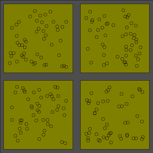
Among the examples from the manual, you will find:
grid.multipanel(vp=viewport(0.5, 0.5, 0.8, 0.8))
But this function is NOT documented.
TODO: check that it is still the case in R 2.1.0
Yet, its code is worth insightful.
> grid.multipanel
function (x = runif(90), y = runif(90), z = runif(90), nrow = 2,
  ncol = 5, nplots = 9, newpage = TRUE, vp = NULL)
{
  # If requested, start a new picture
  if (newpage)
    grid.newpage()
  # It the user said, in the arguments, that we were to
  # go to a given viewport, we do so -- otherwise, we
  # stay in the current viewport, i.e., the whole page.
  # (In the example above, we had given this argument
  # in order to create a margin around the picture.)
  if (!is.null(vp))
    push.viewport(vp)
  # We create a viewport, we divide it into a table of viewports.
  # Here, we can see that the "grid.multipanel" has been written to
  # serve as an illustration, for the user has to specify the number
  # of rows and columns: we trust him, the pictures will be readable
  # and the table will have a sufficient number of entries...
  temp.vp <- viewport(layout = grid.layout(nrow, ncol))
  push.viewport(temp.vp)
  # User-land units:
  # the x- and y-limits, plus 2.5% on each side
  xscale <- range(x) + c(-1, 1) * 0.05 * diff(range(x))
  yscale <- range(y) + c(-1, 1) * 0.05 * diff(range(y))
  breaks <- seq(min(z), max(z), length = nplots + 1)
  for (i in 1:nplots) {
    col <- (i - 1)%%ncol + 1
    row <- (i - 1)%/%ncol + 1
    # We go to each entry of the table
    panel.vp <- viewport(layout.pos.row = row, layout.pos.col = col)
    # In each of those entries , we only plot a small part of the data:
    # here, we select the points we want
    panelx <- x[z >= breaks[i] & z <= breaks[i + 1]]
    panely <- y[z >= breaks[i] & z <= breaks[i + 1]]
    # We give all that to the grid.panel function, that does the
    # actual job
    grid.panel(panelx, panely, range(z),
               c(breaks[i], breaks[i + 1]),
               xscale, yscale,
               axis.left = (col == 1),
               axis.left.label = is.odd(row),
               axis.right = (col == ncol || i == nplots),
               axis.right.label = is.even(row),
               axis.bottom = (row == nrow),
               axis.bottom.label = is.odd(col),
               axis.top = (row == 1),
               axis.top.label = is.even(col),
               vp = panel.vp)
  }
  # We use the grid.text command to name the axes.
  grid.text("Compression Ratio",
            unit(0.5, "npc"), unit(-4, "lines"),
            gp = gpar(fontsize = 20),
            just = "center", rot = 0)
  grid.text("NOx (micrograms/J)",
            unit(-4, "lines"), unit(0.5, "npc"),
            gp = gpar(fontsize = 20),
            just = "centre", rot = 90)
  pop.viewport()
  if (!is.null(vp))
    pop.viewport()
}
Let us now browse through the code of the "grid.panel" function.
> grid.panel
function (x = runif(10), y = runif(10),
          zrange = c(0, 1), zbin = runif(2),
          xscale = range(x) + c(-1, 1) * 0.05 * diff(range(x)),
          yscale = range(y) + c(-1, 1) * 0.05 * diff(range(y)),
          axis.left = TRUE,   axis.left.label = TRUE,
          axis.right = FALSE, axis.right.label = TRUE,
          axis.bottom = TRUE, axis.bottom.label = TRUE,
          axis.top = FALSE,   axis.top.label = TRUE,
          vp = NULL)
{
  if (!is.null(vp))
    push.viewport(vp)
  # We divide the Viewport: one row on the top (for the level names)
  # and the rest beneath.
  temp.vp <- viewport(layout =
    grid.layout(2, 1, heights = unit(c(1, 1), c("lines", "null"))))
  push.viewport(temp.vp)
  strip.vp <- viewport(layout.pos.row = 1, layout.pos.col = 1,
                       xscale = xscale)
  push.viewport(strip.vp)
  # The grid.strip command draws a bright orange rectangle,
  # representing all the data, on top of which we add dark
  # orange rectangle, representing the data plotted in this viewport.
  grid.strip(range.full = zrange, range.thumb = zbin)
  # A black frame
  grid.rect()
  if (axis.top)
    grid.xaxis(main = FALSE, label = axis.top.label)
  pop.viewport()

  # On to the actual plot.
  plot.vp <- viewport(layout.pos.row = 2, layout.pos.col = 1,
                      xscale = xscale, yscale = yscale)
  push.viewport(plot.vp)
  # Draw a grid
  grid.grill()
  # Plot the points
  grid.points(x, y, gp = gpar(col = "blue"))
  # A frame around the picture
  grid.rect()
  # The axes, if required
  if (axis.left)
    grid.yaxis(label = axis.left.label)
  if (axis.right)
    grid.yaxis(main = FALSE, label = axis.right.label)
  if (axis.bottom)
    grid.xaxis(label = axis.bottom.label)
  pop.viewport(2)
  if (!is.null(vp))
    pop.viewport()
  invisible(list(strip.vp = strip.vp, plot.vp = plot.vp))
}
here is another example:
do.it <- function (x=runif(100), y=runif(100),
                   a=.9, b=.1,
                   col1=rgb(0,.3,0), col2=rgb(1,1,0)) {
  xscale <- range(x) + c(-1,1)*.05
  yscale <- range(y) + c(-1,1)*.05
  grid.newpage()
  grid.rect(gp=gpar(fill=col1, col=col1))
  w1 <- a - b/2
  w2 <- 1 - a - b/2
  c1 <- b/3 + w1/2
  c2 <- a + b/6 + w2/2
  vp1 <- viewport(x=c1, y=c1, width=w1, height=w1,
                  xscale=xscale, yscale=yscale)
  push.viewport(vp1)
  grid.rect(gp=gpar(fill=col2, col=col2))
  grid.points(x,y)
  pop.viewport()
  vp2 <- viewport(x=c1, y=c2, width=w1, height=w2,
                  xscale=xscale, yscale=c(0,1))
  push.viewport(vp2)
  grid.rect(gp=gpar(fill=col2, col=col2))
  grid.points(x,rep(.5,length(x)))
  pop.viewport()
  vp3 <- viewport(x=c2, y=c1, width=w2, height=w1,
                  xscale=c(0,1), yscale=yscale)
  push.viewport(vp3)
  grid.rect(gp=gpar(fill=col2, col=col2))
  grid.points(rep(.5,length(y)),y)
  pop.viewport()
}
do.it()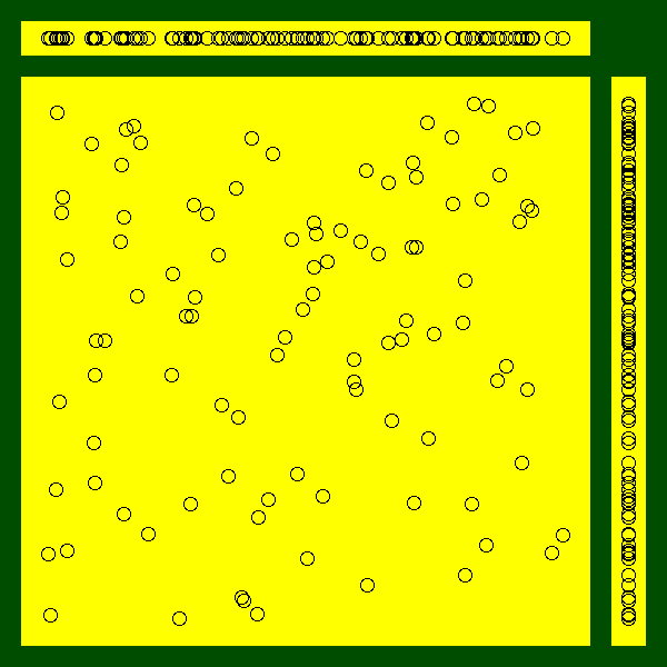
Exercise: replace the scatterplots by box-and-whiskers plots.
LaTeX is a word processor extensively used in mathematics, computer science and theoretical physics. Its typographic quality still surpasses that of mainstream word processors.
It looks like (and indeed is) a programming language: you describe the structure of you document in a text file ("this is a chapter title", "this is a section title", "this is a quotation", "insert the table of contents here", etc.); optionnally, you give some typographic instructions (how the chapter heads should look like, etc.); and you compile the file to get a neat PDF file.
If you want to use LaTeX but are too accustomed to WYSIWYG word processors, have a look at Lyx -- which, strictly speaking, is not WYSIWYG but WYSIWYM (What You See Is What You Mean).
http://www.mail-archive.com/r-help%40stat.math.ethz.ch/msg46946.html
http://www.ci.tuwien.ac.at/~leisch/Sweave/LyX
http://www.troubleshooters.com/lpm/200210/200210.htm
If you want to learn LaTeX, have a look at
http://www.ctan.org/tex-archive/info/lshort/english/lshort.pdf
If you just want to be impressed or to impress your friends/colleagues, have a look at the ConTeXt web page (ConTeXt can be seen as a variant or a competitor to LaTeX, but they are both based on the underlying TeX typesetting system, so any argument in favour of one is also in favour of the other).
http://www.pragma-ade.com/
The xtable package turns tables produced by R (in particular, the tables displaying the anova results) into LaTeX tables, to be included in an article.
> xtable(anova(lm.D9 <- lm(weight ~ group)))
% latex table generated in R 1.6.2 by xtable 1.0-11 package
% Fri Feb 28 18:47:58 2003
\begin{table}
\begin{center}
\begin{tabular}{lrrrrr}
\hline
 & Df & Sum Sq & Mean Sq & F value & Pr($>$F) \\
\hline
group & 1 & 0.69 & 0.69 & 1.42 & 0.2490 \\
Residuals & 18 & 8.73 & 0.48 &  &  \\
\hline
\end{tabular}
\end{center}
\end{table}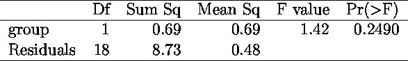
> xtable(summary(lm(weight~group)))
% latex table generated in R 1.6.2 by xtable 1.0-11 package
% Fri Feb 28 18:57:00 2003
\begin{table}
\begin{center}
\begin{tabular}{rrrrr}
\hline
 & Estimate & Std. Error & t value & Pr($>$$|$t$|$) \\
\hline
(Intercept) & 5.0320 & 0.2202 & 22.85 & 0.0000 \\
groupTrt & $-$0.3710 & 0.3114 & $-$1.19 & 0.2490 \\
\hline
\end{tabular}
\end{center}
\end{table}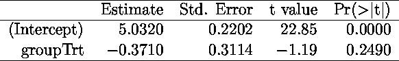
See also the "latex" command in the "Hmisc" library (this is what I currently use).
http://biostat.mc.vanderbilt.edu/twiki/pub/Main/StatReport/latexFineControl.pdf
TODO: give more details.
Sweave allows you to include R code in LaTeX documents; at each new LaTeX compilation, R will redo the computations and the drawings. It is very useful when you write R documentation: you are certain that the code presented to the reader is correct and that it actually produces the pictures. More generally, it is useful when you write statistical reports.
library(tools)
?Sweave

http://www.ci.tuwien.ac.at/~leisch/Sweave
Here is an example:
\documentclass[a4paper,12pt]{article}
\usepackage[T1]{fontenc}
\usepackage[latin1]{inputenc}
\usepackage[frenchb]{babel}
\parindent=0pt
\begin{document}

Computations whose code and results will not be printed:
<<results=hide,echo=FALSE>>=
y <- 1+1
y
@
(nothing appears in the PDF document, it is normal).

Computations whose results is not printed (but whose code is).
<<results=hide,echo=TRUE>>=
library("MASS")
ajoute <- function (a,b) {
  a+b
}
x <- ajoute(1,2)
x
@

Computations with results:
<<results=verbatim>>=
n <- 100
x <- runif(n)
y <- 1 - x - x^2 + rnorm(n)
r <- lm(y~poly(x,5))
summary(r)
@

Computations whose results are "invisible" (a function that returns
nothing or an invisible object) but that prints (with the "cat"
command) LaTeX commands. (The "latex" or "xtable" commands
mentionned above use "cat" that way.)
<<results=tex>>=
cat("\\centerline{\\LaTeX}")
@

A graphic with its code:
<<fig=TRUE>>=
n <- 100
a <- rnorm(n)
b <- 1 - 2*a + rnorm(n)
plot(b~a)
abline(lm(b~a), col='red', lwd=3)
@

A graphic without its code (usually in a "figure" environment):
<<results=hide,echo=FALSE>>=
a <- function (x) {
  round(x, digits=2)
}
@
It is also possible to use the result of some computations in the
text: ``the coefficient of the first regression are
\Sexpr{a(r$coef[1])}, \Sexpr{a(r$coef[2])} and \Sexpr{a(r$coef[3])}''.

\end{document}
It can be compiled as:
Sweave("tmp.Rnw")
system("pdflatex tmp.tex")
system("xpdf tmp.pdf")
here is the result:
SweaveExample.pdf
The options that appear in the code are detailled here:
?RweaveLatex
The most common problem is that functions from the "lattice" library do not seem to produce any plot in Sweave. This is due to the fact that the plot is not produced by the functions themselves but by the corresponding "print" method.
TODO: graphics and loops.
When I use Sweave, I start with the following file:
sweave_template.Rnw
http://cm.bell-labs.com/cm/ms/departments/sia/project/trellis/
The idea behind Lattice (or Treillis -- but the word "treillis" has been registered, so we cannot use it any longer) plots is to plot a 3- (or more) dimensional point cloud, by cutting the cloud into slices, and projecting those slices on a 2-dimensionnal space. You get one plot for each slice.
You can also interpret those plots as plots in which you have partitionned the observations into groups (the slices) and drawn a plot for each group.
library(help=lattice)
library(lattice)
?Lattice
?xyplot
The following example (three quantitative variables) displays earthquake epicenters.
data(quakes)
library(lattice)
Depth <- equal.count(quakes$depth, number=8, overlap=.1)
xyplot(lat ~ long | Depth, data = quakes)
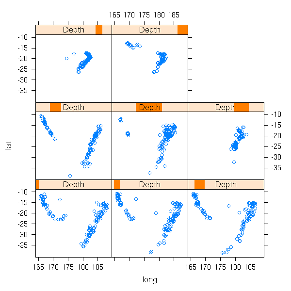
This is much more readable than the projection on one of the coordinate planes (because we do not forget one of the variable, we just slice along it), on the three of them or even on a "carefully chosen" plane (this is called Principal Component Analysis, we shall come back on it later).
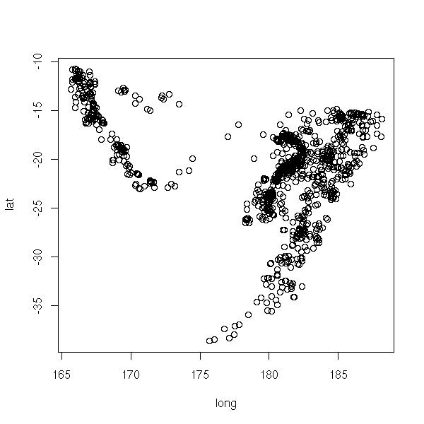
plot(lat ~ long, data=quakes)
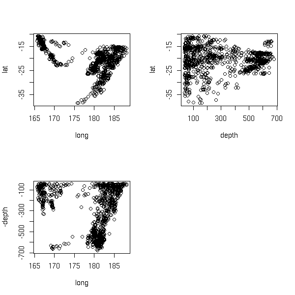
op <- par(mfrow=c(2,2))
plot(lat ~ long, data=quakes)
plot(lat ~ -depth, data=quakes)
plot(-depth ~ long, data=quakes)
par(op)
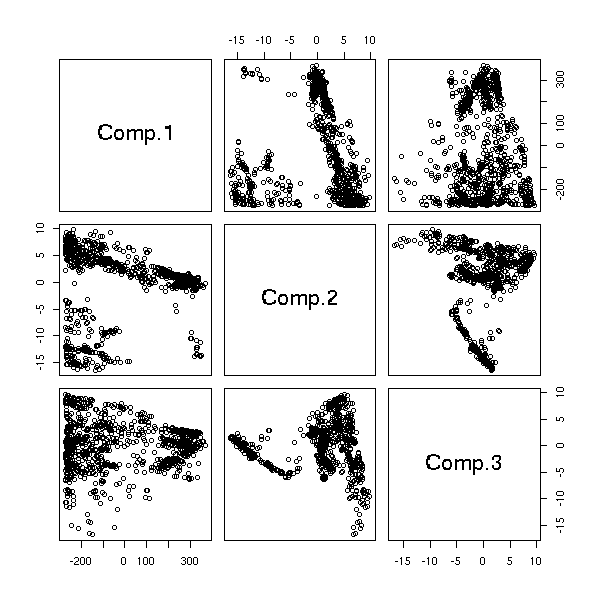
library(mva)
biplot(princomp(quakes[1:3]))
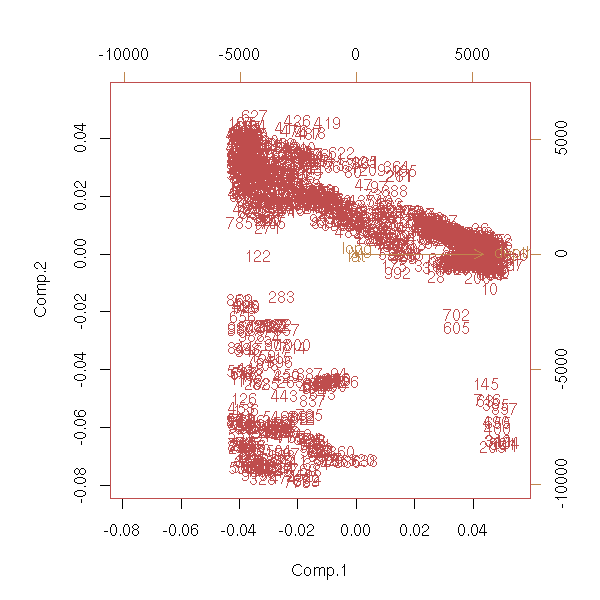
pairs( princomp(quakes[1:3])$scores )
library(scatterplot3d)
scatterplot3d(quakes[,1:3],
              highlight.3d = TRUE,
              pch = 20)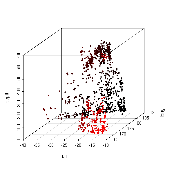
An example with a quantitative variable and 3 qualitative variables in which, if we fix the qualitative variables, we have a single observation (this is sometimes called a "factorial design").
data(barley)
barchart(yield ~ variety | year * site, data=barley)
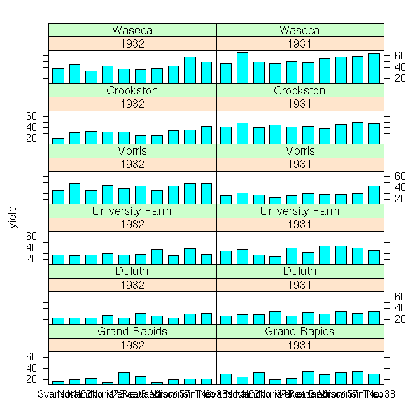
The "scales" argument allows you to change the axes and their ticks (here, we avoid label overlap).
barchart(yield ~ variety | year * site, data = barley,
         ylab = "Barley Yield (bushels/acre)",
         scales = list(x = list(0, abbreviate = TRUE,
                       minlength = 5)))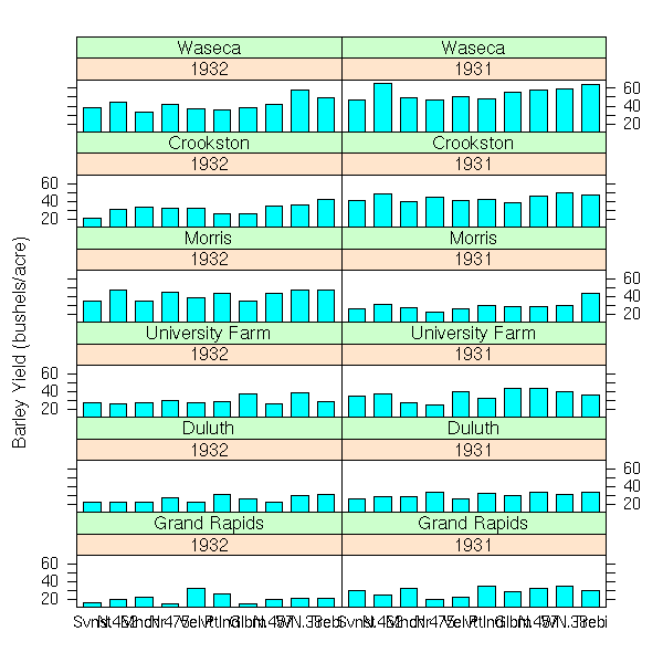
dotplot(yield ~ variety | year * site, data = barley)
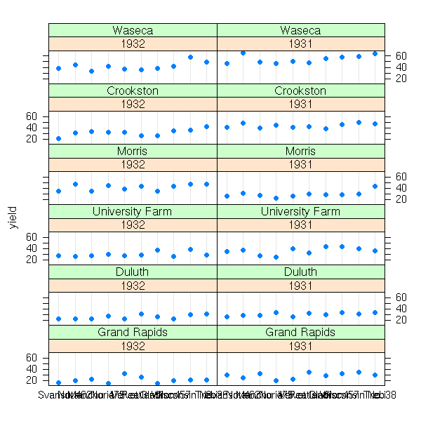
dotplot(variety ~ yield | year * site, data = barley)
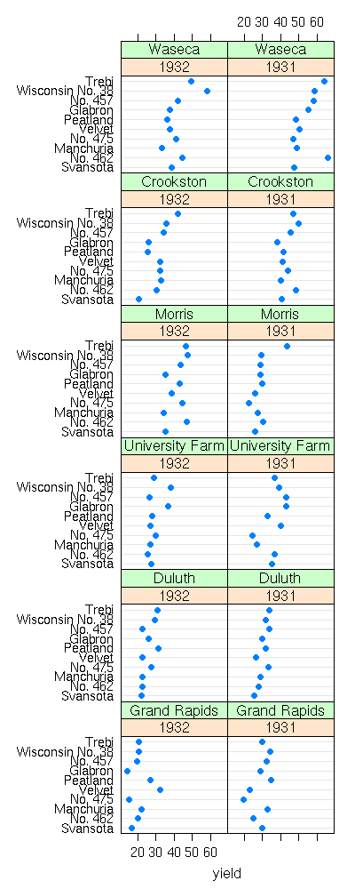
We display the values of one of the qualitative variables by different colours or symbols (for one of the farms, the yield increased: actually, the data for the two years have been interchanged) with the "groups" argument.
%%G 400 1000
data(barley)
## BUG in print_dotplot...
dotplot(variety ~ yield | site, groups = year,
        data = barley,
        layout = c(1, 6), aspect = .5, pch = 16,
        col.line = c("grey", "transparent"),
        panel = "panel.superpose",
        panel.groups = "panel.dotplot")
%--
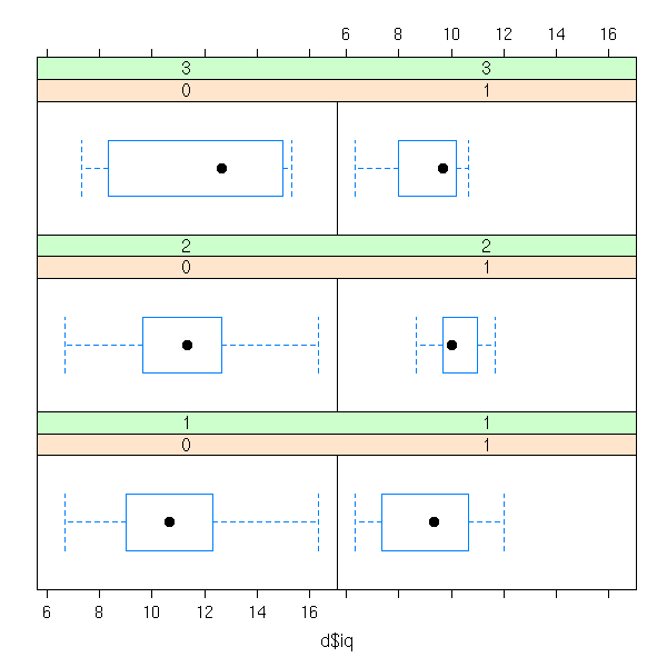
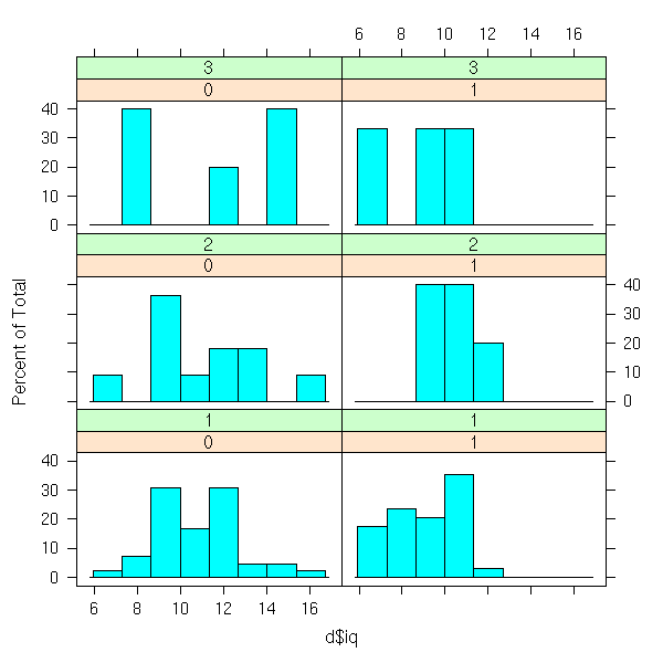
An example with a quantitative variable, qualitative variables, but for which we have several observations in each class.
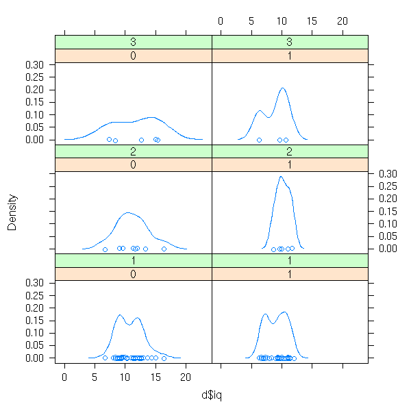
library(nlme)
data(bdf)
d <- data.frame( iq=bdf$IQ.perf, sex=bdf$sex, den=bdf$denomina )
d <- d[1:100,]
bwplot( ~ d$iq | d$sex + d$den )
histogram( ~ d$iq | d$sex + d$den )
densityplot( ~ d$iq | d$sex + d$den )
stripplot( ~ d$iq | d$sex + d$den )
Other example: a quantitative variable as a fcuntion of another quantitative variable and a qualitative variable (we turn the quantitative variable into a "single" with the "equal.count" function).
d <- data.frame( x=bdf$aritPOST, y=bdf$sex, z=equal.count(bdf$langPRET) )
bwplot( ~ x | y + z, data=d )
histogram( ~ x | y + z, data=d )
densityplot( ~ x | y + z, data=d )
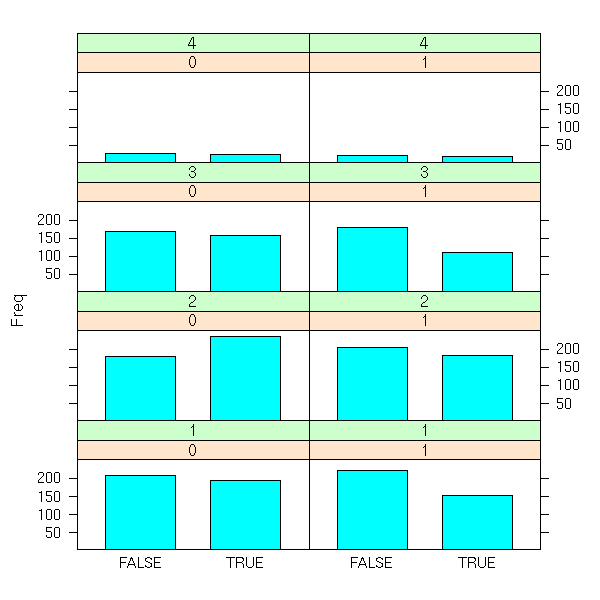
An example with only qualitative variables (we first compute the contingency table, with the "table" function).
d <- data.frame( x= (bdf$IQ.perf>11), y=bdf$sex, z=bdf$denomina )
d <- as.data.frame(table(d))
barchart( Freq ~ x | y * z, data=d )
The formulas used by the "lattice" library may look a bit complex, at first sight.
x ~ y              Plot x as a function of y (on a single plot)
x ~ y | z          Plots x as a function of y after cutting the data
                   into slices for different values of z
x ~ y | z1 * z2    Idem, we cut with according the values of (z1,z2)
x~y|z, groups=t    Idem, but we use a different symbol (or a
                   different colour) according to the values of t
But it also works with univariate data.
~ y
~ y | z
~ y | z1 * z2
~ y | z1 * z2, groups=t
If the variable used to cut the data into slices is qualitative, we ghget a slice for each value. but if it is quantitative, it is better to consider intervals: this can be done with the "equal.count" function, that will choose the intervals so that each contains the same number of observations.
At a lower level, the "lattice" package allows you to precisely specify the location of several plots.
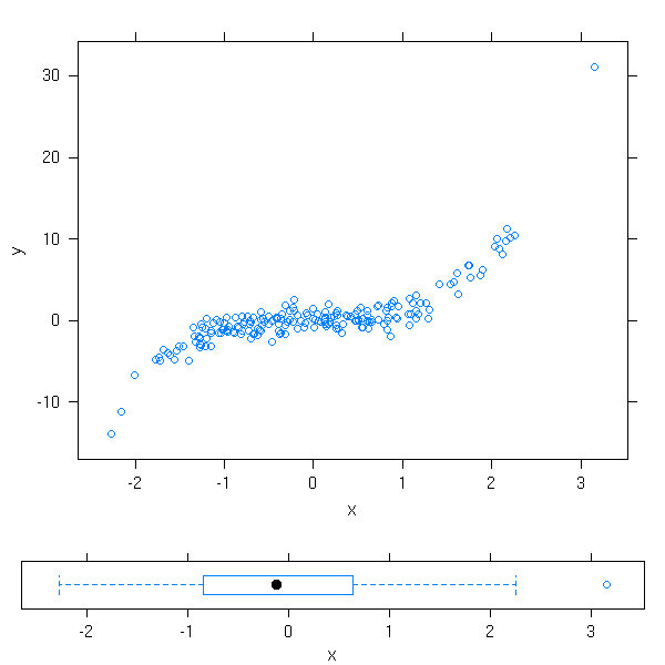
n <- 200
x <- rnorm(n)
y <- x^3+rnorm(n)
plot1 <- xyplot(y~x)
plot2 <- bwplot(x)
# Beware, the order is xmin, ymin, xmax, ymax
print(plot1, position=c(0, .2, 1, 1),  more=T)
print(plot2, position=c(0, 0,  1, .2), more=F)
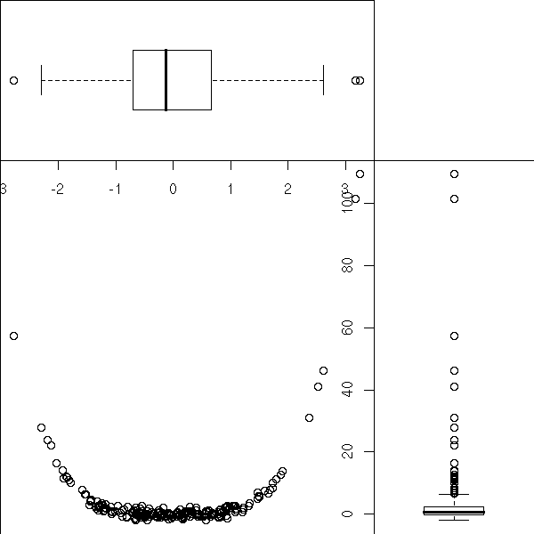
But, actually, we could already do this with the the classical plotting functions and "par(fig=...)".
n <- 200
x <- rnorm(n)
y <- x^4+rnorm(n)
k <- .7
op <- par(mar=c(0,0,0,0))
# Attention : l'ordre est xmin, xmax, ymin, ymax
par(fig=c(0,k,0,k))
plot(y~x)
par(fig=c(0,k,k,1), new=T)
boxplot(x, horizontal=T)
par(fig=c(k,1,0,k), new=T)
boxplot(y, horizontal=F)
par(op)
TODO: Put this example above, when I was speaking of the "par" function?
Actually, the "xyplot", "dotplot", "histogram", "densityplot", "stripplot" simply cut the data into slices and delagate the actual plotting to other functions ("panel.xyplot", etc.), so that you can customize the plots. If you write such a function, you must not use the standard plotting functions ("points", "lines", "segments", "abline", "polygon") but those of the "grid" package ("panel.points", "panel.lines", "panel.segments", "panel.abline", etc.)
%%G 600 1000
# From the manual
# BUG in print_dotplot...
dotplot(variety ~ yield | site,
  data = barley,
  groups = year,
  panel = function(x, y, subscripts, ...) {
    dot.line <- trellis.par.get("dot.line")
    panel.abline(h = y,
                 col = dot.line$col,
                 lty = dot.line$lty)
    panel.superpose(x, y, subscripts, ...)
  },
  key = list(
    space = "right",
    transparent = TRUE,
    points = list(
      pch = trellis.par.get("superpose.symbol")$pch[1:2],
      col = trellis.par.get("superpose.symbol")$col[1:2]
    ),
    text = list(c("1932", "1931"))
  ),
  xlab = "Barley Yield (bushels/acre) ",
  aspect = 0.5,
  layout = c(1,6),
  ylab = NULL
)
%--
The "treillis.par.get" is equivalent to the "par" function for standard plots: it gives you the current values of the various graphical parameters. You can modify them with the "treillis.par.set" function.
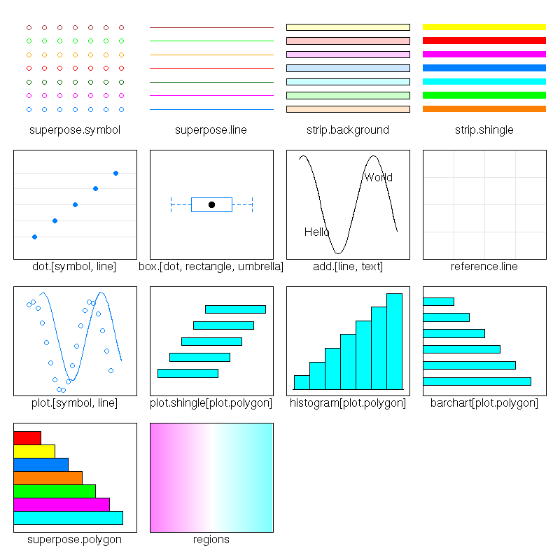
> str(trellis.par.get())
List of 23
 $ background      :List of 1
  ..$ col: chr "#909090"
 $ add.line        :List of 3
  ..$ col: chr "#000000"
  ..$ lty: num 1
  ..$ lwd: num 1
 $ add.text        :List of 3
  ..$ cex : num 1
  ..$ col : chr "#000000"
  ..$ font: num 1
 $ bar.fill        :List of 1
  ..$ col: chr "#00ffff"
 $ box.dot         :List of 4
  ..$ col : chr "#000000"
  ..$ cex : num 1
  ..$ font: num 1
  ..$ pch : num 16
 $ box.rectangle   :List of 3
  ..$ col: chr "#00ffff"
  ..$ lty: num 1
  ..$ lwd: num 1
 $ box.umbrella    :List of 3
  ..$ col: chr "#00ffff"
  ..$ lty: num 2
  ..$ lwd: num 1
 $ dot.line        :List of 3
  ..$ col: chr "#aaaaaa"
  ..$ lty: num 1
  ..$ lwd: num 1
 $ dot.symbol      :List of 4
  ..$ cex : num 0.8
  ..$ col : chr "#00ffff"
  ..$ font: num 1
  ..$ pch : num 16
 $ plot.line       :List of 3
  ..$ col: chr "#00ffff"
  ..$ lty: num 1
  ..$ lwd: num 1
 $ plot.symbol     :List of 4
  ..$ cex : num 0.8
  ..$ col : chr "#00ffff"
  ..$ font: num 1
  ..$ pch : num 1
 $ reference.line  :List of 3
  ..$ col: chr "#aaaaaa"
  ..$ lty: num 1
  ..$ lwd: num 1
 $ strip.background:List of 1
  ..$ col: chr [1:7] "#ffd18f" "#c8ffc8" "#c6ffff" "#a9e2ff" ...
 $ strip.shingle   :List of 1
  ..$ col: chr [1:7] "#ff7f00" "#00ff00" "#00ffff" "#007eff" ...
 $ superpose.line  :List of 3
  ..$ col: chr [1:7] "#00ffff" "#ff00ff" "#00ff00" "#ff7f00" ...
  ..$ lty: num [1:7] 1 1 1 1 1 1 1
  ..$ lwd: num [1:7] 1 1 1 1 1 1 1
 $ regions         :List of 1
  ..$ col: chr [1:100] "#FF80FF" "#FF82FF" "#FF85FF" "#FF87FF" ...
 $ superpose.symbol:List of 4
  ..$ cex : num [1:7] 0.8 0.8 0.8 0.8 0.8 0.8 0.8
  ..$ col : chr [1:7] "#00ffff" "#ff00ff" "#00ff00" "#ff7f00" ...
  ..$ font: num [1:7] 1 1 1 1 1 1 1
  ..$ pch : chr [1:7] "o" "o" "o" "o" ...
 $ axis.line       :List of 4
  ..$ line: num 0
  ..$ col : chr "#000000"
  ..$ lty : num 1
  ..$ lwd : num 1
 $ box.3d          :List of 3
  ..$ col: chr "#000000"
  ..$ lty: num 1
  ..$ lwd: num 1
 $ par.xlab.text   :List of 3
  ..$ cex : num 1
  ..$ col : chr "#000000"
  ..$ font: num 1
 $ par.ylab.text   :List of 3
  ..$ cex : num 1
  ..$ col : chr "#000000"
  ..$ font: num 1
 $ par.main.text   :List of 3
  ..$ cex : num 1.2
  ..$ col : chr "#000000"
  ..$ font: num 2
 $ par.sub.text    :List of 3
  ..$ cex : num 1
  ..$ col : chr "#000000"
  ..$ font: num 2
The "show.setings" explains the meaning of all that.
show.settings()
The "panel.abline" plots lines (here, we use the "h" argument, so that the lines are horizontal, but you can also get vertical lines with the "v" argument, lines given by their intercept and slope (in this order) or even regression line (give an "lm" object)).
The "panel.superpose" uses different colours of different symbols depending on the value of the variable.
The "key" argument specifies the legend.
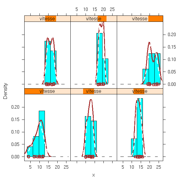
Here is another example: we overlay histogram, density estimation and gaussian density.
y <- cars$dist
x <- cars$speed
vitesse <- shingle(x, co.intervals(x, number=6))
histogram(~ x | vitesse, type = "density",
          panel = function(x, ...) {
            ps <- trellis.par.get('plot.symbol')
            nps <- ps
            nps$cex <- 1
            trellis.par.set('plot.symbol', nps)
            panel.histogram(x, ...)
            panel.densityplot(x, col = 'brown', lwd=3)
            panel.xyplot(x = jitter(x), y = rep(0, length(x)), col='brown' )
            panel.mathdensity(dmath = dnorm,
                              args = list(mean=mean(x),sd=sd(x)),
                              lwd=3, lty=2, col='white')
            trellis.par.set('plot.symbol', ps)
          })
Here is a list of the (high-level) functions you may want to use.
> apropos("^panel\..*")
 [1] "panel.3dscatter"     "panel.3dscatter.new" "panel.3dwire"
 [4] "panel.abline"        "panel.barchart"      "panel.bwplot"
 [7] "panel.cloud"         "panel.densityplot"   "panel.dotplot"
[10] "panel.fill"          "panel.grid"          "panel.histogram"
[13] "panel.levelplot"     "panel.linejoin"      "panel.lmline"
[16] "panel.loess"         "panel.mathdensity"   "panel.pairs"
[19] "panel.parallel"      "panel.qq"            "panel.qqmath"
[22] "panel.qqmathline"    "panel.splom"         "panel.stripplot"
[25] "panel.superpose"     "panel.superpose.2"   "panel.tmd"
[28] "panel.wireframe"     "panel.xyplot"        "panel.smooth"

> apropos("^prepanel\..*")
 [1] "prepanel.default.bwplot"      "prepanel.default.cloud"
 [3] "prepanel.default.densityplot" "prepanel.default.histogram"
 [5] "prepanel.default.levelplot"   "prepanel.default.parallel"
 [7] "prepanel.default.qq"          "prepanel.default.qqmath"
 [9] "prepanel.default.splom"       "prepanel.default.tmd"
[11] "prepanel.default.xyplot"      "prepanel.lmline"
[13] "prepanel.loess"               "prepanel.qqmathline"
Apart from the "panel.superpose" function (a replacement for the "panel.xyplot" function when there is a "groups" argument), and perhaps "panel.smooth" (plots the points, as with "xyplot", and adds a regression curve), the names should be self-explanatory.
Whe you plot curves, you can more easily estimate and compare the slope of the tangents when this slope is around 45 degrees. "Banking" refers to a choice of units on the axes so that the slope is often around 45 degrees.
This is articularily useful for time series: in the second plot, it is obvious that the downwards movement is slower. You may also see it in the first plot, if you have good eyes, and if you know what you are looking for.
data(sunspot.year)
sunspot <- sunspot.year[20 + 1:37]
xyplot(sunspot ~ 1:37 ,type = "l",
       scales = list(y = list(log = TRUE)),
       sub = "log scales")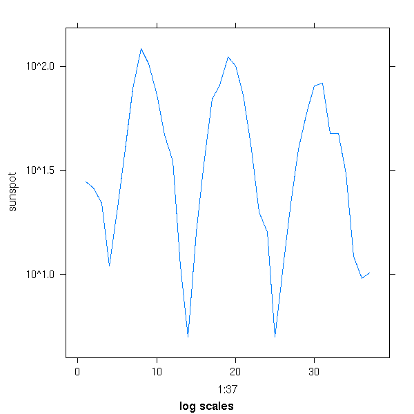
xyplot(sunspot ~ 1:37 ,type = "l", aspect="xy",
       scales = list(y = list(log = TRUE)),
       sub = "log scales")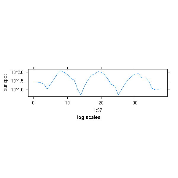
Exercice: take the code of one of those functions, for instance "xyplot" or "splom" and comment it. (Beware: this is VERY long...)
TODO

This work is licensed under a Creative Commons Attribution-NonCommercial-ShareAlike 2.5 License.
Vincent Zoonekynd
<zoonek@math.jussieu.fr>
latest modification on Sat Jan 6 10:28:18 GMT 2007