Sample data
Quantitative univariate data
Ordered univariate data
Qualitative univariate variables
Quantitative bivariate data
Qualitative/quantitative bivariate data
Qualitative bivariate data
Three variables and more
Multivariate data, with some qualitative variables
Fun
TO SORT
In this chapter, we explain how to turn data (heaps of numbers) into graphics, be they simple graphics for uni- or bi-variate data, or less straightforward ones, involving some linear algebra or non trivial algorithms.
Where does the data come from, in the first place? If you are being asked or are asking yourself, genuine questions, about real-world problems, you probably already have your data. On the other hand, if you want to teach you R, you will need some data to play with. Luckily, R comes with a wealth of data sets.
Here is one -- the data used in the cover art of this book: eruption time and time between eruptions for a Geyser.
> ?faithful
> data(faithful)
> faithful
    eruptions waiting
1       3.600      79
2       1.800      54
3       3.333      74
...
270     4.417      90
271     1.817      46
272     4.467      74

> str(faithful)
`data.frame':   272 obs. of  2 variables:
 $ eruptions: num  3.60 1.80 3.33 2.28 4.53 ...
 $ waiting  : num  79 54 74 62 85 55 88 85 51 85 ...
Each package usually comes with a few datasets, used in its examples. The "data" function lists (or loads) those datasets.
data(package='ts')

Data sets in package `ts':

AirPassengers           Monthly Airline Passenger Numbers 1949-1960
austres                 Quarterly Time Series of the Number of
                        Australian Residents
beavers                 Body Temperature Series of Two Beavers
BJsales                 Sales Data with Leading Indicator.
EuStockMarkets          Daily Closing Prices of Major European Stock
                        Indices, 1991-1998.
JohnsonJohnson          Quarterly Earnings per Johnson & Johnson Share
LakeHuron               Level of Lake Huron 1875--1972
lh                      Luteinizing Hormone in Blood Samples
lynx                    Annual Canadian Lynx trappings 1821--1934
Nile                    Flow of the River Nile
nottem                  Average Monthly Temperatures at Nottingham,
                        1920--1939
sunspot                 Yearly Sunspot Data, 1700--1988. Monthly
                        Sunspot Data, 1749--1997.
treering                Yearly Treering Data, -6000--1979.
UKDriverDeaths          Road Casualties in Great Britain 1969--84
UKLungDeaths            Monthly Deaths from Lung Diseases in the UK
UKgas                   UK Quarterly Gas Consumption
USAccDeaths             Accidental Deaths in the US 1973--1978
WWWusage                Internet Usage per Minute
Here are the datasets from the "base" package:
Data sets in package `base':

Formaldehyde            Determination of Formaldehyde concentration
HairEyeColor            Hair and eye color of statistics students
InsectSprays            Effectiveness of insect sprays
LifeCycleSavings        Intercountry life-cycle savings data
OrchardSprays           Potency of orchard sprays
PlantGrowth             Results from an experiment on plant growth
Titanic                 Survival of passengers on the Titanic
ToothGrowth             The effect of vitamin C on tooth growth in
                        guinea pigs
UCBAdmissions           Student admissions at UC Berkeley
USArrests               Violent crime statistics for the USA
USJudgeRatings          Lawyers' ratings of state judges in the US
                        Superior Court
USPersonalExpenditure   Personal expenditure data
VADeaths                Death rates in Virginia (1940)
airmiles                Passenger miles on US airlines 1937-1960
airquality              New York Air Quality Measurements
anscombe                Anscombe's quartet of regression data
attenu                  Joiner-Boore Attenuation Data
attitude                Chatterjee-Price Attitude Data
cars                    Speed and Stopping Distances for Cars
chickwts                The Effect of Dietary Supplements on Chick
                        Weights
co2                     Moana Loa Atmospheric CO2 Concentrations
discoveries             Yearly Numbers of `Important' Discoveries
esoph                   (O)esophageal Cancer Case-control study
euro                    Conversion rates of Euro currencies
eurodist                Distances between European Cities
faithful                Old Faithful Geyser Data
freeny                  Freeny's Revenue Data
infert                  Secondary infertility matched case-control
                        study
iris                    Edgar Anderson's Iris Data as data.frame
iris3                   Edgar Anderson's Iris Data as 3-d array
islands                 World Landmass Areas
longley                 Longley's Economic Regression Data
morley                  Michaelson-Morley Speed of Light Data
mtcars                  Motor Trend Car Data
nhtemp                  Yearly Average Temperatures in New Haven CT
phones                  The Numbers of Telephones
precip                  Average Precipitation amounts for US Cities
presidents              Quarterly Approval Ratings for US Presidents
pressure                Vapour Pressure of Mercury as a Function of
                        Temperature
quakes                  Earthquake Locations and Magnitudes in the
                        Tonga Trench
randu                   Random Numbers produced by RANDU
rivers                  Lengths of Major Rivers in North America
sleep                   Student's Sleep Data
stackloss               Brownlee's Stack Loss Plant Data
state                   US State Facts and Figures
sunspots                Monthly Mean Relative Sunspot Numbers
swiss                   Swiss Demographic Data
trees                   Girth, Height and Volume for Black Cherry
                        Trees
uspop                   Populations Recorded by the US Census
volcano                 Topographic Information on Auckland's Maunga
                        Whau Volcano
warpbreaks              Breaks in Yarn during Weaving
women                   Heights and Weights of Women
There are also many in the "MASS" package (that illustrates the book "Modern Applied Statistics with S" -- which I have never read).
data(package='MASS')
R even says:
Use `data(package = .packages(all.available = TRUE))'
to list the data sets in all *available* packages.
It is "a bit" violent, but you can take ALL the example datasets and have them undergo some statistical operation. I did use such manipulations while writing those notes, in order to find an example satisfying some properties.
#!/bin/sh  # This is not R code but (Bourne) shell code
cd /usr/lib/R/library/
for lib in *(/)
do
  if [ -d $lib/data ]
  then
    (
      cd $lib/data
      echo 'library('$lib')'
      ls
    ) | grep -vi 00Index | perl -p -e 's#(.*)\..*?$#data($1); doit($1)#'
  fi
done > /tmp/ALL.R
The list of all the datasets:
doit <- function (...) {}
source("/tmp/ALL.R")
sink("str_data")
ls.str()
q()
All the datasets with outliers:
doit <- function (d) {
  name <- as.character(substitute(d))
  cat(paste("Processing", name, "\n"))
  if (!exists(name)) {
    cat(paste("  Skipping (does not exist!)", name, "\n"))
  } else if (is.vector(d)) {
    doit2(d, name)
  } else if (is.data.frame(d)) {
    for (x in names(d)) {
      cat(paste("Processing", name, "/", x, "\n"))
      doit2(d[[x]], paste(name,"/",x))
    }
  } else
    cat(paste("  Skipping (unknown reason)", substitute(d), "\n"))
}
doit2 <- function (x,n) {
  if( is.numeric(x) )
    really.do.it(x,n)
  else
    cat("    Skipping (non numeric)\n")
}
really.do.it <- function (x,name) {
  x <- x[!is.na(x)]
  m <- median(x)
  i <- IQR(x)
  n1 <- sum(x>m+1.5*i)
  n2 <- sum(x<m-1.5*i)
  n <- length(x)
  p1 <- round(100*n1/n, digits=0)
  p2 <- round(100*n2/n, digits=0)
  if( n1+n2>0 ) {
    boxplot(x, main=name)
    cat(paste("      OK ", n1+n2, "/", n, " (",p1,"%, ",p2,"%)\n", sep=''))
  }
}

source("ALL.R", echo=F)
You can also use this to TEST your code -- more about tests and test-driven development (TDD) in the "Programing in R" chapter.
Statistical data is typically represented by a table, one row per observation, one column per variable. For instance, if you measure squirrels, you will have one row per squirrel, one column for the weight, another for the tail length, another for the height, another for the fur colour, etc.
Data are said to be univariate when there is only one variable (one column), bivariate when there are two, multivariate when there are more.
A variable is said to be quantitative (or numeric) when it contains numbers with which one can do arithmetic: for instance temperature (multiplication or addition of temperatures is not meaningful, but difference or mean is), but not flat number.
Otherwise, the variable is said to be qualitative: for instance, a yes/no answer, colors or postcodes.
There are sonetimes ordered qualitative variables, for instance, a variable whose values would be "never", "seldom", "sometimes", "often", "always". These data are sometimes obtained by binning quantitative data.
Here, we consider a single, numeric, statistical variable (typically some quantity (height, length, weight, etc.) measured on each subject of some experiment); the data usually comes as a vector. We shall often call this vector a "statistical series".
One can give a summary of such data with a few numbers: the mean, the minimum, the maximum, the median (to get it, sort the numbers and take the middle one), the quantiles (idem, but take the numbers a quarter from the beginning and a quarter from the end). Unsurprisingly, this is what the "summary" function gives us.
> summary(faithful$eruptions)
 Min. 1st Qu.  Median    Mean 3rd Qu.    Max.
1.600   2.163   4.000   3.488   4.454   5.100
> mean(faithful$eruptions)
[1] 3.487783
Always be critical when observing data: in particular, you should check that the extreme values are not aberrant, that they do not come from some mistake.
You can also check various dispersion measures such as the Median Absolute Deviation (MAD), the "standard deviation" or the Inter-Quartile Range (IQR).
> mad(faithful$eruptions)
[1] 0.9510879
> sd(faithful$eruptions)
[1] 1.141371
> IQR(faithful$eruptions)
[1] 2.2915
But you might not be familiar with those notions: let us recall the links between the mean, variance, median and MAD. When you have a set of numbers x1,x2,...,xn, you can try to find the real number m that minimizes the sum
abs(m-x1) + abs(m-x2) + ... + abs(m-xn).
One can show that it is the median. You can also try to find the real number that minimizes the sum
(m-x1)^2 + (m-x2)^2 + ... + (m-xn)^2.
One can show that it is the mean. This property of the mean is called the "Least Squares Property".
Hence the following definition: the Variance of a statistical series x1,x2,...,xn is the mean of the squares deviations from the mean:
          (m-x1)^2 + (m-x2)^2 + ... + (m-xn)^2
Var(x) = --------------------------------------
                          n
where m is the mean,
(some books or software replace "n" by "n-1": we shall see why in a later chapter) the standard deviation is the square root of the variance, similarly, the Median Absolute Deviation (MAD) is the mean of the absolute values of the deviation from the median:
          abs(x1-m) + ... + abs(xn-m)
MAD(x) = -----------------------------
                      n
where m is the median.
At first, the relevance of that notion as a measure of dispersion was not obvious to me; why should we take the mean of the _squares_ of the deviations from the mean, why not simply the mean of the absolute value of those deviations? The preceeding definition of the mean provides one motivation of the notion of variance (or standard deviation). There are other motivations: for instance, the variance is easy to compute, iteratively, contrary to the MAD (it was important in the early days of the Computer Era, when computer power was very limited); another motivation is that the notion of variance is central in many theoretical results (Bienaime-Tchebychev inequality, etc. -- this is due to the good properties of the "square" function as opposed to the absolute value function -- the former is differentiable, not the latter).
But beware: the notions of mean and variance lose their relevance when the data is not symetric or when it contains many extreme values ("outliers", "aberrant values" or "fat tails").
On the contrary, the median, the Inter-Quartile Range (IQR) or the Median Absolute Deviation (MAD) are "robust" dispersion measures: they give good results, even on a non-gaussian sample, contrary to the mean or the standard deviation. (This notion of robustness is very important; robust methods used to be overlooked because they are more computer-intensive -- but this argument has become outdates.) Yet, if your data is gaussian, they are less precise. We shall come back and say more about this problem and others when we introduce the notion of "estimator".
TODO: Does this belong here or should it be in the "dimension reduction" section?
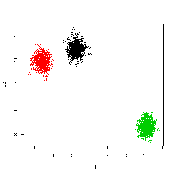
You can display high-dimensional datasets in the L1-L2 space: average value of the coordinates and standard deviation of the coordinates.
TODO: is this correct???
If the data were gaussian, the cloud of points should exhibit a linear shape.
If the data is a mixture of gaussians, if there are several clusters,
you should see several lines. (???)

n <- 1000
k <- 20
p <- 3
i <- sample(1:p, n, replace=TRUE)
x <- 10 * matrix(rnorm(p*k), nr=p, nc=k)
x <- x[i,] + matrix(rnorm(n*k), nr=n, nc=k)
L1L2 <- function (x) {
  cbind(L1 = apply(x, 1, mean),
        L2 = apply(x, 1, sd))
}
plot(L1L2(x), col=i)
This representation can be used to spot outliers.
This kind of representation is used in finance, where the coordinates are the "returns" of assets, at different points in time, and the axes are the average return (vertical axis) and the risk (horizontal axis).
TODO: A plot, with financial data.
e.g., retrieve from Google the returns of half a dozen indices, say,
FTSE100, CAC40, DAX, Nikkei225, DJIA.
On this plot, you can overlay the set of all possible (risk,return) pairs of portfolios built from those assets (a portfolio is simply a linear combination of assets): the frontier of that domain is called the efficient frontier.
TODO: plot it...
To compare two different statistical series that may not have the same unit we can rescale them so that their means be zero and their variance 1.
      xn - m
yn = --------
         s

where  m is the mean of the series
  and  s its standard deviation.

x <- crabs$FL
y <- crabs$CL  # The two vectors need not
               # have the same length
op <- par(mfrow=c(2,1))
hist(x, col="light blue", xlim=c(0,50))
hist(y, col="light blue", xlim=c(0,50))
par(op)
op <- par(mfrow=c(2,1))
hist( (x - mean(x)) / sd(x),
      col = "light blue",
      xlim = c(-3, 3) )
hist( (y - mean(y)) / sd(y),
      col = "light blue",
      xlim = c(-3, 3) )
par(op)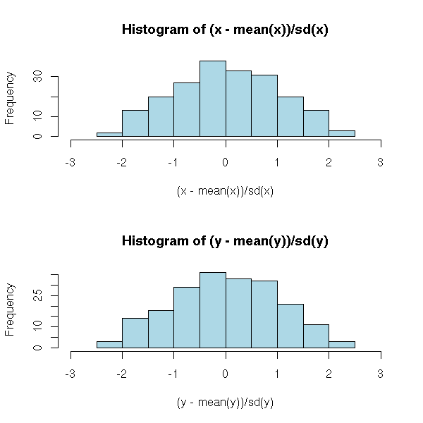
But beware: normalization will just rescale your data, it will not solve other problems. In particular, if your data are not gaussian (i.e., if the histogram is not "bell-shaped"), they will not become gaussian. Furthermore, the presence of even a single extreme value ("outlier") will change the value of the mean and the standard deviation and therefore change the scaling.
N <- 50           # Sample size
set.seed(2)
x1 <- runif(N)    # Uniform distribution
x2 <- rt(N,2)     # Fat-tailed distribution
x3 <- rexp(N)     # Skewed distribution
x4 <- c(x2,20)    # Outlier (not that uncommon,
                  # with fat-tailed distributions)
f <- function (x, ...) {
  x <- (x - mean(x)) / sd(x)
  N <- length(x)
  hist( x,
        col = "light blue",
        xlim = c(-3, 3),
        ylim = c(0, .8),
        probability = TRUE,
        ...
      )
  lines(density(x),
        col = "red", lwd = 3)
  rug(x)
}
op <- par(mfrow=c(2,2))
f(x1, main = "Uniform distribution")
f(x2, main = "Fat-tailed distribution")
f(x3, main = "Skewed distribution")
f(x4, main = "As above, with one outlier")
par(op)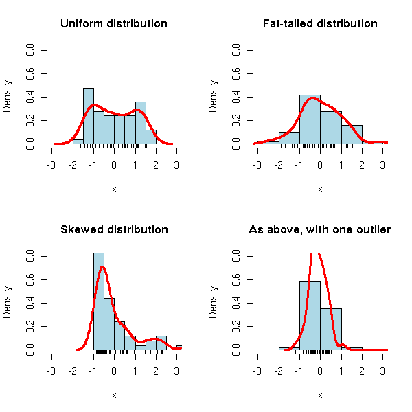
Sometimes, other transformations might make the distribution closer to a gaussian (i.e., bell-shaped) one. For instance, for skewed distributions, taking the logarithm or the square root is often a good idea (other sometimes used transformations include: power scales, arcsine, logit, probit, Fisher).
x <- read.csv("2006-08-27_pe.csv")
op <- par(mfrow=c(1,2))
plot(p ~ eps, data=x, main="Before")
plot(log(p) ~ log(eps), data=x, main="After")
par(op)
In some situations, other transformations are meaningful: power scales, arcsine, logit, probit, Fisher, etc.
Whatever the analysis you perform, it is very important to look at your data and to transform them if needed and possible.
f <- function (x, main, FUN) {
  hist(x,
       col = "light blue",
       probability = TRUE,
       main = paste(main, "(before)"),
       xlab = "")
  lines(density(x), col = "red", lwd = 3)
  rug(x)
  x <- FUN(x)
  hist(x,
       col = "light blue",
       probability = TRUE,
       main = paste(main, "(after)"),
       xlab = "")
  lines(density(x), col = "red", lwd = 3)
  rug(x)
}
op <- par(mfrow=c(2,2))
f(x3,
  main="Skewed distribution",
  FUN = log)
f(x2,
  main="Fat tailed distribution",
  FUN = function (x) {  # If you have an idea of the
                        # distribution followed by
                        # your variable, you can use
                        # that distribution to get a
                        # p-value (i.e., a number between
                        # 0 and 1: just apply the inverse
                        # of the cumulative distribution
                        # function -- in R, it is called
                        # the p-function of the
                        # distribution) then apply the
                        # gaussian cumulative distribution
                        # function (in R, it is called the
                        # quantile function or the
                        # q-function).
          qnorm(pcauchy(x))
        }
  )
par(op)
If you really want your distribution to be bell-shaped, you can "forcefully normalize" it -- but bear in mind that this discards relevant information: for instance, if the distribution was bimodal, i.e., if it had the shape of two bells instead of one, that information will be lost.
uniformize <- function (x) { # This could be called
                             # "forceful uniformization".
                             # More about it when we introduce
                             # the notion of copula.
  x <- rank(x,
            na.last = "keep",
            ties.method = "average")
  n <- sum(!is.na(x))
  x / (n + 1)
}
normalize <- function (x) {
  qnorm(uniformize(x))
}
op <- par(mfrow=c(4,2))
f(x1, FUN = normalize, main = "Uniform distribution")
f(x3, FUN = normalize, main = "Skewed distribution")
f(x2, FUN = normalize, main = "Fat-tailed distribution")
f(x4, FUN = normalize, main = "Idem with one outlier")
par(op)
If you have skipped the last section, read this one. If you have not, skip to the next.
We have just seen that (for a centered statistical series, i.e., a series whose mean is zero), the variance is the mean of the squares of the values. One may replace the squares by another power: the k-th moment M_k of a series is the mean of its k-th powers. One can show (exercice) that:
mean = M_1
Variance = M_2 - M_1^2
The third moment of a centered statistical series is called skewness. For a symetric series, it is zero. To check if a series is symetric and to quantify the departure from symetry, it suffices to compute the third moment of the normalized series.
library(e1071) # For the "skewness" and "kurtosis" functions
n <- 1000
x <- rnorm(n)
op <- par(mar=c(3,3,4,2)+.1)
hist(x, col="light blue", probability=TRUE,
     main=paste("skewness =", round(skewness(x), digits=2)),
     xlab="", ylab="")
lines(density(x), col="red", lwd=3)
par(op)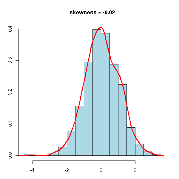
x <- rexp(n)
op <- par(mar=c(3,3,4,2)+.1)
hist(x, col="light blue", probability=TRUE,
     main=paste("skewness =", round(skewness(x), digits=2)),
     xlab="", ylab="")
lines(density(x), col="red", lwd=3)
par(op)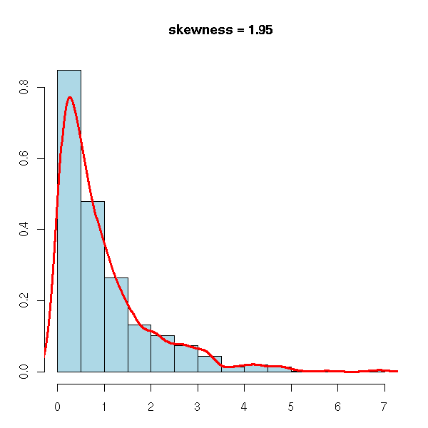
x <- -rexp(n)
op <- par(mar=c(3,3,4,2)+.1)
hist(x, col="light blue", probability=TRUE,
     main=paste("skewness =", round(skewness(x), digits=2)),
     xlab="", ylab="")
lines(density(x), col="red", lwd=3)
par(op)
The fourth moment, tells if a series has fatter tails (i.e., more extreme values) than a gaussian distribution and quantifies the departure from gaussian-like tails. The fourth moment of a gaussian random variable is 3; one defines the kurtosis as the fourth moment minus 3, so that the kurtosis of a gaussian distribution be zero, that of a fat-tailed one be positive, that of a no-tail one be negative.
library(e1071) # For the "skewness" and "kurtosis" functions
n <- 1000
x <- rnorm(n)
qqnorm(x, main=paste("kurtosis =", round(kurtosis(x), digits=2),
                     "(gaussian)"))
qqline(x, col="red")
op <- par(fig=c(.02,.5,.5,.98), new=TRUE)
hist(x, probability=T,
     col="light blue", xlab="", ylab="", main="", axes=F)
lines(density(x), col="red", lwd=2)
box()
par(op)
set.seed(1)
x <- rt(n, df=4)
qqnorm(x, main=paste("kurtosis =", round(kurtosis(x), digits=2),
                     "(T, df=4)"))
qqline(x, col="red")
op <- par(fig=c(.02,.5,.5,.98), new=TRUE)
hist(x, probability=T,
     col="light blue", xlab="", ylab="", main="", axes=F)
lines(density(x), col="red", lwd=2)
box()
par(op)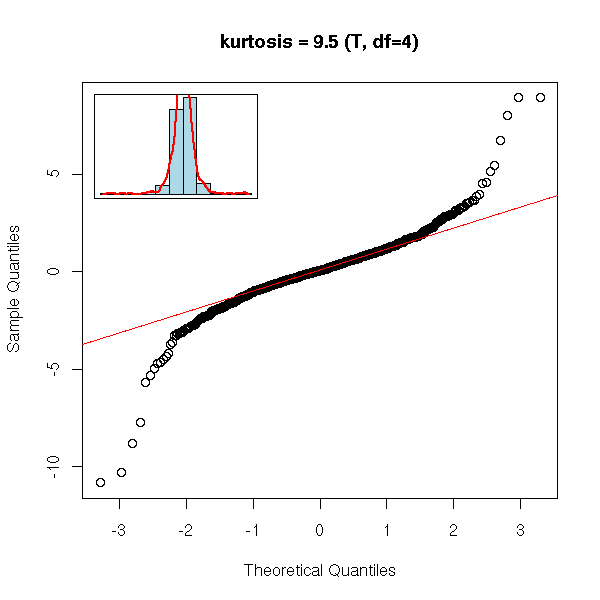
x <- runif(n)
qqnorm(x, main=paste("kurtosis =", round(kurtosis(x), digits=2),
                     "(uniform)"))
qqline(x, col="red")
op <- par(fig=c(.02,.5,.5,.98), new=TRUE)
hist(x, probability=T,
     col="light blue", xlab="", ylab="", main="", axes=F)
lines(density(x), col="red", lwd=2)
box()
par(op)
You stumble upon this notion, for instance, when you study financial data: we often assume that the data we study follow a gaussian distribution, but in finance (more precisely, with high-frequency (intra-day) financial data), this is not the case. The problem is all the more serious that the data exhibits an abnormal number of extreme values (outliers). To see it, we have estimated the density of the returns and we overlay this curve with the density of a gaussian distribution. The vertical axis is logarithmic.
You can notice two things: first, the distribution has a higher, narrower peak, second, there are more extreme values.
op <- par(mfrow=c(2,2), mar=c(3,2,2,2)+.1)
data(EuStockMarkets)
x <- EuStockMarkets
# We aren't interested in the spot prices, but in the returns
# return[i] = ( price[i] - price[i-1] ) / price[i-1]
y <- apply(x, 2, function (x) { diff(x)/x[-length(x)] })
# We normalize the data
z <- apply(y, 2, function (x) { (x-mean(x))/sd(x) })
for (i in 1:4) {
  d <- density(z[,i])
  plot(d$x,log(d$y),ylim=c(-5,1),xlim=c(-5,5))
  curve(log(dnorm(x)),col='red',add=T)
  mtext(colnames(x)[i], line=-1.5, font=2)
}
par(op)
mtext("Are stock returns gaussian?", line=3, font=2)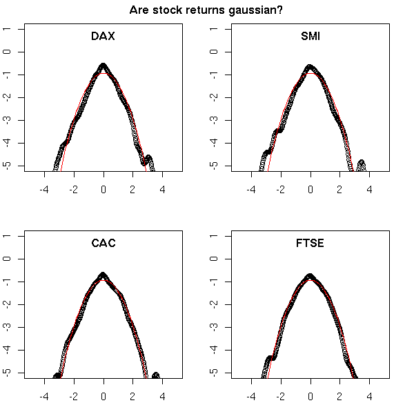
You can check this with a computation:
> apply(z^3,2,mean)
       DAX        SMI        CAC       FTSE
-0.4344056 -0.5325112 -0.1059855  0.1651614

> apply(z^4,2,mean)
     DAX      SMI      CAC     FTSE
8.579151 8.194598 5.265506 5.751968
While a gaussian distribution would give 0 and 3.
> mean(rnorm(100000)^3)
[1] -0.003451044
> mean(rnorm(100000)^4)
[1] 3.016637
You can do several simulations (as we have just done) and look at the distribution of the resulting values: by comparison, are those that come from our data that large? (they were large, but were they significantly large?)
For the third moment, two values are extreme, but the two others look normal.
n <- dim(z)[1]
N <- 2000    # Two thousand samples of the same size
m <- matrix(rnorm(n*N), nc=N, nr=n)
a <- apply(m^3,2,mean)
b <- apply(z^3,2,mean)
op <- par(mar=c(3,3,4,1)+.1)
hist(a, col='light blue', xlim=range(c(a,b)),
     main="Third moment (skewness)",
     xlab="", ylab="")
h <- rep(.2*par("usr")[3] + .8*par("usr")[4], length(b))
points(b, h, type='h', col='red',lwd=3)
points(b, h, col='red', lwd=3)
text(b, h, names(b), pos=3)
par(op)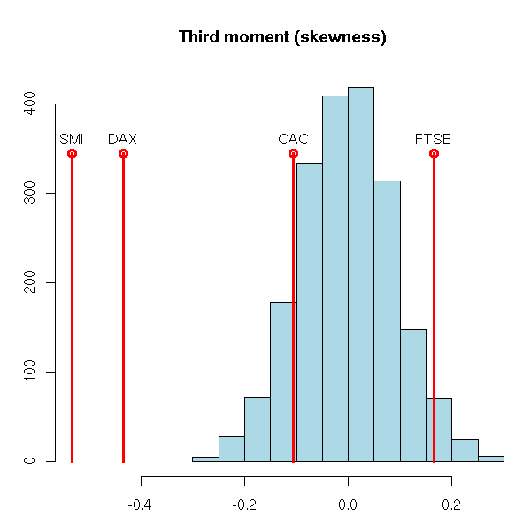
On the contrary, for the kurtosis, our values are really high.
n <- dim(z)[1]
N <- 2000
m <- matrix(rnorm(n*N), nc=N, nr=n)
a <- apply(m^4,2,mean) - 3
b <- apply(z^4,2,mean) - 3
op <- par(mar=c(3,3,4,1)+.1)
hist(a, col='light blue', xlim=range(c(a,b)),
     main="Expected kurtosis distribution and observed values",
     xlab="", ylab="")
h <- rep(.2*par("usr")[3] + .8*par("usr")[4], length(b))
points(b, h, type='h', col='red',lwd=3)
points(b, h, col='red', lwd=3)
text(b, h, names(b), pos=3)
par(op)
We shall see again, later, that kind of measurement of departure from gaussianity -- the computation we just made can be called a "parametric bootstrap p-value computation".
For more moments, see the "moments" packages and, later in this document, the Method of Moments Estimators (MME) and the Generalized Method of Moments (GMM).
Moments allow you to spot non-gaussian features in your data, but they are very imprecise (they have a large variance) and are very sensitive to outliers -- simply because they are defined with powers, that amplify those problems.
One can define similar quantities without any power, with a simple linear combination of order statistics.
If X_{k:n} is the k-th element of a sample of n observations of the distribution you are studying, then the L-moments are
L1 = E[ X_{1:1} ]
L2 = 1/2 E[ X_{2:2} - X{1:2} ]
L3 = 1/3 E[ X_{3:3} - 2 X{2:3} + X{1:3} ]
L4 = 1/4 E[ X_{4:4} - 3 X{3:4} + 3 X{2:4} - X{1:4} ]
...
L1 is the usual mean; L2 is a measure of dispersion: the average distance between two observations; L3 is a measure of asymetry, similar to the skewness; L4 is a measure of tail thickness, similar to the kurtosis.
data(EuStockMarkets)
x <- EuStockMarkets
y <- apply(x, 2, function (x) { diff(x)/x[-length(x)] })

library(lmomco)
n <- dim(z)[1]
N <- 200
m <- matrix(rnorm(n*N), nc=N, nr=n)

# We normalize the data in the same way
f <- function (x) {
  r <- lmom.ub(x)
  (x - r$L1) / r$L2
}
z <- apply(y, 2, f)
m <- apply(m, 2, f)

a <- apply(m, 2, function (x) lmom.ub(x)$TAU3)
b <- apply(z, 2, function (x) lmom.ub(x)$TAU3)
op <- par(mar=c(3,3,4,1)+.1)
hist(a, col='light blue', xlim=range(c(a,b)),
     main="Expected L-skewness distribution and observed values",
     xlab="", ylab="")
h <- rep(.2*par("usr")[3] + .8*par("usr")[4], length(b))
points(b, h, type='h', col='red',lwd=3)
points(b, h, col='red', lwd=3)
text(b, h, names(b), pos=3)
par(op)
a <- apply(m, 2, function (x) lmom.ub(x)$TAU4)
b <- apply(z, 2, function (x) lmom.ub(x)$TAU4)
op <- par(mar=c(3,3,4,1)+.1)
hist(a, col='light blue', xlim=range(c(a,b)),
     main="Expected L-kurtosis distribution and observed values",
     xlab="", ylab="")
h <- rep(.2*par("usr")[3] + .8*par("usr")[4], length(b))
points(b, h, type='h', col='red',lwd=3)
points(b, h, col='red', lwd=3)
text(b, h, names(b), pos=3)
par(op)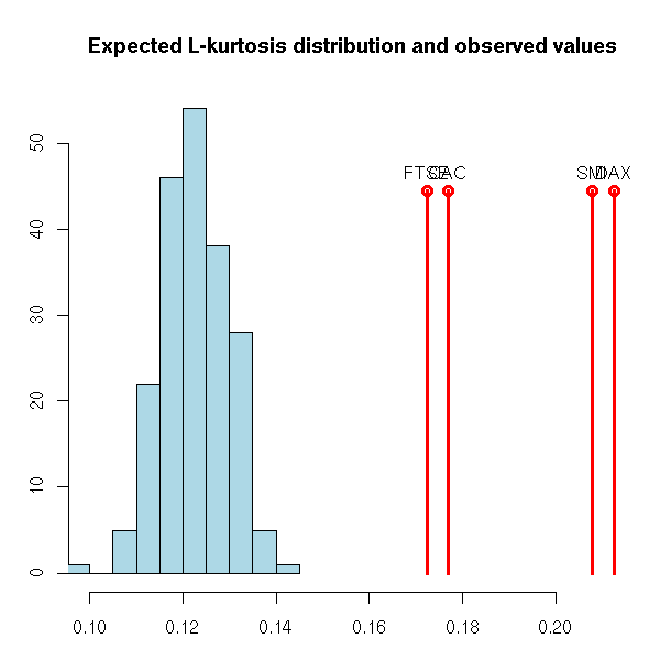
We can see the data we are studying as an untidy bunch of numbers, in which we cannot see anything (that is why you will often see me using the "str" command that only displays the beginning of the data: displaying everything would not be enlightening).
There is a simple way of seeing someting in that bunch of numbers: just sort them. That is better, but we still have hundreds of numbers, we still do not see anything.
> str( sort(faithful$eruptions) )
 num [1:272] 1.60 1.67 1.70 1.73 1.75 ...
In those ordered numbers, you may remark that the first two digits are often the same. Furthermore, after those two digits, there is only one left. Thus, we can put them in several classes (or "bins") according to the first two digits and write, on the bin, the remaining digit. This is called a "stem-and-leaf plot". It is just an orderly way of writing down our bunch of number (we have not summurized the data yet, we have not discarded any information, any number).
> stem(faithful$eruptions)

The decimal point is 1 digit(s) to the left of the |

16 | 070355555588
18 | 000022233333335577777777888822335777888
20 | 00002223378800035778
22 | 0002335578023578
24 | 00228
26 | 23
28 | 080
30 | 7
32 | 2337
34 | 250077
36 | 0000823577
38 | 2333335582225577
40 | 0000003357788888002233555577778
42 | 03335555778800233333555577778
44 | 02222335557780000000023333357778888
46 | 0000233357700000023578
48 | 00000022335800333
50 | 0370
We could also do that by hand (before the advent of computers, people used to do that by hand -- actually, it is no longer used).
http://www.shodor.org/interactivate/discussions/steml.html
http://davidmlane.com/hyperstat/A28117.html
http://www.google.fr/search?q=stem-and-leaf&ie=UTF-8&oe=UTF-8&hl=fr&btnG=Recherche+Google&meta=
One can graphically represent a univariate series by putting the data on an axis.
data(faithful)
stripchart(faithful$eruptions, main="The \"stripchart\" function")

Yet, if there are many data, or if there are several observations with the same value, the resulting graph is not very readable. We can add some noise to that the points do not end up on top of one another.
# Only horizontal noise
stripchart(faithful$eruptions, jitter=TRUE,
           main="jittered scatterplot")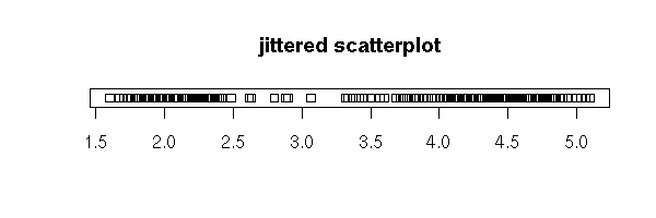
stripchart(faithful$eruptions, method='jitter',
           main="jittered scatterplot")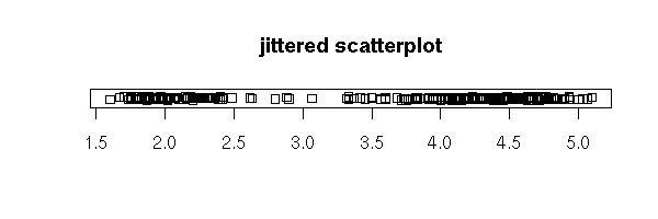
Exercise: to familiarize yourself with the "rnorm" command (and a few others), try to do that yourself.
my.jittered.stripchart <- function (x) {
  x.name <- deparse(substitute(x))
  n <- length(x)
  plot( runif(n) ~ x, xlab=x.name, ylab='noise',
        main="jittered scatterplot" )
}
my.jittered.stripchart(faithful$eruptions)
my.jittered.stripchart <- function (x) {
  x.name <- deparse(substitute(x))
  n <- length(x)
  x <- x + diff(range(x))*.05* (-.5+runif(n))
  plot( runif(n) ~ x,
        xlab=paste("jittered", x.name), ylab='noise',
        main="jittered scatterplot" )
}
my.jittered.stripchart(faithful$eruptions)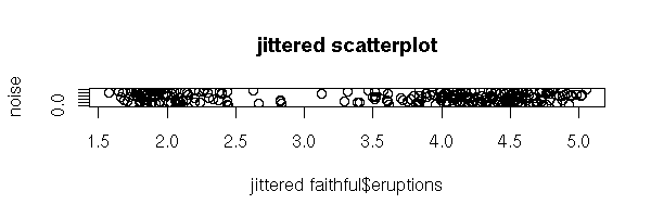
You can also plot the sorted data:
op <- par(mar=c(3,4,2,2)+.1)
plot( sort( faithful$eruptions ),
      xlab = ""
    )
par(op)
The two horizontal parts correspond to the two peaks of the histogram, to the two modes of the distribution.
Actually, it is just a scatter plot with an added dimension. (The "rug" function adds a scatter plot along an axis.)
op <- par(mar=c(3,4,2,2)+.1)
plot(sort(faithful$eruptions), xlab="")
rug(faithful$eruptions, side=2)
par(op)

It also helps to see that the data is discrete -- in a scatter plot with no added noise (no jitter), you would not see it).
op <- par(mar=c(3,4,2,2)+.1)
x <- round( rnorm(100), digits=1 )
plot(sort(x))
rug(jitter(x), side=2)
par(op)

You can also plot the cumulated frequencies (this plot is symetric to the previous one).
cumulated.frequencies <- function (x, main="") {
  x.name <- deparse(substitute(x))
  n <- length(x)
  plot( 1:n ~ sort(x),
        xlab = x.name,
        ylab = 'Cumulated frequencies',
        main = main
      )
}
cumulated.frequencies(faithful$eruptions,
                      main = "Eruption lengths")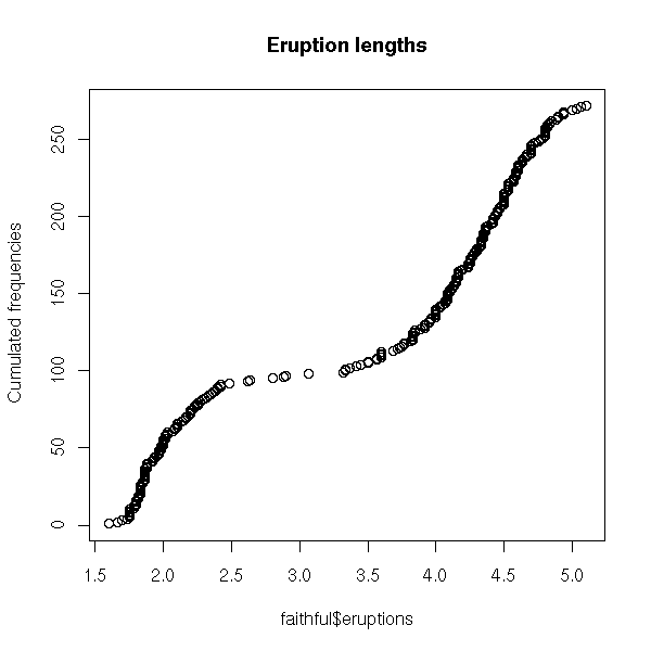
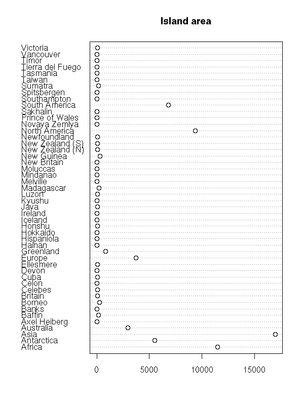
In some cases, the observations (the subjects) are named: we can add the names to the plot (it is the same plot as above, unsorted and rotated by 90 degrees).
data(islands)
dotchart(islands, main="Island area")
dotchart(sort(log(islands)),
         main="Island area (logarithmic scale)")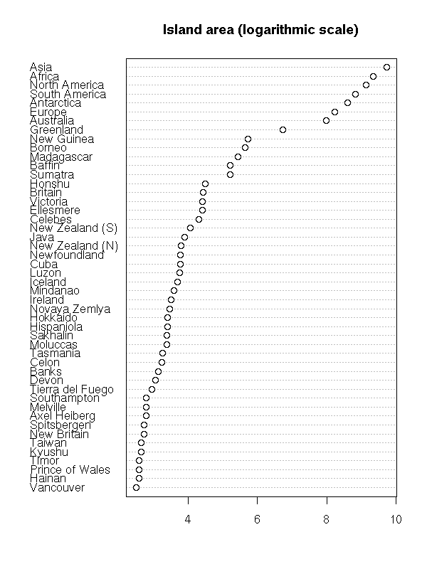
From a theoretical point of view, the cumulative distribution curve is very important, even if its interpretation deos not spring to the eyes. In the following examples, we present the cumulative distribution plot of several distributions.
op <- par(mfcol=c(2,4), mar=c(2,2,1,1)+.1)
do.it <- function (x) {
  hist(x, probability=T, col='light blue',
       xlab="", ylab="", main="", axes=F)
  axis(1)
  lines(density(x), col='red', lwd=3)
  x <- sort(x)
  q <- ppoints(length(x))
  plot(q~x, type='l',
       xlab="", ylab="", main="")
  abline(h=c(.25,.5,.75), lty=3, lwd=3, col='blue')
}
n <- 200
do.it(rnorm(n))
do.it(rlnorm(n))
do.it(-rlnorm(n))
do.it(rnorm(n, c(-5,5)))
par(op)
The box-and-whiskers plots are a simplified view of the cumulative distribution plot: they just contain the quartiles, i.e., the intersections with the horizontal dotted blue lines above.
N <- 2000
x <- rnorm(N)
op <- par(mar=c(0,0,0,0), oma=c(0,0,0,0)+.1)
layout(matrix(c(1,1,1,2), nc=1))
y <- ppoints( length(x) )
plot(sort(x), y, type="l", lwd=3,
     xlab="", ylab="", main="")
abline(h=c(0,.25,.5,.75,1), lty=3)
abline(v = quantile(x), col = "blue", lwd = 3, lty=2)
points(quantile(x), c(0,.25,.5,.75,1), lwd=10, col="blue")
boxplot(x, horizontal = TRUE, col = "pink", lwd=5)
abline(v = quantile(x), col = "blue", lwd = 3, lty=2)
par(new=T)
boxplot(x, horizontal = TRUE, col = "pink", lwd=5)
par(op)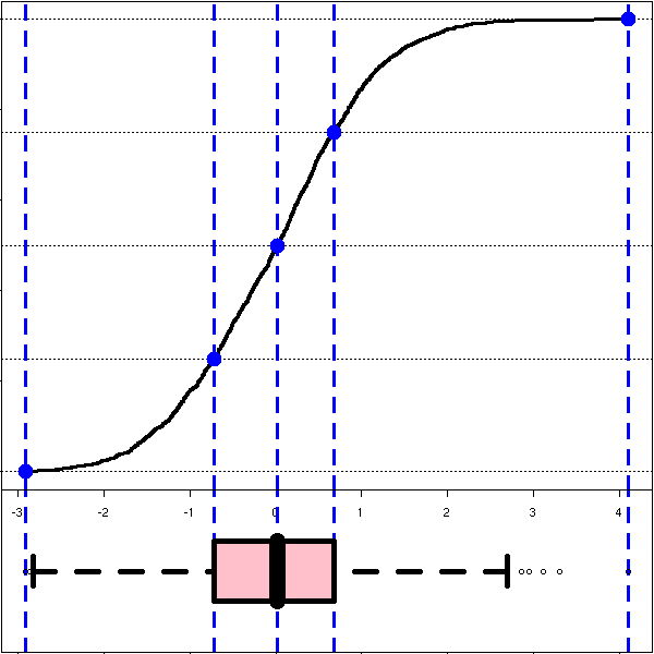
TODO:
Check the vocabulary I have used: "empirical cumulative
distribution function"
State the (much more technical) use of this ECDF to devise
a test comparing two distributions.
A box-and-whiskers plot is a graphical representation of the 5 quartiles (minimum, first quartile, median, third quartile, maximum).
boxplot(faithful$eruptions, range=0)
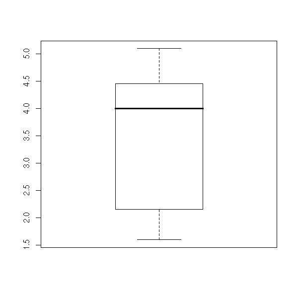
The name of this plot is more understandable if it is drawn horizontally.
boxplot(faithful$eruptions, range=0, horizontal=TRUE)

On this example, we can clearly see that the data are not symetric: thus, we know that it would be a bad idea to apply statistical procedures that assume they are symetric -- or even, normal.
This is one of the main uses of this kind of plot: assessing the symetry of your data.
This graphical representation of the quartiles is simpler and more directly understandable than the following, in terms of area.
op <- par(mfrow=c(1,2), mar=c(3,2,4,2)+.1)
do.it <- function (x, xlab="", ylab="", main="") {
  d <- density(x)
  plot(d, type='l', xlab=xlab, ylab=ylab, main=main)
  q <- quantile(x)
  do.it <- function (i, col) {
    x <- d$x[i]
    y <- d$y[i]
    polygon( c(x,rev(x)), c(rep(0,length(x)),rev(y)), border=NA, col=col )
  }
  do.it(d$x <= q[2], 'red')
  do.it(q[2] <= d$x & d$x <= q[3], 'green')
  do.it(q[3] <= d$x & d$x <= q[4], 'blue')
  do.it(d$x >= q[4], 'yellow')
  lines(d, lwd=3)
}
do.it( rnorm(2000), main="Gaussian" )
do.it( rexp(200), main="Exponential" )
par(op)
mtext("Quartiles", side=3, line=3, font=2, cex=1.2)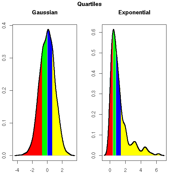
(In this example, the four areas are equal; this highlights the often-claimed fact that the human eye cannot compare areas.)
Without the "range=0" option, the plot also underlines the presence of outliers, i.e., points far away from the median (beyond 1.5 times the InterQuartile Range (IQR)). In this example, there are no outliers.
boxplot(faithful$eruptions, horizontal = TRUE,
        main = "No outliers")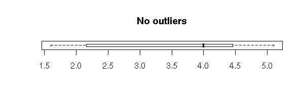
In some cases, these "outliers" are perfectly normal.
# There are outliers, they might bring trouble,
# but it is normal, it is not pathological
boxplot(rnorm(500), horizontal = TRUE,
        main = "Normal outliers")
If there are only a few outliers, really isolated, they might be errors -- yes, in the real life, the data is "dirty"...
x <- c(rnorm(30),20)
x <- sample(x, length(x))
boxplot( x, horizontal = TRUE,
         main = "An outlier" )
library(boot)
data(aml)
boxplot( aml$time, horizontal = TRUE,
         main = "An outlier" )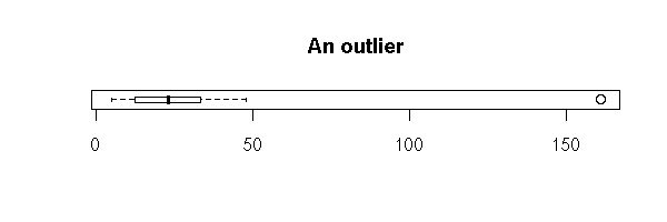
They can also be the sign that the distribution is not gaussian at all.
data(attenu)
boxplot(attenu$dist, horizontal = TRUE,
        main = "Non gaussian (asymetric) data")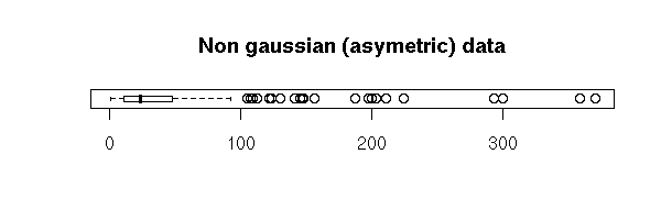
Then, we usually transform the data, by applying a simple and well-chosen function, so that it becomes gaussian (more about this later).
data(attenu)
boxplot(log(attenu$dist), horizontal = TRUE,
        main = "Transformed variable")
Outliers _are_ troublesome, because many statistical procedures are sensitive to them (mean, standard deviation, regression, etc.).
> x <- aml$time
> summary(x)
   Min. 1st Qu.  Median    Mean 3rd Qu.    Max.
   5.00   12.50   23.00   29.48   33.50  161.00
> y <- x[x<160]
> summary(y)
   Min. 1st Qu.  Median    Mean 3rd Qu.    Max.
   5.00   12.25   23.00   23.50   32.50   48.00
This was a second use of box-and-whiskers plots: spotting outliers. Their presence may be perfectly normal (but you must beware that they might bias later computations -- unless you choose robust algorithms); they may be due to errors, that are to be corrected; they may also reveal that the distribution is not gaussian and naturally contains many outliers ("fat tails" -- more about this later, when we mention the "extreme distributions" and high-frequency (intra-day) financial data).
Actually, the larger the sample, the more outliers.
y <- c(rnorm(10+100+1000+10000+100000))
x <- c(rep(1,10), rep(2,100), rep(3,1000), rep(4,10000), rep(5,100000))
x <- factor(x)
plot(y~x,
     horizontal = TRUE,
     col = "pink",
     las = 1,
     xlab = "", ylab = "",
     main = "The larger the sample, the more outliers")
You could plot boxes whose whiskers would extend farther for larger samples, but beware: even if the presence of extreme values in larger samples is normal, it can have an important leverage effect, an important influence on the results of your computations.
Exercise: plot box-and-whiskers whose whisker length varies with the sample size.
You can ask R to plot a confidence interval on the median:
boxplot(faithful$eruptions,
        notch = TRUE,
        horizontal = TRUE,
        main = "Confidence interval on the median...")
library(boot)
data(breslow)
boxplot(breslow$n,
        notch = TRUE,
        horizontal = TRUE,
        col = "pink",
        main = "...that goes beyond the quartiles")
You can also add a scatter plot.
boxplot(faithful$eruptions,
        horizontal = TRUE,
        col = "pink")
rug(faithful$eruption,
    ticksize = .2)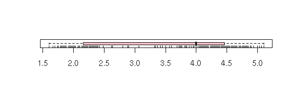
You can also represent those data with a histogram: put each observation in a class (the computer can do this) and, for each class, plot a vertical bar whose height (or area) is proportionnal to the number of elements.
hist(faithful$eruptions)

There is a big, unavoidable prolem with histograms: a different choice of classes can lead to a completely different histogram.
First, the width of the classes can play a role.
hist(faithful$eruptions, breaks=20, col="light blue")

TODO: give an example!
But their position, as well, can completely change the histogram and have it look sometimes symetric, sometimes not. For instance, in neither of the following histograms does the peak look symetric but the asymetry is not in the same direction.
op <- par(mfrow=c(2,1), mar=c(2,2,2,1)+.1)
hist(faithful$eruptions, breaks=seq(1,6,.5),
     col='light blue',
     xlab="", ylab="", main="")
hist(faithful$eruptions, breaks=.25+seq(1,6,.5),
     col='light blue',
     xlab="", ylab="", main="")
par(op)
mtext("Is the first peak symetric or not?",
      side=3, line=2.5, font=2.5, size=1.5)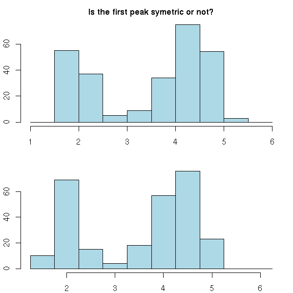
You can replace the histogram with a curve, a "density estimation". If you see the data as a sum of Dirac masses, you can obtain such a function by convolving this sum with a well-chosen "kernel", e.g., a gaussian density -- but you have to choose the "bandwidth" of this kernel, i.e., the standard deviation of the gaussian density.
This density estimation can be adaptive: the bandwidth of this gaussian kernel can change along the sample, being larger when the point density becomes higher (the "density" function does not use an adaptive kernel -- check function akj in the quantreg package if you want one).
hist(faithful$eruptions,
     probability=TRUE, breaks=20, col="light blue",
     xlab="", ylab="",
     main="Histogram and density estimation")
points(density(faithful$eruptions, bw=.1), type='l',
       col='red', lwd=3)
Density estimations still have the first problem of histograms: a different kernel may yield a completely different curve -- but the second problem disappears.
hist(faithful$eruptions,
     probability=TRUE, breaks=20, col="light blue",
     xlab="", ylab="",
     main="Histogram and density estimation")
points(density(faithful$eruptions, bw=1),  type='l',
       lwd=3, col='black')
points(density(faithful$eruptions, bw=.5), type='l',
       lwd=3, col='blue')
points(density(faithful$eruptions, bw=.3), type='l',
       lwd=3, col='green')
points(density(faithful$eruptions, bw=.1), type='l',
       lwd=3, col='red')
One can add many other elements to a histogram. For instance, a scatterplot, or a gaussian density (to compare with the estimated density).
hist(faithful$eruptions,
     probability=TRUE, breaks=20, col="light blue",
     main="")
rug(faithful$eruptions)
points(density(faithful$eruptions, bw=.1), type='l', lwd=3, col='red')
f <- function(x) {
  dnorm(x,
        mean=mean(faithful$eruptions),
        sd=sd(faithful$eruptions),
  )
}
curve(f, add=T, col="red", lwd=3, lty=2)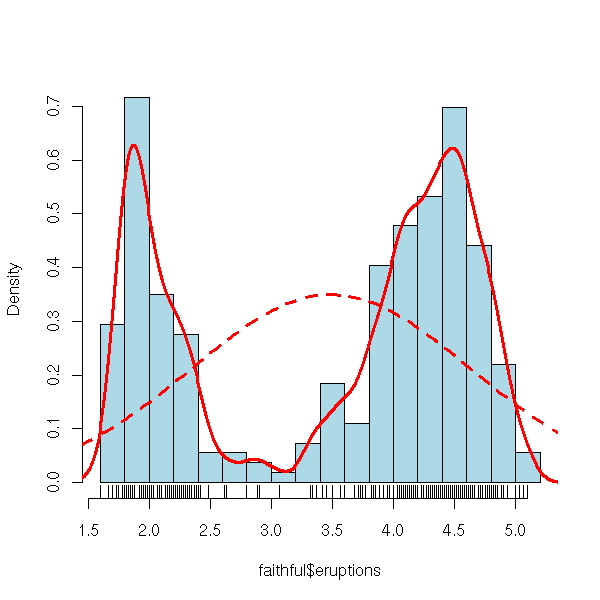
When you look at your data, one of the first questions you may ask is "are they symetric?". The following plot simply sorts the data and tries to pair the first with the last, the second with the second from the end, etc.. The following is a plot of the distance to the median of the (n-i)-th point versus that of the i-th point.
symetry.plot <- function (x0,
                          main="Symetry plot",
                          breaks="Sturges", ...) {
  x <- x0[ !is.na(x0) ]
  x <- sort(x)
  x <- abs(x - median(x))
  n <- length(x)
  nn <- ceiling(n/2)
  plot( x[n:(n-nn+1)] ~ x[1:nn] ,
        xlab='Distance below median',
        ylab='Distance above median',
        main=main,
        ...)
  abline(0,1, col="blue", lwd=3)
  op <- par(fig=c(.02,.5,.5,.98), new=TRUE)
  hist(x0, probability=T, breaks=breaks,
       col="light blue", xlab="", ylab="", main="", axes=F)
  lines(density(x0), col="red", lwd=2)
  box()
  par(op)
}

symetry.plot(rnorm(500),
             main="Symetry plot (gaussian distribution)")
symetry.plot(rexp(500),
             main="Symetry plot (exponential distribution)")
symetry.plot(-rexp(500),
             main="Symetry plot (negative skewness)")
symetry.plot(rexp(500),
             main="Symetry plot, logarithmic scales)")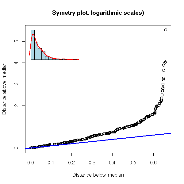
symetry.plot(faithful$eruptions, breaks=20)

The problem is that it is rather hard to see if you are "far away" from the line: the more points the sample has, the more the plot looks like a line. Here, with a 100 points (this is a lot), we are still far away from a line.
symetry.plot.2 <- function (x, N=1000,
                            pch=".", cex=1, ...) {
  x <- x[ !is.na(x) ]
  x <- sort(x)
  x <- abs(x - median(x))
  n <- length(x)
  nn <- ceiling(n/2)
  plot( x[n:(n-nn+1)] ~ x[1:nn] ,
        xlab='Distance below median',
        ylab='Distance above median',
        ...)
  for (i in 1:N) {
    y <- sort( rnorm(n) )
    y <- abs(y - median(y))
    m <- ceiling(n/2)
    points( y[n:(n-m+1)] ~ y[1:m],
            pch=pch, cex=cex, col='red' )
  }
  points(x[n:(n-nn+1)] ~ x[1:nn] , ...)
  abline(0,1, col="blue", lwd=3)
}

n <- 100
symetry.plot.2( rnorm(n), pch='.', lwd=3,
                main=paste("Symetry plot: gaussian,", n, "observations"))
With 10 points, it is even worse...
(It might be because of that that this plot it is rarely used...)
n <- 10
symetry.plot.2( rnorm(n), pch=15, lwd=3, type="b", cex=.5,
                main=paste("Symetry plot: gaussian,", n, "observations"))
But here, we are just comparing the symetry of our distribution with that of a gaussian one: the differences can come either from our distribution not being symetric or from its being non gaussian. Instead, we can compare our distribution with its symetrization, or samples taken (with replacement) from our symetrized sample -- to symetrize, simply concatenate the x_i and the M - (x_i - M).
robust.symetry.plot <- function (x,
                                 N = max(ceiling(1000/length(x)),2),
                                 alpha = .05,
                                 xlab = "Distance below the median",
                                 ylab = "Distance above",
                                 main = "Symetry plot",
                                 ...) {
  cat(N, "\n")
  # The symetry plot
  x <- x[!is.na(x)]
  n <- length(x)
  nn <- ceiling(n/2)
  x <- sort(x)
  d <- abs(x - median(x))       # Distance to the median
  plot( d[1:nn], d[n:(n-nn+1)],
        xlab = xlab, ylab = ylab,
        main = main,
        ... )
  # The symetry plot of resampled, symetric data
  y <- c(x, 2 * median(x) - x)  # We symetrize the data
  X <- Y <- rep(NA, N * nn)
  for (i in 1:N) {
    a <- sort(sample(y, n))
    a <- abs(a - median(a))
    j <- ((i-1) * nn + 1) : (i * nn)
    X[j] <- a[1:nn]
    Y[j] <- a[n:(n-nn+1)]
  }
  points(X, Y, col="red")
  points( d[1:nn], d[n:(n-nn+1)], ...)
  # The 5% confidence interval stemming from the resampled data
  require(quantreg)
  for (tau in c(alpha, 1-alpha)) {
    r <- lprq(X, Y,
              h = bw.nrd0(x),  # See ?density
              tau = tau)
    lines(r$xx, r$fv, col = "blue", lwd = 3)
  }
  abline(0, 1, col = "blue", lty = 2)
  # The histogram, in a corner
  op <- par(fig = if (skewness(x)>0)
                    c(.02,.5,.5,.98)       # Top left corner
                  else c(.5,.98,.02,.5),   # Bottom right
            new = TRUE)
  hist(x, probability=T,
      col="light blue", xlab="", ylab="", main="", axes=F)
  lines(density(x), col="red", lwd=2)
  box()
  par(op)
}
robust.symetry.plot(EuStockMarkets[,"CAC"])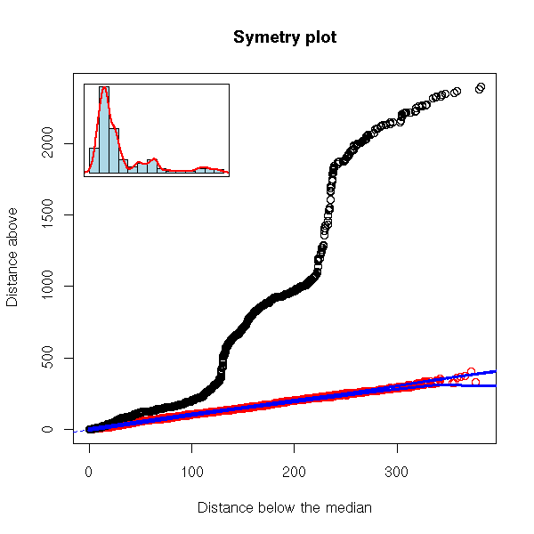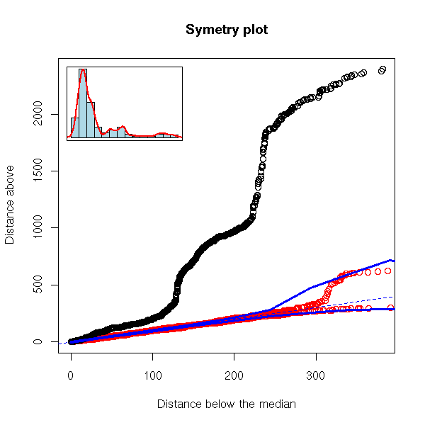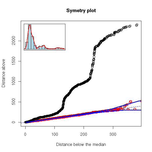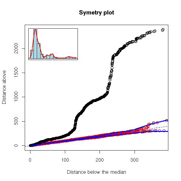
robust.symetry.plot <- function (x,
                                 N = max(ceiling(1000/length(x)),2),
                                 alpha = .05,
                                 xlab = "Distance below the median",
                                 ylab = "Distance above",
                                 main = "Symetry plot",
                                 ...) {
  cat(N, "\n")
  # The symetry plot
  x <- x[!is.na(x)]
  n <- length(x)
  nn <- ceiling(n/2)
  x <- sort(x)
  d <- abs(x - median(x))       # Distance to the median
  plot( d[1:nn], d[n:(n-nn+1)],
        xlab = xlab, ylab = ylab,
        main = main,
        ... )
  # The symetry plot of resampled, symetric data
  y <- c(x, 2 * median(x) - x)  # We symetrize the data
  X <- Y <- rep(NA, N * nn)
  for (i in 1:N) {
    a <- sort(sample(y, n))
    a <- abs(a - median(a))
    j <- ((i-1) * nn + 1) : (i * nn)
    X[j] <- a[1:nn]
    Y[j] <- a[n:(n-nn+1)]
  }
  points(X, Y, col="red")
  points( d[1:nn], d[n:(n-nn+1)], ...)
  # The 5% confidence interval stemming from the resampled data
  require(quantreg)
  for (tau in c(alpha, 1-alpha)) {
    r <- lprq(X, Y,
              h = bw.nrd0(x),  # See ?density
              tau = tau)
    lines(r$xx, r$fv, col = "blue", lwd = 3)
  }
  abline(0, 1, col = "blue", lty = 2, lwd = 3)
  # The histogram, in a corner
  op <- par(fig = if (skewness(x)>0)
                    c(.02,.5,.5,.98)       # Top left corner
                  else c(.5,.98,.02,.5),   # Bottom right
            new = TRUE)
  hist(x, probability=T,
      col="light blue", xlab="", ylab="", main="", axes=F)
  lines(density(x), col="red", lwd=2)
  box()
  par(op)
}
robust.symetry.plot(EuStockMarkets[,"CAC"])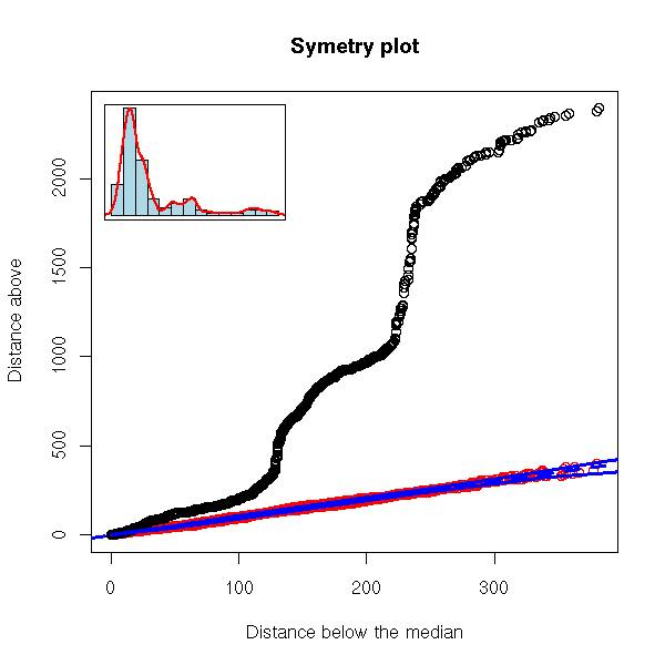
robust.symetry.plot <- function (x,
                                 N = max(ceiling(1000/length(x)),2),
                                 alpha = .05,
                                 xlab = "Distance below the median",
                                 ylab = "Distance above the median",
                                 main = "Symetry plot",
                                 ...) {
  cat(N, "\n")
  # The symetry plot
  x <- x[!is.na(x)]
  n <- length(x)
  nn <- ceiling(n/2)
  x <- sort(x)
  d <- abs(x - median(x))       # Distance to the median
  plot( d[1:nn], d[n:(n-nn+1)],
        xlab = xlab, ylab = ylab,
        main = main,
        ... )
  # The symetry plot of resampled, symetric data
  y <- c(x, 2 * median(x) - x)  # We symetrize the data
  X <- Y <- rep(NA, N * nn)
  for (i in 1:N) {
    a <- sort(sample(y, n))
    a <- abs(a - median(a))
    j <- ((i-1) * nn + 1) : (i * nn)
    X[j] <- a[1:nn]
    Y[j] <- a[n:(n-nn+1)]
  }
  points(X, Y, col="red")
  points( d[1:nn], d[n:(n-nn+1)], ...)
  # The 5% confidence interval stemming from the resampled data
  require(quantreg)
  for (tau in c(alpha, 1-alpha)) {
    r <- lprq(X, Y,
              h = bw.nrd0(x),  # See ?density
              tau = tau)
    lines(r$xx, r$fv, col = "blue", lwd = 3)
  }
  abline(0, 1, col = "blue", lty = 2)
  # The histogram, in a corner
  op <- par(fig = if (skewness(x)>0)
                    c(.02,.5,.5,.98)       # Top left corner
                  else c(.5,.98,.02,.5),   # Bottom right
            new = TRUE)
  hist(x, probability=T,
      col="light blue", xlab="", ylab="", main="", axes=F)
  lines(density(x), col="red", lwd=2)
  box()
  par(op)
}
robust.symetry.plot(EuStockMarkets[,"FTSE"])
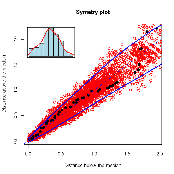
robust.symetry.plot(rnorm(100), N=100, pch=16)
We have just seen a graphical way of assessing the symetry of a sample. One other thing we like, about our data, is when they follow a gaussian distribution -- or any well-known, reference distribution.
In some cases, it is obvious that the distribution is not gaussian: this was the case for the Old Faithful geyser eruption lengths (the data were bimodal, i.e., the density had two peaks). In other cases, it is not that obvious. A first means of checking this is to compare the estimated density with a gaussian density.
data(airquality)
x <- airquality[,4]
hist(x, probability=TRUE, breaks=20, col="light blue")
rug(jitter(x, 5))
points(density(x), type='l', lwd=3, col='red')
f <- function(t) {
  dnorm(t, mean=mean(x), sd=sd(x) )
}
curve(f, add=T, col="red", lwd=3, lty=2)
You can also see, graphically, wether a variable is gaussian: just plot the gaussian quantiles versus the sample quantiles.
There is already a function to do that. (The "qqline" function plots a line through the first and third quartiles.) In this example, the data are roughly gaussian, but we can see that they are discrete.
x <- airquality[,4]
qqnorm(x)
qqline(x,
       col="red", lwd=3)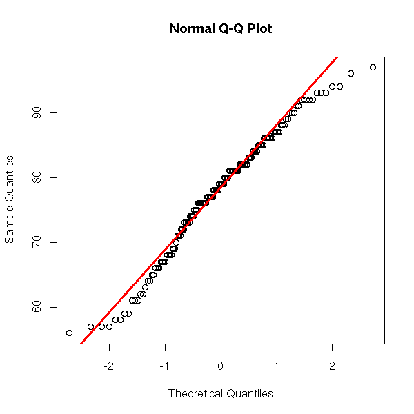
Here is what we would get with a truly gaussian variable.
y <- rnorm(100)
qqnorm(y, main="Gaussian random variable")
qqline(y,
       col="red", lwd=3)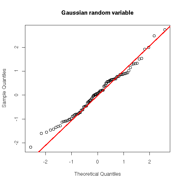
And now, a non gaussian variable.
y <- rnorm(100)^2
qqnorm(y, main="Non gaussian variable")
qqline(y,
       col="red", lwd=3)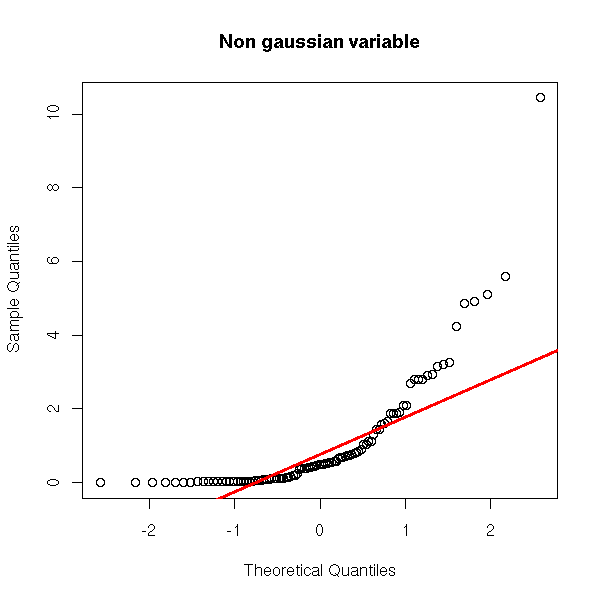
As before, we can overlay several gaussian qqplots to our plot, to see how far from gaussian our data are.
my.qqnorm <- function (x, N=1000, ...) {
  op <- par()
  x <- x[!is.na(x)]
  n <- length(x)
  m <- mean(x)
  s <- sd(x)
  print("a")
  qqnorm(x, axes=F, ...)
  for (i in 1:N) {
    par(new=T)
    qqnorm(rnorm(n, mean=m, sd=s), col='red', pch='.',
           axes=F, xlab='', ylab='', main='')
  }
  par(new=T)
  qqnorm(x, ...)
  qqline(x, col='blue', lwd=3)
  par(op)
}
my.qqnorm(rnorm(100),
          main = "QQplot: Gaussian distribution")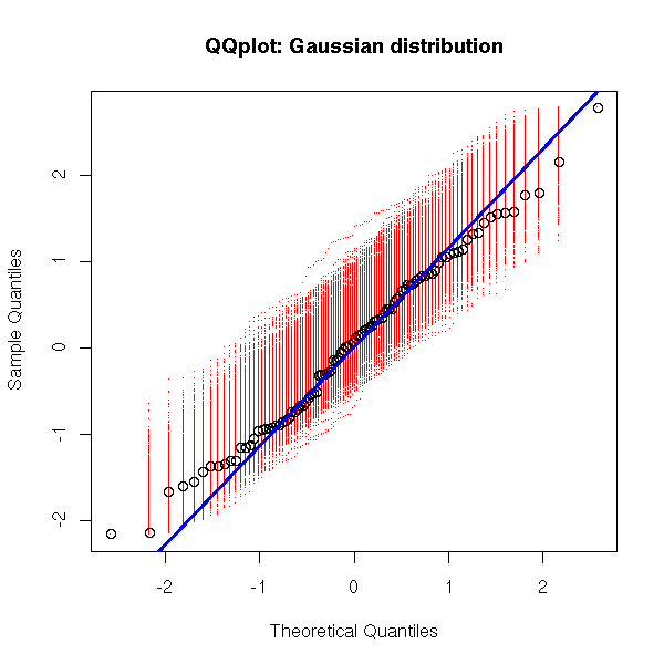
my.qqnorm(runif(100),
          main = "uniform distribution")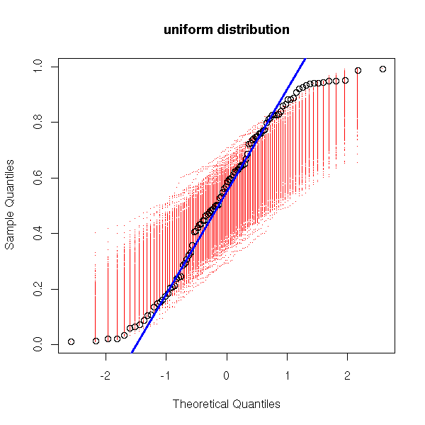
my.qqnorm(exp(rnorm(100)),
          main = 'log-normal distribution')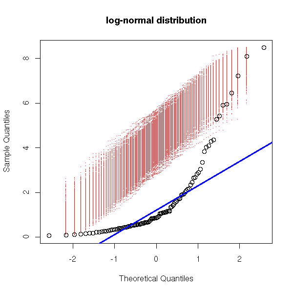
my.qqnorm(c(rnorm(50), 5+rnorm(50)),
          main = 'bimodal distribution')
my.qqnorm(c(rnorm(50), 20+rnorm(50)),
          main = 'two remote peaks')
x <- rnorm(100)
x <- x + x^3
my.qqnorm(x, main = 'fat tails')

Here are other qqplot examples.
Two distributions shifted to the left.
y <- exp(rnorm(100))
qqnorm(y,
       main = '(1) Log-normal distribution')
qqline(y,
       col = 'red', lwd = 3)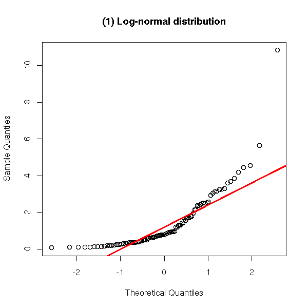
y <- rnorm(100)^2
qqnorm(y, ylim = c(-2,2),
       main = "(2) Square of a gaussian variable")
qqline(y,
       col = 'red', lwd = 3)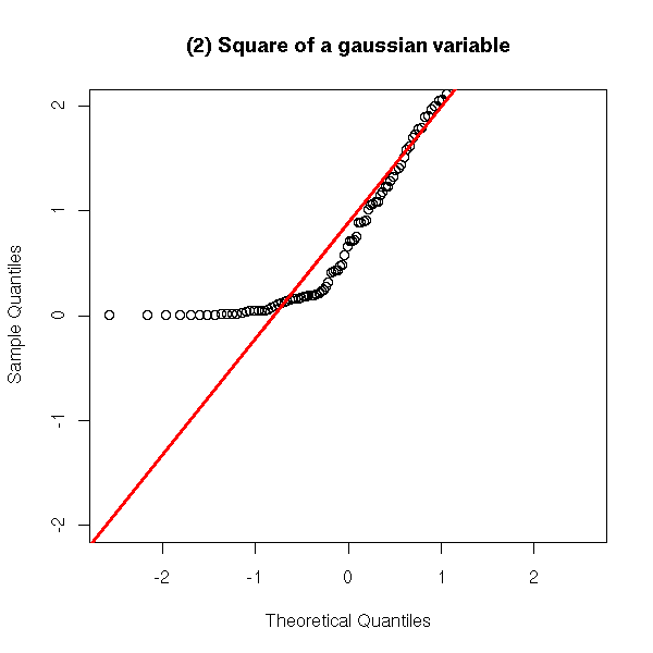
A distribution shifted to the right.
y <- -exp(rnorm(100))
qqnorm(y, ylim = c(-2,2),
       main = "(3) Opposite of a log-normal variable")
qqline(y,
       col = 'red', lwd = 3)
A distribution less dispersed that the gaussian distribution (this is called a leptokurtic distribution).
y <- runif(100, min=-1, max=1)
qqnorm(y, ylim = c(-2,2),
       main = '(4) Uniform distribution')
qqline(y,
       col = 'red', lwd = 3)
A distribution more dispersed that the gaussian distribution (this is called a platykurtic distribution).
y <- rnorm(10000)^3
qqnorm(y, ylim = c(-2,2),
       main = "(5) Cube of a gaussian r.v.")
qqline(y,
       col = 'red', lwd = 3)
A distribution with several peaks.
y <- c(rnorm(50), 5+rnorm(50))
qqnorm(y,
       main = '(6) Two peaks')
qqline(y,
       col = 'red', lwd = 3)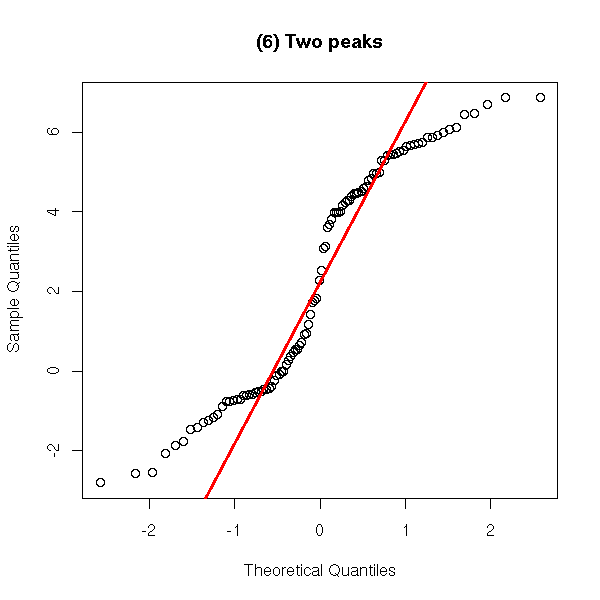
y <- c(rnorm(50), 20+rnorm(50))
qqnorm(y,
       main = '(7) Two peaks, farther away')
qqline(y,
       col = 'red', lwd = 3)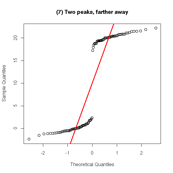
y <- sample(seq(0,1,.1), 100, replace=T)
qqnorm(y,
       main = '(7) Discrete distribution')
qqline(y,
       col = 'red', lwd = 3)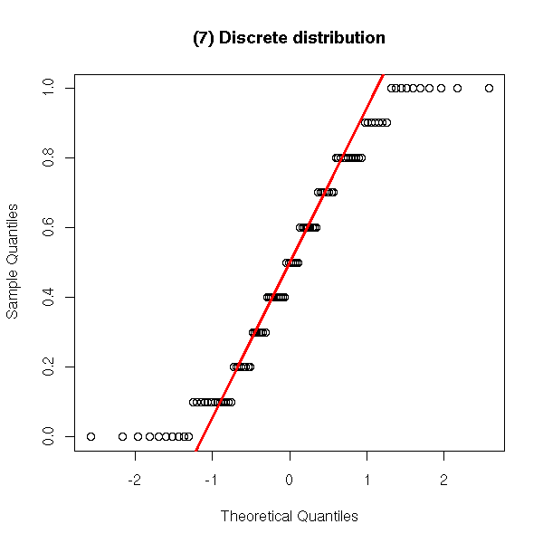
You can read those plots as follows.
a. If the distribution is more concentrated to the left than the gaussian distribution, the left part of the plot is above the line (examples 1, 2 and 4 above).
b. If the distribution is less concentrated to the left than the gaussian distribution, the left part of the plot is under the line (example 3 above).
c. If the distribution is more concentrated to the right than the gaussian distribution, the right part of the plot is under the line (examples 3 and 4 above).
d. If the distribution is less concentrated to the right than the gaussian distribution, the right part of the plot is above the line (examples 1 and 2 above).
For instance, example 5 can be interpreted as: the distribution is symetric, to the left of 0, near 0, it is more concentrated that a gaussian distribution ; to the left of 0, far from 0, it is less concentrated than a gaussian distribution; on the right of 0, it is the same.
x <- seq(from=0, to=2, length=100)
y <- exp(x)-1
plot( y ~ x, type = 'l', col = 'red',
      xlim = c(-2,2), ylim = c(-2,2),
      xlab = "Theoretical (gaussian) quantiles",
      ylab = "Sample quantiles")
lines( x~y, type='l', col='green')
x <- -x
y <- -y
lines( y~x, type='l', col='blue', )
lines( x~y, type='l', col='cyan')
abline(0,1)
legend( -2, 2,
        c( "less concentrated on the right",
           "more concentrates on the right",
           "less concentrated on the left",
           "more concentrated on the left"
         ),
        lwd=3,
        col=c("red", "green", "blue", "cyan")
      )
title(main="Reading a qqplot")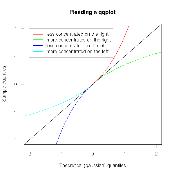
e. If the distribution is "off-centered to the left" (think: if the median is less than the mean between the first and third quartiles), then the curve is under the line in the center of the plot (examples 1 and 2 above).
f. If the distribution is "off-centered to the right" (think: if the median is more than the mean between the first and third quartiles), then the curve is above the line in the center of the plot (example 3 above).
g. If the distribution is symetric (think: if the median coincides with the average of the first and third quartiles), then the curve cuts the line in the center of the plot (examples 4 and 5 above).
op <- par()
layout( matrix( c(2,2,1,1), 2, 2, byrow=T ),
        c(1,1), c(1,6),
      )
# The plot
n <- 100
y <- rnorm(n)
x <- qnorm(ppoints(n))[order(order(y))]
par(mar=c(5.1,4.1,0,2.1))
plot( y ~ x, col = "blue",
      xlab = "Theoretical (gaussian) quantiles",
      ylab = "Sample quantiles" )
y1 <- scale( rnorm(n)^2 )
x <- qnorm(ppoints(n))[order(order(y1))]
lines(y1~x, type="p", col="red")
y2 <- scale( -rnorm(n)^2 )
x <- qnorm(ppoints(n))[order(order(y2))]
lines(y2~x, type="p", col="green")
abline(0,1)

# The legend
par(bty='n', ann=F)
g <- seq(0,1, length=10)
e <- g^2
f <- sqrt(g)
h <- c( rep(1,length(e)), rep(2,length(f)), rep(3,length(g)) )
par(mar=c(0,4.1,1,0))
boxplot( c(e,f,g) ~ h, horizontal=T,
         border=c("red", "green", "blue"),
         col="white", # Something prettier?
         xaxt='n',
         yaxt='n',
         )
title(main="Reading a qqplot")
par(op)
You can roll up your own qqplot, by going back to the definition.
y <- rnorm(100)^2
y <- scale(x)
y <- sort(x)
x <- qnorm( seq(0,1,length=length(y)) )
plot(y~x)
abline(0,1)

Let us have a look at the way the "qqnorm" function is programmed.
> help.search("qqnorm")
Help files with alias or concept or title matching "qqnorm" using
fuzzy matching:

qqnorm.acomp(compositions)
                        Normal quantile plots for compositions and
                        amounts
qqnorml(faraway)        Labeled QQ plot
GarchDistributions(fSeries)
                        GARCH Distributions
qqnorm.aov(gplots)      Makes a half or full normal plot for the
                        effects from an aov model
tnorm(msm)              Truncated Normal distribution
qqnorm.gls(nlme)        Normal Plot of Residuals from a gls Object
qqnorm.lm(nlme)         Normal Plot of Residuals or Random Effects
                        from an lme Object
pnorMix(nor1mix)        Normal Mixture Cumulative Distribution and
                        Quantiles
qnormp(normalp)         Quantiles of an exponential power distribution
qqnormp(normalp)        Quantile-Quantile plot for an exponential
                        power distribution
pcdiags.plt(pcurve)     Diagnostic Plots for Principal Curve Analysis
Lognormal(stats)        The Log Normal Distribution
Normal(stats)           The Normal Distribution
qqnorm(stats)           Quantile-Quantile Plots
NormScore(SuppDists)    Normal Scores distribution

> qqnorm
function (y, ...)
UseMethod("qqnorm")

> apropos("qqnorm")
[1] "my.qqnorm"      "qqnorm"         "qqnorm.default"

> qqnorm.default
function (y, ylim, main = "Normal Q-Q Plot", xlab = "Theoretical Quantiles",
    ylab = "Sample Quantiles", plot.it = TRUE, ...)
{
  y <- y[!is.na(y)]
  if (0 == (n <- length(y)))
    stop("y is empty")
  if (missing(ylim))
    ylim <- range(y)
  x <- qnorm(ppoints(n))[order(order(y))]
  if (plot.it)
    plot(x, y, main = main, xlab = xlab, ylab = ylab, ylim = ylim,
          ...)
  invisible(list(x = x, y = y))
}
You can reuse the same idea to compare your data with other distributions.
qq <- function (y, ylim, quantiles=qnorm,
    main = "Q-Q Plot", xlab = "Theoretical Quantiles",
    ylab = "Sample Quantiles", plot.it = TRUE, ...)
{
  y <- y[!is.na(y)]
  if (0 == (n <- length(y)))
    stop("y is empty")
  if (missing(ylim))
    ylim <- range(y)
  x <- quantiles(ppoints(n))[order(order(y))]
  if (plot.it)
    plot(x, y, main = main, xlab = xlab, ylab = ylab, ylim = ylim,
          ...)
  # From qqline
  y <- quantile(y, c(0.25, 0.75))
  x <- quantiles(c(0.25, 0.75))
  slope <- diff(y)/diff(x)
  int <- y[1] - slope * x[1]
  abline(int, slope, ...)
  invisible(list(x = x, y = y))
}

y <- runif(100)
qq(y, quantiles=qunif)
(The various interpretations of the qqplot remain valid, but points e, f ang g no longer assess the symetry of the distribution but compare this symetry with that of the reference distribution, which need not be symetric.)
People sometimes use a quantile-quantile plot to compare a positive variable with a half-gaussian -- it may help you spot outliers: we shall use it later to look at Cook's distances.
You can turn the quantile-quantile plot so that the line (through the first and third quartiles) be horizontal.
two.point.line <- function (x1,y1,x2,y2, ...) {
  a1 <- (y2-y1)/(x2-x1)
  a0 <- y1 - a1 * x1
  abline(a0,a1,...)
}
trended.probability.plot <- function (x, q=qnorm) {
  n <- length(x)
  plot( sort(x) ~ q(ppoints(n)),
        xlab='theoretical quantiles',
        ylab='sample quantiles')
  two.point.line(q(.25), quantile(x,.25),
                 q(.75), quantile(x,.75), col='red')
}
detrended.probability.plot <- function (x, q=qnorm,
                                        xlab="", ylab="") {
  n <- length(x)
  x <- sort(x)
  x1 <- q(.25)
  y1 <- quantile(x,.25)
  x2 <- q(.75)
  y2 <- quantile(x,.75)
  a1 <- (y2-y1)/(x2-x1)
  a0 <- y1 - a1 * x1
  u <- q(ppoints(n))
  x <- x - (a0 + a1 * u)
  plot(x ~ u,
       xlab=xlab, ylab=ylab)
  abline(h=0, col='red')
}

op <- par(mfrow = c(3,2), mar = c(2,2,2,2) + .1)
x <- runif(20)
trended.probability.plot(x)
detrended.probability.plot(x)
x <- runif(500)
trended.probability.plot(x)
detrended.probability.plot(x)
trended.probability.plot(x, qunif)
detrended.probability.plot(x,qunif)
par(op)
mtext("Detrended quantile-quantile plots",
      side=3, line=3, font=2, size=1.5)
Recently, I had to follow a "data analysis course" (statistical tests, regression, Principal Component Analysis, Correspondance Analysis, Hierarchical analysis -- but, as these are very classical subjects and as I had already started to write this document, I did not learn much) during which we discovered the Gini (or Lorentz) concentration curve.
This is the curve that summarises statements such as "20% of the patients are responsible for 90% of the NHS spendings". For instance:
 Proportion of patients  | Proportions of spendings
----------------------------------------------------
       20%               |          90%
       30%               |          95%
       50%               |          99%
These are cumulated percents: the table should be read as
The top 20% are responsible for 90% of the expenses
The top 30% are responsible for 95% of the expenses
The top 50% are responsible for 99% of the expenses
We can plot those figures:
xy <- matrix(c( 0, 0,
               .2, .9,
               .3, .95,
               .5, .99,
                1, 1), byrow = T, nc = 2)
plot(xy, type = 'b', pch = 15,
     main = "Conventration curve",
     xlab = "patients",
     ylab = "expenses")
polygon(xy, border=F, col='pink')
lines(xy, type='b', pch=15)
abline(0,1,lty=2)
The more inegalities in the situation, the larger the area between the curve and the diagonal: this area (actually, we multiply this area by 2, so that the index varies between 0 (equality) and 1 (maximum inequalities)) is called the "Gini index".
Here is another example:
In a cell,
20    genes are expressed 10^5 times ("expressed" means
                                      "transcribed into ARNm")
2700  genes are expressed 10^2 times
280   genes are expressed 10   times
Let us convert this into cumulated numbers:
20   genes       100000 ARNm
2720 genes       100100 ARNm
3000 genes       100110 ARNm
and then into cumulated frequencies:
 Genes | ARNm
-------------------
  0.7% | 0.9989012
 90.7% | 0.9999001
  100% | 1
Here is the curve (the situation is much worse than the preceding!):
x <- c(0,20,2720,3000)/3000
y <- c(0,100000,100100,100110)/100110
plot(x,y, type='b', pch=15,
     xlab = "Genes", ylab = "ARNm",
     main = "Conventration curve")
polygon(x,y, border=F, col='pink')
lines(x,y, type='b', pch=15)
abline(0,1,lty=2)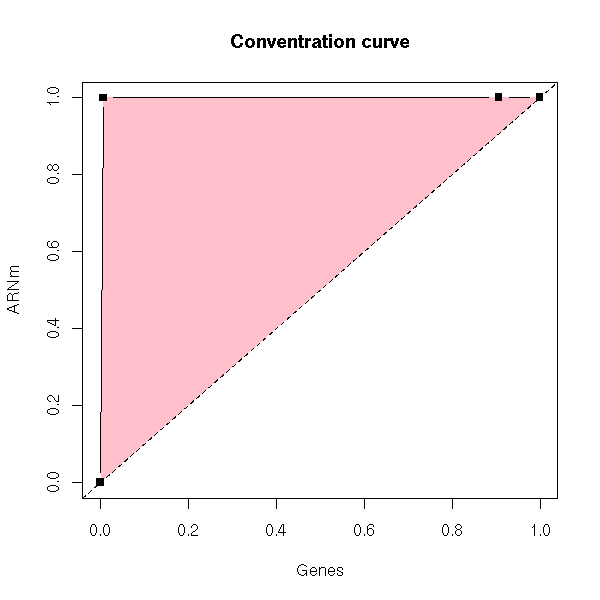
The classical example for the Gini curve is the study of incomes.
The "ineq" package contains functions to plot the Gini curve and compute the Gini index (well, the curves are the symetrics of mine, but that does not change the results).
The "Gini" function, in the "ineq" package, computes the Gini concentration index. It is only defined if the variable studied is POSITIVE (in the examples above -- "NHS spendings", "number of transcribed genes", "income", etc. -- we did not explicitely mention the variable but merely gave its cumulated frequencies).
> n <- 500
> library(ineq)
> Gini(runif(n))
[1] 0.3241409
> Gini(runif(n,0,10))
[1] 0.3459194
> Gini(runif(n,10,11))
[1] 0.01629126
> Gini(rlnorm(n))
[1] 0.5035944
> Gini(rlnorm(n,0,2))
[1] 0.8577991
> Gini(exp(rcauchy(n,1)))
[1] 0.998
> Gini(rpois(n,1))
[1] 0.5130061
> Gini(rpois(n,10))
[1] 0.1702435

library(ineq)
op <- par(mfrow=c(3,3), mar=c(2,3,3,2)+.1, oma=c(0,0,2,0))
n <- 500
set.seed(1)
plot(Lc(runif(n,0,1)),
     main="uniform on [0,1]", col='red',
     xlab="", ylab="")
do.it <- function (x, main="", xlab="", ylab="") {
  plot(Lc(x), col = "red",
       main=main, xlab=xlab, ylab=ylab)
}
do.it(runif(n,0,10),       main="uniform on [0,10]")
do.it(runif(n,10,11),      main="uniform on [10,11]")
do.it(rlnorm(n),          main="log-normal")
do.it(rlnorm(n,0,4),      main="log-normal, wider")
do.it(abs(rcauchy(n,1)),  main="half-Cauchy")
do.it(abs(rnorm(n,1)),    main="half-Gaussian")
do.it(rpois(n,1),         main="Poisson with mean 1")
do.it(rpois(n,10),        main="Poisson with mean 10")
par(op)
mtext("Gini concentration curves", side=3, line=3,
      font=2, cex=1.5)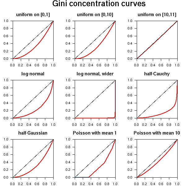
We can compute the Gini index ourselves:
n <- 500
x <- qlnorm((1:(n-1))/n, 1, 2.25)
x <- sort(x)
i <- (1:n)/n
plot(cumsum(x)/sum(x) ~ i, lwd=3, col='red')
abline(0,1)
2*sum(i-cumsum(x)/sum(x))/n
Exercise: the the examples above, the data were presented in two different forms: either cumulated frequencies or a random variable. Write some code to turn one representation into the other.
We are no longer interested in precise numeric values but in rankings. Sometimes, one will cheat and consider them as quantitative variables (and indeed, ordered variables are sometimes a simplification of quantitative variables, when they are put into classes -- but beware, by doing so, you lose information), after transforming them if needed (so that they look more gaussian) or as qualitative variables (because, as qualitative variables, they only assume a finite number of values).
In R, qualitative variables are stored in "factors" and ordered variables in "ordered factors": just replace the "factor" function by "ordered".
> l <- c('petit', 'moyen', 'grand')
> ordered( sample(l,10,replace=T), levels=l)
 [1] grand moyen moyen grand moyen petit moyen petit moyen moyen
Levels:  petit < moyen < grand
The plots are the same as with factors, but the order between the levels is not arbitrary.
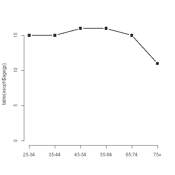
data(esoph)
dotchart(table(esoph$agegp))
mtext("Misleading plot", side=3, line=2.5, font=2, cex=1.2)
mtext("The origin is not on the plot", side=3, line=1)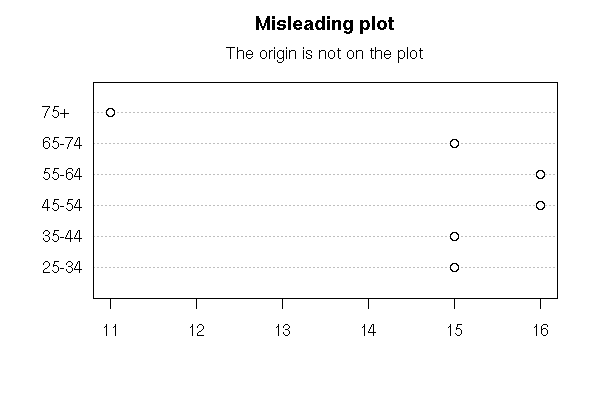
barplot(table(esoph$agegp))

hist(as.numeric(esoph$agegp),
     breaks=seq(.5,.5+length(levels(esoph$agegp)),step=1),
     col='light blue')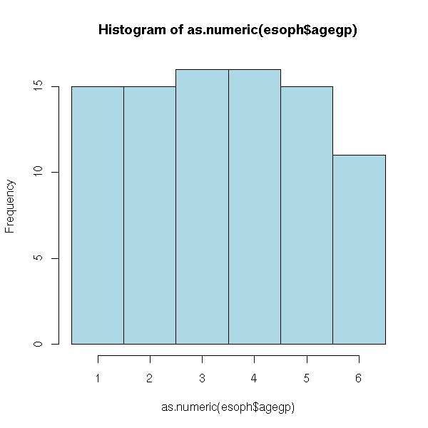
boxplot(as.numeric(esoph$agegp),
        horizontal = T, col = "pink")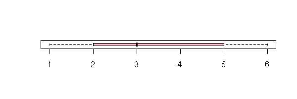
stripchart(jitter(as.numeric(esoph$agegp),2), method='jitter')

plot(table(esoph$agegp), type='b', pch=7)
We have a list of non-numeric values (actually, the data can be coded by numbers, but they are arbitrary, a difference of those numbers is meaningless: for instance, zip codes, phone numbers, or answer numbers in a questionnaire).
There are two ways of presenting such data: either a vector of strings (more precisely, of "factors": when you print it, it looks like strings, but as we expect there will be few values, often repeated, it is coded more efficiently -- you can convert a factor into an actual vector of strings with the "as.character" function), or a contingency table.
> p <- factor(c("oui", "non"))
> x <- sample(p, 100, replace=T)
> str(x)
 Factor w/ 2 levels "non","oui": 1 2 2 2 2 1 2 2 2 2 ...
> table(x)
x
non oui
 48  52
The second representation is much more compact. If you only have quantitative variables, and few of them, you might want to favour it. In the following example, there are three variables and the contingency table is consequently 3-dimensional.
> data(HairEyeColor)
> HairEyeColor
, , Sex = Male

       Eye
Hair    Brown Blue Hazel Green
  Black    32   11    10     3
  Brown    38   50    25    15
  Red      10   10     7     7
  Blond     3   30     5     8

, , Sex = Female

       Eye
Hair    Brown Blue Hazel Green
  Black    36    9     5     2
  Brown    81   34    29    14
  Red      16    7     7     7
  Blond     4   64     5     8
On the contrary, if you have both qualitative and quantitative variables, or if you have many qualitative variables, you will prefer the first representation.
> data(chickwts)
> str(chickwts)
`data.frame':   71 obs. of  2 variables:
 $ weight: num  179 160 136 227 217 168 108 124 143 140 ...
 $ feed  : Factor w/ 6 levels "casein","horseb..",..: 2 2 2 2 2 2 2 2 2 2 ...
But let us stay, for the moment, with univariate data sets.
We have already seen the "table" function, that allowed us to get the compact, contingency table, presentation.
> table(chickwts$feed)
   casein horsebean   linseed  meatmeal   soybean sunflower
       12        10        12        11        14        12
In the orther direction, you can use the "rep" function.
> x <- table(chickwts$feed)
> rep(names(x),x)
 [1] "casein"    "casein"    "casein"    "casein"    "casein"    "casein"
 [7] "casein"    "casein"    "casein"    "casein"    "casein"    "casein"
[13] "horsebean" "horsebean" "horsebean" "horsebean" "horsebean" "horsebean"
[19] "horsebean" "horsebean" "horsebean" "horsebean" "linseed"   "linseed"
[25] "linseed"   "linseed"   "linseed"   "linseed"   "linseed"   "linseed"
[31] "linseed"   "linseed"   "linseed"   "linseed"   "meatmeal"  "meatmeal"
[37] "meatmeal"  "meatmeal"  "meatmeal"  "meatmeal"  "meatmeal"  "meatmeal"
[43] "meatmeal"  "meatmeal"  "meatmeal"  "soybean"   "soybean"   "soybean"
[49] "soybean"   "soybean"   "soybean"   "soybean"   "soybean"   "soybean"
[55] "soybean"   "soybean"   "soybean"   "soybean"   "soybean"   "sunflower"
[61] "sunflower" "sunflower" "sunflower" "sunflower" "sunflower" "sunflower"
[67] "sunflower" "sunflower" "sunflower" "sunflower" "sunflower"
data(HairEyeColor)
x <- apply(HairEyeColor, 2, sum)
barplot(x)
title(main="Column plot")
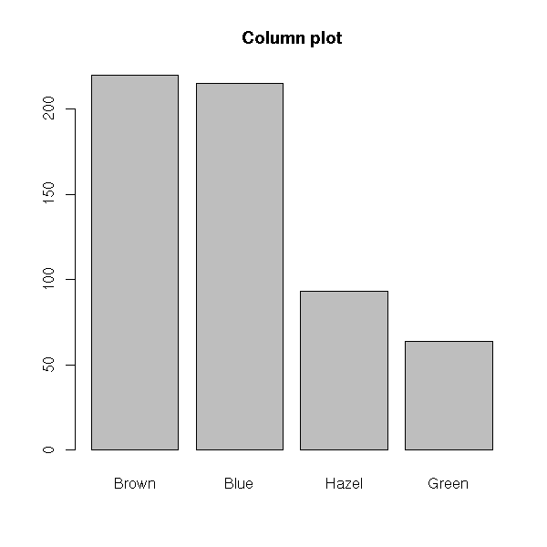
barplot(x, col = 1, density = c(3,7,11,20),
        angle = c(45,-45,45,-45))
title(main = "Column plot")
x <- apply(HairEyeColor, 2, sum)
barplot(as.matrix(x), legend.text = TRUE)
title("Bar plot")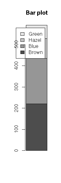
barplot(as.matrix(x),
        horiz = TRUE,
        col = rainbow(length(x)),
        legend.text = TRUE)
title(main = "Bar plot")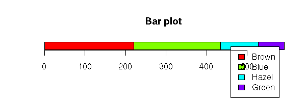
For a single variable, it might be better to place the legend yourself.
op <- par(no.readonly=TRUE)
par(mar=c(5,4,4,7)+.1)
barplot(as.matrix(x))
title("Bar plot, with legend")
par(xpd=TRUE)  # Do not clip to the drawing area
lambda <- .025
legend(par("usr")[2],
       par("usr")[4],
       names(x),
       fill = grey.colors(length(x)),
       xjust = 0, yjust = 1
      )
par(op)
op <- par(no.readonly=TRUE)
par(mar=c(3,1,4,7)+.1)
barplot(as.matrix(x),
        horiz = TRUE,
        col = rainbow(length(x)))
title(main = "Bar plot, with legend")
par(xpd=TRUE)  # Do not clip to the drawing area
lambda <- .05
legend((1+lambda)*par("usr")[2] - lambda*par("usr")[1],
       par("usr")[4],
       names(x),
       fill = rainbow(length(x)),
       xjust = 0, yjust = 1
      )
par(op)
This is simply a column plot in which the data are ordered along decreasing frequencies. If there are few possible values, it is not more enlightening that an unordered column plot (in the preceding examples, the data were already ordered: we were unknowingly looking at Pareto plots).
data(attenu)
op <- par(las=2) # Write the labels perpendicularly to the axes
barplot(table(attenu$event))
title(main="Column plot")
par(op)
op <- par(las=2)
barplot(rev(sort(table(attenu$event))))
title(main="Pareto Plot")
par(op)
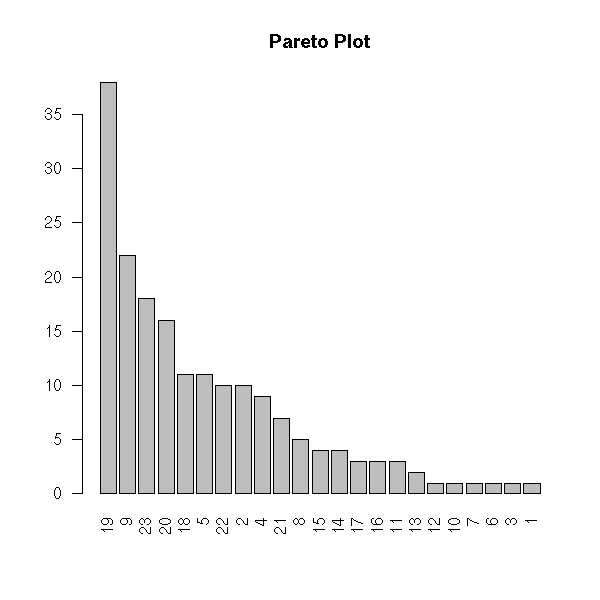
Often, one adds the cumulated frequencies.
# I cannot seem to manage to do it with
# the "barplot" function...
pareto <- function (x, main = "", ylab = "Value") {
  op <- par(mar = c(5, 4, 4, 5) + 0.1,
            las = 2)
  if( ! inherits(x, "table") ) {
    x <- table(x)
  }
  x <- rev(sort(x))
  plot( x, type = 'h', axes = F, lwd = 16,
        xlab = "", ylab = ylab, main = main )
  axis(2)
  points( x, type = 'h', lwd = 12,
          col = heat.colors(length(x)) )
  y <- cumsum(x)/sum(x)
  par(new = T)
  plot(y, type = "b", lwd = 3, pch = 7,
       axes = FALSE,
       xlab='', ylab='', main='')
  points(y, type = 'h')
  axis(4)
  par(las=0)
  mtext("Cumulated frequency", side=4, line=3)
  print(names(x))
  axis(1, at=1:length(x), labels=names(x))
  par(op)
}
pareto(attenu$event)
title(main="Pareto plot with cumulated frequencies")
Pie charts are usually a bad idea: the human eye cannot efficiently compare areas or (even worse) angles; it might be fine if you want to hide information, but if you want to convey information,
x <- apply(HairEyeColor, 2, sum)
pie(x)
title(main="Pie chart")
Actually, human beings cannot easily spot angle or surface differences. As pie charts relie exactly on that, it might not be the most insightful plot to display your data.
If you want to cheat, you can even use a 3D pie chart and put the class you want to appear larger in the foreground.
Actually, the piechart is simply the respectful barchart in polar coordinates. More generally, you can try to plot other common plots in polar coordinates -- most of the time, the result will be awful and/or misleading, but not always.
op <- par(mfrow=c(4,2), mar=c(2,4,2,2))

# Barchart (1 bar)
set.seed(1)
x <- rlnorm(6)
barplot(as.matrix(x),
        xlim = c(-2,3),
        main = "Barchart")

# Barchart with an added dimension (stacked area chart) (p.173)
y <- matrix(rnorm(60), nc=6)
y <- apply(y, 2, cumsum)
y <- exp(y/5)
stacked_area_chart <- function (y, axes = TRUE, ...) {
  stopifnot(all(y>=0))
  y <- t(apply(y, 1, cumsum))
  plot.new()
  plot.window(xlim = c(1,nrow(y)),
              ylim = range(y) + .1*c(-1,1)*diff(range(y)))
  for (i in ncol(y):1) {
    polygon(c(1,1:nrow(y),nrow(y)),
            c(0,y[,i],0),
            col=i, border=NA)
    lines(1:nrow(y), y[,i], lwd=3)
  }
  if (axes) {
    axis(1)
    axis(2)
  }
  box()
}
stacked_area_chart(y, axes = FALSE)
title(main = "Barchart with an added dimension",
      sub = "Stacked area chart")

# Pie chart
pie(x,
    col = 1:length(x),
    labels = LETTERS[1:length(x)],
    main = "Pie chart")

# Annular chart
annular_chart <- function (x, r1=1, r2=2) {
  stopifnot(x>=0, r1 >= 0, r2 > 0, r1 < r2)
  x <- cumsum(x) / sum(x)
  x <- c(0,x)
  plot.new()
  plot.window(xlim = c(-1.1,1.1)*r2,
              ylim = c(-1.1,1.1)*r2)
  for (i in 2:length(x)) {
    theta <- 2*pi*seq(x[i-1], x[i], length=100)
    polygon( c(r1 * cos(theta), r2 * cos(rev(theta))),
             c(r1 * sin(theta), r2 * sin(rev(theta))),
             col = i )
  }
}
annular_chart(x)
title("Annular chart")

# Pie chart
pie(x,
    col = 1:length(x),
    labels = LETTERS[1:length(x)],
    main = "From bad...")

# Concentrical chart
# Grid graphics would be better for this: they would
# help you enforce orthonormal coordinates, and thus
# circular circles...
circular_pie <- function (x, ...) {
  stopifnot(is.vector(x),
            all(x >= 0),
            length(x) >= 1)
  plot.new()
  radii <- sqrt(cumsum(x)) # The areas are
                           # proportional to the
                           # inital x
  plot.window(xlim = max(radii)*c(-1.1,1.1),
              ylim = max(radii)*c(-1.1,1.1) )
  theta <- seq(0, 2*pi, length=100)[-1]
  x <- cos(theta)
  y <- sin(theta)
  for (i in length(x):1) {
    polygon(radii[i] * x, radii[i] * y,
            col = i, border = NA)
    lines(radii[i] * x, radii[i] * y)
  }
}
circular_pie(x)
title("...to worse")

# barchart (several bars)
xx <- sample(x)
barplot(cbind("1" = x, "2" = xx),
        space = 1,
        xlim = c(0,5),
        col = 1:length(x),
        main = "Barchart with several bars")

# Several annular charts p.212
annular_chart_ <- function (x, r1=1, r2=2) {
  stopifnot(x>=0, r1 >= 0, r2 > 0, r1 < r2)
  x <- cumsum(x) / sum(x)
  x <- c(0,x)
  for (i in 2:length(x)) {
    theta <- 2*pi*seq(x[i-1], x[i], length=100)
    polygon( c(r1 * cos(theta), r2 * cos(rev(theta))),
             c(r1 * sin(theta), r2 * sin(rev(theta))),
             col = i )
  }
}
two_annular_charts <- function (x, y,
                               r1=1, r2=1.9,
                               r3=2, r4=2.9) {
  plot.new()
  plot.window(xlim = c(-1.1,1.1)*r4,
              ylim = c(-1.1,1.1)*r4)
  annular_chart_(x, r1, r2)
  annular_chart_(y, r3, r4)
}
two_annular_charts(x, xx)
title("Two annular charts")

par(op)
For instance, it makes sense to plot trees (dendograms) in polar coordinates.
TODO: Check that the following produces a single plot...

library(ape)
example(plot.ancestral)
example(plot.phylo)

TODO: Write a few comments, take real data.
##
## barplot2D(area, colour)
##
##
## The algorithm is not that obvious.
##   - Start with a rectangle, representing 100%, to be filled
##     by other rectangles.
##   - Try to put the first rectangle on the left
##   - If it too elongated, try to put two rectangles, on
##     top of each other, on the left
##   - Go on, until you are satisfied
##   - When you have put those rectangles, proceed with the
##     remaining of the large rectangle container.
## More precisely, we choose the number of rectables to
## stack so as to minimize the following penalty:
##   penalty for the first rectangle in the stack + penalty for the last
## where the penalty of a rectangle is
##   ratio - 1.1
## where "ratio" is the ratio of the longer side by the smaller.
##
## Arguments:
##  area:      vector, containing positive number (NAs are discarded),
##             to be used as the area of the rectangles
##  colour:    vector (same length) of strings containing the colours
##             You can create it with "rgb", or "cm.colors".
##  threshold: The maximum acceptable aspect ratio of the rectangles
##  width, height: Dimensions of the initial rectangle.
##                 I suggest to plot the picture in a rectangular
##                 device, e.g.,
##                   pdf(width=6, height=4)
##                 but to tell the function that this rectangle is
##                 actually a square, i.e.,
##                   barplot2D(area, colour, width=1, height=1)
##                 so that the cells be horizontal
##                 rectangles: you get more space to add
##                 labels
##
## Returns:
##   A matrix, one row per cell, containing the x- and
##   y-coordinates of the corners of all the cells (first
##   eight columns), and the coordinates of the center of
##   those cells (last two columns).
##   The rows are in one-to-one correspondance with the
##   elements of the "area" vector: if there were missing
##   values, we have rows of missing values.
##   The row names are the same as the names of the "area"
##   vector, in the same order.
##

barplot2D <- function (area, colour,
                       threshold=1.1,
                       width=1, height=1) {
  stopifnot(is.vector(area), is.vector(colour),
            length(area) == length(colour),
            !all(is.na(area)))
  if (is.null(names(area))) {
    names(area) <- as.character(1:length(area))
  }
  area0 <- area
  if (any(is.na(area))) {
    warning("Discarding NAs")
    i <- which(!is.na(area))
    area <- area[i]
    colour <- colour[i]
  }
  stopifnot(all(area>=0), sum(area)>0)
  i <- order(-area)
  area <- area[i]
  colour <- colour[i]
  n <- length(area)
  res <- matrix(NA, nr=n, nc=8)
  colnames(res) <- as.vector(t(outer(LETTERS[1:4], 1:2, paste, sep="")))
  rownames(res) <- names(area)
  A <- c(0,height)
  B <- c(0,0)
  C <- c(width,0)
  D <- c(width,height)
  plot.new()
  plot.window(xlim=c(0,1), ylim=c(0,1))
  i <- 1
  while (i <= n) {
    lambda <- cumsum(area[i:n]) / sum(area[i:n])
    mu <- area[i]   / cumsum(area[i:n])
    nu <- area[i:n] / cumsum(area[i:n])
    penalty1 <- mu * sum(abs(A-B)) / ( lambda * sum(abs(A-D)) )
    penalty1 <- ifelse(penalty1 <= threshold, 0, penalty1 - threshold)
    penalty2 <- lambda * sum(abs(A-D)) / ( nu * sum(abs(A-B)) )
    penalty2 <- ifelse(penalty2 <= threshold, 0, penalty2 - threshold)
    j <- which.min(penalty1 + penalty2)[1] + i - 1
    cat(i, " => ", j, "\n")
    lambda <- sum(area[i:j]) / sum(area[i:n])
    A1 <- A
    B1 <- B
    C1 <- (1-lambda) * B + lambda * C
    D1 <- (1-lambda) * A + lambda * D
    AA <- C1
    BB <- C
    CC <- D
    DD <- D1
    while (i <= j) {
      lambda <- area[i] / sum(area[i:j])
      B2 <- (1-lambda) * A1 + lambda * B1
      C2 <- (1-lambda) * D1 + lambda * C1
      polygon(rbind(A1, B2, C2, D1), col=colour[i])
      res[i,] <- c(A1, B2, C2, D1)
      A1 <- B2
      D1 <- C2
      i <- i + 1
    }
    A <- AA
    B <- BB
    C <- CC
    D <- DD
  } # Main loop
  res0 <- matrix(NA, nr=length(area0), nc=10)
  colnames(res0) <- c(colnames(res), "x", "y")
  rownames(res0) <- names(area0)
  res0[ names(area), 1:8] <- res
  res0[, "x"] <- apply(res0[,c("A1","B1","C1","D1")],1,mean)
  res0[, "y"] <- apply(res0[,c("A2","B2","C2","D2")],1,mean)
  invisible(res0)
}

N <- 20
area <- rlnorm(N)
names(area) <- LETTERS[1:N]
value <- rt(N, df=4)
# Difficult part: compute the colours...
colour <- cm.colors(255)[
  1 + round(
    254 * (value - min(value, na.rm = TRUE)) /
    diff(range(value, na.rm = TRUE))
  )
]
r <- barplot2D(area, colour)
title("2-dimensional barplot")
# Add the labels
text(r[,"x"], r[,"y"], names(area), cex=.8)
This plot also goes by the name "treemap" and can be used to represent tree-like datasets, for instance, the space on your hard drive occupied by directories, subdirectories, etc.

http://gdmap.sourceforge.net/
http://www.cs.umd.edu/hcil/treemap-history/index.shtml
See also the following thread, on the R-SIG-Finance mailing list:
https://stat.ethz.ch/pipermail/r-sig-finance/2006q2/000875.html
Treemaps are 2-dimensional barplots used to represent hiearchical classifications.
library(portfolio)
example(map.market)
A Region Tree is a set of barplots that progressively drill-down into the data.
olap <- function (x, i) {
  # Project (drill-up?) a data cube
  y <- x <- apply(x, i, sum)
  if (length(i) > 1) {
    y <- as.vector(x)
    n <- dimnames(x)
    m <- n[[1]]
    for (i in (1:length(dim(x)))[-1]) {
      m <- outer(m, n[[i]], paste)
    }
    names(y) <- m
  }
  y
}
col1 <- c("red", "green", "blue", "brown")
col2 <- c("red", "light coral",
          "green", "light green",
          "blue", "light blue",
          "brown", "rosy brown")
col3 <- col2[c(1,2,1,2,3,4,3,4,5,6,5,6,7,8,7,8)]
op <- par(mfrow=c(3,1), mar=c(8,4,0,2), oma=c(0,0,2,0), las=2)
barplot(olap(Titanic,1),   space=0, col=col1)
barplot(olap(Titanic,2:1), space=0, col=col2)
barplot(olap(Titanic,3:1), space=0, col=col3)
par(op)
mtext("Region tree", font = 2, line = 3)
A TempleMVV plot can be seen as those barplots overlaid on one another.
x1 <- olap(Titanic,3:1)
x2 <- rep(olap(Titanic,2:1), each=dim(Titanic)[3])
x3 <- rep(olap(Titanic,1),   each=prod(dim(Titanic)[2:3]))
x4 <- rep(sum(Titanic),      each=prod(dim(Titanic)[1:3]))
op <- par(mar=c(8,4,4,2))
barplot(x4, names.arg="", axes = FALSE, col = "light coral")
barplot(x3, names.arg="", axes = FALSE, col = "light green",  add = TRUE)
barplot(x2, names.arg="", axes = FALSE, col = "light blue",   add = TRUE)
barplot(x1, las=2,        axes = FALSE, col = "yellow", add = TRUE)
mtext("TempleMVV Plot", line=2, font=2, cex=1.2)
par(op)
Those plots are designed to study OLAP data (i.e., "data cubes", i.e., correspondance tables with many, many variables).
When there are many values, "dotplots" can replace column plots.
x <- apply(HairEyeColor, 2, sum)
dotchart(x, main="dotchart")

They remain readable.
library(MASS)  # For the Cars93 data set
dotchart(table(Cars93$Manufacturer))
library(nlme)
data(Milk)
dotchart(table(Milk$Cow))

Now, consider two series of numbers, in parallel: often, the data comes as a 2-column array, one column per variable, one row per subject.
data(cars)
plot(cars$dist ~ cars$speed,
     xlab = "Speed (mph)",
     ylab = "Stopping distance (ft)",
     las = 1)
title(main = "Point cloud")
You can add a 1-dimensional scatterplot in the margins.
plot(cars$dist ~ cars$speed,
     xlab = "Speed (mph)",
     ylab = "Stopping distance (ft)",
     las = 1)
title(main = "cars data")
rug(side=1, jitter(cars$speed, 5))
rug(side=2, jitter(cars$dist, 20))
You may also want to add a box-and-whiskers plot.
op <- par()
layout( matrix( c(2,1,0,3), 2, 2, byrow=T ),
        c(1,6), c(4,1),
      )

par(mar=c(1,1,5,2))
plot(cars$dist ~ cars$speed,
     xlab='', ylab='',
     las = 1)
rug(side=1, jitter(cars$speed, 5) )
rug(side=2, jitter(cars$dist, 20) )
title(main = "cars data")

par(mar=c(1,2,5,1))
boxplot(cars$dist, axes=F)
title(ylab='Stopping distance (ft)', line=0)

par(mar=c(5,1,1,2))
boxplot(cars$speed, horizontal=T, axes=F)
title(xlab='Speed (mph)', line=1)

par(op)
You can try to approximate the data with a straight line.
plot(dist ~ speed, data = cars,
     main = "\"cars\" data and regression line")
abline(lm( dist ~ speed, data = cars),
       col = 'red')
The "loess" function approximates the data with a curve, not necessarily a line. We shall explain what is behind this (it is called "local regression") when we tackle regression.
plot(cars,
     xlab = "Speed (mph)",
     ylab = "Stopping distance (ft)",
     las = 1)
# lines(loess(dist ~ speed, data=cars),
#       col = "red") # Didn't that use to work?
r <- loess(dist ~ speed, data=cars)
lines(r$x, r$fitted, col="red")
title(main = "\"cars\" data and loess curve")
This is approximately the same as the older "lowess" function.
plot(cars,
     xlab = "Speed (mph)",
     ylab = "Stopping distance (ft)",
     las = 1)
lines(lowess(cars$speed, cars$dist,
             f = 2/3, iter = 3),
      col = "red")
title(main = "\"cars\" data and lowess curve")
If one of the variables is periodic (say, the hour of the day, the direction of the wind), you may want to represent the data as a circle.
Here is for instance the number of visitors to a web site as a function of the time of the day.
x <- c(15, 9, 75, 90, 1, 1, 11, 5, 9, 8, 33, 11, 11,
       20, 14, 13, 10, 28, 33, 21, 24, 25, 11, 33)
# I tried to produce the same with the "stars"
# function, with no success.
clock.plot <- function (x, col = rainbow(n), ...) {
  if( min(x)<0 ) x <- x - min(x)
  if( max(x)>1 ) x <- x/max(x)
  n <- length(x)
  if(is.null(names(x))) names(x) <- 0:(n-1)
  m <- 1.05
  plot(0,
       type = 'n', # do not plot anything
       xlim = c(-m,m), ylim = c(-m,m),
       axes = F, xlab = '', ylab = '', ...)
  a <- pi/2 - 2*pi/200*0:200
  polygon( cos(a), sin(a) )
  v <- .02
  a <- pi/2 - 2*pi/n*0:n
  segments( (1+v)*cos(a), (1+v)*sin(a),
            (1-v)*cos(a), (1-v)*sin(a) )
  segments( cos(a), sin(a),
            0, 0,
            col = 'light grey', lty = 3)
  ca <- -2*pi/n*(0:50)/50
  for (i in 1:n) {
    a <- pi/2 - 2*pi/n*(i-1)
    b <- pi/2 - 2*pi/n*i
    polygon( c(0, x[i]*cos(a+ca), 0),
             c(0, x[i]*sin(a+ca), 0),
             col=col[i] )
    v <- .1
    text((1+v)*cos(a), (1+v)*sin(a), names(x)[i])
  }
}
clock.plot(x,
  main = "Number of visitors to a web site for each hour of the day")
The "stars" function can also produce similar plots.
?stars
TODO
The plotrix package also provides similar functions.
library(plotrix)
clock24.plot(x,
             line.col = "blue",
             lwd = 10)
# See also polar.plot, radial.plot
For more information about that kind of data, have a look at the "circular" package
library(circular)
rose.diag(x)
# x <- as.circular(rep( 2*pi / 24 * (0:23), x ))
detach("package:circular")   # redefines "var"...
Plots in polar coordinates can also help highlight periodic phenomena.
# Polar plot to spot seasonal patterns
x <- as.vector(UKgas)
n <- length(x)
theta <- seq(0, by=2*pi/4, length=n)
plot(x * cos(theta), x * sin(theta),
     type = "l",
     xlab = "", ylab = "",
     main = "UK gas consumption")
abline(h=0, v=0, col="grey")
abline(0, 1, col="grey")
abline(0, -1, col="grey")
circle <- function (x, y, r, N=100, ...) {
  theta <- seq(0, 2*pi, length=N+1)
  lines(x + r * cos(theta), y + r * sin(theta), ...)
}
circle(0,0, 250, col="grey")
circle(0,0, 500, col="grey")
circle(0,0, 750, col="grey")
circle(0,0, 1000, col="grey")
circle(0,0, 1250, col="grey")
segments( x[-n] * cos(theta[-n]),
          x[-n] * sin(theta[-n]),
          x[-1] * cos(theta[-1]),
          x[-1] * sin(theta[-1]),
          col = terrain.colors(length(x)),
          lwd = 3)
text(par("usr")[2], 0, "Winter", adj=c(1,0))
text(0, par("usr")[4], "Spring", adj=c(0,1))
text(par("usr")[1], 0, "Summer", adj=c(0,0))
text(0, par("usr")[3], "Autumn", adj=c(0,0))
legend("topright", legend = c(1960, 1973, 1986),
       fill = terrain.colors(3))
A conformal mapping is a (continuous) transformation of the plane that preserves angles.
http://mathworld.wolfram.com/ConformalMapping.html
Though they have interesting theoretical properties, they rarely provide intuitive graphics, with one exception: the exponential -- it can be used as a replacement for polar coordinates should you feel the need to preserve angles.
conformal_plot <- function (x, y, ...) {
  # To be used when y is thought to be a periodic function of x,
  # with period 2pi.
  z <- y + 1i * x
  z <- exp(z)
  x <- Re(z)
  y <- Im(z)
  plot(x, y, ...)
}
conformal_abline <- function (h=NULL, v=NULL, a=NULL, b=NULL, ...) {
  if (!is.null(a) | ! is.null(b)) {
    stop("Do not set a or b but only h or v")
  }
  if (!is.null(h)) {
    theta <- seq(0, 2*pi, length=200)
    for (i in 1:length(h)) {
      rho <- exp(h[i])
      lines(rho * cos(theta), rho * sin(theta), type = "l", ...)
    }
  }
  if (!is.null(v)) {
    rho <- sqrt(2) * max(abs(par("usr")))
    segments(0, 0, rho * cos(v), rho * sin(v), ...)
  }
}

op <- par(mar=c(1,1,3,1))
x <- as.vector(sunspots)
conformal_plot(2 * pi * seq(from=0, by=1/(11*12), length=length(x)),
               x / 100,
               type = "l",
               lwd = 2,
               col = "blue",
               xlab = "", ylab = "",
               main = "Sunspots after conformal transformation")
conformal_abline(h=seq(0,3, by=.25), col="grey")
conformal_abline(v = seq(0, 2*pi, length=12), ## 11 years...
                 col = "grey")
par(op)
You can also cut the cloud point in slices, along one variable Y, and plot a boxplot, a histogram, a density estimation of the other variable X. These are called "treillis plots" or "lattice plots"; the "lattice" package provides the corresponding functions.
The idea of cutting the data into slices may sound simple, but it is actually very powerful.
library(lattice)
y <- cars$dist
x <- cars$speed
# vitesse <- shingle(x, co.intervals(x, number=6))
vitesse <- equal.count(x)
histogram(~ y | vitesse)
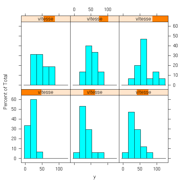
bwplot(~ y | vitesse, layout=c(1,6))
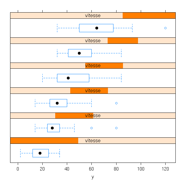
densityplot(~ y | vitesse, aspect='xy')

densityplot(~ y | vitesse, layout=c(1,6))

Before knowing lattice plots, I was cutting one of the variables in quartiles and plotting the median (or the quartiles) of the other for each of those quartiles.
y <- cars$dist
x <- cars$speed
q <- quantile(x)
o1 <- x<q[2]
o2 <- q[2]<x & x<q[3]
o3 <- q[3]<x & x<q[4]
o4 <- q[4]<x
dotchart(c(median(y[o1]), median(y[o2]),
           median(y[o3]), median(y[o4])),
         labels = as.character(1:4),
         xlab = "speed", ylab = "distance",
         main = "Before I knew lattice plots")
my.dotchart <- function (y,x,...) {
  x <- as.matrix(x)
  z <- NULL
  for (i in 1:dim(x)[2]) {
    q <- quantile(x[,i])
    for (j in 1:4) {
      z <- append(z, median(y[
        q[j] <= x[,i] & x[,i] <= q[j+1]
      ]))
      names(z)[length(z)] <-
        paste(colnames(x)[i], as.character(j))
    }
  }
  dotchart(z, ...)
}
my.dotchart(y, x, xlab = "speed", ylab = "distance",
         main = "Before I knew lattice plots")
my.dotchart <- function (y,x,...) {
  x <- as.matrix(x)
  z <- NULL
  for (i in 1:dim(x)[2]) {
    q <- quantile(x[,i])
    for (j in 1:4) {
      ya <- y[ q[j] <= x[,i] & x[,i] <= q[j+1] ]
      z <- rbind(z, quantile(ya))
      rownames(z)[dim(z)[1]] <-
        paste(colnames(x)[i], as.character(j))
    }
  }
  dotchart(t(z), ...)
}
my.dotchart(y, x, xlab = "speed", ylab = "distance",
         main = "Before I knew lattice plots")
I would like to overlay those plots...
my.dotchart <- function (y,x,...) {
  x <- as.matrix(x)
  z <- NULL
  for (i in 1:dim(x)[2]) {
    q <- quantile(x[,i])
    for (j in 1:4) {
      ya <- y[ q[j] <= x[,i] & x[,i] <= q[j+1] ]
      z <- rbind(z, quantile(ya))
      rownames(z)[dim(z)[1]] <-
        paste(colnames(x)[i], as.character(j))
    }
  }
  xmax <- max(z)
  xmin <- min(z)
  n <- dim(z)[1]
  plot( z[,3], 1:n, xlim = c(xmin,xmax), ylim = c(1,n),
        axes=F, frame.plot = TRUE, pch = '.',
        ... )
  axis(1)
  axis(2, at=1:n, las=1)
  abline( h=1:n, lty=3 )
  # median
  points( z[,3], 1:n, pch=16, cex=3 )
  # quartiles
  segments( z[,2], 1:n, z[,4], 1:n, lwd=7 )
  # min and max
  segments( z[,1], 1:n, z[,5], 1:n )
}
my.dotchart(y,x, xlab="speed", ylab="distance",
            main = "Before I knew lattice plots")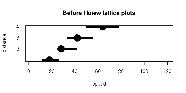
Ah... I have reinvented the box-and-whiskers plot...
Scatterplot matrices or lattice plots can be generalized: e.g., the plots can be arranged into a circle (a lattice plot whose cells are drawn in polar coordinates), a tree, a graph, etc.
TODO: Example
Mosaic plots and linked micromaps can also be seen as facet plots.
TODO: Examples?
To have an idea of the shape of the cloud of points, some people suggest to have a look at the convex hull of the cloud.
plot(cars)
polygon( cars[chull(cars),], col="pink", lwd=3)
points(cars)
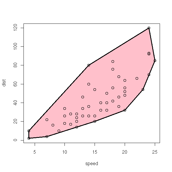
The convex hull is actually determined by a (usually) small number of points from the cloud: if you remove all the others, the convex hull would not change. Those points are sometimes called "archetypes" and can be used to describe or summarize the data: this can be seen as a 2-dimensional (or low-dimensional -- in very high dimensions, most of the points would be on the convex hull) of the minumum and maximum.
draw.ellipse <- function (
    x, y = NULL,
    N = 100,
    method = lines,
    ...
  ) {
  if (is.null(y)) {
    y <- x[,2]
    x <- x[,1]
  }
  centre <- c(mean(x), mean(y))
  m <- matrix(c(var(x),cov(x,y),
                cov(x,y),var(y)),
              nr=2,nc=2)
  e <- eigen(m)
  r <- sqrt(e$values)
  v <- e$vectors
  theta <- seq(0,2*pi, length=N)
  x <- centre[1] + r[1]*v[1,1]*cos(theta) +
       r[2]*v[1,2]*sin(theta)
  y <- centre[2] + r[1]*v[2,1]*cos(theta) +
       r[2]*v[2,2]*sin(theta)
  method(x,y,...)
}
plot(cars)
draw.ellipse(cars, col="blue", lwd=3)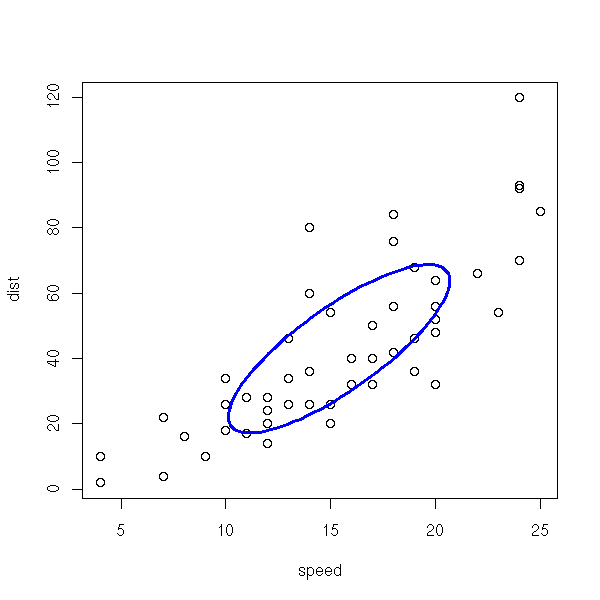
If you have too many points, scatterplots are unreadable: the picture is all black. Instead, you can estimate the "density" of the cloud of points (e.g., with the "kde2d" function, from the MASS package) and represent it in various ways.
TODO: Find appropriate data...
TODO: change the default arguments of persp, contour.

TODO: this plot?
library(chplot)
data(hdr)
x <- hdr$age
y <- log(hdr$income)
library(hexbin)
plot(hexbin(x,y))

library(chplot)
data(hdr)
x <- hdr$age
y <- log(hdr$income)
library(MASS)
z <- kde2d(x,y, n=50)
image(z, main = "Density estimation")

contour(z,
        col = "red", drawlabels = FALSE,
        main = "Density estimation: contour plot")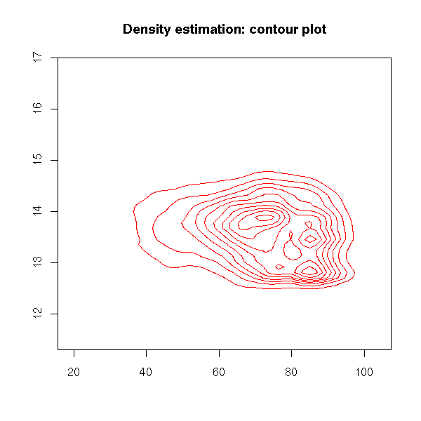
i <- sample(1:length(x), 1000)
plot(jitter(x[i]), y[i])
contour(z,
        col = "red", lwd = 3, drawlabels = FALSE,
        add = TRUE,
        main = "Density estimation: contour plot")
persp(z, main = "Density estimation: perspective plot")
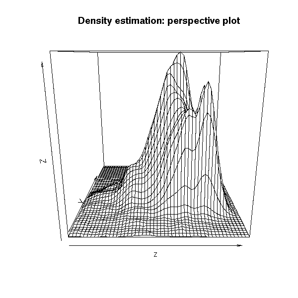
persp(z,
      phi = 45, theta = 30,
      xlab = "age", ylab = "income", zlab = "density",
      main = "Density estimation: perspective plot")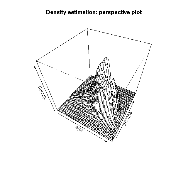
op <- par(mar=c(0,0,2,0)+.1)
persp(z, phi = 45, theta = 30,
      xlab = "age", ylab = "income", zlab = "density",
      col = "yellow", shade = .5, border = NA,
      main = "Density estimation: perspective plot")
par(op)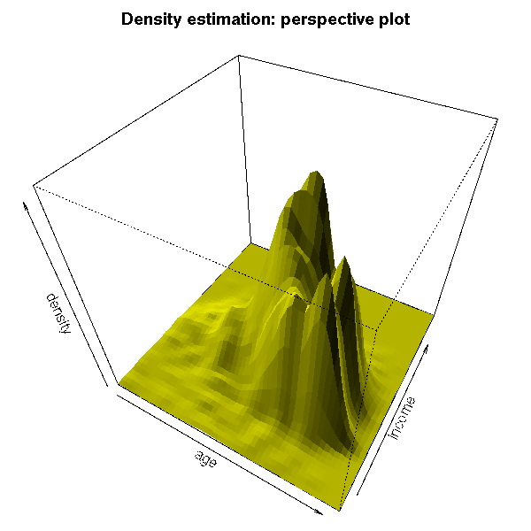
TODO: a more colourful plot, as in the manual page?
For a more interactive plot, you can use "rgl".
library(rgl)
open3d()
surface3d((z$x - min(z$x)) / diff(range(z$x)),
          (z$y - min(z$y)) / diff(range(z$y)),
          (z$z - min(z$z)) / diff(range(z$z)))
surface3d((z$x - min(z$x)) / diff(range(z$x)),
          (z$y - min(z$y)) / diff(range(z$y)),
          (z$z - min(z$z)) / diff(range(z$z)),
          color = terrain.colors(256)[
            1 + round(254 * (z$z - min(z$z)) / diff(range(z$z)))
          ])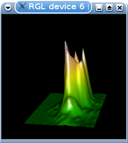
surface3d((z$x - min(z$x)) / diff(range(z$x)),
          (z$y - min(z$y)) / diff(range(z$y)),
          (z$z - min(z$z)) / diff(range(z$z)),
          color = terrain.colors(256)[
            1 + round(254 * (z$z - min(z$z)) / diff(range(z$z)))
          ],
          back="lines"
         )
Actually, you can draw much more than surfaces.
demo(rgl)

Another way of plotting a very large cloud of points is to divide it into fractiles of the first variable and compute the mean (or the median, or anything you see fit) of the second variable in each of those fractiles.
library(chplot)
data(hdr)
x <- hdr$age
y <- log(hdr$income)
FUNPerFractile <- function (x, y, N, FUN=mean, ...) {
  y <- cut(y,
           breaks = quantile(y, seq(0, 1, length = N+1),
                             na.rm=T),
           labels = FALSE)
  a <- 1:N
  b <- tapply(x, y, FUN, ...)
  data.frame(a,b)
}
MeanPerFractilePlot <- function (x, y, N=20, ...) {
  plot(FUNPerFractile(x,y,N=N,FUN=mean,na.rm=T),...)
}
MeanPerFractilePlot(x, y, type = "b", lwd = 3,
                    xlab = "age fractiles",
                    ylab = "mean income",
                    main = "Mean-per-fractile plot")
MedianPerFractilePlot <- function (x, y, N=20, ...) {
  plot(FUNPerFractile(x,y,N=N,FUN=median,na.rm=T),...)
}
MedianPerFractilePlot(x,y, type="b", lwd=3,
                    xlab = "age fractiles",
                    ylab = "median income",
                    main = "Median-per-fractile plot")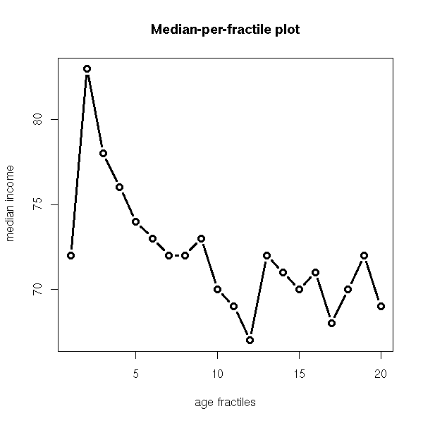
This is very similar to the loess line -- drawn WITHOUT the chould of points. There is a big difference, however, if your data have a lot of outliers.
r <- loess(y~x)
o <- order(x)
plot( r$x[o], r$fitted[o], type = "l",
      xlab = "age", ylab = "income",
      main = "loess curve, without the points" )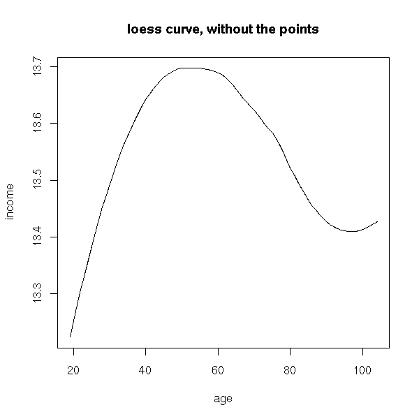
Er...
r <- loess(y~x)
o <- order(x)
plot( jitter(x, amount = .5), y, pch = ".",
      xlab = "age", ylab = "income",
     main = "Loess curve")
lines(r$x[o], r$fitted[o], col="blue", lwd=3)
r <- kde2d(x,y)
contour(r, drawlabels=F, col="red", lwd=3, add=T)
You can draw one box-and-whiskers plot for each value of the qualitative variable (here, we compare the efficiency of several insect sprays).
data(InsectSprays)
boxplot(count ~ spray,
        data = InsectSprays,
        xlab = "Type of spray",
        ylab = "Insect count",
        main = "InsectSprays data",
        varwidth = TRUE,
        col = "lightgray")
We can modify the "my.dotchart", defined above, so that it also accepts qualitative variables.
my.dotchart <- function (y,x,...) {
  x <- data.frame(x)
  z <- NULL
  cn <- NULL
  for (i in 1:dim(x)[2]) {
    if( is.numeric(x[,i]) ) {
      q <- quantile(x[,i])
      for (j in 1:4) {
        ya <- y[ q[j] <= x[,i] & x[,i] <= q[j+1] ]
        z <- rbind(z, quantile(ya))
        cn <- append(cn, paste(colnames(x)[i], as.character(j)))
      }
    } else {
      for (j in levels(x[,i])) {
        ya <- y[ x[,i] == j ]
        z <- rbind(z, quantile(ya))
        cn <- append(cn, paste(colnames(x)[i], as.character(j)))
      }
    }
  }
  xmax <- max(z)
  xmin <- min(z)
  n <- dim(z)[1]
  plot( z[,3], 1:n,
        xlim=c(xmin,xmax), ylim=c(1,n),
        axes=F, frame.plot=T, pch='.', ... )
  axis(1)
  axis(2, at=1:n, labels=cn, las=1)
  abline( h=1:n, lty=3 )
  # median
  points( z[,3], 1:n, pch=16, cex=3 )
  # quartiles
  segments( z[,2], 1:n, z[,4], 1:n, lwd=7 )
  # min and max
  segments( z[,1], 1:n, z[,5], 1:n )
}
spray <- InsectSprays$spray
y <- InsectSprays$count
my.dotchart(y,spray, xlab="count", ylab="spray")
Violin plots are a variant of box-and-whiskers plots, that also represent an estimation of the density of each variable. For instance, you can spot bimodal distributions.
# (This package used to be called UsingR)
library(UsingR)
n <- 1000
k <- 10
x <- factor(sample(1:5, n, replace=T))
m <- rnorm(k,sd=2)
s <- sample( c(rep(1,k-1),2) )
y <- rnorm(n, m[x], s[x])
simple.violinplot(y~x, col='pink')
detach("package:UsingR")
The vioplot function, in the vioplot packages is similar, but it does not expect a formula.
library(vioplot)
vioplot(y[x=="1"], y[x=="2"], y[x=="3"],
        y[x=="4"], y[x=="5"])
title( main = "vioplot" )
# The following does not work because the function
# wants its first argument to be called "x": it was
# defined as function(x,...) instead of function(...).
# do.call("vioplot", tapply(y, x, function (x) x))
There is also a similar function in the "lattice" package.
library(lattice)
bwplot( y ~ x,
        panel = panel.violin,
        main = "panel.violin" )
Box-and-whiskers plots only contain information about the quartiles of a distribution: we can try to use the same idea with deciles or centiles, to get an idea of the continuity of the distribution.
f <- function (x, N=20) {
  plot.new()
  plot.window( xlim = range(x),
               ylim = c(0,1) )
  q <- quantile(x, seq(0, 1, by=1/N))
  segments(q, 0, q, 1)
  lines(c(min(x), min(x), max(x), max(x), min(x)),
          c(0, 1, 1, 0, 0))
}
x <- rnorm(1000)
f(x)
We can also add the same information vertically.
f <- function (x, N=20) {
  plot.new()
  plot.window( xlim=range(x), ylim=c(-.6,.6) )
  q <- quantile(x, seq(0,1, by=1/N))
  for (i in 1:N) {
    y <- if (i <= N/2) (i-1)/N else (N-i)/N
    lines( c(q[i], q[i], q[i+1], q[i+1], q[i]),
           c(y, -y, -y, y, y) )
  }
}
f(x, N=100)
Actually, what we did was, more or less, to draw the cumulative distribution function of our sample -- in order to have a diamond shape, the second part (after the median) has to be reversed.
op <- par(mfrow=c(3,1), mar=c(2,2,3,2))

n <- length(x)
plot(sort(x), (1:n)/n,
     type = "l",
     main = "Cumulative distribution function")

a <- sort(x)
b <- (1:length(x))/length(x)
plot(a, b,
     type = "l",
     main = "We reverse its second half")
k <- ceiling(n/2)
lines(a, c( b[1:(k-1)], (1-b)[k:n] ),
      col = "blue", lwd = 3)

plot.new()
plot.window( xlim=range(x), ylim=c(-.6, .6) )
lines(a, c( b[1:(k-1)], (1-b)[k:n] ),
      col="blue", lwd=3,)
lines(a, -c( b[1:(k-1)], (1-b)[k:n] ),
      col="blue", lwd=3)
axis(1)
title("We symetrize it to get the box-percentile plot")
abline(h=0, lty=3)
par(op)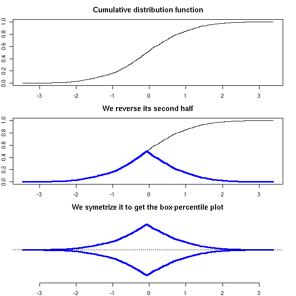
library(Hmisc)
bpplot(tapply(y, x, function (x) x))

Actually, such box-percentile plots are not really more readable than cumulative distribution functions, from which you cannot easily extract information. The vertical bars indicating the quartiles or deciles are needed.
library(Hmisc)
bpplt()    # This is the documentation
title(main = "bpplt()")
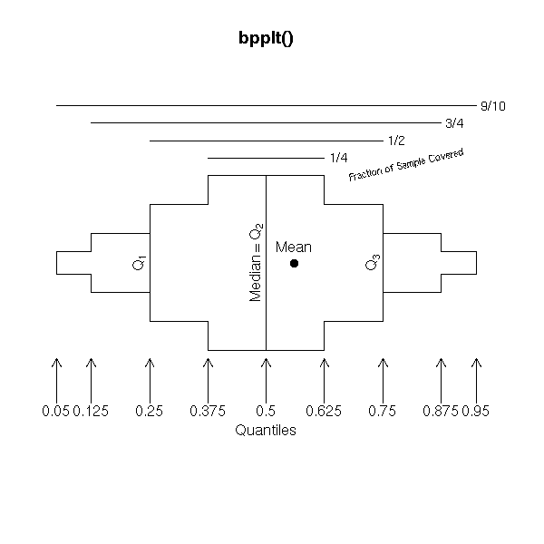
bwplot( ~ y | x,
        panel = panel.bpplot,
        main = "panel.bpplot",
        layout = c(1,5) )
Even then, this tool will fail to reveal important and obvious facts about your data, such as bimodality -- but if you know your distribution is unimodal, it is fine.
bpplot( faithful$waiting,
        main = "Box-precentile plot of bimodal data" )
TODO: use Grid graphics
grid.newpage()
pushViewport(viewport(layout=grid.layout(2, 1)))
pushViewport(viewport(layout.pos.col=1,
                       layout.pos.row=1))

nint <- round(log2(length(x)) +1)
endpoints <- lattice:::extend.limits(
  range(x, finite = TRUE),
  prop = 0.04
)
breaks <- do.breaks(endpoints, nint)
panel.histogram(x, breaks= breaks)
popViewport()
pushViewport(viewport(layout.pos.col=1,
                      layout.pos.row=2))
panel.histogram(x, breaks=2)
popViewport()
popViewport()
Yet another modification of the box-and-whiskers plot...
library(hdrcde)
hdr.boxplot(rnorm(1000), col = "pink",
            main = "Highest Density Region Plot")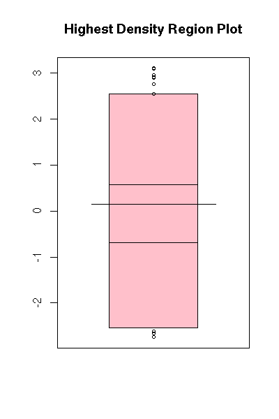
hdr.boxplot(faithful$waiting,
            col = "pink",
            main = "Highest Density Region Plot")
stripchart(InsectSprays$count ~ InsectSprays$spray,
           method = 'jitter')
In higher dimensions, one often adds colors in scatterplots.
data(iris)
plot(iris[1:4],
     pch = 21,
     bg = c("red", "green", "blue")[
       as.numeric(iris$Species)
     ])
But the "scatterplot" function lacks this "bg" argument. We can try to do it by hand -- but it is not very enlightening.
a <- InsectSprays$count
b <- rnorm(length(a))
plot(b ~ a,
     pch = 21,
     bg = c("red", "green", "blue",
          "cyan", "yellow", "black")
       [as.numeric(InsectSprays$spray)],
     main = "1-dimensional scatter plot",
     xlab = "Number of insects",
     ylab = "")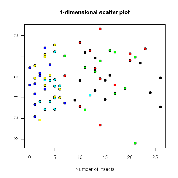
a <- as.vector(t(iris[1]))
b <- rnorm(length(a))
plot(b ~ a,
     pch = 21,
     bg = c("red", "green", "blue")[
       as.numeric(iris$Species)
     ],
     main = "1-dimensional scatter plot",
     xlab = "Number of insects",
     ylab = "")
Let us try with simulated data.
do.it <- function (v, ...) {
  n <- 100
  y <- sample( 1:3, n, replace=T )
  a <- runif(1)
  b <- runif(1)
  c <- runif(1)
  x <- ifelse( y==1, a+v*rnorm(n),
       ifelse( y==2, b+v*rnorm(n), c+v*rnorm(n) ))
  r <- rnorm(n)
  plot( r ~ x,
        pch = 21,
        bg = c('red', 'green', 'blue')[y],
        ... )
}
do.it(.1, main = "1-dimensional scatterplot")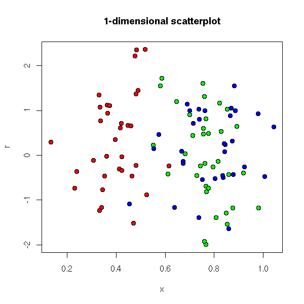
The groups really have to be clearly separated...
do.it(.05, main = "1-dimensional scatterplot")
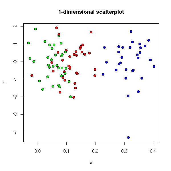
We can also plot several histograms, one for each group.
hists <- function (x, y, ...) {
  y <- factor(y)
  n <- length(levels(y))
  op <- par( mfcol=c(n,1), mar=c(2,4,1,1) )
  b <- hist(x, ..., plot=F)$breaks
  for (l in levels(y)){
    hist(x[y==l], breaks=b, probability=T, ylim=c(0,.3),
         main="", ylab=l, col='lightblue', xlab="", ...)
    points(density(x[y==l]), type='l', lwd=3, col='red')
  }
  par(op)
}
hists(InsectSprays$count, InsectSprays$spray)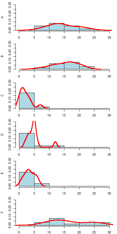
We can do the same thing with lattice plots.
library(lattice)
histogram( ~ count | spray, data=InsectSprays)
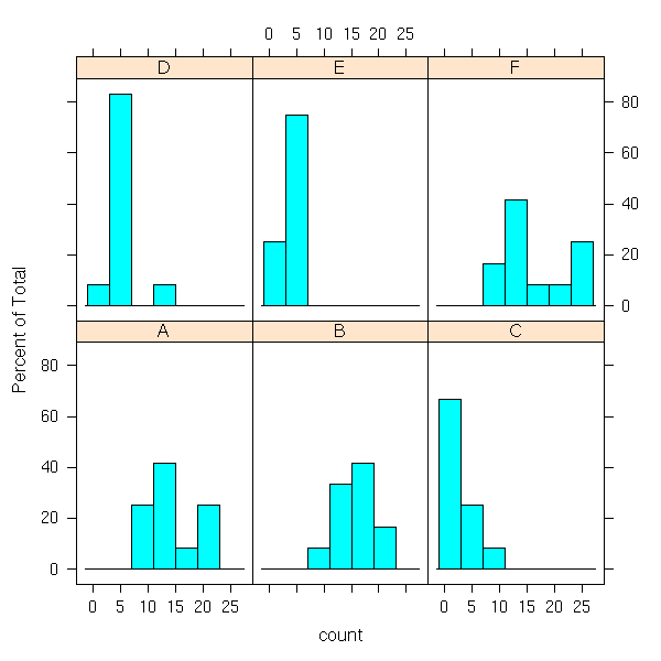
densityplot( ~ count | spray, data = InsectSprays )

bwplot( ~ count | spray, data = InsectSprays )
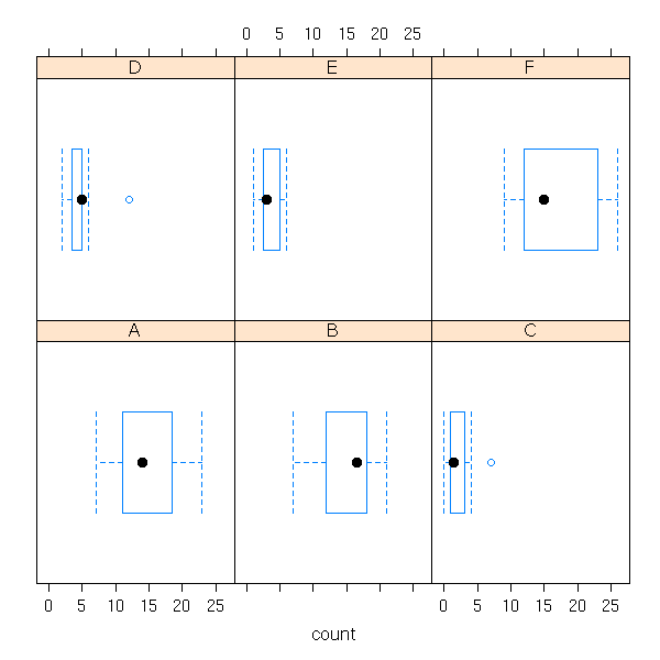
bwplot( ~ count | spray, data = InsectSprays, layout=c(1,6) )

If X is a qualitative variable and Y a quantitative variable, we can write the variance of Y as the sum of the "variance explained by X" and a "residual variance". One can then compute the quotient of the variance explained by X by the total variance of Y: this is the R squared (some people take the square root, others do not).
> aov( count ~ spray, data = InsectSprays )
Call:
   aov(formula = r)

Terms:
                   spray Residuals
Sum of Squares  2668.833  1015.167
Deg. of Freedom        5        66

Residual standard error: 3.921902
Estimated effects may be unbalanced
Here, the explained variance is 2669, the residual variance is 1015. The R squared is thus (it is the ratio of the explained variance by the total variance),
> s <- summary(aov( count ~ spray, data = InsectSprays ))[[1]][,2]
> s[1]/(s[1]+s[2])
[1] 0.7244
One sums this up by saying that the insect spray explains 70% of the variation of the number of insects.
Here is another way of getting this quantity (we shall detail the rest of this output when we tacke regression and analysis of variance).
> summary( lm( count ~ spray, data = InsectSprays ) )

Call:
lm(formula = count ~ spray, data = InsectSprays)

Residuals:
   Min     1Q Median     3Q    Max
-8.333 -1.958 -0.500  1.667  9.333

Coefficients:
            Estimate Std. Error t value Pr(>|t|)
(Intercept)  14.5000     1.1322  12.807  < 2e-16 ***
sprayB        0.8333     1.6011   0.520    0.604
sprayC      -12.4167     1.6011  -7.755 7.27e-11 ***
sprayD       -9.5833     1.6011  -5.985 9.82e-08 ***
sprayE      -11.0000     1.6011  -6.870 2.75e-09 ***
sprayF        2.1667     1.6011   1.353    0.181
---
Signif. codes:  0 `***' 0.001 `**' 0.01 `*' 0.05 `.' 0.1 ` ' 1

Residual standard error: 3.922 on 66 degrees of freedom
Multiple R-Squared: 0.7244,     Adjusted R-squared: 0.7036
F-statistic:  34.7 on 5 and 66 DF,  p-value: < 2.2e-16
We shall come back on the notion of R squared and its generalizations later, when we present regression.
One can represent such data as a contingency table, one row for each value of the first variable, one column for each value of the second variable, the entries of the table containing the number of corresponding observations ("frequencies").
data(HairEyeColor) a <- as.table( apply(HairEyeColor, c(1,2), sum) ) barplot(a, legend.text = attr(a, "dimnames")$Hair)
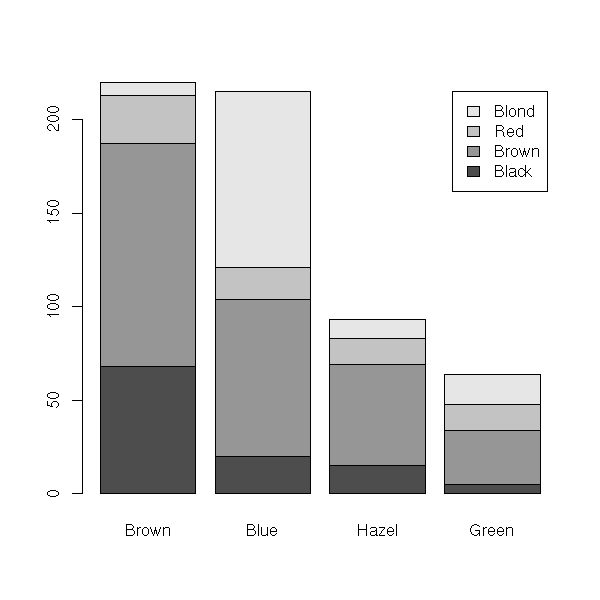
Table "a" then contains:
Eye
Hair Brown Blue Hazel Green
Black 68 20 15 5
Brown 119 84 54 29
Red 26 17 14 14
Blond 7 94 10 16Here are other ways of displaying the same information.
barplot(a,
beside = TRUE,
legend.text = attr(a, "dimnames")$Hair)
barplot(t(a),
legend.text = attr(a, "dimnames")$Eye)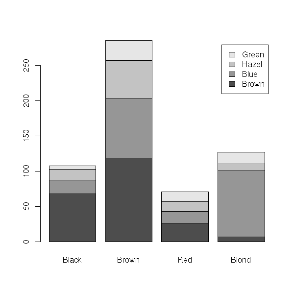
barplot(t(a),
beside = TRUE,
legend.text = attr(a, "dimnames")$Eye)
You can replace the row by the "row-profiles", i.e., the "marginal frequencies": you consider each row separately and you divide each row by its sum. To check that we did not interchange rows and columns, we compute the sum of the elements of each row: it should be 1.
> b <- a / apply(a, 1, sum)
> apply(b, 1, sum)
Black Brown Red Blond
1 1 1 1
> stopifnot( apply(b, 1, sum) == 1 )
> options(digits=2)
> b
Eye
Hair Brown Blue Hazel Green
Black 0.630 0.19 0.139 0.046
Brown 0.416 0.29 0.189 0.101
Red 0.366 0.24 0.197 0.197
Blond 0.055 0.74 0.079 0.126
TODO
> # Bad example: You should not call your
> # variables "c" -- it is already the name
> # of a function...
> c <- t( t(a) / apply(a, 2, sum) )
> apply(c, 2, sum)
Brown Blue Hazel Green
1 1 1 1
> stopifnot( apply(c, 2, sum) == 1 )
> c
Eye
Hair Brown Blue Hazel Green
Black 0.309 0.093 0.16 0.078
Brown 0.541 0.391 0.58 0.453
Red 0.118 0.079 0.15 0.219
Blond 0.032 0.437 0.11 0.250
b <- a / apply(a, 1, sum)
barplot(t(b))
c <- t( t(a) / apply(a, 2, sum) ) barplot(c)
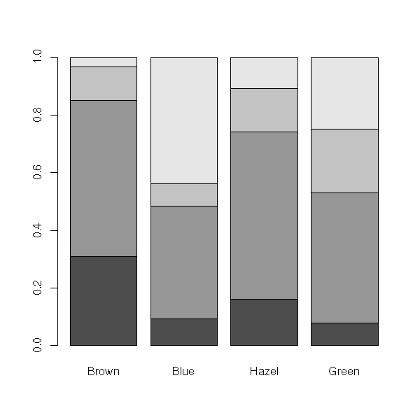
The "mosaicplot" function already does this (and the width of the bars depends on the marginal frequencies).
plot(a, main = "Mosaic plot")

plot(t(a), main = "Mosaic plot")

We can add colours:
plot(a,
col = heat.colors(dim(a)[2]),
main = "Mosaic plot")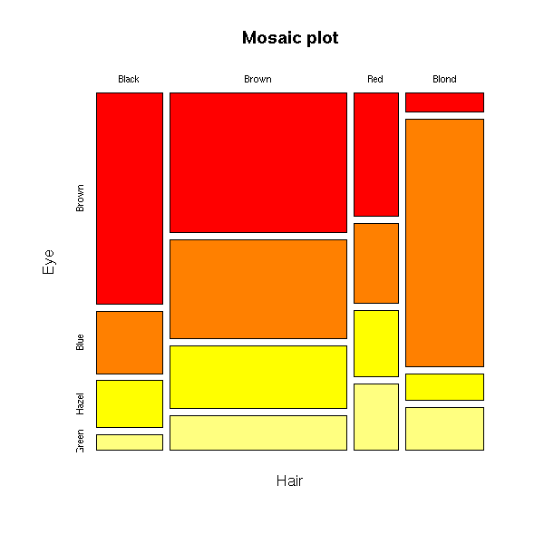
or simply:
plot(a,
color = TRUE,
main = "Mosaic plot")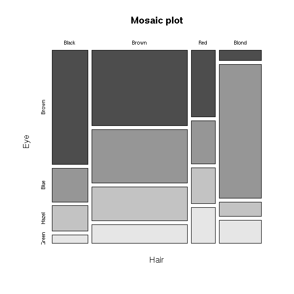
But I cannot seem to get both colours (for the values of the first variable) and shading lines (for the second).
We can ask R to stress the classes whose frequencies are significantly high or significantly low.
plot(a,
shade = TRUE,
main = "Mosaic plot")
plot(t(a),
shade = TRUE,
main = "Mosaic plot")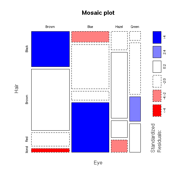
One can display each row of the table by a curve (the x-axis is then used for the other qualitative variable and the y-axis for the frequencies).
data(HairEyeColor)
a <- apply(HairEyeColor, c(1,2) , sum)
qualplot <- function (a) {
matplot( row(a), a,
type = 'l', axes = FALSE,
col = 1:dim(a)[2]+1,
lty = 1:dim(a)[2],
lwd=3,
xlab = names(dimnames(a))[1],
ylab = names(dimnames(a))[2] )
axis(1, 1:dim(a)[1], row.names(a))
axis(2)
legend(1, max(a), row.names(t(a)),
lwd = 3, cex = 1.5,
col = 1:dim(a)[2]+1,
lty = 1:dim(a)[2])
}
# For interactive use
qualplots <- function (a) {
op <- par(ask=TRUE)
qualplot(a)
qualplot(t(a))
par(op)
}
qualplot(a)
qualplot(t(a))

You can also modify the contingency table so that the marginal frequencies be equal, i.e., replace the contingency table by the row-profiles or the column profiles.
qualplotfreq <- function (a) {
a <- t( t(a) / apply(a,2,sum) )
qualplot(a)
}
qualplotsfreq <- function (a) {
op <- par(ask=TRUE)
qualplotfreq(a)
qualplotfreq(t(a))
par(op)
}
qualplotfreq(a)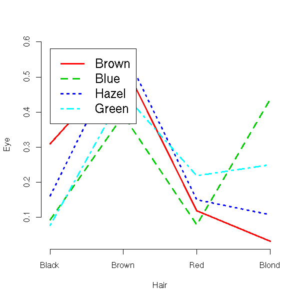
qualplotfreq(t(a))
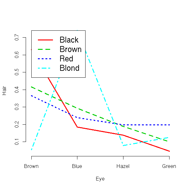
If the variables only have two values, you can also use the "fourfoldplot" function.
data(bacteria, package="MASS") fourfoldplot( table(bacteria$y, bacteria$ap) )

The area of the quarter discs is proportioinnal to the frequencies. The two variables are linked (not independant) if opposite quqrter circles have comparable sizes significantly different from the two other quarters. To ease the comparison, 95% confidence intervals are also plotted: if they do not overlap, the difference is statistically significant. In the preceding example, the difference is significant. In the following examples, the variables seem not independant for week 6, but seem so for the other weeks -- but beware: we have actually performed several tests, so the probability that one of them wrongly tells us there is something statistically significant gets higher...
fourfoldplot( table(bacteria$y,
bacteria$ap,
bacteria$week) )
One can plot three quantititative variables by discs in the plane: the first three give the coordinates of the center, the third gives the diameter or the area (if you want to convey the impression that the changes are important, use the diameter, if you want to deceive and give the impression that the changes are not important, use the area). This is often used for spacial data: e.g., for when you measure the diameter of trees and the location of those trees.
Either way, you will fail to objectively convey information: the human eye has problems comparing areas.
n <- 50
x <- rnorm(n)
y <- rnorm(n)
z <- rnorm(n)
my.renorm <- function (z) {
z <- abs(z)
z <- 10*z/max(z)
z
}
z <- my.renorm(z)
op <- par(mar = c(3,2,4,2)+.1)
plot(x, y, cex = z,
xlab = "", ylab = "",
main = "Bubble plot")
plot(x, y, cex = z,
pch = 16, col = 'red',
xlab = "", ylab = "",
main = "Bubble plot")
points(x, y, cex = z)
You can also add a variable (often, a qualitative one such as the tree species) by varying the colour of the discs;
u <- sample(c('red','green','blue'),n,replace=T)
plot(x, y, cex = z, col = u,
pch = 16,
xlab = "", ylab = "",
main = "Bubble plot")
points(x, y, cex = z)
you can also add several qualitative variables by replacing the discs by concentric circles, etc. (but it becomes even less readable).
z2 <- rnorm(n)
z2 <- my.renorm(z2)
plot(x, y, cex = z,
xlab = "", ylab = "",
main = "Bubble plot")
points(x, y, cex = z2, col = 'red')
# Other renormalization (if there is no zero)
my.renorm <- function (z) {
z <- (z-min(z)) / (max(z)-min(z))
z <- 1+9*z
z
}
z <- my.renorm(z)
z2 <- my.renorm(z2)
plot(x, y, cex = z,
xlab = "", ylab = "",
main = "Bubble plot")
points(x, y, cex = z2, col = 'red')
You can also replace the concentric circles by star plots.
n <- 50
x <- runif(n)
y <- runif(n)
z1 <- rnorm(n)
z2 <- rnorm(n)
z3 <- rnorm(n)
z4 <- rnorm(n)
z5 <- rnorm(n)
stars( data.frame(z1,z2,z3,z4,z5), location=cbind(x,y),
labels=NULL, len=1/sqrt(n)/2,
main = "Star plot" )
v <- .2
n <- 50
x <- runif(n)
y <- runif(n)
z1 <- x+y+v*rnorm(n)
z2 <- x*y+v*rnorm(n)
z3 <- x^2 + y^2 + v*rlnorm(n)
stars( data.frame(z1,z2,z3),
location = cbind(x,y),
labels = NULL,
len = 1/sqrt(n)/2,
axes = TRUE,
draw.segments = TRUE,
col.segments = 1:5,
main = "Star plot" )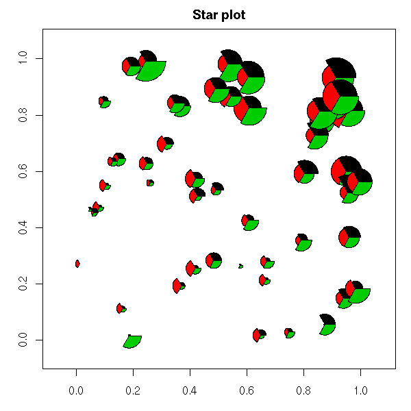
Here, we plot several variables Y1, Y2, etc. as a function of X. We can overlay the curves with the "matplot" function.
n <- 10
d <- data.frame(y1 = abs(rnorm(n)),
y2 = abs(rnorm(n)),
y3 = abs(rnorm(n)),
y4 = abs(rnorm(n)),
y5 = abs(rnorm(n))
)
matplot(d,
type = 'l',
ylab = "",
main = "Matplot")
We could also use a bar plot.
barplot(t(as.matrix(d)))

For a "line chart", we can proceed as follows. We first plot Y1 as a function of X, we colour under the curve, we plot Y1+Y2 as a function of X, we colour between the two curves, etc.. Of course, this only works for positive variables, using the same measurement unit.
line.chart <- function (d,
xlab = "", ylab = "",
main = "") {
m <- d
m <- t(apply(m,1,cumsum))
#print(m)
n1 <- dim(m)[1]
n2 <- dim(m)[2]
col <- rainbow(n)
plot.new()
plot.window(xlim = c(1, n1),
ylim = c(min(m), max(m)))
axis(1)
axis(2)
title(xlab = xlab, ylab = ylab,
main = main)
for (i in n2:1) {
polygon(c(1:n1,n1,1), c(m[,i],0,0),
col = col[i],
border = 0)
}
for (i in n2:1) {
lines(m[,i], lwd = 2)
}
}
line.chart(d, main = "Linechart")
The "pairs" function displays such data.
data(LifeCycleSavings) plot(LifeCycleSavings)

We can have a look at the correlation matrix (but beware, this is only relevant if the phenomena you are studying are linear).
> cor(LifeCycleSavings)
sr pop15 pop75 dpi ddpi
sr 1.00 -0.46 0.32 0.22 0.30
pop15 -0.46 1.00 -0.91 -0.76 -0.05
pop75 0.32 -0.91 1.00 0.79 0.03
dpi 0.22 -0.76 0.79 1.00 -0.13
ddpi 0.30 -0.05 0.03 -0.13 1.00You can configure this plot, by putting other things in the squares: histograms, correlation coefficients, etc. However, this is not sufficiently configurable to my taste, because the functions we give to the "pairs" function do not know the row and column number of the data they are displaying -- no way to get an "added variable plot"...
panel.hist <- function(x, ...) {
usr <- par("usr");
on.exit(par(usr))
par(usr = c(usr[1:2], 0, 1.5) )
h <- hist(x, plot = FALSE)
breaks <- h$breaks
nB <- length(breaks)
y <- h$counts; y <- y/max(y)
rect(breaks[-nB], 0, breaks[-1], y, ...)
}
# Correlation coefficient
my.panel.smooth <-
function (x, y,
col = par("col"),
bg = NA,
pch = par("pch"),
cex = 1,
col.smooth = "red",
span = 2/3,
iter = 3, ...) {
points(x, y,
pch = pch, col = col,
bg = bg, cex = cex)
ok <- is.finite(x) & is.finite(y)
if (any(ok))
lines(lowess(x[ok], y[ok],
f = span,
iter = iter),
col = col.smooth,
...)
usr <- par('usr')
text( (usr[1]+usr[2])/2, (usr[3]+9*usr[4])/10,
floor(100*cor(x,y))/100,
col='blue', cex=3, adj=c(.5,1) )
}
pairs(LifeCycleSavings,
diag.panel = panel.hist,
upper.panel = panel.smooth,
lower.panel = my.panel.smooth,
gap = 0)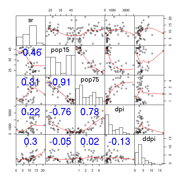
You can also use colours to represent the correlation coefficients. In the following example, we see that y is correlated with x1, x4 and x5 and that x4 and x5 are correlated. We shall again see that kind of example when we present multiple regression and "variable selection" (and when we explain why variable selection is rarely a good idea): someone wanting to forecast y from the xi would be tempted to use x1 and x4 or x1 and x5.
cor.plot <- function (x,
xlab = "", ylab = "",
main = "") {
n <- dim(x)[1]
m <- dim(x)[2]
N <- 1000
col = topo.colors(N)
plot(NA, xlim = c(0,1.2), ylim = c(-1,0),
xlab = xlab, ylab = ylab, main = main)
for (i in 1:n) {
for (j in 1:m) {
polygon( c((j-1)/m, (j-1)/m, j/m, j/m),
-c((i-1)/m, i/m, i/m, (i-1)/m),
col = col[ N*(x[i,j]+1)/2 ] )
}
}
for (i in 1:N) {
polygon( c(1.1, 1.1, 1.2, 1.2),
-c((i-1)/N, i/N, i/N, (i-1)/N),
col = col[N-i+1],
border = NA )
}
# Exercice: add a legend
}
n <- 200
x1 <- rnorm(n)
x2 <- rnorm(n)
x3 <- rnorm(n)
x <- rnorm(n)
x4 <- x + .1*rnorm(n)
x5 <- x + .1*rnorm(n)
y <- 1 + x1 + x4 + rnorm(n)
d <- data.frame(y,x1,x2,x3,x4,x5)
op <- par(mar=c(3,3,4,2)+.1)
cor.plot(cor(d), main = "Correlation plot")
par(op)
Actually, there is already a function to do this.
library(sma)
plot.cor(cor(d),
labels = colnames(d),
main = "plot.cor (in the \"sma\" package)")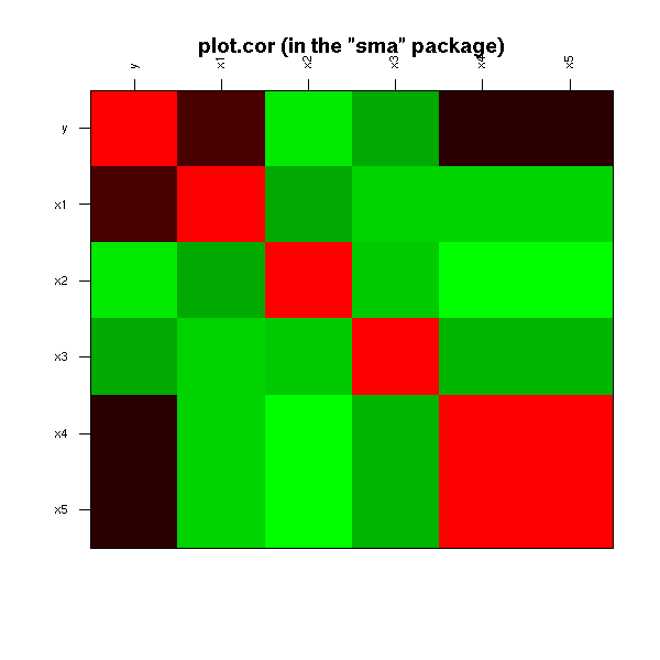
library(ellipse) plotcorr(cor(d), main = "plotcorr (in the \"ellipse\" package)")

When a scatterplot matrix (splom) is too large, you can just plot a (selected) part of it. But how to select "interesting" pairs of variables?
One idea is to consider several measures of "interestingness", of peculiarity of scatterplots: for instance, whether the plot is circular, whether there is a clear relation between the variables, whether this relation is monotonic, whether this relation is linear, etc. Those measures are called "scagnostics" -- scatterplot diagnostics. One can then look at the scatterplot of those scagnostics: the variables are those scagnostics and the observations are the pairs of initial variables, i.e., the cells in the initial (overly large) splom.
Here are some classical scagnostics: area of closed 2-dimensional density contours, perimeter of those contours, convexity of those contours, number of connected components of those contours (multimodality), non-linearity of the principal curves, average nearest-neighbour distance, etc.
uniformize <- function (x) {
x <- rank(x, na.last="keep")
x <- (x - min(x, na.rm=TRUE)) / diff(range(x, na.rm=TRUE))
x
}
scagnostic_contour <- function (x, y, ..., FUN = median) {
x <- uniformize(x)
y <- uniformize(y)
require(MASS) # For kde2d()
r <- kde2d(x, y, ...)
r$z > FUN(r$z)
}
translate <- function (x,i,j,zero=0) {
n <- dim(x)[1]
m <- dim(x)[2]
while (i>0) {
x <- rbind( rep(zero,m), x[-n,] )
i <- i - 1
}
while (i<0) {
x <- rbind( x[-1,], rep(zero,m) )
i <- i + 1
}
while (j>0) {
x <- cbind( rep(zero,n), x[,-m] )
j <- j - 1
}
while (j<0) {
x <- cbind( x[,-1], rep(zero,n) )
j <- j + 1
}
x
}
scagnostic_perimeter <- function (x, y, ...) {
z <- scagnostic_contour(x, y, ...)
zz <- z |
translate(z,1,0) | translate(z,0,1) |
translate(z,-1,0) | translate(z,0,-1)
sum(zz & ! z)
}
scagnostic_area <- function (x, y, ...) {
z <- scagnostic_contour(x, y, ..., FUN = mean)
sum(z) / length(z)
}
connected_components <- function (x) {
stopifnot(is.matrix(x), is.logical(x))
m <- dim(x)[1]
n <- dim(x)[2]
x <- rbind( rep(FALSE, n+2),
cbind( rep(FALSE, m), x, rep(FALSE, m) ),
rep(FALSE, n+2))
x[ is.na(x) ] <- FALSE
# Assign a label to each pixel, so that pixels with the same
# label be in the same connected component -- but pixels in the
# same connected component may have different labels.
current_label <- 0
result <- ifelse(x, 0, 0)
equivalences <- list()
for (i in 1 + 1:m) {
for (j in 1 + 1:n) {
if (x[i,j]) {
number_of_neighbours <- x[i-1,j-1] + x[i-1,j] + x[i-1,j+1] + x[i,j-1]
labels <- c( result[i-1,j-1], result[i-1,j],
result[i-1,j+1], result[i,j-1] )
labels <- unique(labels[ labels > 0 ])
neighbour_label <- max(0,labels)
if (number_of_neighbours == 0) {
current_label <- current_label + 1
result[i,j] <- current_label
} else if (length(labels) == 1) {
result[i,j] <- neighbour_label
} else {
result[i,j] <- neighbour_label
equivalences <- append(equivalences, list(labels))
}
}
}
}
# Build the matrix containing the equivalences between those labels
# We just have the matrix of a (non-equivalence) relation: we compute
# the equivalence relation it generates.
E <- matrix(FALSE, nr=current_label, nc=current_label)
for (e in equivalences) {
stopifnot( length(e) > 1 )
for (i in e) {
for (j in e) {
if (i != j) {
E[i,j] <- TRUE
}
}
}
}
E <- E | t(E)
diag(E) <- TRUE
for (k in 1:current_label) {
E <- E | (E %*% E > 0)
}
stopifnot( E == E | (E %*% E > 0) )
# Find the equivalence classes, i.e., the unique rows of this matrix
E <- apply(E, 2, function (x) min(which(x)))
# Finally, label the equivalence classes
for (i in 1:current_label) {
result[ result == i ] <- E[i]
}
result
}
connected_components_TEST <- function () {
n <- 100
x <- matrix(NA, nr=n, nc=n)
x <- abs(col(x) - (n/3)) < n/8 & abs(row(x) - n/3) < n/8
x <- x | ( (col(x) - 2*n/3)^2 + (row(x) - 2*n/3)^2 < (n/8)^2 )
image(!x)
image(-connected_components(x))
}
scagnostic_modality <- function (x, y, ...) {
z <- scagnostic_contour(x, y, ...)
z <- connected_components(z)
max(z)
}
scagnostic_slope <- function (x,y) {
x <- uniformize(x)
y <- uniformize(y)
pc1 <- prcomp(cbind(x,y))$rotation[,1]
pc1[2] / pc1[1]
}
scagnostic_sphericity <- function (x,y) {
x <- uniformize(x)
y <- uniformize(y)
# Ratio of the eigenvalues of the PCA
# For a spherical cloud of points, the slope
# is not well defined, but this ratio is close to 1.
ev <- prcomp(cbind(x,y))$sdev
ev[1] / ev[2]
}
scagnostic_curvature <- function (x,y) {
x <- uniformize(x)
y <- uniformize(y)
require(pcurve)
# BUG: pcurve() starts a new plot by fiddling with par() --
# it also fails to set it back to what it was...
par <- function (...) { }
r <- NULL
try(
r <- pcurve(cbind(x,y),
start = "pca", # Defaults to CA,
# which only works with count data...
plot.pca = FALSE,
plot.true = FALSE,
plot.init = FALSE,
plot.segs = FALSE,
plot.resp = FALSE,
plot.cov = FALSE,
use.loc = FALSE)
)
if (is.null(r)) return(0)
X <- r$s[,1:2] # The principal curve
n <- dim(X)[1]
V <- X[2:n,] - X[1:(n-1),]
V <- V / sqrt(V[,1]^2 + V[,2]^2) # The direction of the principal
# curve, at each point on it
C <- apply( V[1:(n-2),] * V[2:(n-1),], 1, sum )
C <- acos(C) # The angles
sum(abs(C)) / pi
}
scagnostic_distance <- function (x,y) {
i <- is.finite(x) & is.finite(y)
if (length(i) < 2) {
return(NA)
}
x <- uniformize(x)[i]
y <- uniformize(y)[i]
d <- as.matrix(dist(cbind(x,y)))
diag(d) <- Inf
d <- apply(d, 2, min) # Nearest neighbour distance
mean(d)
}
scagnostics <- function (
x,
functions = list(
Perimeter = scagnostic_perimeter,
Area = scagnostic_area,
Modality = scagnostic_modality,
Slope = scagnostic_slope,
Sphericity = scagnostic_sphericity,
Curvature = scagnostic_curvature,
"Nearest neighbour distance" = scagnostic_distance
)
) {
stopifnot( is.matrix(x) || is.data.frame(x) )
number_of_variables <- dim(x)[2]
number_of_scagnostics <- length(functions)
res <- array(NA, dim=c(number_of_variables,
number_of_variables,
number_of_scagnostics))
dimnames(res) <- list(
Variable1 = colnames(x),
Variable2 = colnames(x),
Scagnostic = names(functions)
)
for (i in 1:number_of_variables) {
for (j in 1:number_of_variables) {
if (i != j) {
for (k in 1:number_of_scagnostics) {
res[i,j,k] <- functions[[k]] (x[,i], x[,j])
}
}
}
}
class(res) <- "scagnostics"
res
}
plot.scagnostics <- function (x, FUN=pairs, ...) {
stopifnot(inherits(x, "scagnostics"))
y <- apply(x, 3, as.vector)
colnames(y) <- dimnames(x)[[3]]
rownames(y) <- outer(dimnames(x)[[1]], dimnames(x)[[2]], paste, sep="-")
FUN(y, ...)
}
pairs(USJudgeRatings, gap=0)
plot(scagnostics(USJudgeRatings), gap=0)
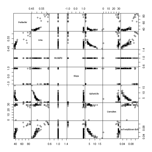
x <- Harman74.cor[[1]] pairs(x, gap=0)
plot(scagnostics(x), gap=0)

Scagnostics are most useful in an interactive environment: one would have the traditionnal scatterplot matrix and the scagnostics scatterplot matrix; one could select cells in the traditional scatterplot and see where they are in the scagnostics scatterplot matrix; one could select ("brush") sets of pairs of variables in the scagnostics scatterplot matrix and have the corresponding cells in the traditional scatterplot matrix immediately highlighted. Sadly, R does not provide such a high level of interactivity yet -- but keep an eye on iPlot.
http://rosuda.org/iPlots/iplots.html
One can also define graph-theoretic scagnostics (i.e., using the minimum spanning tree, the convex hull, the alpha hull, etc., instead of the density estimation).
Graph-theoretic scagnostics, Wilkinson et al. (2005) http://infovis.uni-konstanz.de/members/bustos/sva_ss06/papers/wilkinso.pdf
When dealing with a large number of numeric variables, one could be tempted to consider the dataset as a table of numbers and plot it, as an image. It is not that insightful, because the order on the variables and the observations is likely to be random.
image(t(as.matrix(USJudgeRatings)))
Can we select a meaningful order on the variables and the observations to highlight patterns in the data? Most people advocate a hierarchical clustering on the rows and columns, but it does not appear to be the most efficient method: most of the time, principal component analysis (PCA) or multidimensional scaling (MDS) (or its variants: isomap, LPP, etc.) yield slightly better results.
# This uses cluster analysis heatmap(as.matrix(USJudgeRatings))

These methods are useful when you need to choose an order on the variables and/or on the observations and no such order is available a priori (for instance, it could be a time or space ordering): e.g., to plot a correlation matrix or for a parallel plot.
You can also plot a box-and-whiskers plot of the values of Y for each quantile of each variable Xi -- this is not symetric.
my.dotchart(LifeCycleSavings[,1], LifeCycleSavings[,-1],
xlab='savings', ylab='')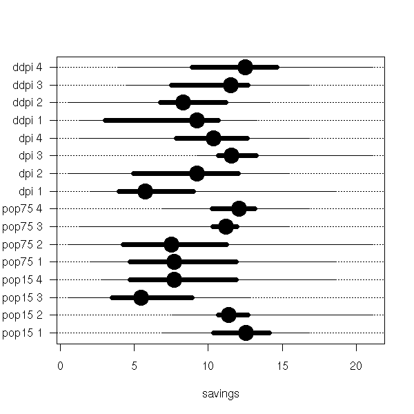
With real box-and-whiskers plots:
to.factor.vector <- function (x, number = 4) {
resultat <- NULL
intervalles <- co.intervals(x, number,
overlap = 0)
for (i in 1:number) {
if ( i == 1 ) {
intervalles[i,1] = min(x)
} else {
intervalles[i,1] <- intervalles[i-1,2]
}
if( i == number ) {
intervalles[i,2] <- max(x)
}
}
for (valeur in x) {
r <- NA
for (i in 1:number) {
if( valeur >= intervalles[i,1] &
valeur <= intervalles[i,2] )
r <- i
}
resultat <- append(resultat, r)
}
factor(resultat, levels = 1:number)
}
to.factor <- function (x, number = 4) {
if(is.vector(x))
r <- to.factor.vector(x, number)
else {
r <- NULL
for (v in x) {
a <- to.factor.vector(v)
if( is.null(r) )
r <- data.frame(a)
else
r <- data.frame(r,a)
}
names(r) <- names(x)
}
r
}
x <- to.factor(LifeCycleSavings[,-1])
y <- LifeCycleSavings[,1]
y <- as.vector(matrix(y,
nr = length(y),
ncol = dim(x)[2]))
for (i in names(x)) {
levels(x[[i]]) <- paste(i, levels(x[[i]]))
}
col <- gl( dim(x)[2], length(levels(x[,1])),
labels = rainbow( dim(x)[2] ))
col <- as.vector(col)
x <- factor(as.vector(as.matrix(x)))
boxplot(y ~ x,
horizontal = TRUE,
las = 1,
col = col,
main = "Boxplot for each quartile")
You can also do this with lattice plots, whose basic idea is to cut data into slices (here, fractiles). I could not seem to manage to put this in a loop: nothing was getting displayed.
TODO: Loop...
bwplot( ~ LifeCycleSavings[,1] |
equal.count(LifeCycleSavings[,2], number=4),
layout=c(1,4) )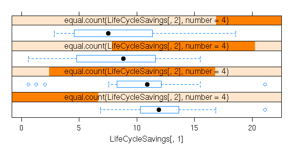
bwplot( ~ LifeCycleSavings[,1] |
equal.count(LifeCycleSavings[,3], number=4),
layout=c(1,4) )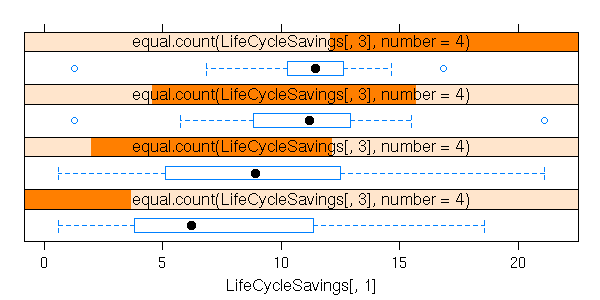
bwplot( ~ LifeCycleSavings[,1] |
equal.count(LifeCycleSavings[,4], number=4),
layout=c(1,4) )
bwplot( ~ LifeCycleSavings[,1] |
equal.count(LifeCycleSavings[,5], number=4),
layout=c(1,4) )
If you have many variables (half a dozen or more quantitative variables) and few observations (a dozen), you can use starplots.
data(mtcars)
stars(mtcars[, 1:7],
key.loc = c(14, 2),
main = "Motor Trend Cars : stars(*, full = FALSE)",
full = FALSE)
stars(mtcars[, 1:7],
key.loc = c(14, 1.5),
main = "Motor Trend Cars : full stars()",
flip.labels = FALSE)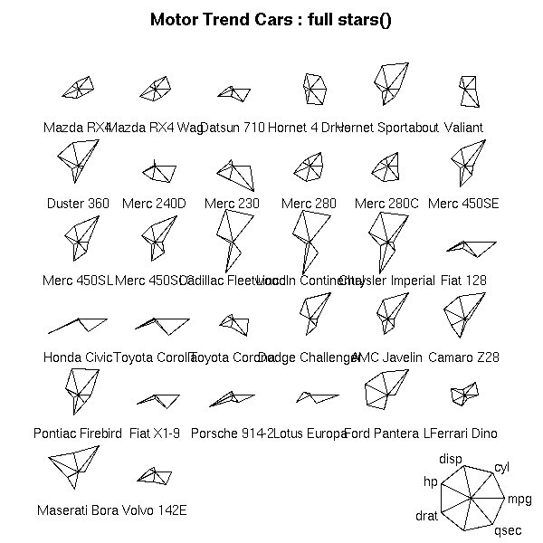
palette(rainbow(12, s = 0.6, v = 0.75))
stars(mtcars[, 1:7],
len = 0.8,
key.loc = c(12, 1.5),
main = "Motor Trend Cars",
draw.segments = TRUE)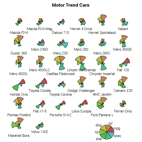
stars(mtcars[, 1:7],
locations = c(0,0),
radius = FALSE,
key.loc=c(0,0),
main="Motor Trend Cars",
lty = 2)
TODO:
library(circular) rose.diag(mtcars[,5])
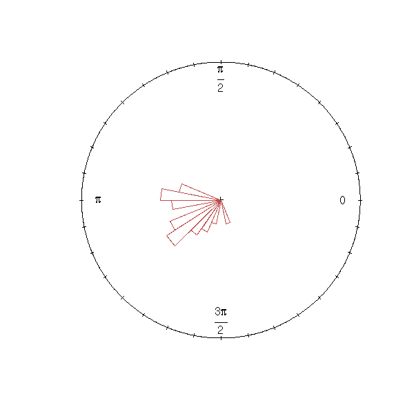
rose.diag(mtcars)

R can plot surfaces defined by an equation of the form z = f(x,y). They are described the value of f on a grid: the first two arguments are vectors (of length n and m), giving the x and y coordinates of the grid, the third argument in a matrix (of size n*m) containing the values of z.
First, a wireframe surface.
# From the manual
x <- seq(-10, 10, length=50)
y <- x
f <- function(x,y) {
r <- sqrt(x^2+y^2)
10 * sin(r)/r
}
z <- outer(x, y, f)
z[is.na(z)] <- 1
persp(x, y, z, theta = 30, phi = 30, expand = 0.5, col = "lightblue",
shade=.5,
xlab = "X", ylab = "Y", zlab = "Z")
# From the manual
data(volcano)
z <- 2 * volcano # Exaggerate the relief
x <- 10 * (1:nrow(z)) # 10-meter spacing (S to N)
y <- 10 * (1:ncol(z)) # 10-meter spacing (E to W)
persp(x, y, z,
theta = 120, phi = 15,
scale = FALSE, axes = FALSE)
# See also the other examples in
# demo(persp)
The "contour" function draws level lines.
# From the manual
data("volcano")
rx <- range(x <- 10*1:nrow(volcano))
ry <- range(y <- 10*1:ncol(volcano))
ry <- ry + c(-1,1) * (diff(rx) - diff(ry))/2
tcol <- terrain.colors(12)
op <- par(pty = "s", bg = "lightcyan")
plot(x = 0, y = 0,
type = "n",
xlim = rx, ylim = ry,
xlab = "", ylab = "")
u <- par("usr")
rect(u[1], u[3], u[2], u[4],
col = tcol[8],
border = "red")
contour(x, y, volcano,
col = tcol[2],
lty = "solid",
add = TRUE,
vfont = c("sans serif", "plain"))
title("A Topographic Map of Maunga Whau", font = 4)
abline(h = 200*0:4, v = 200*0:4,
col = "lightgray",
lty = 2,
lwd = 0.1)
par(op)
We can overlay the level lines on the image plot.
# From the manual
data(volcano)
x <- 10*(1:nrow(volcano))
y <- 10*(1:ncol(volcano))
image(x, y, volcano,
col = terrain.colors(100),
axes = FALSE,
xlab = "", ylab = "")
contour(x, y, volcano,
levels = seq(90, 200, by=5),
add = TRUE,
col = "peru")
axis(1, at = seq(100, 800, by = 100))
axis(2, at = seq(100, 600, by = 100))
box()
title(main = "Maunga Whau Volcano", font.main = 4)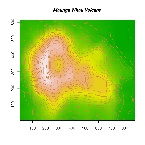
You might also want to look at the "wireframe" and "cloud" functions, in the lattice library.
data(volcano) x <- 10*(1:nrow(volcano)) x <- rep(x, ncol(volcano)) y <- 10*(1:ncol(volcano)) y <- rep(y, each=nrow(volcano)) z <- as.vector(volcano) wireframe( z ~ x * y )

cloud( z ~ x * y )
If you have the required glasses, you can also consider a stereoscopic plot.
data(iris)
print(cloud(Sepal.Length ~ Petal.Length * Petal.Width,
data = iris, cex = .8,
groups = Species,
subpanel = panel.superpose,
main = "Stereo",
screen = list(z = 20, x = -70, y = 3)),
split = c(1,1,2,1), more = TRUE)
print(cloud(Sepal.Length ~ Petal.Length * Petal.Width,
data = iris, cex = .8,
groups = Species,
subpanel = panel.superpose,
main = "Stereo",
screen = list(z = 20, x = -70, y = 0)),
split = c(2,1,2,1))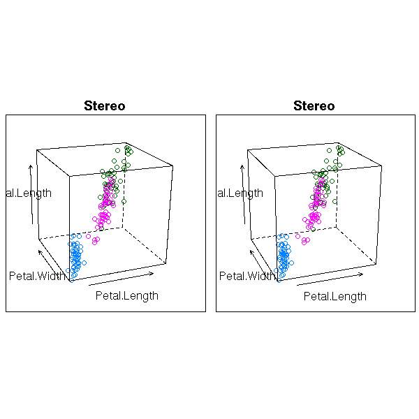
When plotting a 3-dimensional dataset with the image() function, especially with few points, you might want to interpolate between those points, so as to have a smoother plot (this is the analogue of linking the points with a linem when you draw a function).
z <- matrix(rnorm(24),nr=4)
library(akima) # non-free
r <- interp( as.vector(row(z)),
as.vector(col(z)),
as.vector(z),
seq(1, dim(z)[1], length=500),
seq(1, dim(z)[2], length=500) )
op <- par(mfrow=c(2,1))
image(t(z), main="Data to be smoothed or interpolated")
box()
image(t(r$z), main="Linear interpolation")
box()
par(op)
# The following should provide spline interpolation.
# It does not work because the points form a grid.
# If you try to add some noise to the points, the results
# become meaningless.
# (But this uses a non-free Fortran library: nothing surprising)
r <- interp( as.vector(row(z)),
as.vector(col(z)),
as.vector(z),
seq(1, dim(z)[1], length=500),
seq(1, dim(z)[2], length=500),
linear = FALSE )
image(t(r$z), main="Spline interpolation")
library(fields)
loc <- make.surface.grid(list( seq(1,dim(z)[1],length=500),
seq(1,dim(z)[2],length=500) ))
r <- interp.surface(
list(x=1:dim(z)[1], y=1:dim(z)[2], z=z),
loc
)
op <- par(mfrow=c(2,1))
image.plot(z, main="Raw data")
image.plot(as.surface(loc,r), main="Linear interpolation")
par(op)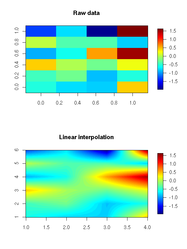
# You may not want to interpolate, but rather to smooth
# (the initial data set need not be on a grid)
# Also check the Tps() function in the fields package
library(tgp)
r <- interp.loess( as.vector(row(z)),
as.vector(col(z)),
as.vector(z),
gridlen = 500 )
image(t(r$z), main="Loess 2-dimensional smoothing")
Prefer image.plot(), from the fields package to image(): the latter misses a legend and you may notice that the box surrounding the plot is not always complete.
library(fields) data(lennon) x <- lennon[201:240,201:240] op <- par(mfrow=c(2,1)) image(x, main="image()") image.plot(x, main="image.plot()") par(op)

The default colour palette for the image() function is not always a good choice. For instance, if the sign of the values to be plotted is important, you want that sign to be easily readable from the colours -- with the default palette, you are not even sure that the zero is in the middle of the palette.
The RColorBrewer package provides colour palette "with a zero" (it also provides some without a zero, and some to be used for qualitative plots).
library(RColorBrewer) display.brewer.all(type="div") title(main="RColorBrewer: diverging palettes (i.e., with a zero)")

display.brewer.all(type="seq") title(main="RColorBrewer: sequential palettes")
display.brewer.all(type="qual") title(main="RColorBrewer: qualitative palettes")
breaks <- function (x, N) {
x <- as.vector(x)
x <- x[ !is.na(x) ]
if (length(x) == 0) {
return( rep(NA, N) )
}
if (N %% 2 == 0) {
if (all(x >= 0)) {
res <- c(rep(0, N/2), seq(0, max(x), length=N/2+1))
} else if (all(x <= 0)) {
res <- c(seq(min(x), 0, length=N/2+1), rep(0,N/2))
} else {
res <- c(seq(min(x), 0, length=N/2+1),
seq(0, max(x), length=N/2+1)[-1])
}
} else {
if (all(x >= 0)) {
res <- c(rep(0,length=(N+1)/2), seq(0, max(x), length=(N+1)/2))
} else if (all(x <= 0)) {
res <- c(seq(min(x), 0, length=(N+1)/2), rep(0, length=(N+1)/2))
} else {
res <- c(seq(min(x), 0, length=N+1) [seq(1, N, by=2)],
seq(0, max(x), length=N+1) [seq(2, N+1, by=2)])
}
}
stopifnot( length(res) == N+1 )
stopifnot( res == sort(res) )
stopifnot( all(x <= max(res)), all(x >= min(res)) )
res
}
breaks( 0:10, 5) == c(0,0,0, 0,5,10)
breaks(-(0:10), 5) == c(-10,-5,0, 0,0,0)
breaks(-20:10, 5) == c(-20, -12, -4, 2, 6, 10)
breaks( 0:9, 6) == c(0,0,0, 0, 3,6,9)
breaks(-(0:9), 6) == c(-9,-6,-3, 0, 0,0,0)
breaks( -30:9, 6) == c(-30,-20,-10,0,3,6,9)
# Example from the "fields" manual
data(ozone2)
x<-ozone2$lon.lat
y<- ozone2$y[16,]
# Remove the missing values
i <- !is.na(y)
y <- y[i]
x <- x[i,]
# The residuals of a regression
r <- Tps(x,y)
z <- residuals(r)
# Put those residuals on a regular grid
# We cannot use interp.surface(): it assumes that the data is regular
library(tgp)
r <- interp.loess(x[,1], x[,2], z, gridlen=500)
# I wanted an example with skewed data: residuals tend to be symetric...
op <- par(mfrow=c(2,2))
image(r)
image.plot(r)
image.plot(r,
breaks=breaks(r$z, 9), # Fine for the plot, but no for the legend...
col=rev(brewer.pal(9, "RdBu")))
par(op)
TODO http://wsopuppenkiste.wiso.uni-goettingen.de/~dadler/rgl/
TODO: Check that this section is still up to date (xgobi is supposed to have been superceded by ggobi -- for at least three years)
R itself cannot (yet) display animations, but you can export the data to observe them in another software, e.g., xgobi. (When the xgobi window appears, press "g" to start the animation.)
library(xgobi)
n <- 50
x <- seq(-10, 10, length=n)
y <- x
f <- function(x,y) {
r <- sqrt(x^2+y^2)
10 * sin(r)/r
}
z <- outer(x, y, f)
z[is.na(z)] <- 1
x <- matrix(x,nr=n,nc=n)
y <- matrix(y,nr=n,nc=n,byrow=T)
sombrero <- data.frame(x=as.vector(x),y=as.vector(y),z=as.vector(z))
xgobi(sombrero)
This is also very useful to look at statistical data in higher dimensionnal spaces.
http://www.public.iastate.edu/~dicook/JSS/paper/paper.html TODO: You can give xgobi several files: x.dat data x.row row names x.col col names x.glyphs x.colors But how can we do that when we call it from R?
A few tutorials:
http://industry.ebi.ac.uk/%257Ealan/VisWorkshop99/XGobi_Tutorial/index.html http://www.public.iastate.edu/~dicook/stat503.html
The new version of xgobi is called ggobi:
http://www.ggobi.org/
If the data are rather complex, you can ask xgobi to plot it at the same time in several windows, select some points in one window and see when they are in the other windows: this is called "brushing".
n <- 1000 x <- runif(3) + rnorm(n) y <- runif(3) + rnorm(n) z <- runif(3) + rnorm(n) t <- c(-5,-5,5) + rnorm(n) u <- c(-5,5,5) + rnorm(n) three.clusters <- data.frame(x,y,z,t,u) xgobi(three.clusters)
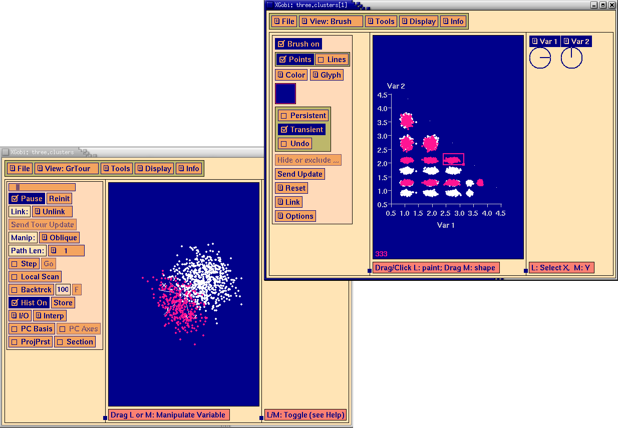
Xgobi also displays "parallel plots": for each data point, we draw a broken line whose y-coordinate are the successive coordinates of the point. Quite often, you do not see anything on it. But you can ask Xgobi to highlight some points or groups of points.
n <- 100
m <- matrix( rnorm(5*n)+c(1,-1,3,0,2),
nr = n, nc = 5, byrow = TRUE )
matplot(1:5, t(m), type = 'l',
xlab = "", ylab = "")
title(main = "Parallel plot: Homogeneous cloud")
n <- 50
k <- 2
m <- matrix( rnorm(5*k*n) +
runif(5*k, min = -10, max = 10),
nr = n, nc = 5, byrow = TRUE )
matplot(1:5, t(m), type = 'l',
xlab = "", ylab = "")
title(main = "Parallel plot: two clusters")
n <- 50
k <- 5
m <- matrix( rnorm(5*k*n) +
runif(5*k, min = -10, max = 10),
nr = n, nc = 5, byrow = TRUE )
matplot(1:5, t(m), type = 'l',
xlab = "", ylab = "")
title(main = "Parallel plot, 5 clusters")
matplot(1:5, t(princomp(m)$scores), type = 'l') title(main = "Idem, after PCA")

matplot(1:5, t(m), type = 'l') title(main = "Point cloud with less visible clusters")
Should you want it, there is already a "parallel" function in the "lattice" package.
library(lattice) parallel(as.data.frame(m))
You can also create parallel plots in polar coordinates.
polar_parallel_plot <- function (d, col = par("fg"),
type = "l", lty = 1, ...) {
d <- as.matrix(d)
d <- apply(d, 2, function (x) .5 + (x - min(x)) / (max(x) - min(x)))
theta <- (col(d) - 1) / ncol(d) * 2 * pi
d <- cbind(d, d[,1])
theta <- cbind(theta, theta[,1])
matplot( t(d * cos(theta)),
t(d * sin(theta)),
col = col,
type = type, lty = lty, ...,
axes = FALSE, xlab = "", ylab = "" )
segments(rep(0,ncol(theta)), rep(0, ncol(theta)),
1.5 * cos(theta[1,]), 1.5 * sin(theta[1,]))
if (! is.null(colnames(d))) {
text(1.5 * cos(theta[1,-ncol(theta)]),
1.5 * sin(theta[1,-ncol(theta)]),
colnames(d)[-ncol(d)])
}
}
op <- par(mar=c(0,0,0,0))
polar_parallel_plot(iris[1:4], col = as.numeric(iris$Species))
par(op)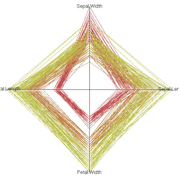
Some care should be taken to choose an order on the coordinates: the parallel plot actually compares each variable with the next. If there are interesting features between variables n and n+2, but nothing striking between n and n+1 and between n+1 and n+2, they will be unnoticed. For instance, in the previous example, one could readily compare the width and length of a petal, or the length and width of a sepal, but not the width of sepals and petals, nor their lengths. The order on the variables should be carefully chosen, either from previous domain knowledge, or from the data.
parallel(~iris[1:4], groups = Species, iris)
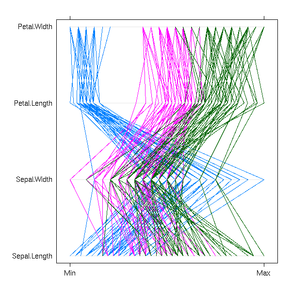
parallel(~iris[c(2,4,1,3)], groups= Species, iris)

Instead of a parallel plot, you can use a Fourier function, i.e., represent the vector (x1, x2, x3, x4, x5) by the curve of the function
f(t) = x1 + x2 cos(t) + x3 sin(t)
+ x4 cos(2t) + x5 sin(2t).The resulting curves are sometimes called "Andrew curves". In polar coordinates, this is called a Fourier blob. As for parallel plots, care should be taken to select a meaningful order on the coordinates.
x <- seq(-pi, pi, length=100)
y <- apply(as.matrix(iris[,1:4]),
1,
function (u) u[1] + u[2] * cos(x) +
u[3] * sin(x) + u[4] * cos(2*x))
matplot(x, y,
type = "l",
lty = 1,
col = as.numeric(iris[,5]),
xlab = "", ylab = "",
main = "Fourier (Andrew) curves")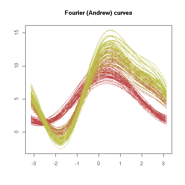
matplot(y * cos(x), y * sin(x),
type = "l",
lty = 1,
col = as.numeric(iris[,5]),
xlab = "", ylab = "",
main = "Fourier blob")
Chernoff faces are a more human alternative to Fourier blobs -- they might look funny and useless, but they are surprisingly efficient for quick decision making.
library(TeachingDemos) faces(longley[1:9,], main="Macro-economic data")

Let us now consider three quantitative variables that sum up to 100 (often, percents, in chemistry).
TODO: There is now a function to do exactly this.
help.search("ternary")
library(MASS)
data(Skye)
ternary <- function(X, pch = par("pch"), lcex = 1,
add = FALSE, ord = 1:3, ...)
{
X <- as.matrix(X)
if(any(X) < 0) stop("X must be non-negative")
s <- drop(X %*% rep(1, ncol(X)))
if(any(s<=0)) stop("each row of X must have a positive sum")
if(max(abs(s-1)) > 1e-6) {
warning("row(s) of X will be rescaled")
X <- X / s
}
X <- X[, ord]
s3 <- sqrt(1/3)
if(!add)
{
oldpty <- par("pty")
on.exit(par(pty=oldpty))
par(pty="s")
plot(c(-s3, s3), c(0.5-s3, 0.5+s3), type="n", axes=FALSE,
xlab="", ylab="")
polygon(c(0, -s3, s3), c(1, 0, 0), density=0)
lab <- NULL
if(!is.null(dn <- dimnames(X))) lab <- dn[[2]]
if(length(lab) < 3) lab <- as.character(1:3)
eps <- 0.05 * lcex
text(c(0, s3+eps*0.7, -s3-eps*0.7),
c(1+eps, -0.1*eps, -0.1*eps), lab, cex=lcex)
}
points((X[,2] - X[,3])*s3, X[,1], ...)
}
ternary(Skye/100, ord=c(1,3,2))
Here, the sum of each row of the table is 100.
> sum( apply(Skye,1,sum) != 100 ) [1] 0
Here is another way of plotting these data, following http://finzi.psych.upenn.edu/R/Rhelp01/archive/1000.html
tri <-
function(a, f, m, symb = 2, grid = F, ...)
{
ta <- paste(substitute(a))
tf <- paste(substitute(f))
tm <- paste(substitute(m))
tot <- 100/(a + f +m)
b <- f * tot
y <- b * .878
x <- m * tot + b/2
par(pty = "s")
oldcol <- par("col")
plot(x, y, axes = F, xlab = "", ylab = "",
xlim = c(-10, 110), ylim= c(-10, 110), type = "n", ...)
points(x,y,pch=symb)
par(col = oldcol)
trigrid(grid)
text(-5, -5, ta)
text(105, -5, tm)
text(50, 93, tf)
par(pty = "m")
invisible()
}
trigrid <-
function(grid = F)
{
lines(c(0, 50, 100, 0), c(0, 87.8, 0, 0)) #draw frame
if(!grid) {
for(i in 1:4 * 20) {
lines(c(i, i - 1), c(0, 2 * .878)) #side a-c (base)
lines(c(i, i + 1), c(0, 2 * .878))
T.j <- i/2 #side a-b (left)
lines(c(T.j, T.j + 2), c(i * .878, i * .878))
lines(c(T.j, T.j + 1), c(i * .878, (i - 2) * .878))
T.j <- 100 - i/2 #side b-c (right)
lines(c(T.j, T.j - 2), c(i * .878, i * .878))
lines(c(T.j, T.j - 1), c(i * .878, (i - 2) * .878))
}
} else {
for(i in 1:4 * 20) {
# draw dotted grid
lines(c(i, i/2), c(0, i * .878), lty = 4, col = 3)
lines(c(i, (50 + i/2)), c(0, .878 * (100 - i)), lty = 4, col = 3)
lines(c(i/2, (100 - i/2)), c(i * .878, i * .878), lty = 4, col = 3)
}
par(lty = 1, col = 1)
}
}
# some random data in three variables
c1<- runif(5, 10, 20)
c2<- runif(5, 1, 5)
c3 <- runif(5, 15, 25)
# basic plot
tri(c1,c2,c3)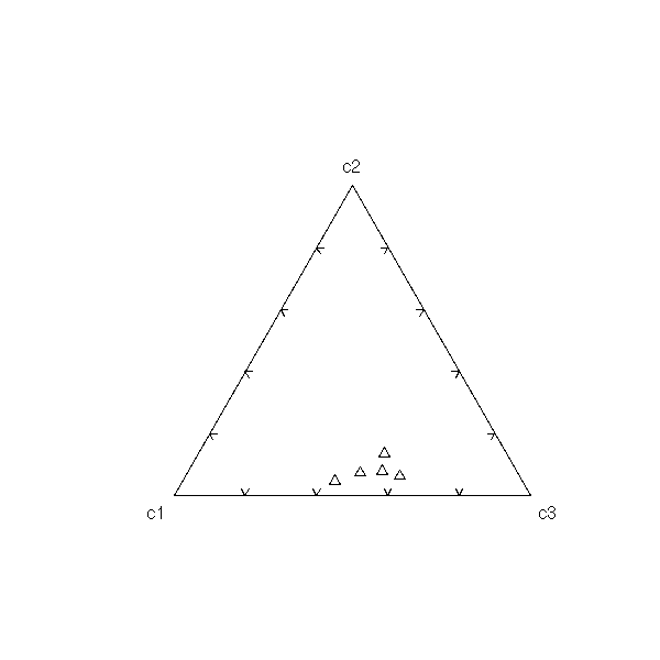
# plot with different symbols and a grid tri(c1,c2,c3, symb=7, grid=T)

It is a good exercise to write your own ternary plot function. For instance, could you, behind the grid, add a gradient, assigning a colour to each vertex of the triangle?
TODO
TODO: There is now a function to do this...
library(ade4) example(triangle.plot)
You can add a dimension and use xgobi to display the result.
library(xgobi) data(PaulKAI) quadplot(PaulKAI, normalize = TRUE)

You can also turn your data into sound -- but a musical ear might be helpful...
http://www.matthiasheymann.de/Download/Sonification.pdf http://www.matthiasheymann.de/Download/sound-manual.pdf
Musical interlude: some people try to turn DNA into music...
http://www.bbc.co.uk/radio4/science/thematerialworld_20031120.shtml http://www.dnamusiccentral.com/#About%20DNA
Another example:
http://www.bbc.co.uk/radio4/science/thematerialworld_20061005.shtml
We can use lattice plots.
histogram( ~ Sepal.Length | Species, data = iris,
layout = c(1,3) )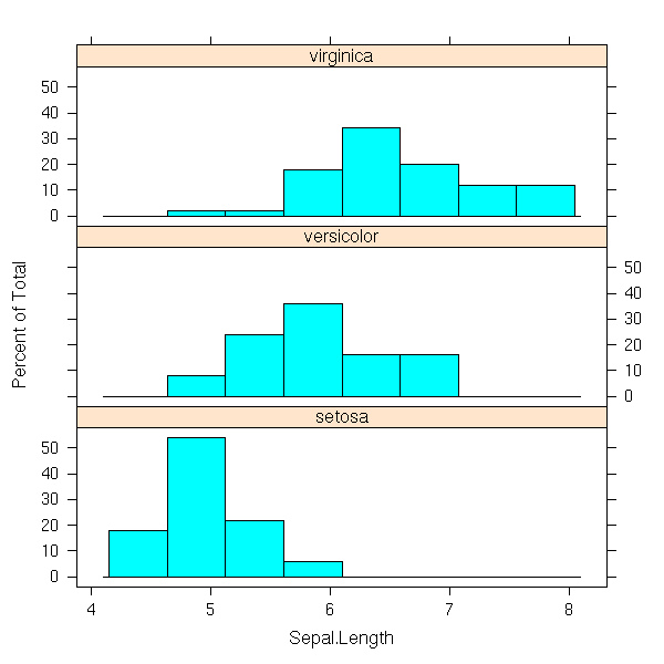
xyplot( Sepal.Length ~ Sepal.Width | Species, data = iris,
layout = c(1,3) )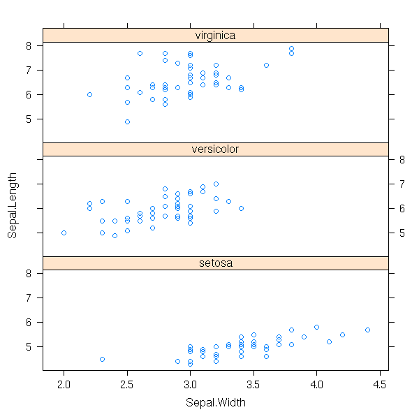
xyplot( Sepal.Length ~ Sepal.Width, group = Species, data = iris,
panel = function (x, y, groups, ...) {
panel.superpose(x, y, groups = groups, ...)
groups <- as.factor(groups)
for (i in seq(along=levels(groups))) {
g <- levels(groups)[i]
panel.lmline( x[groups == g], y[groups == g],
col = trellis.par.get("superpose.line")$col[i] )
}
}
)
xyplot( Sepal.Length ~ Sepal.Width, group = Species, data = iris,
panel = function (x, y, groups, ...) {
panel.superpose(x, y, groups = groups, ...)
groups <- as.factor(groups)
for (i in seq(along=levels(groups))) {
g <- levels(groups)[i]
panel.loess( x[groups == g], y[groups == g],
col = trellis.par.get("superpose.line")$col[i] )
}
}
)
You can display the values of the qualitative variable by different symbols or different colors.
data(iris)
plot(iris[1:4], pch=21,
bg=c("red", "green", "blue")[as.numeric(iris$Species)])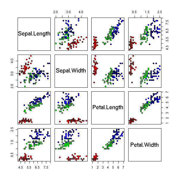
If one of the qualitative variables is binary, you can use the "fourfoldplot", as seen above.
Whe you have a simgle qualitative variable and a quantitative variable, you can use a box-and-whiskers plot.
But with two qualitative and one quantitative variable, the plot is no longer readable.
a <- rnorm(10)
b <- 1+ rnorm(10)
c <- 1+ rnorm(10)
d <- rnorm(10)
x <- c(a,b,c,d)
y <- factor(c( rep("A",20), rep("B",20)))
z <- factor(c( rep("U",10), rep("V",20), rep("U",10) ))
op <- par(mfrow=c(2,2))
plot(x~y)
plot(x~z)
plot(x[z=="U"] ~ y[z=="U"], border="red", ylim=c(min(x),max(x)))
plot(x[z=="V"] ~ y[z=="V"], border="blue", add=T)
plot(x[y=="A"] ~ z[y=="A"], border="red", ylim=c(min(x),max(x)))
plot(x[y=="B"] ~ z[y=="B"], border="blue", add=T)
par(op)
If the variables ave just two values, you can put the boxplots side by side.
l <- rep("",length(x))
for (i in 1:length(x)){
l[i] <- paste(y[i],z[i])
}
l <- factor(l)
boxplot(x~l)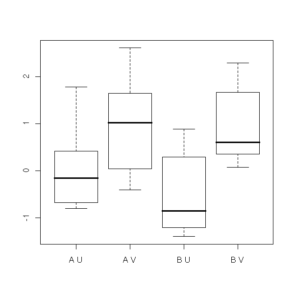
Instead of stacking the boxplots, you can overlay the curves plotting the mean of each group.
# l is a 2-element list
myplot1 <- function (x, l, ...) {
t <- tapply(x,l,mean)
l1 <- levels(l[[1]])
l2 <- levels(l[[2]])
matplot(t,
type='l', lty=1, col=1:length(l2),
axes=F, ...)
axis(1, 1:2, l1)
axis(2)
lim <- par("usr")
legend(lim[1] + .05*(lim[2]-lim[1]), lim[4],
l2, lwd=1, lty=1, col=1:length(l2) )
}
op <- par(mfrow=c(1,2))
myplot1( x, list(y,z), ylim=c(0,2), ylab = "" )
myplot1( x, list(z,y), ylim=c(0,2), ylab = "" )
par(op)
If the plot is not too cluttered, you can add the quartiles and the extreme values of each group.
myplot3 <- function (x, l, ...) {
l1 <- levels(l[[1]])
l2 <- levels(l[[2]])
t0 <- tapply(x,l,min)
t1 <- tapply(x,l,function(x)quantile(x,.25))
t2 <- tapply(x,l,median)
t3 <- tapply(x,l,function(x)quantile(x,.75))
t4 <- tapply(x,l,max)
matplot(cbind(t0,t1,t2,t3,t4),
type='l',
lty=c(rep(3,length(l2)), rep(2,length(l2)),
rep(1,length(l2)), rep(2,length(l2)),
rep(3,length(l2)) ),
col=1:length(l2),
axes=F, ...)
axis(1, 1:2, l1)
axis(2)
lim <- par("usr")
legend(lim[1] + .05*(lim[2]-lim[1]), lim[4],
l2, lwd=1, lty=1, col=1:length(l2) )
}
op <- par(mfrow=c(1,2))
myplot3( x, list(y,z), ylab = "" )
myplot3( x, list(z,y), ylab = "" )
par(op)
We can play and add 3d effects -- it distracts the reader, but if you do not want to convey information but merely deceive, this is for you...
A pie chart with a shadow.
shaded.pie <- function (...) {
pie(...)
op <- par(new=T)
a <- seq(0,2*pi,length=100)
for (i in (256:64)/256) {
r <- .8-.1*(1-i)
polygon( .1+r*cos(a), -.2+r*sin(a), border=NA, col=rgb(i,i,i))
}
par(new=T)
pie(...)
par(op)
}
x <- rpois(10,5)
x <- x[x>0]
shaded.pie(x)
A 3D bar chart (Err... I cheated: this was done with kchart. I leave it to the reader, as an exercice, to do the same thing with R).
You could also put the bars behind each other, you could also use 3D-bands, etc.
You could even delagate this task to a real drawing software such as PoVRay...
http://www.povray.org/ http://www.irtc.org/ http://www.kpovmodeler.org/ http://www.blender3d.org/ http://www.elysiun.com/forum/ http://www.cs.brown.edu/~tor/
For instance, here is the R code that generated the PoVRay code that generated the 3-dimensional part of the coverart of this book.
povray.hist <- function (x, ...) {
x <- hist(x, plot=F, ...)$counts
if( min(x)<0 ) x <- x-min(x)
x <- x/max(x)*1.5
n <- length(x)
w <- 2/n
e <- .01
my.cat <- function (s) { cat(s); cat("\n") }
my.cat('#include "colors.inc"')
my.cat('#include "stones.inc"')
my.cat('#include "woods.inc"')
my.cat('#declare rd=seed(0);')
my.cat('#declare T1 = texture { T_Stone16 scale .2}')
my.cat('#declare T2 = texture { T_Wood9 }')
my.cat('background { color White }')
my.cat('camera{')
my.cat(' location <.6,2,-1.5>')
my.cat(' look_at <0,.6,0>')
my.cat('}')
my.cat('light_source{<-1, 4, -2> color .5*White}')
my.cat('light_source{<+1, 4, -2> color White}')
my.cat('light_source{<1,.5,-2> color White}')
my.cat('// Ground ')
my.cat('#declare e = .1 ;')
my.cat('box{ <-1-e, -.02, -.25-e>, <1+e, 0, .25+e> texture {T1} }')
my.cat('// Boxes')
for (i in 1:n) {
my.cat(paste( 'box{<', -1+(i-1)*w +e, ',', x[i], ',', -w/2, '>, <',
-1+i*w, ',', 0, ',', w/2, '> ',
'texture{T2 rotate rand(rd)*90*x ',
'translate 2*<rand(rd), rand(rd), rand(rd)> }}' ))
}
}
povray.hist(faithful$eruptions)
An animation is merely a sequence of static images: the following example represents the quantile-quantile plot ox x^a for several values of a. In a corner, we have added a histogram of x^a and an estimation of its density.
n <- 500
set.seed(7236)
x <- rnorm(n,10)
N <- 50
a <- seq(.002,10,length=N)
for (i in factor(1:N)) {
png(filename=sprintf("animation_1_%03d.png", i))
y <- x^a[i]
qqnorm(y, main=paste("a =", signif(a[i])))
qqline(y, col='red')
par(fig=c(.7,.9,.2,.4),mar=c(0,0,0,0),new=T)
hist(y, col='light blue', probability=T,axes=F,main='')
lines(density(y), col='red', lwd=3)
curve(dnorm(x,mean(y),sd=sd(y)),col='blue',lty=2,lwd=3, add=T)
dev.off()
}We can now convert this sequence of images into an animation, e.g., with ImageMagick.
convert -delay 50 -loop 50 *.png animation_1.gif
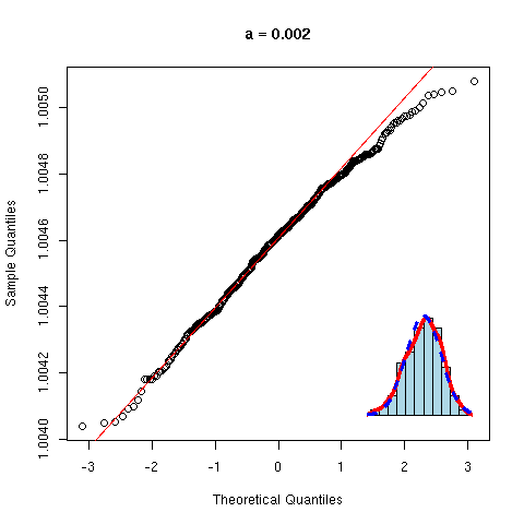
The "MNG" format is to "PNG" what "animated GIF" is to "GIF":
convert -delay 50 -loop 50 *.png animation_1.mng
If you just want to watch the animation, you do not need to convert the files:
animate -delay 50 *.png
You should be able to convert a bunch of PNG or JPEG files into an animation with mencoder (part of mplayer), as follows:
mencoder mf://*.jpg -mf fps=25:type=jpg -o output.avi -ovc lavc
or
mencoder mf://*.png -mf fps=25:type=png -o output.avi -ovc lavc
(I tried, it did work for JPEG, but not for PNG.)
See also
http://users.pandora.be/acp/ppmfilter/ TODO
Here are a few (fractal) animations made with R:
http://pinard.progiciels-bpi.ca/plaisirs/animations/index.html
TODO:
library(caTools) # Animated GIFs
TODO:
http://software.newsforge.com/article.pl?sid=05/07/01/1959251&from=rss https://stat.ethz.ch/pipermail/r-help/2005-July/074819.html
You can also use Tcl/Tk:
TODO: Explain...
f <- function () {
plot(...)
tkcmd("after", 1000, f)
}
f()
# To stop the animation: f <- NULL
You can sometimes display a very large data set without really summarizing it: this is the case if you can put the data into a rectangular table, with a meaning fil order on the rows and columns.
TODO: Example with random, unordered data TODO: Example with random, reordered data
This is the case, for instance, with the results of microarray experiments: there is one column per patient, one row per gene; the values measure the expression of each gene in each patient. There is no a priori order on the genes or on the patients, but one can obtain one by a hierarchical classification of the genes and of the patients. The resulting picture is often decorated by the corresponding classification trees.
TODO: Example
Here is another example. Software development is usually centered around a version control system (the best known are the ageing CVS and its competitor, Subversion): all the developers send (or "commit") their modifications, improvements, bug corrections to a central "repository", that tracks them all. It is then possible to retrieve the latest version of the software (a version is often called a "revision"), or the version at a given date, or the modifications that occured between two dates. Version control systems typically allow for a coarse graphical representation of those data: the number of revisions per day, the number of commits per developer and per week, etc. Can we do better?
A dense pixel display can display much more information: the table would have one row per line of code, one column per revision and the values could be a flag for the creation, deletion, modification of that line; the presence or absence of the line; the presence or absence of a keyword ("BUG", "TODO", "FIXME", etc.); the success of regression tests; whether the line was acrually tested; who modified the line; etc.
There is one problem, though: the number of lines of a project can vary wildly. One solution is to use a row for each line that ever existed -- if the project is young, this will not be much of a project, but if it has already undergone several rewrites, the picture will be mostly empty. Another solution is to accept that the number of lines varies: the "table" is no longer rectangular, but each column has a potentially different number or elements -- it has to be coerced into a rectangular form, e.g., by adding elements at the end of each column so that the have the same number of elements, or by adding elements at both ends of the columns, so that the plot be centered.
This can help decompose the life of a project into phases, such as growth, debugging prior to a release, bug fixes after a release, etc. -- it can also help see whether the software was released at the right time.
(You may wonder, as I do, how to include "branches" in such a plot...)
CVSscan: Visualization of code evolution (L. Voinea et al.) http://www.win.tue.nl/~lvoinea/cvss.pdf Version-Centric visualization of code evolution (S.L. Voinea et al.) http://www.win.tue.nl/~alext/ALEX/PAPERS/EuroVis05/paper.pdf
TODO
Examples:
Financial data, stocks: sector/industry group/industry/subindustry
region/country
E-commerce items: Books/Computer science/Programming languages
Newsgroups
Information classification (in a library, on Yahoo, dmoz)
Directories on a hard drive
Graphical representation:
- diagram with a lot of circles (for more readability, you can only
represent the "current" element (the one on which you focus), its
parents and children.
Actually, it can remain readable if you represent all the
ancestors (concentric circles) and their immediate offsprings
(just one generation) (other circles in those outer circles).
- tree
You can zoom on an element and only represent its immediate
parents and children.
You can also draw the whole tree and zoom by deforming the
picture, as if you had put a magnifying glass on if (maginfying
the current element and its immediate neighbours), or if you were
looking at it through a fish-eye lens.
Mathematitians can also implement this zoom by drawing the tree in
the hyperbolic (Poincare) plane -- do not do that in the US: the
hyperbolic plane has been patented...
http://mathworld.wolfram.com/PoincareHyperbolicDisk.html
http://hypertree.sourceforge.net/
http://www.freepatentsonline.com/6104400.html
Multi-hierarchies: each element can have several tags, some of which
are nested (as in a real hierarchy, by you could have several
unrelated hierarchies), some of which overlap.
library(help=elliptic)

This work is licensed under a Creative Commons Attribution-NonCommercial-ShareAlike 2.5 License.
Vincent Zoonekynd
<zoonek@math.jussieu.fr>
latest modification on Sat Jan 6 10:28:18 GMT 2007